| Author: | |
| Website: | |
| Page title: | |
| URL: | |
| Published: | |
| Last revised: | |
| Accessed: |
The Gantt chart is named after its inventor, Henry Gantt. It is a graphical way of presenting information about the activities involved in implementing a project (essentially a horizontal bar chart), and is a useful tool for scheduling and tracking progress. The horizontal (x) axis of the chart shows the timescale over which the project work is carried out, and is divided into appropriate time units (the units of time used will depend on the overall timescale for the project). The vertical (y) axis identifies the various tasks that must be carried out. Each task is represented by a horizontal bar, occupying its own row on the y-axis which is often identified with a task number at the left-hand side of the chart. The left-hand end of the bar is positioned on the x-axis in such a way that it represents the start date for the task, while the right hand end of the bar represents the finish date. The length of the bar therefore represents the duration of the task by definition. Task dependencies may also be indicated using an arrow that links the end of one task to the beginning of the next. Gantt charts can be created and updated relatively easily using project management software like Microsoft's MS Project, and can even be created using spreadsheet packages like MS Excel.
One of the fundamental principles of project scheduling is to be able to identify which tasks can be carried out independently of other tasks, and which tasks can only commence on completion of some other task (i.e. they can be said to have a task dependency). The Gantt chart makes it relatively easy to identify those tasks that have a task dependency, and which tasks they are dependent upon. If one task begins before the completion of another, the bars will overlap, and it is quite possible that two or more tasks may be performed in parallel. Larger projects may employ a series of Gantt charts if the complexity of the project is such that a single chart cannot provide the required level of detail. In some implementations of the Gantt chart, the work achieved for each task can be shown by shading part of the bar to represent the work that has been completed, so that the status of each activity can be seen a glance. To demonstrate how the Gantt chart works we can construct an example using some imaginary project tasks. Consider the information in the following table.
| Task No. | Duration (days) | Task dependency |
|---|---|---|
| 01 | 3 | N/A |
| 02 | 2 | N/A |
| 03 | 1 | N/A |
| 04 | 11 | 02, 03 |
| 05 | 11 | 02, 03 |
| 06 | 15 | 02, 03 |
| 07 | 1 | 02, 03 |
| 08 | 11 | 07 |
| 09 | 6 | 07 |
| 10 | 6 | 07 |
| 11 | 5 | 08, 09, 10 |
| 12 | 5 | 04, 05, 06, 11 |
| 13 | 4 | 02 |
| 14 | 5 | 12 |
| 15 | 4 | 12 |
| 16 | 4 | 13, 14, 15 |
The screen shots below show how this information is entered into the GanttProject software package, which can be used to produce a Gantt chart. Its creators describe it as: "a cross-platform desktop tool for project scheduling and management . . . [that] runs on Windows, Linux and MacOSX, it is free and its code is opensource". GanttProject is indeed a free software package, and can be downloaded from:
http://www.ganttproject.biz/download
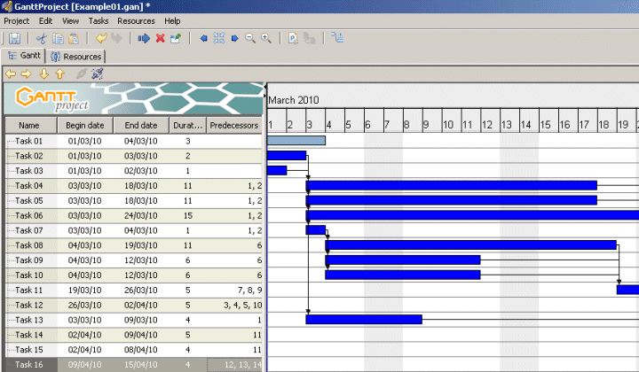
Task duration and dependency information is entered into the GanttProject software
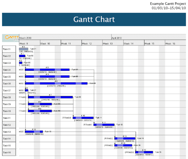
The detailed Gantt chart, exported by GanttProject in PDF format