| Author: | |
| Website: | |
| Page title: | |
| URL: | |
| Published: | |
| Last revised: | |
| Accessed: |
HTML forms allow a user to input data on a web page - usually for onward transmission to a script of some kind on the web server that will process the data in some way. We will be discussing how to create server-side scripts to handle form input data in the section "Server-side Scripting". In this page, we will concentrate on learning how to create user-friendly forms that facilitate the data-entry process.
Forms are an interactive feature of many websites. They are primarily used to gather information of some kind from the user and send that information to a web server. The information is typically handled by a server-side script which processes the data and generates some kind of automated response. This response usually takes the form of a message telling the user whether or not their form submission has been successful.
In a typical scenario, the user will input data to the form and click on a "Submit" button to send the data to the server. Before the data is sent, however, some kind of validation is usually carried out at the client end to make sure that (a) all of the required data has been provided, and (b) all of the data has been entered in the correct format.
In the past, data validation has often been carried out by client-side scripts written in JavaScript. These scripts typically check to see whether all of the required fields have been completed, and that things like email addresses and telephone numbers have been entered in the correct format. If any errors or omissions are found, the form data will not be sent to the server until the user has made the necessary changes.
HTML 5 has introduced a number of new input types that have basic data validation features built into them, as well as the required attribute for form inputs which will cause the user to be prompted for any missing data. HTML 5 is thus able to undertake some of the validation tasks normally carried out by client-side scripts. However, in view of the often-rudimentary nature of the validation provided, and the fact that browser support for the new features is still very patchy, developers are advised to continue to use traditional methods of validating form data.
Before we start actually creating forms, it is probably a good idea to familiarise ourselves with the range of HTML elements that are available for use with forms, and briefly explain their purpose. The table below lists these elements alphabetically and provides a brief description of each.
| Form Element | Description |
|---|---|
| <button> … </button> | Button - represents a clickable button that can be used with forms, or wherever else in a document a button may be required. |
| <datalist> … </datalist> | Datalist - specifies a set of pre-defined <option> elements that represent values available for other controls - for example, as an "autocomplete" feature for an <input> element. |
| <fieldset> … </fieldset> | Fieldset - groups together a number of related elements within a form and draws a box around them. |
| <form> … </form> | Form - creates an HTML form that can contain one or more interactive controls to enable the user to submit information to a web server. |
| <input …> | Input - creates an interactive control (i.e. an input field of some kind) that allows an HTML form to accept data from the user. |
| <label> … </label> | Label - defines a label for an <input> element. Depending on the input type clicking on the enclosed text may initiate an action (for example, it will toggle the value of a checkbox or radio button input type). |
| <legend> … </ legend > | Legend - defines a label for a <fieldset> element. |
| <optgroup> … </optgroup> | Option Group - defines a grouping of related <option> elements within a drop-down list defined by a <select> element. |
| <option> … </option> | Option - defines a single option within a <select> element, an <optgroup> element, or a <datalist> element. |
| <output> … </output> | Output - a container that receives the result of a calculation or displays the outcome of a user action. |
| <select> … </select> | Select - used to create a drop-down list consisting of a number of options from which a user can choose (each option is defined by an <option> element). |
| <textarea> … </textarea> | Text Area - defines a text input field (typically within an HTML <form> element) that can span multiple lines and hold an unlimited number of characters; text is rendered using a fixed-width font by default. |
You will not use all of the elements listed in every form you create. The elements you will find in pretty much every HTML form you come across are the <form> element itself (of course!) and <input> elements of one kind or another. These elements are used to get input from the user, which is after all what forms are all about.
You will also find at least one button on the form. This can either be implemented as a <button> element, or as an <input> element with its type attribute set to either "button" or "submit". Clicking on a "Submit" button usually triggers a validation process that checks to see if all of the required fields have been completed and that the data is in the correct format. If no errors or omissions are found, the data is then sent to a server-side script for processing.
We are now going to create a web page that contains a simple form - very simple, in fact. It will contain a single input field, a label, and a button. It's essentially a simplified version of the kind of thing you see on a lot of web pages that offer free stuff in exchange for your email address. Here is the code (we'll explain what the code does in due course):
<!doctype html>
<html lang="en">
<head>
<meta charset="utf-8">
<title>Form Demo 01</title>
</head>
<body>
<h1 style="text-align: center">Form Demo 01</h1>
<form style="width: 200px; margin: auto; border: solid 1px; padding: 0 1em;">
<p><label for="email">Email address:</label></p>
<p><input type="email" id="email" name="user_email"></p>
<p><input type="submit" value="Submit"></p>
</form>
</body>
</html>
Copy and paste this code into a new file in your HTML editor, save the file as form-demo-01.html, and open the file in a web browser. You should see something like the following:
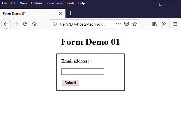
This page contains a very basic form
The <form> element is the container for all of the form controls, text, and labels that we want to appear on our form. All of the input elements and any other form controls we intend to implement are (in most cases) declared between the opening and closing tags of the <form> element.
One thing we should say about HTML forms up front is that form layout is primarily implemented using other HTML elements - for example <div> or <p>. It's also quite common to see a table used inside the <form> element to define the layout of a form. If you search the W3C documentation you will find numerous examples of how to code a form, but there does not appear to be a preferred method.
For this simple form, we have used the paragraph element (<p>) to structure the form; each form element is enclosed within its own separate paragraph element. Putting each form element inside its own paragraph element means that the form components (a label, an input field, and a button) appear one above the other in the form.
We have also applied some rudimentary styling on the <form> element itself (using the style attribute) to make sure that the form actually looks like a form. We have restricted the width of the form to 200 pixels (width: 200px;), centred it in the browser window (margin: auto;), given it a one-pixel wide border (border: solid 1px;), and put some white space around the elements inside the form (padding: 0 1em;).
The code below creates a form that looks identical to the previous example when displayed in a web browser. This time, however, we have structured the form using the division (<div>) element instead of the paragraph element.
<!doctype html>
<html lang="en">
<head>
<meta charset="utf-8">
<title>Form Demo 01</title>
</head>
<body>
<h1 style="text-align: center">Form Demo 01</h1>
<form style="width: 200px; margin: auto; border: solid 1px; padding: 0 1em;">
<div style="padding: 1em 0 0 0;"><label for="email">Email address:</label></div>
<div style="padding: 1em 0 0 0;"><input type="email" id="email" name="user_email"></div>
<div style="padding: 1em 0;"><input type="submit" value="Submit"></div>
</form>
</body>
</html>
The main difference between the division element and the paragraph element is that, by default, the paragraph element adds white space above and below whatever it contains (this is usually text, but in this case, it happens to be a form element). We have added white space at the top of each <div> tag, using the padding property of its style attribute, in order to achieve the same vertical alignment of the form elements.
Before we move on, here is one last version of the code. This time we have used a table to structure the form. When this page is displayed in a web browser, it looks identical to the previous two examples:
<!doctype html>
<html lang="en">
<head>
<meta charset="utf-8">
<title>Form Demo 01</title>
</head>
<body>
<h1 style="text-align: center">Form Demo 01</h1>
<form style="width: 200px; margin: auto; border: solid 1px; padding: 14px 18px 14px 14px;">
<table>
<tr><td style="padding: 0;"><label for="email">Email address:</label></td></tr>
<tr><td style="padding: 14px 0;"><input type="email" id="email" name="user_email"></td></tr>
<tr><td style="padding: 0;"><input type="submit" value="Submit"></td></tr>
</table>
</form>
</body>
</html>
We have had to adjust the amount of white space inside both the form and the table data cells in order to get this version to match the previous two versions exactly. We achieved this by using pixel values for the padding property of each element, together with a certain amount of trial and error. Our aim in doing so was to demonstrate that the same result can be achieved using different approaches to structuring a form.
We suggest that, when it comes to structuring your own forms, you use whatever approach you feel comfortable with. W3C are strangely reticent on what they considered to be good practice in this respect. From the relatively small number of examples we have seen on their website, we can only conclude that there is no single preferred method.
Now we come to the actual form elements. These consist of an input field, a label, and a button. The purpose of the input field is to get the user's email address. The purpose of the label is to indicate to the user what kind of data is expected (i.e. an email address). And the purpose of the button is to send the data somewhere once it has been entered.
The label is implemented using a <label> element. Labels are a critical feature of forms because they tell the user what kind of input they are expected to provide. In this case, the label informs the user that they are expected to enter an email address. The <label> element's for attribute associates it with a specific <input> element; the value of the for attribute must match the value of the <input> element's id attribute.
The first <input> element on the form is the email address field. Its type attribute is set to "email", which means that the user is expected to input an email address. When the user clicks on the "Submit" button, the input will be checked automatically to ensure that it is a correctly formatted e-mail address (this does not guarantee that the email address actually exists).
You may have noticed that the <input> element has both a name attribute and an id attribute. These attributes can have the same values, but they are not the same thing, i.e. they not alternative means of identifying the input element. The value of the name attribute must be unique within a form; the value of the id attribute must be unique within the entire HTML document.
The name attribute is used to identify a data item sent to the server when the user clicks on the form's submit button. The id attribute (which, remember, has global scope in an HTML document) uniquely identifies the HTML input element itself (in this case, the email address input field). The id attribute is typically used by CSS and JavaScript to address a specific HTML element in an HTML document.
The last element on our form is also an <input> element, but this time the type attribute is set to "submit". This defines it as a button which, when clicked, will submit the form data to a server-side script of some kind. The value attribute is set to "Submit". This is the text that will appear on the button when it is rendered by the browser.
As things stand, clicking on the "Submit" button will not do anything particularly useful, because we have not told the form to what to do when the button is clicked (we will come back to this point in due course). Clicking on the "Submit" button when no other action has been defined essentially just re-opens the current page.
If you enter an email address into the form's email address field and click on the "Submit" button, the email address will disappear from the email address field. If you look at the web browser's address bar, however, you will see the URL of the web page followed by the form data. For example, when I put my email address in and click "Submit", the address bar looks like this:
Form data appears in the browser address bar
You will find various types of <input> element in HTML forms. The introduction of a dozen new input types in HTML 5 means that this element is now more versatile than ever. The downside is that not all browsers support all of the new input types, so if you intend to use any of the new features in your forms, we advise you to carry out adequate testing. The table below lists the values that can be assigned to the <input> element's type attribute and gives a brief description of each.
| Input type | Description |
|---|---|
| text | Text - a single-line text input field. Use this when you want the user to enter a single line of text, like a name, or one line of an address. |
| password | Password - allows the user to enter a password securely. Text entered by the user is obscured so that it cannot be read, usually by replacing each character with an asterisk ("*") or a dot ("•"), depending on the browser and client operating system. |
| checkbox | Checkbox - creates a single checkbox control, displayed by default as a small square box. When a checkbox is selected (by clicking on it once), a tick appears in the checkbox to show that it is selected. Clicking on the checkbox a second time will de-select it. There can be multiple checkboxes on a page, any of which may be independently selected or deselected. |
| radio | Radio button - creates a single radio button. Radio buttons representing a set of related options are grouped together. There can be any number of radio button groups in a page. All of the radio buttons in a group must have the same name, which must be unique to that group. Each radio button in a group should be assigned a different value, and only one radio button in a group can be selected at any time. A radio button is typically displayed as a small circle when not selected, which becomes a disk when the radio button is selected. |
| submit | Submit button - creates a button that (usually) attempts to submit the form data to a server when clicked. |
| reset | Reset button - creates a button that will set all form values back to their default state when clicked. |
| file | File selection - creates a browse button and a file selection field. Allows a user to open a file picker dialog box and browse their local file system in order to select one or more (if the multiple attribute is used) files. The selected file(s) can be uploaded to the server using form submission or manipulated in some manner by a client-side script. The type of file displayed in the file picker can be restricted using the accept attribute, which takes a comma separated list of file extensions. |
| hidden | Hidden - creates a hidden input field that allows web developers to include data that cannot be seen or modified by the user (although it can be seen if the user views the page source code). Typically used for things like storing the ID of a database record that is being updated by a user. The idea is that the record ID is retrieved along with the record content, and is stored in the hidden field. When the user submits the amended record to the server, the record ID in the hidden field is submitted along with the rest of the form data so that the database management system on the server will know which record to update. |
| image | Graphical submit button - uses an image to create a button that attempts to submit the form data to a server when clicked. Essentially, an <input> element of this type has the same functionality as an <input> element of whose type is specified as submit, but otherwise behaves like an <img> element. |
| button | Button - creates a generic button control that, when clicked on, triggers the execution of an event handler of some description (an event handler is a program or script that listens for, and responds to, a certain kind of event). The event handler is typically implemented using JavaScript. |
| search | Search - creates a text field for entering a search term, together with a search button. |
| tel * | Telephone number - creates an input field that accepts a telephone number. Unlike <input> elements of type email and url, the input value cannot be automatically validated before the form data is submitted to the server due to the fact that telephone number formats vary so widely. Nevertheless, having a specific input type for telephone numbers does simplify the task of writing custom validation and telephone number handling routines; it also prompts some mobile devices to present a keypad that is optimised for entering telephone numbers. |
| url * | URL - creates an input field that accepts a URL. If a value has been entered, it is automatically validated to ensure that it is a properly-formatted URL before the form data is submitted to the server (this does not guarantee that the URL actually exists - it just checks to make sure it's in the correct format for a URL). |
| email * | Email - creates an input field that accepts an email address. If a value has been entered, it is automatically validated to ensure that it is a properly-formatted email address before the form data is submitted to the server (this does not guarantee that the email address actually exists - it just checks to make sure it's in the correct format for an email address). |
| date * | Date - creates a user interface control element that allows the user to enter a date. The value sent to the server will be a string in the form "yyyy-mm-dd", where "yyyy" represents the year, "mm" represents the month, and "dd" represents the day. The date February 14, 2018 would thus be represented as "2018-02-14". At the time of writing, not all browsers support the date input type. If a browser does support it, and depending on how that support is implemented, a date picker may be displayed in the input field.
The manner in which a date is input and displayed can vary, depending on the user's locale and browser. Browsers that do not support the date input type generally fall back on providing a simple text box. Browsers that do support it don't perform data validation as such, but won't allow the user to enter anything that is not a valid date. They may also enable developers to constrain input to a specific range of dates by using the min and max attributes to specify the first and last dates in the range. |
| month * | Month - creates a user interface control element that allows the user to enter a year-month pairing. The value sent to the server will be a string in the form "yyyy-mm", where "yyyy" represents the year and "mm" represents the month. The month September 2018 would thus be represented as "2018-09". At the time of writing not all browsers support the month input type. If a browser does support it, and depending on how that support is implemented, a year and month picker may be displayed in the input field.
The manner in which the year and month are input and displayed can vary, depending on the user's locale and browser. Browsers that do not support the month input type generally fall back on providing a simple text box. Browsers that do support it don't perform data validation as such, but they won't allow the user to enter anything that is not a valid year-month pairing. They may also enable developers to constrain input to a specific range of dates by using the min and max attributes to specify the first and last year-month pairings in the range. |
| week * | Week - creates a user interface control element that allows the user to enter a year-week pairing. The value sent to the server will consist of a string in the form "yyyy-Www", where "yyyy" represents the year and "ww" represents the week (a two-digit value in the range 01 to 53). Week 32 of 2018 would thus be represented as "2018-W32". At the time of writing not all browsers support the week input type. If a browser does support it, and depending on how that support is implemented, a year and week picker may be displayed in the input field.
The manner in which the year and week are input and displayed could vary, depending on the user's locale and browser. Browsers that do not support the week input type generally fall back on providing a simple text box. Browsers that do support it don't perform data validation as such, but they won't allow the user to enter anything that is not a valid year-week pairing. They may also enable developers to constrain input to a specific range of dates by using the min and max attributes to specify the first and last year-week pairings in the range. |
| time * | Time - creates a user interface control element that allows the user to enter a time (typically in 24-hour format). The value sent to the server will consist of a string in the form "hh:mm" (or optionally "hh:mm:ss"), where "hh" represents the hour, "mm" represents the minute, and "ss" represents the second. At the time of writing not all browsers support the time input type. If a browser does support it, and depending on how that support is implemented, an hour and minute picker may be displayed in the input field.
The manner in which the time is input and displayed could vary, depending on the user's locale and browser. Browsers that do not support the time input type generally fall back on providing a simple text box. Browsers that do support it don't perform data validation as such, but they won't allow the user to enter anything that is not a valid time. Browsers may allow developers to constrain input to a specific range of times using the min and max attributes to specify the earliest and latest times in the range. They can also specify a default value using the value attribute, and the interval (in seconds) by which the user can step through the range of times using the step attribute. The default value for step is 60 seconds (one minute). If the step attribute is set to "any", there are no constraints on the size of the interval. If the input value does not fall on a defined interval, the browser may round it up or down to the nearest valid value. |
| datetime-local * | Datetime-local - creates a user interface control element that allows the user to enter a date and time, including the year, month, day, hour and minute (seconds are not supported). The user's local time zone is used. The value sent to the server will consist of a string in the form "yyyy-MM-ddThh:mm", where "yyyy" represents the year, "MM" represents the month, "dd" represents the day, "hh" represents the hour, and "mm" represents the minute. At the time of writing not all browsers support the datetime-local input type. If a browser does support it, and depending on how that support is implemented, a date picker may be displayed in the input field. There may also be an hour and minute picker.
The manner in which the date and time are input and displayed could vary, depending on the user's locale and browser. Browsers that do not support the datetime-local input type generally fall back on providing a simple text box. Browsers that do support the datetime-local input type don't perform data validation as such, but they won't allow the user to enter anything that is not consist of a valid date and time. Browsers may allow developers to constrain input to a specific range of dates and times using the min and max attributes to specify the earliest date and time to accept, and the latest date and time to accept. They can also specify a default value using the value attribute, and the interval (in seconds) by which the user can step through the date and time values using the step attribute. The default value for step is 60 seconds (one minute). If the step attribute is set to "any", there are no constraints on the size of the interval. If the input value does not fall on a defined interval, the browser may round it up or down to the nearest valid value. |
| number | Number - creates a user interface control element (typically a number picker) that allows the user to enter a numeric value. There does not appear to be a limit to the size of numbers entered, and both negative and positive values are accepted, although developers can specify the minimum and maximum values for the range using the min and max attributes. They can also specify a default value using the value attribute, and the interval by which the user can step through the range using the step attribute (the default value is 1). If the step attribute is set to "any", there are no constraints on the size of the interval. The number picker control usually consists of a set of up/down arrows that step the number up or down by the defined step interval.
If a browser does not support the number input type, it will typically fall back on providing a text box. If text input is required, the input will automatically be validated to ensure it represents a value that can be converted to a valid floating-point number. The minimum, maximum and interval values for the range can all be set to any valid floating-point value. How invalid input is dealt with is dependent on the browser implementation. For example, input values that are found to be outside the specified range may be set to the minimum or maximum value, depending on whether they are too low or too high. Similarly, if a value is entered that is within the specified range but that does not meet the interval requirements (as specified by the step attribute), it may be rounded up or down by the browser to the nearest acceptable value. |
| range * | Range - creates a user interface control element (typically a slider) that lets the user select a numeric value from a defined range. The default range is 0 to 100, although developers can specify the minimum and maximum values for the range using the min and max attributes. They can also specify a default value using the value attribute, and the interval by which the user can step through the range using the step attribute (the default value is 1). If the step attribute is set to "any", there are no constraints on the size of the interval. Slider controls are typically imprecise, so if the precision of the value to be selected is critical, a different type of numerical input field should be chosen (an input of this type is typically used for things like volume controls).
If a browser does not support the range input type, it will typically fall back on providing a text box. If text input is required, the input will automatically be validated to ensure it represents a value that can be converted to a valid floating-point number. The minimum, maximum and interval values for the range can all be set to any valid floating-point value. How invalid input is dealt with is dependent on the browser implementation. For example, input values that are found to be outside the specified range may be set to the minimum or maximum value, depending on whether they are too low or too high. Similarly, if a value is entered that is within the specified range but that does not meet the interval requirements (as specified by the step attribute), it may be rounded up or down by the browser to the nearest acceptable value. It may also be possible to add tick marks and labels to the range control, depending on the browser implementation, although support for this kind of feature is currently somewhat patchy. |
| color * | Color - creates a user interface control element that lets the user specify a colour, either by entering the relevant 7-character hexadecimal colour value string or by selecting a colour from a colour-picker interface, depending on the browser implementation and operating system. If text input is required, the input will automatically be validated to ensure that it is in the correct format ("#rrggbb"). The input may be in either upper or lower case, but the result will be stored as a lower-case string. If the user input is invalid (i.e. not in the correct RGB hexadecimal format) the colour value will automatically be set to "#000000" (black), which is the default value. |
* New in HTML 5
A number of other attributes may be applied to <input> elements that are not hidden, depending on the value of the type attribute. Some of the more commonly used of these attributes are summarised in the following table.
| Input type | Attribute | Description |
|---|---|---|
| all (non-hidden) types | autofocus | The input control will have the focus when the page loads. Only one input element in a page can have the autofocus attribute. |
| disabled | The user cannot interact with the input control and no input values will be submitted. Disabled controls do not receive the focus and are do not participate in the tabbing order (if the user tabs through the controls, any disabled controls are skipped). Disabled controls may appear greyed out, depending on the browser implementation. | |
| name | The name used to identify the input element when form data is submitted. | |
| required | Indicates that the user must supply a value before form data can be submitted. | |
| value | Sets a default value for the control (must be a valid value for the type of control). | |
| checkbox and radio | checked | Indicates that the checkbox or radio button is checked / selected by default (can only be applied to one radio button in a group). |
| image (button) | alt | Specifies alternative text for the button's image. |
| height | Sets the height of the button's image. | |
| src | Specifies the URL for the button's image. | |
| width | Sets the width of the button's image. | |
| file | accept | Specifies a comma-separated list of file extensions that is used to restrict the type of file displayed in the file picker dialog box. |
| multiple | Indicates that multiple files may be selected. | |
| input types that accept only alpha-numeric data (text, password, search, tel, url and email) | autocapitalize | Specifies whether or not, and how, user input may be capitalised. Valid values for this attribute are "none" or "off" (all characters are set to lower-case by default), "characters" (all characters entered are set to upper-case by default), "words" (the first letter of each word is set to upper-case by default) or "sentences" (the first letter of each sentence is set to upper-case by default). |
| autocomplete | Set to "on" or "off", depending on whether the value entered by the user may be automatically completed by the browser using a previously stored value. | |
| maxlength | Specifies the maximum number of characters that can be entered by the user. | |
| pattern | Specifies a regular expression that will be used to validate the input value. May be used for input types search, tel, url, email or text. Otherwise ignored. | |
| placeholder | Defines placeholder text that provides the user with a hint as to what kind of data can be entered. May be used for input types search, tel, url, email or text. Otherwise ignored. | |
| readonly | Indicates that the user cannot modify the input's value. Read-only controls receive the focus and participate in the tab order. The contents of a read-only control will be submitted to the server. | |
| size | Sets the size of the input element (in characters) for input types search, tel, url, email, text and password. |
Something to bear in mind when creating HTML forms is that not all of the new (in HTML 5) input types are fully supported by all browsers at the time of writing. The same is true of some of the new attributes introduced in HTML 5 for form elements. If you decide to use any of these new features, we strongly advise you to test your pages in all of the popular web browsers before uploading them to a live web server. This will allow you to determine whether or not your forms will perform as expected, and if necessary, implement the appropriate workarounds (a discussion of which is beyond the scope of this article).
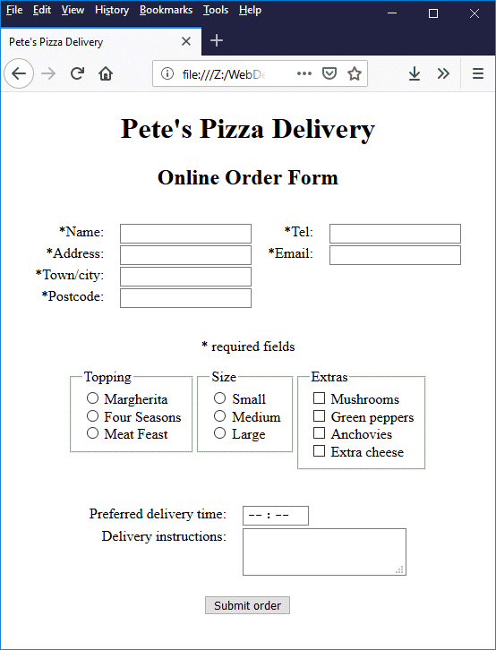
Although it may well be possible to create a form that employs all of the HTML form elements described above, it is probably not a particularly useful exercise at this stage. Instead, we present below the HTML code required to produce a simple online pizza order form, which is loosely based on the example provided in the Forms section of the HTML 5.2 W3C Recommendation, 14 December 2017.
<!doctype html>
<html lang="en">
<head>
<meta charset="utf-8">
<title>Pete's Pizza Delivery</title>
<style>
table {margin: auto; padding: 1em;}
td {padding: 0 0.5em; vertical-align: top;}
</style>
</head>
<body>
<h1 style="text-align: center;">Pete's Pizza Delivery</h1>
<h2 style="text-align: center;">Online Order Form</h2>
<form method="post" action="">
<table>
<tr>
<td style="text-align: right;"><label for="name">*Name: </label></td><td><input type="text" name="name" id="name" required></td>
<td style="text-align: right;"><label for="tel">*Tel: </label></td><td><input type="tel" name="tel" id="tel" required></td>
</tr>
<tr>
<td style="text-align: right;"><label for="addr">*Address: </label></td><td><input type="text" name="addr" id="addr" required></td>
<td style="text-align: right;"><label for="mail">*Email: </label></td><td><input type="email" name="mail" id="mail" required></td>
</tr>
<tr>
<td style="text-align: right;"><label for="town">*Town/city: </label></td><td><input type="text" name="town" id="town" required></td>
</tr>
<tr>
<td style="text-align: right;"><label for="pcode">*Postcode: </label></td><td><input type="text" name="pcode" id="pcode" required></td>
</tr>
</table>
<p style="text-align: center;">* required fields</p>
<table>
<tr>
<td>
<h3>Topping</h3>
<label><input type=radio name="topping" id="marg" required value="marg"> Margherita</label><br>
<label><input type=radio name="topping" id="four" required value="four"> Four Seasons</label><br>
<label><input type=radio name="topping" id="meat" required value="meat"> Meat Feast</label><br>
</td>
<td>
<h3>Size</h3>
<label><input type=radio name="base" id="s" required value="s"> Small</label><br>
<label><input type=radio name="base" id="m" required value="m"> Medium</label><br>
<label><input type=radio name="base" id="l" required value="l"> Large</label><br>
</td>
<td>
<h3>Extras</h3>
<label><input type=checkbox name="extra" id="mu" value="mu"> Mushrooms</label><br>
<label><input type=checkbox name="extra" id="pe" value="pe"> Green peppers</label><br>
<label><input type=checkbox name="extra" id="an" value="an"> Anchovies</label><br>
<label><input type=checkbox name="extra" id="ch" value="ch"> Extra cheese</label><br>
</td>
</tr>
</table>
<br>
<table>
<tr>
<td style="text-align: right;"><label for="del">Preferred delivery time: </label></td>
<td><input type=time min="11:00" max="21:00" step="900" name="del" id="del" required></td>
</tr>
<tr>
<td style="text-align: right;"><label for="instr">Delivery instructions: </label></td>
<td><textarea name="instr" id="instr" maxlength=1000></textarea></td>
</tr>
<tr>
<td colspan="2" style="text-align: center;"><br><button>Submit order</button></td>
</tr>
</table>
</form>
</body>
</html>
Copy and paste this code into a new file in your HTML editor, save the file as form-demo-02.html, and open the file in a web browser. You should see something like the following:
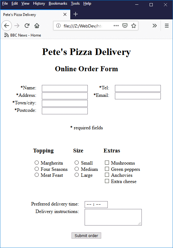
This page contains a simple online pizza order form
For this example, we have used tables to structure the form elements that make up the form simply for the sake of convenience. The form is predominantly made up of text boxes of various kinds, together with a number of radio buttons and checkboxes (which we will talk about in more detail in due course). We have also included a <textarea> element (which we will talk about shortly) to enable the user to enter additional delivery instructions if necessary.
The first significant thing to note about the form is that several of the input fields are required fields. This is necessary in order to ensure that the user enters critical information such as their name, address and telephone number. After all, we can't very well deliver a pizza to the customer if we don't know their address!
We have placed an asterisk in front of the label for each required field to draw the user's attention to the fact that they are required to enter some data in these fields. This is not strictly necessary, however, since if any of the required fields have not been filled in when the user clicks on the "Submit order" button, a message box will appear requesting them to provide the missing information.
If you hover over one of the required fields with the mouse while it is still blank (and does not currently contain the cursor) you will see a further reminder that the field most be completed in the form of a tooltip that says "This is a required field" (Microsoft Edge and Microsoft Internet Explorer) or "Please fill out this field" (Chrome, Opera and Firefox).
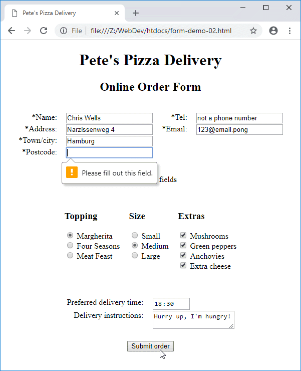
Trying to submit a form with missing information will bring up a message box like the one shown above
Other interesting things to note here include the degree to which validation is carried out by browsers, and the level of support provided by different browsers for some of HTML's new features. For example (and as we mentioned above), no attempt is made to validate the telephone number. Validation of the email address only seems to extend to checking whether an at symbol ("@") is present somewhere within the string entered, and that the string contains no spaces or punctuation marks.
There is a lot of variation among browsers at the time of writing (November 2018) in the level of support provided for <input> elements of type time. Firefox, for example, allows the hour and minute to be input either manually (by typing the numbers) or by using the up and down arrow keys on the keyboard to step through the hours and minutes. It will initially accept any valid time value (00 to 23 for the hour, or 00 to 59 for the minute) but will complain when the user clicks on the "Submit order" button if the time entered falls outside the specified range or does not fall on an accepted time interval.
Chrome behaves in a similar way to Firefox in that it will initially accept any valid time values that are entered manually, but will complain when the user clicks on the "Submit order" button if the time entered falls outside the specified range or does not fall on an accepted time interval. However, Chrome also provide an hour and minute picker that allows the user to only select times within the specified range (as defined by the min and max attributes), and time intervals that meet the requirements of the step attribute.
Microsoft Internet Explorer provides a text field only, and allows just about anything to be entered; no validation is carried out on the time value entered whatsoever. By contrast, Microsoft Edge will not allow time to be manually input at all, and insists on displaying a time picker widget that is frankly both unwieldy and unattractive - and whilst it does restrict the hour values according to the time range specified by the min and max attributes, it does not step through the minute values in accordance with the step attribute.
The last thing we want to draw attention to here is the role of the <label> element. Obviously, we need to label the input controls on a form in order to let the user know what kind of input is required for each control. We could of course simply put some appropriate text next to, or above, or below the form control. However, using a <label> element and associating it with a specific input control has two additional outcomes.
The first of these is that the <label> element provides screen readers and other assistive technologies vital information about the structure and content of the form. A screen reader, for example, will typically read out the label of an input control, providing sight-impaired users with the information they need to complete the form.
The second outcome is that, by associating a <label> element with a particular control, we can enable the user to activate a particular control by clicking on that control's label. This is particularly useful if the physical size of the control on the screen is relatively small. This is usually the case, for example, with radio buttons and checkboxes.
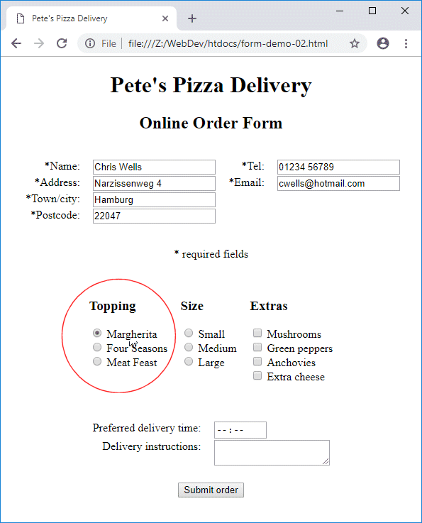
Radio buttons and checkboxes can be checked/unchecked by clicking on an associated label
There are two ways in which we can associate a label with a particular control. The first way, which we used for the text-based input fields on our pizza order form, is to explicitly associate the <label> element with an <input> (or <textarea>) element using the for attribute:
<label for="name">*Name: </label>
.
.
.
<input type="text" name="name" id="name" required>
In our example, we use tables to structure the form and have placed each label, and the control to which it belongs, in separate table cells. This means that we can only use the explicit method of associating a label with a control, for reasons that will become clear shortly. The important thing to note here is that we must give each control both a name attribute and an id attribute.
The name attribute is what is used to associate a form control with its value when form data is sent to the server, and must be unique within the form. The id attribute is what is used to identify a specific control within an HTML document, and must be unique within that document.
The second way to associate a label with a form control, and the one we used to code the radio buttons and checkboxes on our pizza order form, is to do so implicitly by placing the control element inside its associated <label> element, like this:
<label><input type=radio name="base" id="s" required value="s"> Small</label><br>
The <textarea> element is a multi-line input control that allows the user to enter a large amount of text. You may be wondering why, since all of the other input controls we have looked at have essentially been different types of <input> element, do we have a completely different element for multi-line text. The short answer is that way back in the early days of HTML, when there were far fewer different kinds of input control, a multi-line text field was considered to be sufficiently different from other kinds of text input control to justify the creation of a new element.
Another difference is that, unlike the <input> element, the <textarea> element is not an empty (or void) element. It has both an opening tag and a closing tag (<textarea> . . . </textarea>), which means that it can initially be either empty or contain some default text (the <textarea> element does not support the value attribute). Some of the more commonly used attributes that can be applied to the <textarea> element are summarised below.
| Attribute | Description |
|---|---|
| autocapitalize | Specifies whether or not, and how, user input may be capitalised. Valid values for this attribute are "none" or "off" (all characters are set to lower-case by default), "characters" (all characters entered are set to upper-case by default), "words" (the first letter of each word is set to upper-case by default) or "sentences" (the first letter of each sentence is set to upper-case by default). |
| autocomplete | Set to "on" or "off", depending on whether the value entered by the user may be automatically completed by the browser using a previously stored value. |
| autofocus | The <textarea> control will have the focus when the page loads. Only one input element in a page can have the autofocus attribute. |
| cols | Specifies the visible width of the <textarea> control in average character widths (the value assigned must be must be a positive integer). If the attribute is not used, the default value is 20. |
| disabled | The user cannot interact with the <textarea> control and no input values will be submitted. The <textarea> control does not receive the focus and are does not participate in the tabbing order (if the user tabs through the form controls, a disabled <textarea> will be skipped). Disabled <textarea> controls may appear greyed out, depending on the browser implementation. |
| maxlength | Specifies the maximum number of characters that can be entered by the user (by default, there is no limit). |
| minlength | Specifies the minimum number of characters that the user should enter. |
| name | The name used to identify the text area element when form data is submitted. |
| placeholder | Defines placeholder text that provides the user with a hint as to what kind of information should be entered. |
| readonly | Indicates that the user cannot modify any text in the <textarea> control. A read-only <textarea> control receives the focus and participates in the tab order. The contents of a read-only <textarea> control will be submitted to the server. |
| required | Indicates that the user must enter some text before form data can be submitted. |
| rows | Specifies the visible height (i.e. the number of lines of text that will be visible) for the <textarea> control (the value assigned must be must be a positive integer). If the attribute is not used, the default value is 2. |
| spellcheck | Specifies whether the contents of the <textarea> control will be subject to spellchecking by the browser or operating system. Possible values are "true" (the contents should be spellchecked), "soft" (the contents should not be spellchecked) and "default" (the contents should be spellchecked or not, depending on some kind of default behaviour - for example that of the parent element). |
| wrap | Has an effect only if the cols attribute is specified. Specifies how text wrapping will be handled when the contents of a <textarea> control are submitted. Possible values are "hard" (the submitted text will contain line breaks [CR+LF] so that the length of each line of text is no greater than the width of the <textarea> control, "soft" (the default behaviour - line breaks entered by the user are preserved but the browser does not add any additional line breaks to the submitted text), and "off" which is like "soft" except that the text entered by the user does now automatically wrap around when it reaches the edge of the <textarea> control (a horizontal scroll bar is provided when the length of a line exceeds the value specified in the cols attribute). |
The HTML code below creates a web page containing a form with a single <textarea> control in which the user is invited to enter their life story.
<!doctype html>
<html lang="en">
<head>
<meta charset="utf-8">
<title>Form Demo 03</title>
</head>
<body>
<h1 style="text-align: center">Form Demo 03</h1>
<form style="width: 420px; margin: auto; border: solid 1px; padding: 0 1em;">
<p><label for="lifestory">Tell us your life story!</label></p>
<p><textarea rows="30" cols="50" name="lifestory" id="lifestory" placeholder="Your story ..." style="resize: none;"></textarea></p>
<p><input type="submit" value="Submit"></p>
</form>
</body>
</html>
Copy and paste this code into a new file in your HTML editor, save the file as form-demo-03.html, and open the file in a web browser. You should see something like the following:
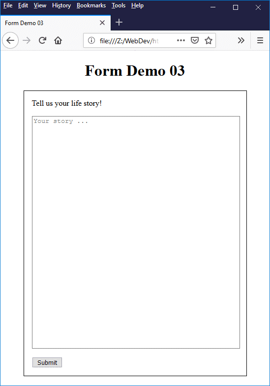
This page contains a form with a single <textarea> element
There are a few things to note here. First of all, the <textarea> element has both a label and some placeholder text to give the user an idea of what kind of information they are expected to provide. Try typing something into the input field (it doesn't actually have to be your life story). You will see that as soon as you start typing, the placeholder text disappears and is replaced by whatever you are typing.
As you continue typing, you should see the text wrapping around to the next line as you reach the <textarea> control's right-hand boundary. If you enter a sufficiently large quantity of text (enough to fill all of the available space), you will see a vertical scroll bar appear on the right-hand side of the control. The illustration below is a screen shot of the same page after several paragraphs of text (an extract from Charles Dickens' classic novel "David Copperfield") have been added.
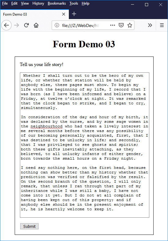
The <textarea> element now contains some text
Note that the browser (in this case we are using Firefox) is spellchecking the text we have entered, and has underlined the word "neighbourhood" with a red wavy line - presumably because it prefers the North American spelling of the word. Notice also that the default font used for the entered text is a rather unattractive fixed-width font; this can be changed using style sheets or inline styling.
We have set the resize property of the <textarea> element's style attribute to "none" to prevent the user from resizing the control. This isn't strictly necessary, but it prevents the user from dragging the boundaries of the <textarea> control beyond those of the form itself (which by default they would be able to do).
The <textarea> element is useful when you want to allow users to enter a potentially large amount of free-form text. This could include things like user comments, queries, and general feedback. The illustration below shows a screenshot of one of Amazon's customer product review pages, featuring a <textarea> form control that enables a customer to provide feedback on an item they have purchased.
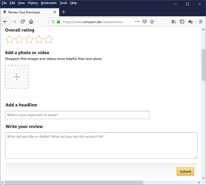
The <textarea> element is used here to obtain customer feedback on a product
The code used to create the <textarea> in the illustration is shown below.
<textarea placeholder="What did you like or dislike? What did you use this product for?" id="ryp-review-text" style="height: 100px;" class="a-form-error"></textarea>
We have already seen an example (our online pizza order form) of a form that uses both checkboxes and radio buttons. Both of these control types are essentially simple on/off switches that allow the user to make a choice based on the accompanying labels. The main difference between the two apart from their appearance (checkboxes are small squares whereas radio buttons are small circles), is that more than one (or all) of the checkboxes in a group may be selected, whereas only one radio button in a group can be selected at any one time.
This difference highlights the fact each checkbox in a form represents a choice that can be made independently of any other consideration, whereas the choices offered by a group of radio buttons are mutually exclusive. In other words, if you are asking the user to choose zero or more "optional extras", use checkboxes. If you want them to choose one, and only one option from a number of alternatives, use radio buttons.
Here once more is the code we used to create the radio buttons and checkboxes for our pizza order form:
<table>
<tr>
<td>
<h3>Topping</h3>
<label><input type=radio name="topping" id="marg" required value="marg"> Margherita</label><br>
<label><input type=radio name="topping" id="four" required value="four"> Four Seasons</label><br>
<label><input type=radio name="topping" id="meat" required value="meat"> Meat Feast</label><br>
</td>
<td>
<h3>Size</h3>
<label><input type=radio name="base" id="s" required value="s"> Small</label><br>
<label><input type=radio name="base" id="m" required value="m"> Medium</label><br>
<label><input type=radio name="base" id="l" required value="l"> Large</label><br>
</td>
<td>
<h3>Extras</h3>
<label><input type=checkbox name="extra" id="mu" value="mu"> Mushrooms</label><br>
<label><input type=checkbox name="extra" id="pe" value="pe"> Green peppers</label><br>
<label><input type=checkbox name="extra" id="an" value="an"> Anchovies</label><br>
<label><input type=checkbox name="extra" id="ch" value="ch"> Extra cheese</label><br>
</td>
</tr>
</table>
Note that we have assigned the same value to the name attribute of each of the first three radio buttons. This identifies these three radio buttons as belonging to the same group, and is also the control name for each radio button. By contrast, the value assigned to the value attribute of each radio button must be unique within the group. Similarly, the value assigned to the id attribute of each radio button must be unique within the HTML document.
The id attribute provides a unique reference for an element in an HTML document that allows that element to be targeted by cascading style sheets and client-side scripts; it has no significance for the data sent to the server when the form is submitted. The name and value attributes, on the other hand, are used to send the form data to the server as a set of key-value pairs.
Each key-value pair sent to the server consists of the name of a control (i.e. the value assigned to the name attribute) and the value assigned to the control (i.e. the value currently assigned to the value attribute when the user clicks on the "Submit" button). For a group of radio buttons, the same key (control name) will be submitted to the server regardless of which radio button is chosen, but the value submitted will depend on which radio button has been selected.
The situation with a group of checkboxes is somewhat different. As for a group of radio buttons, each checkbox will have the same value for the name attribute and a unique (within the group) value for the value attribute. When the submit button is clicked, however, a separate key-value pair will be sent to the server for each of the selected checkboxes.
The data submitted to the server takes the form of a query string which will be appended to the URL of the script to which we are sending the data to be processed. The query string created when the user clicks on the submit button on our pizza order form might look something like this:
?name=Chris+Wells&tel=0123+456789&addr=Narzissenweg+4&mail=cwells%40hotmail.com&town=Hamburg&pcode=22047&topping=four&base=l&extra=mu&extra=pe&extra=an&extra=ch&del=12%3A30&instr=Please+hurry%21
The destination script's URL is followed by a question mark, which is followed by the key-value pairs in the form "key=value". Each key-value pair is separated from the next by an ampersand ("&"), spaces are represented by a plus sign ("+"), and any special (non-alpha-numeric) characters are represented using the appropriate URL encodings.
Both radio boxes and checkboxes can only be assigned Boolean values. This means that an individual radio button or checkbox control can only ever be assigned a value of one (meaning true, selected or on) or zero (meaning false, unselected or off). Checkboxes are normally unselected by default. If you want a checkbox to be initially selected, use the checked attribute, e.g.:
<input type="checkbox" checked> Send the invoice to the address above
If a group of radio buttons has the required attribute set, and no radio button has been selected when the user clicks on the "Submit" button, the form data will not be submitted and the user will be asked to make a choice. If the required attribute has not been set, the resulting behaviour will depend on the browser implementation (for example, the browser might default to setting the value of first radio button in the group to checked).
Since allowing the browser implementation to make choices for us is not a particularly desirable state of affairs, developers are advised to either set the required attribute or set the initial value of one of the radio buttons to checked. Note that you can only set the checked attribute for one radio button in a group (selecting a radio button in a group automatically deselects any previously selected radio button in the same group).
The pizza order form example we saw earlier worked perfectly well, but using tables to organise a form's layout is perhaps not the best way to do things, Indeed, when it comes to grouping things like radio buttons and checkboxes together, HTML provides two special form elements - <fieldset> and <legend> - that are better suited to this task. Let's rewrite our pizza order form to demonstrate how these elements are used:
<!doctype html>
<html lang="en">
<head>
<meta charset="utf-8">
<title>Pete's Pizza Delivery</title>
<style>
table {margin: auto; padding: 1em;}
td {padding: 0 0.5em; vertical-align: top;}
</style>
</head>
<body>
<h1 style="text-align: center;">Pete's Pizza Delivery</h1>
<h2 style="text-align: center;">Online Order Form</h2>
<form method="post" action="">
<table>
<tr>
<td style="text-align: right;"><label for="name">*Name: </label></td><td><input type="text" name="name" id="name" required></td>
<td style="text-align: right;"><label for="tel">*Tel: </label></td><td><input type="tel" name="tel" id="tel" required></td>
</tr>
<tr>
<td style="text-align: right;"><label for="addr">*Address: </label></td><td><input type="text" name="addr" id="addr" required></td>
<td style="text-align: right;"><label for="mail">*Email: </label></td><td><input type="email" name="mail" id="mail" required></td>
</tr>
<tr>
<td style="text-align: right;"><label for="town">*Town/city: </label></td><td><input type="text" name="town" id="town" required></td>
</tr>
<tr>
<td style="text-align: right;"><label for="pcode">*Postcode: </label></td><td><input type="text" name="pcode" id="pcode" required></td>
</tr>
</table>
<p style="text-align: center;">* required fields</p>
<div style="text-align: center;">
<div style="display: inline-block; text-align: left;">
<div style="float: left;">
<fieldset>
<legend>Topping</legend>
<label><input type=radio name="topping" id="marg" required value="marg"> Margherita</label><br>
<label><input type=radio name="topping" id="four" required value="four"> Four Seasons</label><br>
<label><input type=radio name="topping" id="meat" required value="meat"> Meat Feast</label><br>
</fieldset>
</div>
<div style="float: left;">
<fieldset>
<legend>Size</legend>
<label><input type=radio name="base" id="s" required value="s"> Small</label><br>
<label><input type=radio name="base" id="m" required value="m"> Medium</label><br>
<label><input type=radio name="base" id="l" required value="l"> Large</label><br>
</fieldset>
</div>
<div style="float: left;">
<fieldset>
<legend>Extras</legend>
<label><input type=checkbox name="extra" id="mu" value="mu"> Mushrooms</label><br>
<label><input type=checkbox name="extra" id="pe" value="pe"> Green peppers</label><br>
<label><input type=checkbox name="extra" id="an" value="an"> Anchovies</label><br>
<label><input type=checkbox name="extra" id="ch" value="ch"> Extra cheese</label><br>
</fieldset>
</div>
</div>
</div>
<br>
<table>
<tr>
<td style="text-align: right;"><label for="del">Preferred delivery time: </label></td>
<td><input type=time min="11:00" max="21:00" step="900" name="del" id="del" required></td>
</tr>
<tr>
<td style="text-align: right;"><label for="instr">Delivery instructions: </label></td>
<td><textarea name="instr" id="instr" maxlength=1000></textarea></td>
</tr>
<tr>
<td colspan="2" style="text-align: center;"><br><button>Submit order</button></td>
</tr>
</table>
</form>
</body>
</html>
Copy and paste this code into a new file in your HTML editor, save the file as form-demo-04.html, and open the file in a web browser. You should see something like the following:
Radio buttons and checkboxes are grouped using the <fieldset> element
Note that we have used <div> tags in the above code to give the individual radio button and checkbox groups the same vertical alignment and centre them on the page. A <fieldset> element occupies the full width of the HTML element containing it, so if we had not used the <div> tags to organise them them, the <fieldset> elements would be fill the entire width of the page and be stacked vertically, as shown here:
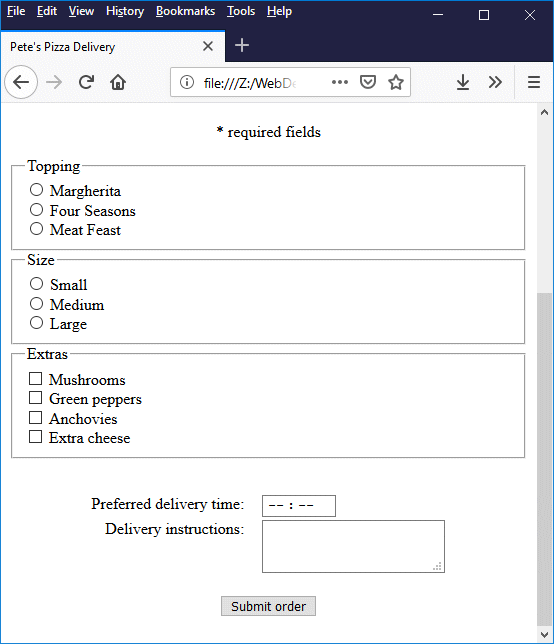
By default, a <fieldset> element occupies the entire width of the page
The <fieldset> element provides a border around the radio button or checkbox elements that it contains, clearly highlighting the fact that these controls belong to a distinct group of controls. The <legend> element provides the <fieldset> element with a caption that identifies the control group, and gives the user a hint as to what kind of choice they are being asked to make.
The <fieldset> element can be used to group any set of related form controls. The HTML code below creates a revised version of our pizza order form page that demonstrates the use of the <fieldset> element, together with the <div> element, to control form layout. Note that we have also employed a significant amount of styling in order to make the form look reasonably presentable.
<!doctype html>
<html lang="en">
<head>
<meta charset="utf-8">
<title>Pete's Pizza Delivery</title>
<style>
fieldset {margin: 0.25em;}
fieldset.customer {height: 12em;}
fieldset.customer label {display: inline-block; width: 100px; margin: 0.25em;}
fieldset.choice {height: 6em;}
fieldset.choice label {display: inline-block; width: 150px;}
fieldset.delivery {height: 10em;}
fieldset.delivery label {display: inline-block; width: 160px; margin: 0.5em;}
</style>
</head>
<body>
<h1 style="text-align: center;">Pete's Pizza Delivery</h1>
<h2 style="text-align: center;">Online Order Form</h2>
<div style="text-align: center;">
<form method="post" action="">
<p style="text-align: center;">* required fields</p>
<div style="display: inline-block; text-align: left;">
<fieldset class="customer">
<legend>Customer details</legend>
<label for="name">*Name: </label><input type="text" name="name" id="name" size="30" required><br>
<label for="addr">*Address: </label><input type="text" name="addr" id="addr" size="50" required><br>
<label for="town">*Town/city: </label><input type="text" name="town" id="town" size="15" required><br>
<label for="pcode">*Postcode: </label><input type="text" name="pcode" id="pcode" size="6" required><br>
<label for="tel">*Tel: </label><input type="tel" name="tel" id="tel" size="15" required><br>
<label for="mail">*Email: </label><input type="email" name="mail" id="mail" size="50" required>
</fieldset>
<div style="float: left;">
<fieldset class="choice">
<legend>Topping *</legend>
<label><input type=radio name=topping id="marg" required value="marg"> Margherita</label><br>
<label><input type=radio name=topping id="four" required value="four"> Four Seasons</label><br>
<label><input type=radio name=topping id="meat" required value="meat"> Meat Feast</label><br>
</fieldset>
</div>
<div style="float: left;">
<fieldset class="choice">
<legend>Size *</legend>
<label><input type=radio name=base id="s" required value="s"> Small</label><br>
<label><input type=radio name=base id="m" required value="m"> Medium</label><br>
<label><input type=radio name=base id="l" required value="l"> Large</label><br>
</fieldset>
</div>
<div style="float: left;">
<fieldset class="choice">
<legend>Extras</legend>
<label><input type=checkbox name=extra id="mu" value="mu"> Mushrooms</label><br>
<label><input type=checkbox name=extra id="pe" value="pe"> Green peppers</label><br>
<label><input type=checkbox name=extra id="an" value="an"> Anchovies</label><br>
<label><input type=checkbox name=extra id="ch" value="ch"> Extra cheese</label><br>
</fieldset>
</div>
<div>
<fieldset class="delivery">
<legend>Delivery</legend>
<label for="del">Preferred delivery time: </label>
<input type=time min="11:00" max="21:00" step="900" name="del" id="del" required><br>
<label for="instr">Delivery instructions: </label><br>
<textarea rows="3" cols="60" name="instr" id="instr" maxlength=1000></textarea>
</fieldset>
</div>
</div>
<br><br><button>Submit order</button>
</form>
</div>
</body>
</html>
Copy and paste this code into a new file in your HTML editor, save the file as form-demo-05.html, and open the file in a web browser. You should see something like the following:
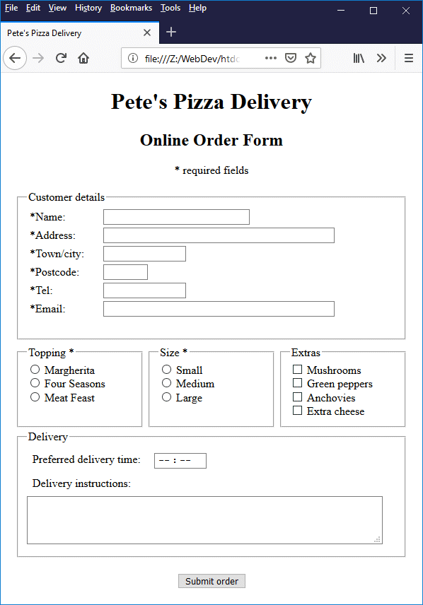
We have used <fieldset> and <div> elements here to control the form layout
Sometimes we want to get the user to select one or more options from a pre-defined list of options. One way of doing this is to get them to choose a value from a drop-down list or a list box. The HTML form elements we use to implement this kind of control are <select>, <option> and <optgroup>.
The <select> element creates a menu. In order to populate the menu, we must create a number of menu options. Each menu option is created using an <option> element. If we want our menu to contain several groups of options, we create each option group using an <optgroup> element.
If we are using option groups, all of the <option> elements in a group are placed inside an <optgroup> ... </optgroup> tag set, and all of the <optgroup> elements are enclosed within the <select>...</select> tag set. If we are not using option groups, we simply place all of the <option> elements inside the <select>...</select> tag set.
The HTML code below creates a web page containing a form that includes several drop-down lists and a list box.
<!doctype html>
<html lang="en">
<head>
<meta charset="utf-8">
<title>Form Demo 06</title>
</head>
<body>
<div style="text-align: center;">
<h1>Form Demo 06</h1>
<h2>Browser Demographics Survey</h2>
<form method="post" action="">
<div style="display: inline-block; text-align: left;">
<p>
<div style="float: left; margin: 2em; width: 10em;">
<p><label>As which gender<br>do you identify?</label></p>
<select name="gender" id="gender" required>
<option value="" selected disabled>Gender</option>
<option value="male">Male</option>
<option value="female">Female</option>
<option value="other">Other</option>
</select>
</div>
<div style="float: left; margin: 2em; width: 10em;">
<p><label>To which age group<br>do you belong?</label></p>
<select name="age" id="age" required>
<option value="" selected disabled>Age group</option>
<option value="UN18">Under 18</option>
<option value="1825">18-24 years old</option>
<option value="2534">25-34 years old</option>
<option value="3544">35-44 years old</option>
<option value="4554">45-54 years old</option>
<option value="5564">55-64 years old</option>
<option value="6574">65-74 years old</option>
<option value="75OO">75 or over</option>
</select>
</div>
</p>
<p>
<div style="float: left; margin: 2em; width: 10em;">
<p><label>In which geographic<br>region do you live?</label></p>
<select name="region" id="region" required>
<option value="" selected disabled>Region</option>
<option value="Africa">Africa</option>
<option value="Asia">Asia</option>
<option value="Caribbean">Caribbean</option>
<option value="CAmerica">Central America</option>
<option value="Europe">Europe</option>
<option value="NAmerica">North America</option>
<option value="Oceania">Oceania</option>
<option value="SAmerica">South America</option>
</select>
</div>
<div style="float: left; margin: 2em; width: 10em;">
<p><label>Which Internet web<br>browsers do you use?</label></p>
<select name="browser" id="browser" required multiple size="4">
<option>Google Chrome</option>
<option>Internet Explorer</option>
<option>Microsoft Edge</option>
<option>Mozilla Firefox</option>
<option>Opera</option>
<option>Safari</option>
</select>
</div>
</p>
</div>
<p>
<input type="reset" value="Reset" style="margin: 0 2em;">
<input type="submit" value="Submit" style="margin: 0 2em;">
</p>
</form>
</div>
</body>
</html>
Copy and paste this code into a new file in your HTML editor, save the file as form-demo-06.html, and open the file in a web browser. You should see something like the following:
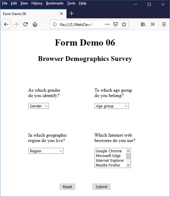
The Browser Demographics Survey form uses drop-down lists and a a list box
The purpose of the (relatively) simple form illustrated above is to gather demographic information about web browser usage. We are asking the user to tell us their gender, their age, where they live, and which web browser (or browsers) they use. If you examine the code, you will see that all of the <select> elements have the required attribute set; the form data will not be submitted until the user has selected one option from each of the three drop-down lists, and at least one option from the list box.
Note that the first <option> element within each <select> element implemented as a drop-down list has its value attribute set to the empty string (""), as well as having both the disabled and selected attributes set. We have done this because the <select> element, unlike the <input> element, does not have a placeholder attribute. This is not a problem for list boxes, but can potentially be problematic for drop-down lists.
Because several items are displayed in a list box, there are clearly a number of options to choose from, none of which is initially selected unless we specify otherwise. For a drop-down list, on the other hand, only the first option defined for the drop-down list will be displayed. This option will be selected by default. It also effectively becomes the placeholder for the drop-down list.
If the user overlooks a drop-down list and clicks on the "Submit" button, the value of the displayed option will be sent to the server, regardless of whether or not it is what the user would have selected had they not overlooked the drop-down list. Even if the user does not overlook the drop-down list, having one of the valid options acting as a placeholder is not an ideal state of affairs; a placeholder should be just a placeholder, not an option in its own right.
We have therefore created an additional option at the beginning of the list that reflects the nature of the input required, but cannot itself be selected. If you click on the drop-down button you will see that the option is greyed-out, and does not respond to a user click.
If a list box or drop-down list item has been selected, the key-value pair sent to the server when the user clicks on the "Submit" button consists of the value of the <select> element's name attribute plus the value of the selected <option> element's value attribute. If the value attribute is missing, the text that appears between the opening and closing <option>…</option> tags (i.e. the text displayed in the list box or drop-down list) is used instead.
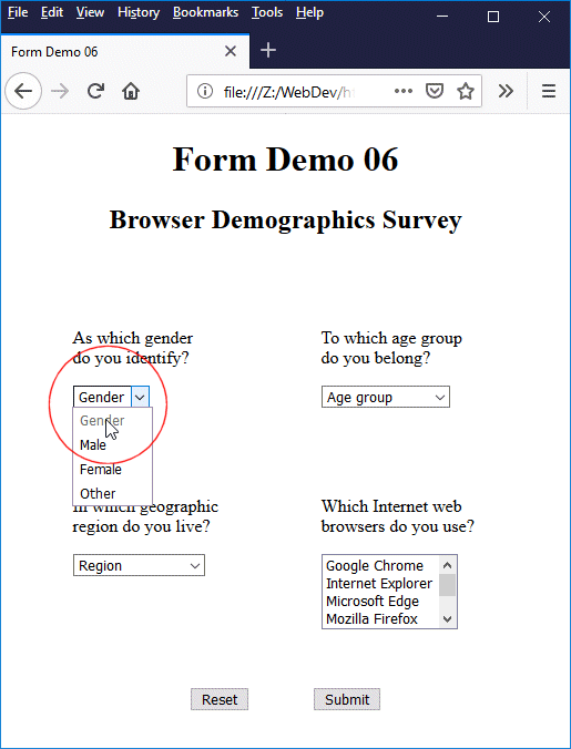
The "placeholder" option appears greyed-out and cannot be selected
For our Browser Demographics Survey form, we pre-selected the placeholder options for the drop-down boxes, all of which have their values set to the empty string (""), by setting the selected attribute for the placeholder <option> elements. Thus, if the user clicks on the "Submit" button before making a valid choice from any of these drop-down lists, the form data will not be submitted. Instead, a message will appear asking the user to choose one of the available options.
Note that only one <option> element may be pre-selected unless the <select> element has the multiple attribute set, in which case any number of <option> elements can be pre-selected. If the selected attribute is set for more than one <option> element and the multiple attribute has not been set for the <select> element, an error occurs. How such an error is handled will be dependent on the browser implementation.
The use of a list box for the browser selection reflects the fact that users may (and often do) use more than one web browser. Note that the multiple attribute is set for the <select> element to enable the user to select more than one option from the list. Note also that, by default, setting the multiple attribute automatically causes a list box (as opposed to a drop-down list) to be displayed.
We have also set the size attribute of browser list box (size="4"). This is not strictly necessary, since most browsers will default to displaying four items in a list box anyway, if the multiple attribute is set. We can make the list longer (or shorter) by changing the value assigned to the size attribute (this should always be an integer value greater than one).
One of the HTML form elements you may not come across so frequently is the <optgroup> element. This element can be used to organise long lists of options into logical groupings, making the process of navigating and selecting an appropriate option from a long list of options a little easier for the user.
The HTML code below creates a page that contains a form that includes a list box that lists the subsystems in a typical car (this could be used, for example, on a self-study website about car maintenance). Here, <optgroup> elements are used to break the list down into three sections. The label attribute for each <optgroup> element specifies the label for each group. In this case, each label identifies the main automotive system to which the group's members belong.
<!doctype html>
<html lang="en">
<head>
<meta charset="utf-8">
<title>Form Demo 07</title>
<style>
select {padding: 0.25em;}
option {padding: 0.5em 2em;}
</style>
</head>
<body>
<div style="text-align: center;">
<h1>Car Subsystems</h1>
<form method="post" action="">
<p>
<label for="subsystem">Select the car subsystem(s) you would like to study:</label>
</p>
<p>
<select name="subsystem" id="subsystem" required multiple size="6">
<optgroup label="Body and Frame">
<option value="BF1">Electrical Systems</option>
<option value="BF2">Electronics</option>
<option value="BF2">Climate Control</option>
<option value="BF2">Interior/Trim</option>
<option value="BF2">Exterior</option>
</optgroup>
<optgroup label="Powertrain">
<option value="PT1">Engine</option>
<option value="PT2">Transmission</option>
</optgroup>
<optgroup label="Chassis">
<option value="CH1">Steering/Suspension</option>
<option value="CH2">Brakes</option>
<option value="CH3">Axle/Differential</option>
</optgroup>
</select>
</p>
<p>
<input type="reset" value="Reset" style="margin: 0 1em;">
<input type="submit" value=" Continue" style="margin: 0 1em;">
</p>
</form>
</div>
</body>
</html>
Copy and paste this code into a new file in your HTML editor, save the file as form-demo-07.html, and open the file in a web browser. You should see something like the following:
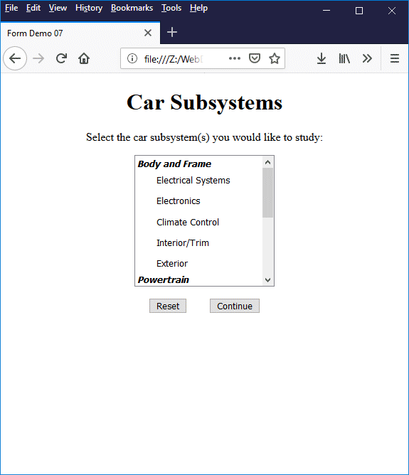
The <optgroup> element can be used to break long lists into logical groupings
Note that, to date, the HTML specification does not allow option groups to be nested. The HTML 4.0 specification does however have the following to say on this point:
Note. Implementors are advised that future versions of HTML may extend the grouping mechanism to allow for nested groups (i.e., OPTGROUP elements may nest). This will allow authors to represent a richer hierarchy of choices.
The autocomplete attribute can be used with the <input> element for input types that accept alpha-numeric text input (i.e. text, password, search, tel, url and email). If the attribute is set to "on", any value entered by the user may be autocompleted by the browser using a previously stored value (this is the default behaviour in most browsers, even if the autocomplete attribute is omitted).
The HTML <datalist> element, which is new in HTML 5, takes things a step further by allowing the developer to create a pre-defined list of autocomplete options for an input element. Let's look at an example. The HTML code below creates a page containing a form that includes a text input field. The user is required to enter their favourite Football Premier League team.
<!doctype html>
<html lang="en">
<head>
<meta charset="utf-8">
<title>Form Demo 08</title>
</head>
<body>
<div style="text-align: center;">
<h1>Premier League Football</h1>
<form method="post" action="">
<p>
<label for="myBrowser">What is your favourite Premier League team?</label>
</p>
<input list="teams" id="myTeam" name="myTeam" required>
<datalist id="teams">
<option>AFC Bournemouth</option>
<option>Arsenal</option>
<option>Brighton & Hove Albion</option>
<option>Burnley</option>
<option>Cardiff City</option>
<option>Chelsea</option>
<option>Crystal Palace</option>
<option>Everton</option>
<option>Fulham</option>
<option>Huddersfield Town</option>
<option>Leicester City</option>
<option>Liverpool</option>
<option>Manchester City</option>
<option>Manchester United</option>
<option>Newcastle United</option>
<option>Southampton</option>
<option>Tottenham Hotspur</option>
<option>Watford</option>
<option>West Ham United</option>
<option>Wolverhampton Wanderers</option>
</datalist>
<p>
<input type="reset" value="Reset" style="margin: 0 1em;">
<input type="submit" value="Continue" style="margin: 0 1em;">
</p>
</form>
</div>
</body>
</html>
Copy and paste this code into a new file in your HTML editor, save the file as form-demo-08.html, and open the file in a web browser. Start typing something in the input field. You should see something like the following:
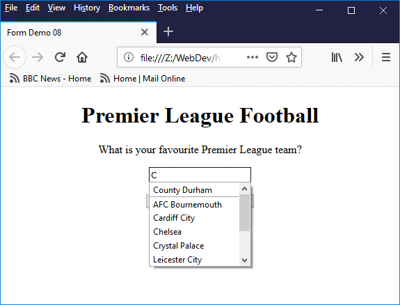
The <datalist> element holds a list of autocomplete options
As you can probably see from the illustration, when the user starts to type something in the input field, any options in the data list that contain a substring matching what the user has typed so far will appear in a drop-down list, allowing them to make a selection. The number of options in the drop-down list will decrease as the user types more characters and fewer matches are found. Note that the value entered does not have to match one of the options in the data list.
The <datalist> element provides a much more versatile autocomplete feature for <input> elements than the autocomplete attribute, because the developer now has complete control over which options will be available. Note that the <input> element's list attribute is used to specify which <datalist> element is to be used to provide options for the autocomplete drop-down list; the value of the list attribute must match that of the <datalist> element's id attribute.
The <option> elements inside a <datalist> element may optionally have a value attribute. The value attribute can be set to the same value as the contents of the <option> element or it can be set to something else - a short code for example. Let's suppose that what we really want our user to enter, rather than the full name of their favourite Premier League team, is the three-character code used by Reuters (yes, there really is such a thing). Our HTML code might now look like this:
<!doctype html>
<html lang="en">
<head>
<meta charset="utf-8">
<title>Form Demo 09</title>
</head>
<body>
<div style="text-align: center;">
<h1>Premier League Football</h1>
<form method="post" action="">
<p><label for="myBrowser">What is your favourite Premier League team?</label></p>
<p><input list="teams" id="myTeam" name="myTeam" required></p>
<p><label for="myBrowser">(Reuters code)</label></p>
<datalist id="teams">
<option value="BOU">AFC Bournemouth</option>
<option value="ARS">Arsenal</option>
<option value="BRI">Brighton & Hove Albion</option>
<option value="BUR">Burnley</option>
<option value="CDF">Cardiff City</option>
<option value="CHE">Chelsea</option>
<option value="CRY">Crystal Palace</option>
<option value="EVE">Everton</option>
<option value="FUL">Fulham</option>
<option value="HDD">Huddersfield Town</option>
<option value="LEI">Leicester City</option>
<option value="LIV">Liverpool</option>
<option value="MCI">Manchester City</option>
<option value="MUN">Manchester United</option>
<option value="NEW">Newcastle United</option>
<option value="SOU">Southampton</option>
<option value="TOT">Tottenham Hotspur</option>
<option value="WAT">Watford</option>
<option value="WHU">West Ham United</option>
<option value="WLV">Wolverhampton Wanderers</option>
</datalist>
<p>
<input type="reset" value="Reset" style="margin: 0 1em;">
<input type="submit" value="Continue" style="margin: 0 1em;">
</p>
</form>
</div>
</body>
</html>
When the user starts to type something in the input box, they will still see a list of the names of Premier League football teams (note that some browsers will show both the three-character code and the name of the team). This is a user-friendly way of doing things, because the user is more likely to be familiar with the team names than with the Reuters codes we are looking for. When they make their selection, however, it will be the three-character Reuters code that is displayed in the input box, and that will be sent to the server when the "Continue" button is pressed.
Copy and paste this code into a new file in your HTML editor, save the file as form-demo-09.html, and open the file in a web browser. Start typing something in the input field and select one of the teams that appears in the drop-down list. You should see something like the following (we selected Wolverhampton Wanderers):
The value associated with a selected option is displayed in the input field
The <datalist> element is useful when the user can (but doesn't have to) choose a value from a drop-down list. It may well be that our football team example would be better served by using a <select> element that constrains the user to the options provided, since we are looking specifically for a current Premier League football team. Nevertheless, the football team example demonstrates how the <datalist> element works.
The <datalist> element could well come into its own, however, where we are asking the user to select an option from a very long list - selecting their country of birth from a list that contains the name of every country in the world, for example. Having an autocomplete facility that narrows the list down to a handful of choices after we have typed two or three characters is far better than potentially having to scroll through hundreds of options to find the one that we are looking for.
One thing in favour of using the <datalist> element for input fields where the user may enter a value that is not on the list of options is that we do not need to be unduly concerned about browsers that do not support this element; ultimately, the list of options provided are merely suggestions. There are of course various workarounds and fallback options to deal with non-compliant browsers, but these are beyond the scope of this article.
On the downside, it is currently not possible to carry out any meaningful styling of the <datalist> element using CSS, or to control other facets of its behaviour. It is not possible, for example, to control the positioning of the drop-down list, or to specify how many characters the user should type before the drop-down list of suggested options appears, or to determine where in the target string a matching substring should be sought. Nevertheless, the <datalist> element can be considered a step in the right direction in terms of removing the need to resort to client-side scripting to implement autocomplete functionality.
The user can select most controls on a form by clicking directly in the control's input field, or by clicking on the input control's label (providing, of course, that the label has been created with a <label> element, and has been associated with the input control either implicitly (by enclosing the control between its opening and closing tags) or explicitly (using the for attribute to create the association).
However, it is often more convenient for the user to be able to navigate from one input control to the next using the keyboard. This is usually achieved by pressing the TAB key to move from one form control to the next. For that reason, navigating a form using the keyboard is usually referred to as tabbing.
The order in which the user can navigate from one form control to the next is called the tabbing order. A form's tabbing order is, by default, determined by the order in which the form controls appear within the form's HTML code. Sometimes, this is the order in which the user would normally expect to tab through the form controls. Sometimes, however, we need to "tweak" the tabbing order to make it more user friendly.
Consider the online pizza order form example we saw earlier. The input controls at the top of the form require the user to enter their name, address, telephone number and email address, as shown in the illustration below. We have numbered the input fields to show the order in which they will be navigated by default if the user tabs through the form using the keyboard.
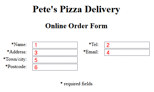
Partial screenshot of the pizza order form showing the default tab order
When the user loads the web page containing the form and presses the TAB key, a flashing cursor will appear in the Name field, because this is the first focusable control to appear in the HTML code (see below). Consider the scenario from the user's point of view. Once you have typed your name and pressed the TAB key, you would naturally expect to be taken to the Address field. Instead, the flashing cursor appears in the Tel field, because this is the input control that follows the Name field in the form's HTML code.
<table>
<tr>
<td style="text-align: right;"><label for="name">*Name: </label></td><td><input type="text" name="name" id="name" required></td>
<td style="text-align: right;"><label for="tel">*Tel: </label></td><td><input type="tel" name="tel" id="tel" required></td>
</tr>
<tr>
<td style="text-align: right;"><label for="addr">*Address: </label></td><td><input type="text" name="addr" id="addr" required></td>
<td style="text-align: right;"><label for="mail">*Email: </label></td><td><input type="email" name="mail" id="mail" required></td>
</tr>
<tr>
<td style="text-align: right;"><label for="town">*Town/city: </label></td><td><input type="text" name="town" id="town" required></td>
</tr>
<tr>
<td style="text-align: right;"><label for="pcode">*Postcode: </label></td><td><input type="text" name="pcode" id="pcode" required></td>
</tr>
</table>
Whilst this is not an error as such, it is not an ideal situation because the HTML code is being allowed to impose a tabbing order on our form that differs from the order in which most users would fill out the form. Can we do anything about this? We could of course change the layout of our form - not an attractive proposition if we are happy with the current layout.
Alternatively, we could find a workaround using HTML and CSS in order to change the order in which the control elements appear within the code whilst maintaining our existing screen layout. This is also a not a particularly palatable solution, since it's inevitably going to involve some extra work.
There is however a much easier solution to our problem, which is to use the global HTML tabindex attribute. By doing so, we can precisely control the order in which the user will navigate the form's focusable (input) controls as they tab through the form. The code can be amended to include the tabindex attribute for the form controls as follows:
<table>
<tr>
<td style="text-align: right;"><label for="name">*Name: </label></td><td><input type="text" name="name" id="name" required tabindex="1"></td>
<td style="text-align: right;"><label for="tel">*Tel: </label></td><td><input type="tel" name="tel" id="tel" required tabindex="5"></td>
</tr>
<tr>
<td style="text-align: right;"><label for="addr">*Address: </label></td><td><input type="text" name="addr" id="addr" required tabindex="2"></td>
<td style="text-align: right;"><label for="mail">*Email: </label></td><td><input type="email" name="mail" id="mail" required tabindex="6"></td>
</tr>
<tr>
<td style="text-align: right;"><label for="town">*Town/city: </label></td><td><input type="text" name="town" id="town" required tabindex="3"></td>
</tr>
<tr>
<td style="text-align: right;"><label for="pcode">*Postcode: </label></td><td><input type="text" name="pcode" id="pcode" required tabindex="4"></td>
</tr>
</table>
The value assigned to tabindex for each of the form's focusable controls should be an integer value between 1 and 32767, and will determine the order in which the input controls will receive the focus when navigated using the keyboard. Navigation starts with the form control that has the lowest tabindex value, and traverses the remaining controls in strict numerical order (the values assigned do not necessarily have to be sequential or start at a particular value).
For the record, almost any HTML element, whether focusable by default or not, may be included in the tab order by setting its tabindex attribute, usually to zero. Assuming the focusable controls in an HTML document have not had their tabindex attribute set, then all of the focusable controls (including any that we have rendered focusable by setting their tabindex attribute to zero) will be navigated in the order in which they appear in the HTML code.
If any of the controls in an HTML document have their tabindex attribute set to a positive integer value, navigation proceeds as follows: controls with a positive tabindex value are navigated first, in ascending numerical order (controls having the same values are navigated in the order in which they appear in the HTML code). Controls with a tabindex value of zero, together with any controls that are focusable by default but do not have their tabindex attribute set, will be navigated next, in the order in which they appear in the HTML code.
If a control has its tabindex attribute set to a negative value (for example -1), it becomes programmatically focusable but is not included in the tab order; in other words, a user can't tab to it using the keyboard but it can be given the focus by a client-side script.
Be advised that the W3C appears to suggest that using the tabindex attribute for form navigation should be avoided. They have this (among other things) to say on the subject:
Using a positive value for tabindex to specify the element's position in the sequential focus navigation order interacts with the order of all focusable elements. It is error-prone, and therefore not recommended. Authors should generally leave elements to appear in their default order.
If you want to read about what the W3C have to say on the subject in more depth, you can find the relevant section of the HTML 5.3 Editor's Draft (18 October 2018) here. Alternatives to using tabindex can include restructuring your form, or ordering your form elements in the required tab order and then using CSS to determine their position on the page. Our own view is that if these alternatives prove to be too problematic, you should consider using tabindex.
Another feature that can be used to navigate HTML forms is the global HTML accesskey attribute, which can be used to assign an access key (more commonly referred to as a shortcut key) to a form control. The accesskey attribute can be used with almost any HTML element, although overuse of this feature could perhaps be considered counter-productive.
Once an access key has been assigned to an HTML element, pressing the key will activate or give the focus to that element, depending on the nature of the element. For example, if the linked to element is a hypertext link, the browser will attempt to follow the link; if the element is a text input field, the input field gets the focus and a flashing cursor will appear inside it; if it's a button of type submit, the browser will attempt to submit the form data; and so on.
If you assign an access key to a form control element, it might also be a good idea provide some kind of visual cue to indicate to the user that the access key exists, for example by including the access key in the text of the label associated with the element, and emphasizing it in some way (perhaps by underlining it). You could also create a separate page, accessible via a link on your home page, that lists any generic shortcut keys you may have implemented for your website, although this is probably not particularly helpful for forms.
Before we discuss the question of whether or not to implement access keys further, let's look at a simple example. The HTML code below creates a web page containing a basic contact form that elicits personal details from the user.
<!doctype html>
<html lang="en">
<head>
<meta charset="utf-8">
<title>Form Demo 10</title>
<style>
label {width: 120px; display: inline-block; text-align: right;}
span.shortcut {font-weight: bold; text-decoration: underline;}
</style>
</head>
<body>
<h1 style="text-align: center">Contact Details</h1>
<form style="width: 460px; margin: auto; border: solid 1px; padding: 0 1em;" method="post" action="">
<p>Please enter your personal details:</p>
<p><label for="fname"><span class="shortcut">F</span>irst name:* </label><input type="text" size="15" accesskey="F" id="fname" name="fname" required></p>
<p><label for="lname"><span class="shortcut">L</span>ast name:* </label><input type="text" size="15" accesskey="L" id="lname" name="lname" required></p>
<p><label for="addr">Street <span class="shortcut">a</span>ddress: </label><input type="text" size="40" accesskey="A" id="addr" name="addr"></p>
<p><label for="town"><span class="shortcut">T</span>own/city: </label><input type="text" size="15" accesskey="T" id="town" name="town"></p>
<p><label for="pcode">Post<span class="shortcut">c</span>ode/zip: </label><input type="text" size="8" accesskey="C" id="pcode" name="pcode"></p>
<p><label for="tel">Tele<span class="shortcut">p</span>hone: </label><input type="tel" size="15" accesskey="P" id="tel" name="tel"></p>
<p><label for="mob"><span class="shortcut">M</span>obile: </label><input type="tel" size="15" accesskey="M" id="mob" name="mob"></p>
<p><label for="email"><span class="shortcut">E</span>mail address:* </label><input type="email" size="40" accesskey="E" id="email" name="email" required></p>
<p style="text-align: center;"><small>Fields marked * are required.</small></p>
<p style="text-align: center;"><button type="submit" accesskey="S"><span class="shortcut">S</span>ubmit</button></p>
</form>
</body>
</html>
Copy and paste this code into a new file in your HTML editor, save the file as form-demo-10.html, and open the file in a web browser. You should see something like the illustration below.
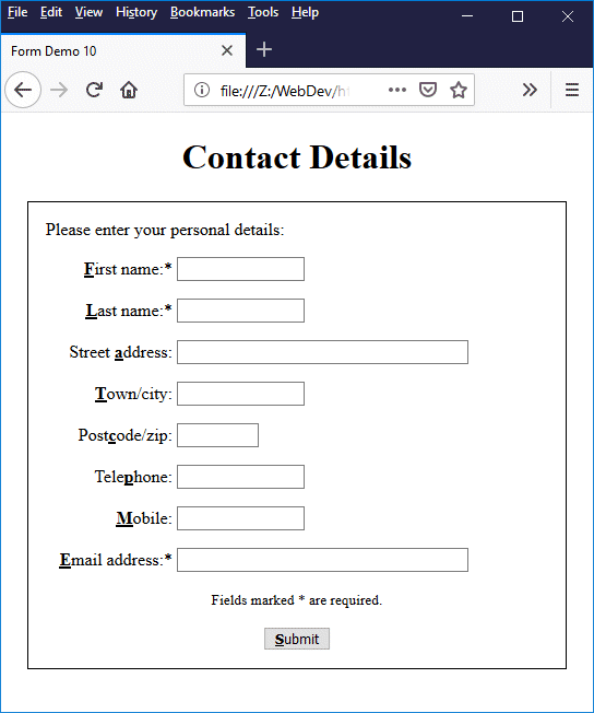
Each input control on the form has its own access key
If you examine the code, you will see that the access key for each input control is specified by assigning a character value to the control's accesskey attribute. The character value used must be a single printable character that can be generated using the keyboard. The access key character chosen for each control appears in the text of the control's label (or in the case of the submit button, in the text that appears on the button), and has been emboldened and underlined to draw the user's attention to the fact that it has special significance.
Note that the method used to activate an access key will depend on the user's browser and operating system. On a Windows computer, for example, you would use the key combination Alt + Shift + key for Mozilla Firefox, and either Alt + Shift + key or Alt + key for Google Chrome, depending on which character has been assigned (which is a far from ideal state of affairs).
We suggest you test the page in various browsers to see how (and whether) it works. For some browsers (Firefox for example), it is possible to change the key combination to be used with shortcut keys in the user preferences.
There is some debate over whether or not developers should implement access keys. There are various arguments for and against. According to W3C's User Agent Accessibility Guidelines (UAAG) 2.0 (W3C Working Group Note 15 December 2015), which you can find here, the following should be observed:
"All functionality can be operated via the keyboard using sequential or direct keyboard commands that do not require specific timings for individual keystrokes, except where the underlying function requires input that depends on the path of the user's movement and not just the endpoints (e.g. free hand drawing). This does not forbid and should not discourage providing other input methods in addition to keyboard operation including mouse, touch, gesture and speech."
This requirement can arguably be fulfilled via tabbed keyboard navigation without having to implement access keys. Indeed, there are a number of concerns over the use of access keys in terms of their effect on accessibility, including variation in the degree to which they are supported by different browsers, and potential conflicts between access keys assigned by developers and those used by operating systems, browsers and various assistive technologies.
There is also no guarantee that, given the increasing trend towards internationalisation, the characters used to implement access keys will be found on all keyboards, particularly if the assignment of access key characters is made on an arbitrary basis. And there exists the possibility that a user unfamiliar with the access key assignments might accidentally activate a control using an assigned keystroke combination.
If all of the required information has been provided in the correct format, the user can submit the form data to a web server, usually by clicking a button. As we have already seen, there are a number of different ways to implement buttons on a form. We can, for example use the <input> element, with its type set to submit, reset, button or image in order to create different kinds of button, depending on what we want them to do and how we want them to look. We can also use the <button> element.
The <button> element can, essentially, do everything that a button created with the <input> element can do, but is a little more flexible because, unlike the <input> element, the <button> element is not an empty element - it has both an opening tag and a closing tag. This means that, regardless of the value we assign to its type attribute, the <button> element can contain other HTML elements (for example, some text and/or an image).
The kind of button used to submit form data is often a matter of personal choice; once the data has been validated, it will be sent to the server regardless. On the question of validation, as we have already mentioned, some of the work is now done by the HTML code (for example by using the required attribute to ensure that all of the mandatory input fields are completed).
That said, HTML data validation is still rather limited. In order to implement sufficiently strict data validation, the developer still needs to implement client-side validation scripts, and this will probably be the case for the foreseeable future. Client-side validation scripts fall outside the scope of this article (they will be dealt with in due course elsewhere). We will concentrate instead on the process of actually sending the form data to the server.
Let's start by having a look at the attributes that can be applied to the <form> element itself, most of which are directly related to the process of form data submission. The table below summarises these attributes.
| Attribute | Description |
|---|---|
| accept-charset | A space-delimited list of character encodings that specifies the character encoding(s) to be used for the form submission. If the accept-charset attribute is omitted, the character encoding used for the document containing the form element is used. |
| action | Specifies the URL of a program or script to which the form-data will be sent when a form is submitted. The program or script will then process the form information. This value can be overridden by an action attribute on a <button> or <input> element belonging to the form. |
| autocomplete | Specifies whether input elements can, by default, have their values automatically completed by the browser. This value can be overridden by an autocomplete attribute on one of the form's child elements. Possible values are on or off. If the autocomplete attribute is set to on, the browser can automatically complete values based on values previously entered by the user. Otherwise, the browser will not attempt to autocomplete user entries. In the case of username and password fields, even if the autocomplete attribute has been set to on, most browsers will still ask the user whether they should store the values entered in these fields for future use. |
| enctype | Specifies how form data should be encoded when it is submitted to the server (applies only when the method attribute is set to post). The enctype attribute is the MIME type of the data submitted to the server. Possible values are:
|
| method | Specifies the HTTP method to use to submit the form data. The options are post - the form data is encoded within a message body before it is sent to the server, and get - the form data is appended to the URL specified by the action attribute and the resulting query string is sent to the server. Generally speaking, post is the preferred method for sending data to a server, while get is usually reserved for retrieving data from a server. The value can be overridden by a formmethod attribute on a <button> or <input> element belonging to the form. |
| name | Specifies the name of the form. The name of each form in a document must be unique, and cannot be an empty string. |
| novalidate | If used, this attribute specifies that form data should not be validated when the form is submitted. Otherwise, validation will take place unless a formnovalidate attribute has been used on a <button> or <input> element belonging to the form. |
| target | Specifies the browsing context (e.g. a tab, window or iframe) in which to display the response that is received after submitting the form. Possible values are as follows:
|
We should perhaps start by quickly discussing the accept-charset attribute. Don't confuse this with the Accept-Charset parameter which forms part of the browser's HTTP request header. Most browsers no longer set this parameter, and even if they do it is usually ignored by the server. The accept-charset attribute, if used, specifies the character encoding to be used by the browser when submitting form data to the server.
In practice, the accept-charset is used to indicate that the character encoding used for the submitted form data should be something other than the character encoding used for the web page containing the form. This might be necessary, for example, if the web page is ISO-8859-1 encoded, but there is a good chance that the user will enter characters not included in the ISO-8859-1 specification.
You could avoid potential problems by using <form accept-charset="utf-8">, since UTF-8 is a variant of the Unicode character encoding standard, and includes encodings for almost every character, punctuation mark and symbol used by every language in the world, as well as being supported by current versions of virtually every operating system and web browser. Alternatively, you could simply use the UTF-8 encoding for your web page to begin with.
The action attribute (usually) specifies the URL of a program or script to which the form data will be submitted, and which will then process the form data and (in most cases) generate a response that will be sent back to the user's browser. Let's revisit the contact form web page we looked at earlier. Here is a somewhat simplified version of the code:
<!doctype html>
<html lang="en">
<head>
<meta charset="utf-8">
<title>Form Demo 10</title>
<style>
label {width: 120px; display: inline-block; text-align: right;}
</style>
</head>
<body>
<h1 style="text-align: center">Contact Details</h1>
<form style="width: 460px; margin: auto; border: solid 1px; padding: 0 1em;" method="post" action="https://www.technologyuk.net/assets/demo-php/display_contact_details.php" target="_self">
<p>Please enter your personal details:</p>
<p><label for="fname">First name:* </label><input type="text" size="15" id="fname" name="fname" required></p>
<p><label for="lname">Last name:* </label><input type="text" size="15" id="lname" name="lname" required></p>
<p><label for="addr">Street address: </label><input type="text" size="40" id="addr" name="addr"></p>
<p><label for="town">Town/city: </label><input type="text" size="15" id="town" name="town"></p>
<p><label for="pcode">Postcode/zip: </label><input type="text" size="8" id="pcode" name="pcode"></p>
<p><label for="tel">Telephone: </label><input type="tel" size="15" id="tel" name="tel"></p>
<p><label for="mob">Mobile: </label><input type="tel" size="15" id="mob" name="mob"></p>
<p><label for="email">Email address:* </label><input type="email" size="40" id="email" name="email" required></p>
<p style="text-align: center;"><small>Fields marked * are required.</small></p>
<p style="text-align: center;"><button type="submit">Submit</button></p>
</form>
</body>
</html>
Copy and paste this code into a new file in your HTML editor, save the file as form-demo-11.html, open the file in a web browser, and enter some data in the form (this can be entirely fictitious). You should see something like the illustration below.
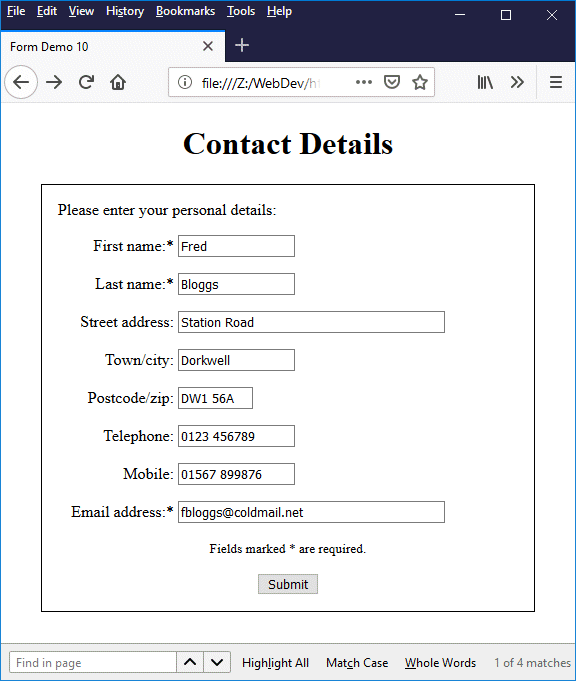
Enter some fictitious contact details in the form
You will note from the code that the form's action attribute has been assigned the following value:
action="https://www.technologyuk.net/assets/demo-php/display_contact_details.php"
The URL shown here is an actual PHP script hosted on this website. Its purpose is to receive the contact form data and echo it back to the user's browser. No other data processing is carried out, and none of the data submitted is stored on the server. Once you have entered some fictitious contact details into the form, click on the "Submit" button. You should now see something like the following:
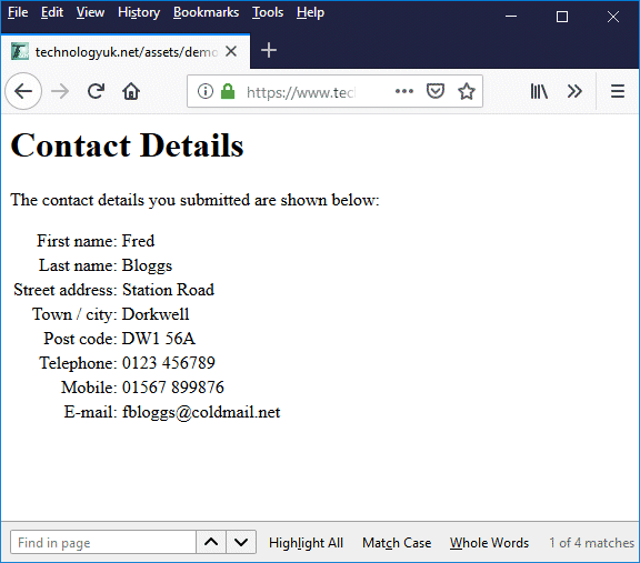
The contents of the contact form are displayed
Take special note of the URL displayed in the browser's address bar, which should look like this:
https://www.technologyuk.net/assets/demo-php/display_contact_details.php
We have set the value of the form's target attribute to "_self". This tells the browser to display the response from the server in the current browsing context. In other words, we are telling the browser that the web page containing the contact form should be replaced by the details sent back to the browser by the web server in response to our form submission. Setting the target attribute to "_blank" would cause the response to be displayed in a new browsing context (typically in a new browser tab).
We have set the form's method attribute to "post". This will invariably be the case when we are sending data to a server because it instructs the browser to encode the form data into the message body of the HTTP request that it sends to the server. Try changing the value of the method attribute from "post" to "get" in your HTML code, then reload the page and enter your fictitious contact details once again. When you have done this, click on the "Submit" button and look at the URL displayed in the browser's address bar. You should see something like this:
https://www.technologyuk.net/assets/demo-php/display_contact_details.php?fname=Fred&lname=Bloggs&addr=Station+Road&town=Dorkwell&pcode=DW1+56A&tel=0123+456789&mob=01567+899876&email=fbloggs%40coldmail.net
What this exercise also demonstrates is that, if "get" is used, the submitted form data will be appended to the URL specified by the form's action attribute and form part of the query string sent to the server rather than being encoded in the message body of the HTTP request. As you can see, all of our potentially sensitive personal data is clearly visible in the browser address bar - not a particularly desirable state of affairs.
The query string containing our personal data will be transmitted in clear text to the server. Another unfortunate side effect in this instance is that using "get" has also rendered our script rather useless because, as you may have observed, the details we entered in the contact form are no longer included in the response generated by the server.
Another good reason not to use "get" for submitting form data is that it places limits on the amount of form data we can send. The length of the HTTP query string is limited to around three thousand characters, whereas there are virtually no restrictions on the size of an HTTP request's message body.
Temporarily assigning a value of "get" to the method attribute is nevertheless a useful exercise, because it allows us to observe how the form data submitted to the server is structured. As you can see, each successful form control (more about what we mean by the term "successful" shortly) has the value of its name attribute paired with the value entered for that control by the user, like this:
fname=Fred&lname=Bloggs&addr=Station+Road . . .
Each successful control generates a key-value pair consisting of the control's name and the value entered by the user, separated by an equals sign ("="). The individual key-value pairs are separated by an ampersand symbol ("&"). The dataset for the form thus consists of a sequence of key-value pairs; within each key-value pair, spaces are replaced with a plus sign ("+"), and special (non-alpha-numeric) characters are replaced with the corresponding ASCII hexadecimal code.
A "successful" control is one for which data will be sent to the server when the form is submitted. A control must have a current value when the form is submitted in order to be successful. Examples include selected checkboxes and radio buttons, completed text input fields, selected options (for <select> elements), and selected files (for <input> elements of type file). Hidden input fields that have a current value will also be successful.
Controls that are unsuccessful include disabled form controls, controls that do not have a current value when the form is submitted, and form controls for which the name attribute has been omitted (regardless of whether or not they have a current value).
The method used to encode the form's dataset for submission to the server will depend on the value of the form element's enctype attribute, which specifies the content type of the form data. The default value for enctype is "application/x-www-form-urlencoded". Key-value pairs will be formatted as described above, and listed in the order in which they appear in the HTML document.
If users are being asked to upload a file (or maybe several files) as part of the form's dataset, the value assigned to the enctype attribute must be "multipart/form-data". The main difference between the default encoding and multipart encoding is that the former encodes spaces as "+" and special characters as their corresponding ASCII hexadecimal code, whereas the latter does not. If we are uploading files to a server, we want the file to be transmitted in its entirety, without being changed in any way. We certainly don't want the browser trying to encode any bit patterns it interprets as spaces or special characters.
There are a couple of final things to note here. The first is that the enctype attribute should only be used if the method attribute is set to "post". If the method attribute is set to "get", the enctype attribute will be ignored. The second is that, unless you are using multipart encoding, you don't actually need to specify the enctype attribute, since enctype="application/x-www-form-urlencoded" is the default setting.