| Author: | |
| Website: | |
| Page title: | |
| URL: | |
| Published: | |
| Last revised: | |
| Accessed: |
The contents of an HTML document can be thought of as a document tree that we can visualise in the same way we would a family tree. The document tree consists of the collection of HTML elements contained within the HTML document, starting with the root element (<html>). Like every family tree, the HTML document tree consists of ancestors and descendants, parents and children, and siblings.
There are two main branches of the HTML family tree. One branch starts with the <head> element. The other starts with the <body> element. These two elements are siblings at the highest level of the document tree, directly below the root.
The elements contained within the <head> element do not directly concern us here. They may well influence certain aspects of our document's appearance and behaviour, but they will not be visible when the page is rendered. We are interested in the elements contained within the <body> element, because most if not all of these elements will be rendered on a display device by the user agent.
The user agent will process the information in the head of the HTML document first to see whether there is any information it needs before it can render the contents of the document body. This could include embedded stylesheet information, or the contents of an external stylesheet to which the document is linked. It then turns its attention to the document body.
Every HTML element that can be rendered on a display device by a user agent will occupy its own rectangular area on the screen. We can think of this rectangular area as a box. The dimensions of the box will depend on the nature of the HTML element and its contents. Other characteristics, which are common to all displayable HTML elements, are described by something called the CSS box model.
The browser will traverse the body of the document, starting with the <body> element, in order to create the document's on-screen representation. It does so in accordance with an algorithm known as the visual formatting model.
The details of how the visual formatting model algorithm works are beyond the scope of this page (we will be looking at it in more detail elsewhere). The important thing to understand here is that each element in the document tree will generate zero or more boxes in accordance with the CSS box model. Each box, together with its contents, will be styled in accordance with any applicable stylesheet rules.
The CSS box model essentially describes the rectangular area, or box, within which the contents of an HTML element are displayed. The content itself could consist of some text, an image, some kind of media control interface, or other (nested) HTML elements. The box consists of a rectangular content area that encloses the element's content, surrounded by three rectangular regions.
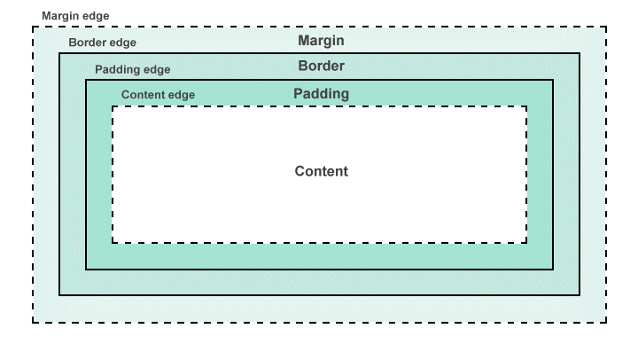
The CSS box model
The four rectangular regions that make up the box model can be summarised as follows:
By default, the width and height of the content area are determined by the element's content; the element's padding and margin will have zero width, and no border will be drawn around the element. If the element's display property is set to either block or inline-block, all of these properties can be modified using CSS. If its display property is set to inline, the size of the element's content area will depend on the content alone, and cannot be changed using CSS.
The margin will always be transparent, while the colour of the padding will always match the background colour of the element. The element's background colour can be set using CSS, but is transparent by default. If a border is displayed, its colour can be set using CSS. If no colour is specified for the border, its colour will depend on the value of the element's color property.
The HTML code below creates a simple web page that demonstrates the basic properties of the CSS box model and how we can manipulate the size and appearance of the box using a style sheet.
<!doctype html>
<html lang="en">
<head>
<meta charset="utf-8">
<title>Box Model Demo</title>
<style>
body {
background: #eeeeee;
text-align: center;
}
.content {
background: #ffffff;
font-size: 2em;
}
.inner {
padding: 5em;
border: 5px solid #808080;
margin: 5em;
background: #eeeeee;
}
.outer {
display: inline-block;
background: #ffffff;
}
</style>
</head>
<body>
<div class="outer">
<div class="inner">
<span class="content">
CONTENT
</span>
</div>
</div>
</body>
</html>
Copy and paste this code into a new file in your HTML editor, save the file as box-model-demo.html, and open the file in a web browser. You should see something like the illustration below.
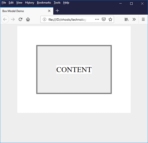
A simple web page that demonstrates the CSS box model
The "box model" here is represented by a <div> element with the class "inner" that contains a <span> element enclosing the word "CONTENT". We have set a grey background for the <div> element and a white background for the <span> element so that you can clearly see that the bounding rectangle for the (inline) <span> element has the same width and height as its content.
Note that the overall height of any text content will be the line-height which, by default, is set to (approximately) 120% of the font size - the exact value will depend on the font and the browser implementation. There will also be a small amount of clearance (usually one or two pixels) between the left- and right-hand content edges and the text. The exact amount of clearance will again depend on the font and browser implementation.
The padding, margin and border values for our box are all set using the following CSS rule:
.inner {
padding: 5em;
border: 5px solid #808080;
margin: 5em;
background: #eeeeee;
}
It is actually possible to set different values for the padding, margin and border on all four sides of the box (top, bottom, left-hand side and right-hand side). We have opted here to set the same values all round for the sake of simplicity.
We have enclosed the <div> element which defines our box inside another <div> element that has the class "outer":
.outer {
display: inline-block;
background: #ffffff;
}
The inner <div> element takes up the full width of its container, which is the outer <div> element. However, because the outer <div> element's display property has been set to inline-block, it will size itself according to the dimensions of its contents rather than taking up the full width of its own container (we will look at the calculation it performs to work out those dimensions shortly).
The area around the outer <div> element is grey (the background colour we set for the <body> element). Setting a white background for the outer <div> element enables us to identify the area occupied by the margin of the inner <div> element (margins, as you may recall, are always transparent). As a final touch, we have centred our "box" horizontally in the browser window by setting the text-align property for the <body> element to "center".
Most modern browsers allow us to inspect an individual HTML element, including a graphical representation of its box model. Reopen the file box-model-demo.html in your browser, right-click on the grey area surrounding the word "CONTENT", and select "Inspect Element" or "Inspect" from the context menu that appears (the only browser we have tried that doesn't offer this facility at all is Safari for Windows, although Internet Explorer and Edge do not seem to provide the graphical representation). You should see something like the following:
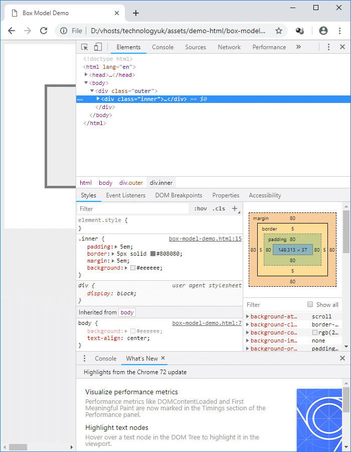
Most browsers allow you to inspect the properties of an individual HTML element
We have seen that, by default, HTML elements have zero-width padding, margins and borders. What happens to the dimensions of an HTML element when we decide we want a tangible border, or need some padding around our content, or want to create a margin in order to put some white space between our HTML elements?
The short (and fairly obvious) answer is that our box is going to get bigger. The width of our box will be whatever value is specified for the element's width property plus the width of the element's left and right margins, borders, and padding. The same basic calculation is used if we want to find the height of a box, except that this time we need to add the widths of the top and bottom margins, borders and padding to the element's height property.
Being able to calculate the size of a box using these simple formula does of course depend on our having assigned a fixed width and/or height to the element - or at least on us being able to derive a value for the width or height of the element, if all we want to know is what its dimensions will be in a particular situation.
In many scenarios, determining the overall width of an element is more important than determining its height, because one of the main concerns we have as web developers is that visitors to our page should not have to use horizontal scrolling to see content that is too wide for the display screen.
Vertical scrolling is an inevitable feature of web pages that contain a significant amount of content (although putting important information "above the fold" and providing "bookmarks" to aid user navigation within the page is usually a good idea). Nevertheless, there might still be occasions when we want to precisely determine - or specify - the height of an element.
Further complications arise when different units are used to specify the width of borders, margins, and padding, as well as the value of the width property of the element itself. We might, for example, decide to dimension the width of a <div> element as a percentage of the width of its parent container (this could be the <body> element, or another <div> element, or whatever.
Subsequently setting values for margins, borders, or padding will obviously increase the overall size of our box, but what effect will it have in terms of calculating the width of the box as a percentage of the width of its parent container? The simple answer to this question is that there is no single solution that fits every situation. Each case has to be considered on its merits.
The HTML code below creates a web page that contains multiple columns in a fixed-width page layout - an approach that is not as uncommon as you might imagine, given the current emphasis on "responsive design". Here is the code:
<!doctype html>
<html lang="en">
<head>
<meta charset="utf-8">
<title>Size Calculation Demo</title>
<style>
body {
margin: 0;
font-family: sans-serif;
background: #eeeeff;
}
main {
width: 720px;
margin: auto;
background: #ffffff;
}
header { padding: 0.25em 0 0; }
h1, h2, h3 { text-align: center; }
h2 {
padding: 10px;
background: #8080ff;
color: white;
}
.col {
float: left;
width: 240px;
}
footer {
text-align: center;
padding: 2em;
font-size: 83.33%;
font-weight: bold;
color: #ffffff;
background: #8080ff;
clear: left;
}
p {
text-align: justify;
padding: 0 20px;
font-size: 83.33%;
}
p.caption {
font-size: 70%;
text-align: center;
}
img {
width: 198px;
margin: 10px 20px 0px;
border: solid 1px #dddddd;
}
</style>
</head>
<body>
<main>
<header>
<h1>Life Before Man</h1>
</header>
<h2>The Dinosaurs</h2>
<div class="col">
<h3>
Stegosaurus
</h3>
<p>
From fossil evidence found in the USA, it has been determined that the Stegosaurus was an armoured herbivorous dinosaur that lived between 145 and 155 million years ago in the Late Jurassic period. Approximately nine metres long, Stegosaurus had a relatively small head, with a brain not much bigger than a golf ball. Although thought to be slow moving, Stegosaurus probably defended itself against predators using its powerful spiked tail. The purpose of the vertical bony plates protruding from either side of the spibne in an alternating pattern is uncertain, but it is thought that they may have been used to warn off predators, or possibly to regulate body temperature.
</p>
<img src="https://www.technologyuk.net/assets/demo-images/dino-01-stegosaurus.jpg" alt="Stegosaurus">
<p class="caption">Stegosaurus</p>
<h3 id="ID02">Diplodocus</h3>
<p>
Diplodocus was a large herbivorous dinosaur with a weight of approximately twenty metric tonnes and a length of about twenty-six metres. Fossil evidence found in the USA indicates that Diplodicus lived between 145 and 155 million years ago in the Late Jurassic period, walked on four legs, and used its long neck to reach high vegetation which it stripped with rows of comb-like teeth.
</p>
<img src="https://www.technologyuk.net/assets/demo-images/dino-02-diplodocus.jpg" alt="Diplodocus">
<p class="caption">Diplodocus</p>
</div>
<div class="col">
<h3 id="ID03">Tyrannosaurus Rex</h3>
<p>
Fossilised remains of Tyrannosaurus Rex has been found in the USA and Canada. Tyrannosaurus Rex was a twelve metre long, seven metric tonne carnivore that lived between 66 and 68 million years ago in the Late Cretaceous period. The ultimate killing machine, this creature moved on two legs and could crush bone with its sixty saw-edged and pointed teeth, each of which could be up to 20 centimetres in length (the skull was over one-and-a-half metres long).
</p>
<p>
Tyrannosaurus Rex was probably both a hunter and a scavenger, using its keen sense of smell to locate both prey and the carcasses of other creatures. The fossil evidence suggests that Tyrannosaurus Rex often consumed the bones of the creatures it preyed upon along with everything else.
</p>
<img src="https://www.technologyuk.net/assets/demo-images/dino-03-tyrannosaurus-rex.jpg" alt="Tyrannosaurus Rex">
<p class="caption">Tyrannosaurus Rex</p>
<h3 id="ID04">Brachiosaurus</h3>
<p>
Fossil remains of Brachiosaurus found in Algeria, Portugal, Tanzania and the USA show that it lived between 140 and 155 million years ago during the Late Jurassic period. This creature was one of the largest land-dweling dinosaurs ever to have walked the Earth, with a weight of anything up to fifty-eight metric tonnes and an estimated length of up to thirty metres.
</p>
</div>
<div class="col">
<h3 id="ID04">Brachiosaurus (cont.)</h3>
<p>
A herbivorous quadruped, Brachiosaurus had a disproportionately long neck that allowed it to reach vegetation up to nine metres above the ground. The front legs were considerably longer than the hind legs, resulting in a sloping body you can see in the illustration. The tail is relatively short compared to other sauropods. The skull, although small, had relatively wide jaws with broad-crowned teeth, enabling Brachiosaurus to consume large amounts of foliage.
</p>
<img src="https://www.technologyuk.net/assets/demo-images/dino-04-brachiosaurus.jpg" alt="Brachiosaurus">
<p class="caption">Brachiosaurus</p>
<h3 id="ID05">Triceratops</h3>
<p>
Fossil remains found in the USA indicate that Triceratops lived between 66 and 68 million years ago during the Late Cretaceous period. Weighing approximately five and a half metric tonnes and with a length of about nine metres, Triceratops was a herbivore and moved on four legs. It had a horny beak and shearing teeth, which it is thought to have used to eat palm fronds. The most distinctive features of this dinosaur are undoubtedly its three horns and the large frill covering its neck. The horns were probably used to fend off attacks by predators such as Tyrannosaurus Rex, while the frill is thought to have protected the neck.
</p>
<img src="https://www.technologyuk.net/assets/demo-images/dino-05-triceratops.jpg" alt="Triceratops">
<p class="caption">Triceratops</p>
</div>
<footer>
Copyright © TechnologyUK
</footer>
</main>
</body>
</html>
Copy and paste this code into a new file in your HTML editor, save the file as size-calculationl-demo.html, and open the file in a web browser. You should see something like the illustration below.
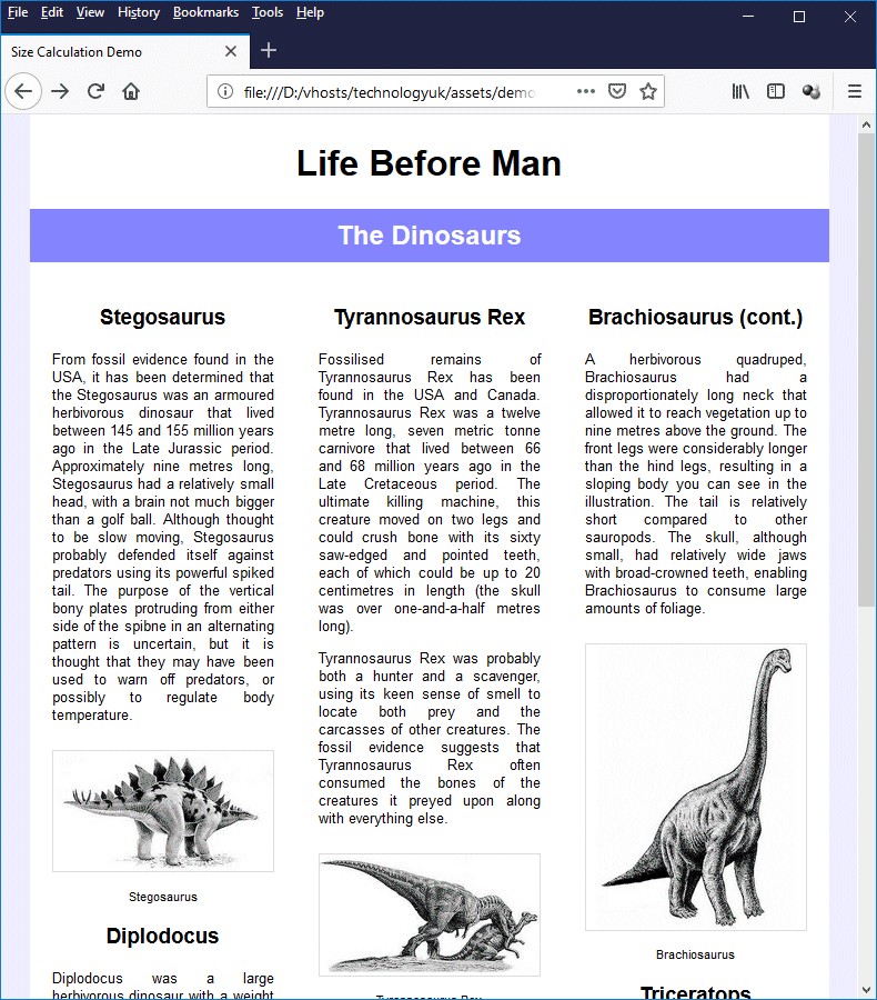
A fixed-width multiple-column layout
We have deliberately restricted the width of the <main> element in this example (this element acts as the "wrapper" for everything else) to 720 pixels for the sake of convenience. Many fixed-width layouts have a width of 960 pixels. This is considered by many developers to be a "magic number", because it provides a great deal of flexibility in terms of the number of columns the layout can contain and the widths chosen for individual columns. Here is the CSS rule that sets up the "wrapper" container for the layout:
main {
width: 720px;
margin: auto;
background: #ffffff;
}
Note that the margin property is set to auto. This effectively centres the <main> element horizontally in the browser window because it tells the browser that the left and right margins should be of equal width, and should take up whatever space is available between the left- and right- hand sides of the <body> element's content box and the outer edges of the <main> element.
Note that, because we set the <body> element's margins to zero, we are effectively talking about the space between the left- and right-hand edges of the <main> element and the left- and right-hand borders of the browser window.
We want our main content pane to contain three columns for this example. For this purpose, we have used three <div> elements whose class attribute is set to "col". Here is the CSS rule for the class:
.col {
float: left;
width: 240px;
}
The width property is to 240 pixels. We have not specified any padding, margins, or borders for this class, and because they all have zero width by default, the width of the box containing each column is also 240 pixels. The three column widths therefore add up to 720 pixels.
Because the <div> tag is a block-level element, the three columns would by default be stacked vertically, but we want them to be displayed next to each other. This is achieved by setting the float property for the col class to "left", which changes its default behaviour by taking it out of the normal flow of the document.
The paragraph (<p>) element will fill the full width of its parent by default, so we don't need to worry about setting its overall width. We create an area of white space to either side of the text by setting both the left and right margins to 20 pixels, and the value of the paragraph element's width property will automatically be reduced to 200 pixels so that the paragraph element's overall width matches that of the column:
p {
text-align: justify;
padding: 0 20px;
font-size: 83.33%;
}
We also have several images of dinosaurs which we want to fit within a column. All of the images have a width of 400 pixels, so we need to use the <img> element's width property to reduce the display width. In order to keep the images nicely lined up with the text, we have set the left- and right-hand margins to a width of 20 pixels.
We have also set a 10-pixel wide top margin to create some white space between each image and the text above it, and we have added a 1-pixel wide border on all four sides. We calculate the value to assign to an image's width property by working backwards from the available width - a column width of 240 pixels.
We have not added any padding to the <img> element, so we only need to deduct the width of the left and right margins (20 pixels each) and the width of the left- and right-hand borders (1 pixel each). The calculation is therefore as follows:
240 - (20 × 2) - (1 × 2) = 198
Here is the CSS rule:
img {
width: 198px;
margin: 10px 20px 0px;
border: solid 1px #dddddd;
}
Fixed-width page layouts are good for certain situations, but there are times when we need our page layouts to be a little more flexible. Indeed, the huge range of devices on which our web pages can now be displayed has steadily increased the need for web pages that can adapt to different screen sizes and resolutions, resulting in the evolution of what we today call "responsive" web design.
One approach to responsive design, and the very antithesis of fixed-width page layout, is the idea of fluid (or sometimes liquid) layout. This approach takes its name from the way that a liquid will adapt its shape and volume in response to the shape and size of the vessel in which it finds itself.
In the case of electronic display devices, there is an additional complicating factor. The dimensions and screen resolution of the display device will impose limitations on the size of the viewport (i.e. the visible screen area on the device itself). However, within those limitations the user may be able to resize their browser window, and will often do so continuously by dragging the borders of the browser window around.
The idea of a fluid web page layout is that it should enable the overall dimensions of a web page and its contents to automatically resize themselves, both in response to the initial dimensions of the browser window (which will vary from one device to another and from one user to another), and in response to changes in the size of the viewport instigated by the user.
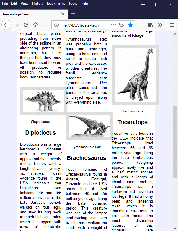
One frequently used method for creating a "fluid" web page layout is to set the width of each of the main components of a web page to a percentage of the width of the browser window rather than using fixed pixel widths. The HTML code below creates an alternative version of the previous example, this time using percentages instead of pixel values.
<!doctype html>
<html lang="en">
<head>
<meta charset="utf-8">
<title>Percentage Demo</title>
<style>
body {
margin: 0;
font-family: sans-serif;
background: #eeeeff;
}
main {
width: 80%;
margin: auto;
background: #ffffff;
}
header { padding: 0.25em 0 0; }
h1, h2, h3 { text-align: center; }
h2 {
padding: 10px;
background: #8080ff;
color: white;
}
.col {
float: left;
width: 33.33%;
}
footer {
text-align: center;
padding: 2em;
font-size: 83.33%;
font-weight: bold;
color: #ffffff;
background: #8080ff;
clear: left;
}
p {
text-align: justify;
padding: 0 5%;
font-size: 83.33%;
}
p.caption {
font-size: 70%;
text-align: center;
}
img {
box-sizing: border-box;
width: 90%;
margin: 10px 5% 0;
border: solid 1px #dddddd;
}
</style>
</head>
<body>
<main>
<header>
<h1>Life Before Man</h1>
</header>
<h2>The Dinosaurs</h2>
<div class="col">
<h3>
Stegosaurus
</h3>
<p>
From fossil evidence found in the USA, it has been determined that the Stegosaurus was an armoured herbivorous dinosaur that lived between 145 and 155 million years ago in the Late Jurassic period. Approximately nine metres long, Stegosaurus had a relatively small head, with a brain not much bigger than a golf ball. Although thought to be slow moving, Stegosaurus probably defended itself against predators using its powerful spiked tail. The purpose of the vertical bony plates protruding from either side of the spibne in an alternating pattern is uncertain, but it is thought that they may have been used to warn off predators, or possibly to regulate body temperature.
</p>
<img src="https://www.technologyuk.net/assets/demo-images/dino-01-stegosaurus.jpg" alt="Stegosaurus">
<p class="caption">Stegosaurus</p>
<h3 id="ID02">Diplodocus</h3>
<p>
Diplodocus was a large herbivorous dinosaur with a weight of approximately twenty metric tonnes and a length of about twenty-six metres. Fossil evidence found in the USA indicates that Diplodicus lived between 145 and 155 million years ago in the Late Jurassic period, walked on four legs, and used its long neck to reach high vegetation which it stripped with rows of comb-like teeth.
</p>
<img src="https://www.technologyuk.net/assets/demo-images/dino-02-diplodocus.jpg" alt="Diplodocus">
<p class="caption">Diplodocus</p>
</div>
<div class="col">
<h3 id="ID03">Tyrannosaurus Rex</h3>
<p>
Fossilised remains of Tyrannosaurus Rex has been found in the USA and Canada. Tyrannosaurus Rex was a twelve metre long, seven metric tonne carnivore that lived between 66 and 68 million years ago in the Late Cretaceous period. The ultimate killing machine, this creature moved on two legs and could crush bone with its sixty saw-edged and pointed teeth, each of which could be up to 20 centimetres in length (the skull was over one-and-a-half metres long).
</p>
<p>
Tyrannosaurus Rex was probably both a hunter and a scavenger, using its keen sense of smell to locate both prey and the carcasses of other creatures. The fossil evidence suggests that Tyrannosaurus Rex often consumed the bones of the creatures it preyed upon along with everything else.
</p>
<img src="https://www.technologyuk.net/assets/demo-images/dino-03-tyrannosaurus-rex.jpg" alt="Tyrannosaurus Rex">
<p class="caption">Tyrannosaurus Rex</p>
<h3 id="ID04">Brachiosaurus</h3>
<p>
Fossil remains of Brachiosaurus found in Algeria, Portugal, Tanzania and the USA show that it lived between 140 and 155 million years ago during the Late Jurassic period. This creature was one of the largest land-dweling dinosaurs ever to have walked the Earth, with a weight of anything up to fifty-eight metric tonnes and an estimated length of up to thirty metres.
</p>
</div>
<div class="col">
<h3 id="ID04">Brachiosaurus (cont.)</h3>
<p>
A herbivorous quadruped, Brachiosaurus had a disproportionately long neck that allowed it to reach vegetation up to nine metres above the ground. The front legs were considerably longer than the hind legs, resulting in a sloping body you can see in the illustration. The tail is relatively short compared to other sauropods. The skull, although small, had relatively wide jaws with broad-crowned teeth, enabling Brachiosaurus to consume large amounts of foliage.
</p>
<img src="https://www.technologyuk.net/assets/demo-images/dino-04-brachiosaurus.jpg" alt="Brachiosaurus">
<p class="caption">Brachiosaurus</p>
<h3 id="ID05">Triceratops</h3>
<p>
Fossil remains found in the USA indicate that Triceratops lived between 66 and 68 million years ago during the Late Cretaceous period. Weighing approximately five and a half metric tonnes and with a length of about nine metres, Triceratops was a herbivore and moved on four legs. It had a horny beak and shearing teeth, which it is thought to have used to eat palm fronds. The most distinctive features of this dinosaur are undoubtedly its three horns and the large frill covering its neck. The horns were probably used to fend off attacks by predators such as Tyrannosaurus Rex, while the frill is thought to have protected the neck.
</p>
<img src="https://www.technologyuk.net/assets/demo-images/dino-05-triceratops.jpg" alt="Triceratops">
<p class="caption">Triceratops</p>
</div>
<footer>
Copyright © TechnologyUK
</footer>
</main>
</body>
</html>
Copy and paste this code into a new file in your HTML editor, save the file as percentage-demo.html, and open the file in a web browser. You should see something like the illustration below.
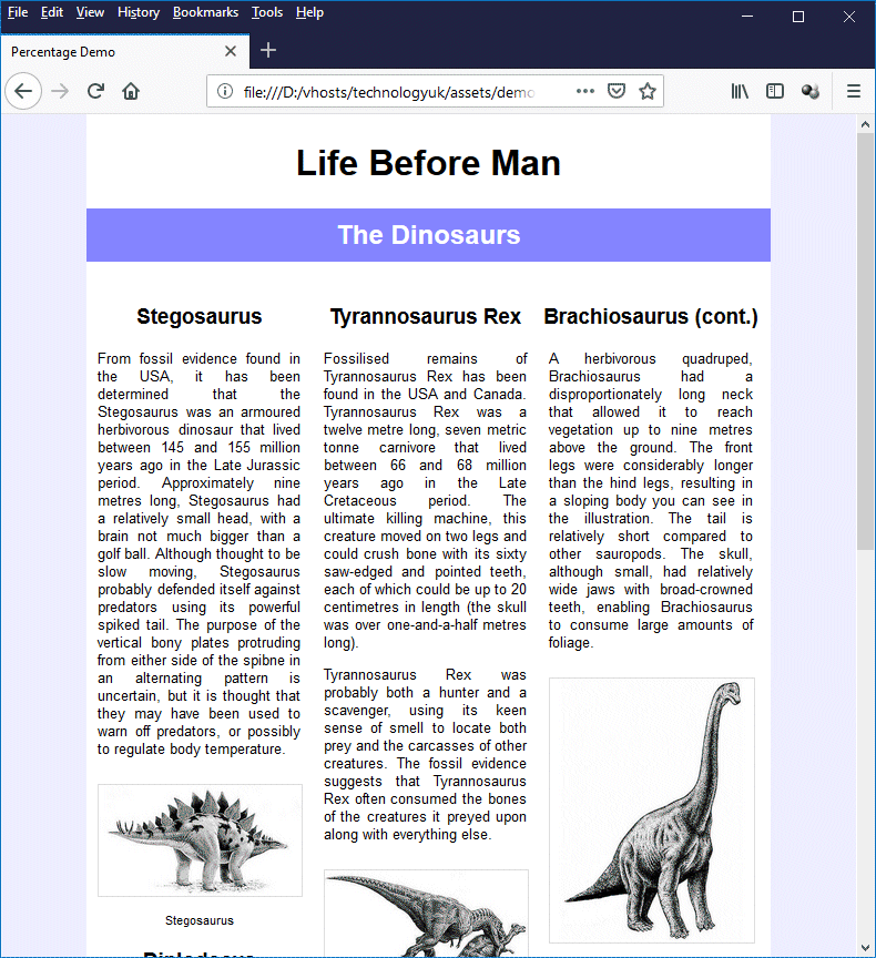
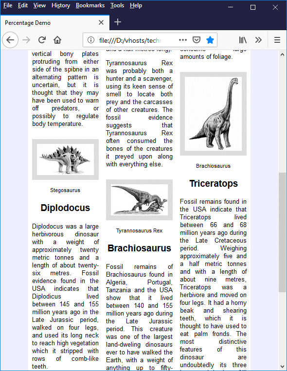
A "fluid" page layout
In order to appreciate the differences between this and the previous example, open the file size-calculationl-demo.html in a separate web browser window, and experiment a little by changing the size of both browsers. You should see that the fixed-with page does not respond at all to changes in the size of the browser window, whereas the columns in the fluid layout will resize themselves immediately in response to any change in the width of the browser window, as will the width of the text and images inside each column.
You will find that the responsive layout stays readable on a laptop or a desktop computer, even if we reduce the width of the browser window to 600 pixels, or even a little bit less. On a mobile device, the story is a little bit different because the physical display screen is much smaller. The illustration below shows what our page might look like on a smartphone.
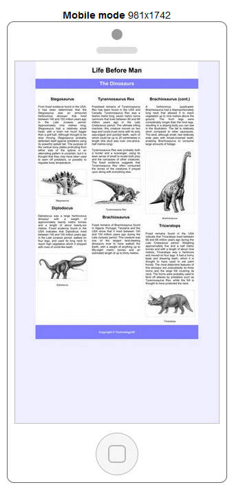
Our "fluid" page layout as it might appear on a smartphone
The above image was generated using the "Mobile Friendly Analysis" tool on SEO Centro's website. As you can see, the fluid layout works perfectly, but the text on our page is now virtually impossible to read because it is far too small. There is obviously more work to be done here in order to make our page mobile friendly, but that is a topic we will look at in more detail elsewhere.
Interestingly, when we loaded this page on an Android smartphone using Google Chrome, we were given the option "Show simplified view", which did indeed display a simplified view consisting of the text and images of our page in a single column format that was very easy to read, as the following screenshot demonstrates:
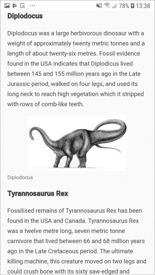
The "simplified" mobile version of our fluid page layout
We should not, however, rely on the availability of such features. To get back to subject of fluid layouts, they are certainly a viable alternative to fixed-width layouts as far as non-mobile display devices are concerned, and can also be seen as a first step in creating a truly responsive web page layout. But how much of our CSS and HTML code did we actually need to change in order to achieve our fluid layout?
The answer is, surprisingly little. In fact, the HTML code for our fluid layout is identical to the HTML code used for the fixed-width layout. Only the CSS rules have changed, and even there the changes were fairly minor. The first change can be seen in the styling applied to the <main> element, where we go from this:
main {
width: 720px;
margin: auto;
background: #ffffff;
}
to this:
main {
width: 80%;
margin: auto;
background: #ffffff;
}
Our main content window will now occupy 80% of the width of the browser window as opposed to being fixed at 720 pixels. The next change is in the col class applied to the <div> elements that form our columns. We go from this:
col {
float: left;
width: 240px;
}
to this:
col {
float: left;
width: 33.33%;
}
Remember that percentages are applied according to the width of the element's parent container, so we don't have to do too much in the way of calculation here. Each column will automatically adjust itself to be 33.33% (i.e. one-third) of the width of its parent container.
Setting the width of the text and images within each column is a little bit trickier. We have changed the styling of the paragraph element from this:
p {
text-align: justify;
padding: 0 20px;
font-size: 83.33%;
}
to this:
p {
text-align: justify;
padding: 0 5%;
font-size: 83.33%;
}
which in itself does not cause any problems. The width of the text in each column will automatically adjust itself to accommodate the 5% left and right padding, which leaves us with a column of text that is centred within the column, and has a width that is 90% of the column width.
We can, of course, set the width property for the <img> element to 90% and set its left- and right-hand margins to 5%. In fact, we could probably get away with this for our example page because the border is only one pixel wide all round. Suppose we had specified that the border should be 10 pixels wide instead of one pixel. What would the outcome be?
Remember that the width property only specifies the width of an element's content box. We need to add the width of the left- and right-hand padding, margins, and borders in order to get the total width of the element's box. We haven't specified any padding, and the margins and borders together add up to 100% of our column width. That leaves us with a 10-pixel border to the left and right of our image, so our box is 20 pixels wider than the column.
The <img> element has a width of 90% and 10-pixel wide left and right borders
As you can see, the left-hand edge of each image lines up nicely with the left-hand edge of the text within its column, but the right-hand edge of each image extends for 20 pixels beyond the right-hand edge of the text. We could compensate by reducing the percentage value we assign to the <img> element's width property, but how do we calculate a percentage value that reduces the width by exactly 20 pixels?
The short answer is that we can't, because the percentage that represents 20 pixels will change as the width of the column changes. Fortunately, there is an easy way to solve the problem. We can set the <img> element's box-sizing property, which is by default set to "content-box", to "border-box". Doing this forces any value we assign to the <img> element's width property to be applied to the width of the image including any padding and borders. Our page now looks like this:
The <img> element now has a width of 90% including the left and right borders
Here is the CSS rule we use for the <img> element:
img {
box-sizing: border-box;
width: 90%;
margin: 10px 5% 0;
border: solid 1px #dddddd;
}
Padding is the area between the outer edges of an element's content area and the inner edges of its borders. The padding area can be thought of as an extension of the content area that includes the element's padding; it is bounded by the padding edge. The padding properties are used to specify the thickness of the padding that is added to the top, bottom, left-hand side and right-hand side of the content box. There are four "longhand" padding properties:
The HTML code below creates a web page in which a <div> element encloses a block of text. The padding-top, padding-right, padding-bottom and padding-left properties for the <div> element have been assigned values of "10px", "20px", "30px" and "40px" respectively. We have set the background colour to grey so that you can see the result.
<!doctype html>
<html lang="en">
<head>
<meta charset="utf-8">
<title>Padding Demo</title>
<style>
div {
padding-top: 20px;
padding-right: 40px;
padding-bottom: 60px;
padding-left: 80px;
background: #eeeeee;
}
</style>
</head>
<body>
<div>
Lorem ipsum dolor sit amet, consectetur adipiscing elit. Sed blandit libero sit amet nunc ultricies, eu feugiat diam placerat. Phasellus tincidunt nisi et lectus pulvinar, quis tincidunt lacus viverra. Phasellus in aliquet massa. Integer iaculis massa id dolor venenatis scelerisque. Morbi non eros a ex interdum molestie in eget leo. Proin pulvinar facilisis eros, sed porta ante imperdiet ut. Suspendisse tincidunt facilisis metus non faucibus. Integer posuere vehicula congue. Sed pharetra felis sapien, at imperdiet diam lacinia quis. Sed pharetra turpis et dui aliquam, in rhoncus elit ornare. Quisque posuere consequat nunc in rutrum. Praesent leo nibh, porta et arcu quis, placerat tincidunt turpis.
</div>
</body>
</html>
Copy and paste this code into a new file in your HTML editor, save the file as padding-demo.html, and open the file in a web browser. You should see something like the illustration below.
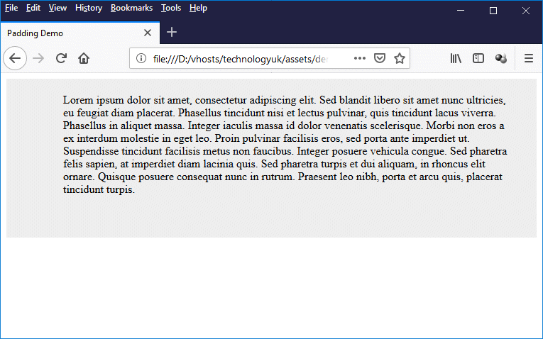
This example demonstrates the effect of adding padding to a <div> element
Because the <div> element is a block-level element, it takes up all of the available width of its parent container, which in this case is the <body> element. Its height will be determined by the height of its contents and the amount of padding we have added above and below the text.
The height of the content will depend on how many lines of text there are. The addition of padding to the left and right of the text will reduce the width of the content box, which means that fewer words will fit on each line. The content box will increase in height each time an additional line of text is required.
In addition to the "longhand" padding properties, there is also a "shorthand" padding property (padding) that allows us to set values for the padding on all four sides with a single line of code. In the padding-demo.html example, we could achieve exactly the same result by replacing this:
<style>
div {
padding-top: 20px;
padding-right: 40px;
padding-bottom: 60px;
padding-left: 80px;
background: #eeeeee;
}
</style>
with this:
<style>
div {
padding: 20px 40px 60px 80px;
background: #eeeeee;
}
</style>
Note that we have not explicitly stated which values apply to which side because we don't have to. The values in the above example will be applied clockwise, starting with the value for padding-top, followed by padding-right, then padding-bottom, and finally padding-left. The padding property can take from one to four values, which will be interpreted as follows:
Note that padding values cannot be negative. If percentage values are used, they refer to the width of the element's parent container regardless of whether they are applied to the top, bottom, left-hand or right-hand padding (if the width of the container is dependent on its contents, the effect of setting a percentage value is undefined). Note also that if an element's padding is set to zero on all four sides (this is the default setting), then the padding edge will coincide with the content edge.
The padding properties can be applied to all (displayable) HTML elements except <table-row-group>, <table-header-group>, <table-footer-group>, <table-row>, <table-column-group> and <table-column>.
The border area is the area between the outer edges of an element's padding area and the inner edges of its margins, and is bounded by the border edge. It can be thought of as an extension of the padding area that includes the element's borders; it allows us to draw a visible border around the content of an HTML element. The border properties are used to specify the style, thickness, and colour of the border that is drawn around an element.
We have already seen a number of examples in which we have used the most concise "shorthand" border property, namely border. This property very conveniently allows us to set the border style, border width, and border colour for all four sides of an element with just a one-line CSS rule. For example:
h1 { border: solid 1px black; }
This rule sets a one-pixel wide solid black border on all four sides of any level 1 heading (note that the order in which the properties are specified is not important). Being able to use this kind of shorthand format to specify borders is useful, because in many cases the borders form a box around the element, with each side of the box having the same style, width and colour.
There are four other equally concise shorthand formats that we can use to style borders on individual sides of an element, namely border-top, border-right, border-bottom and border-left. We could, for example, underline a level 1 heading (rather than putting a box around it) like this:
h1 { border-bottom: solid 2px black; }
In the following sections we will be looking at various border properties that allow us to set the style, width, and colour for each border individually, giving us total control over the appearance of our borders.
Four "longhand" border properties are used to set the border's style:
Each of these border style properties can be set to any one of the following styles:
The HTML code below creates a web page containing a number of <div> elements that demonstrate the effect of setting the various "long-hand" border style properties to different values. All of the <div> elements have been given a 5-pixel wide border so that the different border styles can be clearly seen.
<!doctype html>
<html lang="en">
<head>
<meta charset="utf-8">
<title>Border Demo 01</title>
<style>
div {
width: 80%;
height: 50px;
padding: 10px;
margin: 10px auto;
border-color: black;
border-width: 5px;
background: #eeeeff;
}
div.a {
border-top-style: dotted;
border-right-style: dashed;
border-bottom-style: solid;
border-left-style: double;
}
div.b {
border-top-style: groove;
border-right-style: groove;
border-bottom-style: groove;
border-left-style: groove;
}
div.c {
border-top-style: ridge;
border-right-style: ridge;
border-bottom-style: ridge;
border-left-style: ridge;
}
div.d {
border-top-style: inset;
border-right-style: inset;
border-bottom-style: inset;
border-left-style: inset;
}
div.e {
border-top-style: outset;
border-right-style: outset;
border-bottom-style: outset;
border-left-style: outset;
}
</style>
</head>
<body>
<div class="a">
This container has one <em>dotted</em>, one <em>dashed</em>, one <em>solid</em>, and one <em>double</em> border.
</div>
<div class="b">
This container has a <em>grooved</em> border.
</div>
<div class="c">
This container has a <em>ridged</em> border.
</div>
<div class="d">
This container has an <em>inset</em> border.
</div>
<div class="e">
This container has an <em>outset</em> border.
</div>
</body>
</html>
Copy and paste this code into a new file in your HTML editor, save the file as border-demo-01.html, and open the file in a web browser. You should see something like the illustration below.
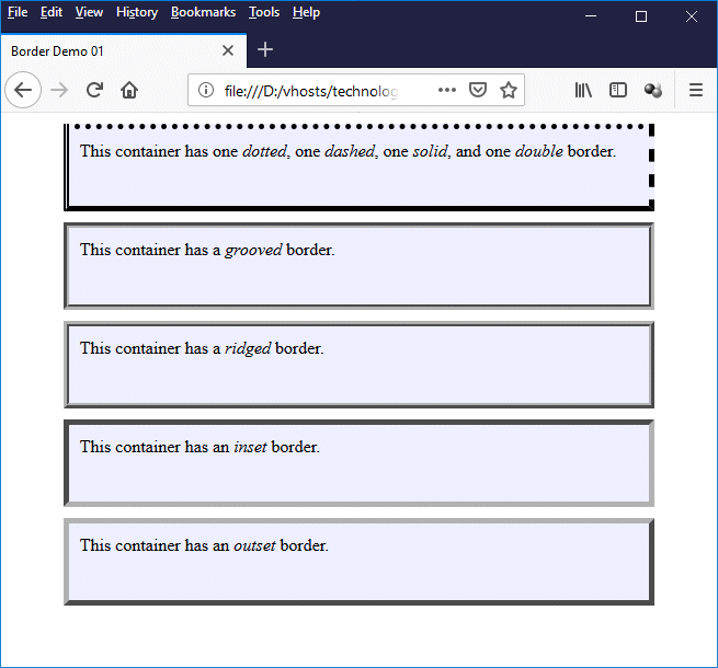
This example demonstrates effect of assigning different values to the border style properties
In addition to the "longhand" border style properties, there is also a "shorthand" border style property (border-style) that allows us to set values for the border styles on all four sides at the same time with a single line of code. In the borders-demo-01.html example, we could achieve exactly the same result by replacing this:
div.one {
border-top-style: dotted;
border-right-style: dashed;
border-bottom-style: solid;
border-left-style: double;
}
div.two {
border-top-style: groove;
border-right-style: groove;
border-bottom-style: groove;
border-left-style: groove;
}
div.three {
border-top-style: ridge;
border-right-style: ridge;
border-bottom-style: ridge;
border-left-style: ridge;
}
div.four {
border-top-style: inset;
border-right-style: inset;
border-bottom-style: inset;
border-left-style: inset;
}
div.five {
border-top-style: outset;
border-right-style: outset;
border-bottom-style: outset;
border-left-style: outset;
}
with this:
div.one { border-style: dotted dashed solid double; }
div.two { border-style: groove; }
div.three { border-style: ridge }
div.four { border-style: inset }
div.five { border-style: outset }
For the values assigned in the first line, we don't have to explicitly state which values apply to which side. They will be applied clockwise, starting with the value for border-top-style, followed by border-right-style, then border-bottom-style, and finally border-left-style. The border-style property can take from one to four values, which will be interpreted as follows:
As for border styles, there is a set of "longhand" border properties for setting the border's width:
Each of these border width properties can be set using any valid unit of measurement (such as pixels or em units, for example), or to one of the following values:
Note that the definition of "thin", "medium" and "thick" is dependent on the user agent. The typical values we have quoted here are based on current desktop versions of Mozilla Firefox.
The HTML code below creates a web page containing a number of <div> elements that demonstrate the effect of setting the various "long-hand" border width properties to different values (all of the <div> elements have been given a solid border, but you can play around with the CSS rules to see the effect of mixing different border widths and styles).
<!doctype html>
<html lang="en">
<head>
<meta charset="utf-8">
<title>Border Demo 02</title>
<style>
div {
width: 600px;
height: 60px;
margin: 10px auto;
padding: 10px;
background: #eeeeff;
border-style: solid;
}
div.a {
border-top-width: thin;
border-right-width: medium;
border-bottom-width: thick;
border-left-width: 10px;
}
div.b {
border-top-width: thin;
border-right-width: thin;
border-bottom-width: thin;
border-left-width: thin;
}
div.c {
border-top-width: medium;
border-right-width: medium;
border-bottom-width: medium;
border-left-width: medium;
}
div.d {
border-top-width: thick;
border-right-width: thick;
border-bottom-width: thick;
border-left-width: thick;
}
div.e {
border-top-width: 10px;
border-right-width: 10px;
border-bottom-width: 10px;
border-left-width: 10px;
}
</style>
</head>
<body>
<div class="a">This container has mixed border widths.</div>
<div class="b">This container has a "thin" border on all four sides.</div>
<div class="c">This container has a "medium" border on all four sides.</div>
<div class="d">This container has a "thick" border on all four sides.</div>
<div class="e">This container has a 10-pixel-wide border on all four sides.</div>
</body>
</html>
Copy and paste this code into a new file in your HTML editor, save the file as border-demo-02.html, and open the file in a web browser. You should see something like the illustration below.
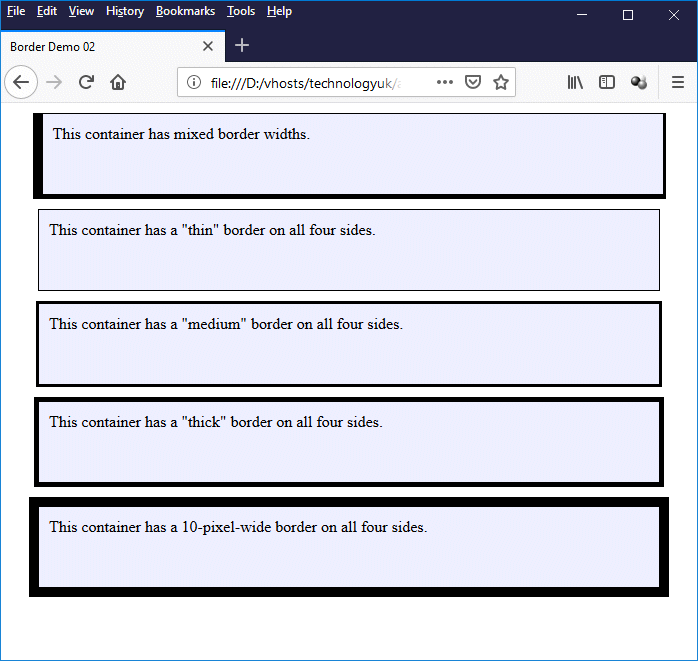
This example demonstrates effect of assigning different values to the border width properties
In addition to the "longhand" border width properties, there is also a "shorthand" border width property (border-width) that allows us to set values for the border widths on all four sides at the same time with a single line of code. In the borders-demo-02.html example, we could achieve exactly the same result by replacing this:
div.a {
border-top-width: thin;
border-right-width: medium;
border-bottom-width: thick;
border-left-width: 10px;
}
div.b {
border-top-width: thin;
border-right-width: thin;
border-bottom-width: thin;
border-left-width: thin;
}
div.c {
border-top-width: medium;
border-right-width: medium;
border-bottom-width: medium;
border-left-width: medium;
}
div.d {
border-top-width: thick;
border-right-width: thick;
border-bottom-width: thick;
border-left-width: thick;
}
div.e {
border-top-width: 10px;
border-right-width: 10px;
border-bottom-width: 10px;
border-left-width: 10px;
}
with this:
div.a { border-width: thin medium thick 10px; }
div.b { border-width: thin; }
div.c { border-width: medium; }
div.d { border-width: thick; }
div.e { border-width: 10px; }
For the values assigned in the first line, we don't have to explicitly state which values apply to which side. They will be applied clockwise, starting with the value for border-top-width, followed by border-right-width, then border-bottom-width, and finally border-left-width. The border-width property can take from one to four values, which will be interpreted as follows:
A final set of "longhand" border properties allows us to set the border's colour:
Each of these border colour properties can be set using any valid colour value (such as colour names, hexadecimal colour values, RGB/RGBA colours, or HSL/HSLA colours.
The HTML code below creates a web page containing a number of <div> elements that demonstrate the effect of setting the various "long-hand" border colour properties to different values (all of the <div> elements have been given a fixed-width solid border, but you can play around with the CSS rules to see the effect of mixing different border widths, styles and colours).
<!doctype html>
<html lang="en">
<head>
<meta charset="utf-8">
<title>Border Demo 03</title>
<style>
div {
float: left;
width: 170px;
height: 230px;
margin: 10px;
padding: 10px;
background: #eeeeff;
border-width: 10px;
border-style: solid;
}
div.a {
border-top-color: red;
border-right-color: green;
border-bottom-color: blue;
border-left-color: yellow;
}
div.b {
border-top-color: #ff0000;
border-right-color: #008000;
border-bottom-color: #0000ff;
border-left-color: #ffff00;
}
div.c {
border-top-color: rgb(255,0,0);
border-right-color: rgb(0,127,0);
border-bottom-color: rgb(0,0,255);
border-left-color: rgb(255,255,0);
}
div.d {
border-top-color: hsl(0,100%,50%);
border-right-color: hsl(120,100%,25%);
border-bottom-color: hsl(240,100%,50%);
border-left-color: hsl(60,100%,50%);
}
</style>
</head>
<body>
<div class="a">This container's borders have named colours.</div>
<div class="b">This container's borders have hex-valued colours.</div>
<div class="c">This container's borders are coloured with the rgb() function.</div>
<div class="d">This container's borders are coloured with the hsl() function.</div>
<div>This container's borders are the default colour.</div>
</body>
</html>
Copy and paste this code into a new file in your HTML editor, save the file as border-demo-03.html, and open the file in a web browser. You should see something like the illustration below.
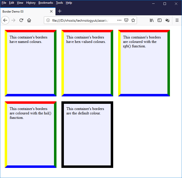
This example demonstrates effect of assigning different values to the border colour properties
In addition to the "longhand" border colour properties, there is also a "shorthand" border colour property (border-color) that allows us to set values for the border colours on all four sides at the same time with a single line of code. In the borders-demo-03.html example, we could achieve exactly the same result by replacing this:
div.a {
border-top-color: red;
border-right-color: green;
border-bottom-color: blue;
border-left-color: yellow;
}
div.b {
border-top-color: #ff0000;
border-right-color: #008000;
border-bottom-color: #0000ff;
border-left-color: #ffff00;
}
div.c {
border-top-color: rgb(255,0,0);
border-right-color: rgb(0,127,0);
border-bottom-color: rgb(0,0,255);
border-left-color: rgb(255,255,0);
}
div.d {
border-top-color: hsl(0,100%,50%);
border-right-color: hsl(120,100%,25%);
border-bottom-color: hsl(240,100%,50%);
border-left-color: hsl(60,100%,50%);
}
with this:
div.a { border-color: red green blue yellow; }
div.b { border-color: #ff0000 #008000 #0000ff #ffff00; }
div.c { border-color: rgb(255,0,0) rgb(0,127,0) rgb(0,0,255) rgb(255,255,0); }
div.d { border-color: hsl(0,100%,50%) hsl(120,100%,25%) hsl(240,100%,50%) hsl(60,100%,50%); }
We don't have to explicitly state which values apply to which side. They will be applied clockwise, starting with the value for border-top-color, followed by border-right-color, then border-bottom-color, and finally border-left-color. The border-color property can take from one to four values, which will be interpreted as follows:
As you can see, the colour of an element's border can be specified in various ways. We can even set it to be transparent if we wish; it will still be there, it just won't be visible. We can also omit to specify a border colour at all, in which case the border colour would be dependent on the value assigned to the element's color property.
Note that, for borders whose border-style property is set to groove, ridge, inset or outset, more than one colour will be needed in order to create the required 3D effect. The colours actually used will depend on the colour specified for the border, the kind of effect to be achieved, and to some extent on the browser implementation.
The margin area is an area that extends beyond the outer edges of an element's border area. It can be thought of as an extension of the border area that includes the element's margins; it is bounded by the margin edge. The margin properties are used to specify the thickness of the margin that is added to the top, bottom, left-hand side and right-hand side of the border box. There are four "longhand" margin properties:
The HTML code below creates a web page in which a <div> element encloses a second <div> element, which in turn encloses a block of text. We have styled both <div> elements to have a one-pixel border on all four sides. The margin-top, margin-right, margin-bottom and margin-left properties for the inner <div> element have assigned values of "10px", "20px", "30px" and "40px" respectively. We have set its background colour to grey so that you can see the result.
<!doctype html>
<html lang="en">
<head>
<meta charset="utf-8">
<title>Margin Demo 01</title>
<style>
div {
border: solid 1px;
}
div.margin {
margin-top: 20px;
margin-right: 40px;
margin-bottom: 60px;
margin-left: 80px;
background: #eeeeee;
}
</style>
</head>
<body>
<div>
<div class="margin">
Lorem ipsum dolor sit amet, consectetur adipiscing elit. Sed blandit libero sit amet nunc ultricies, eu feugiat diam placerat. Phasellus tincidunt nisi et lectus pulvinar, quis tincidunt lacus viverra. Phasellus in aliquet massa. Integer iaculis massa id dolor venenatis scelerisque. Morbi non eros a ex interdum molestie in eget leo. Proin pulvinar facilisis eros, sed porta ante imperdiet ut. Suspendisse tincidunt facilisis metus non faucibus. Integer posuere vehicula congue. Sed pharetra felis sapien, at imperdiet diam lacinia quis. Sed pharetra turpis et dui aliquam, in rhoncus elit ornare. Quisque posuere consequat nunc in rutrum. Praesent leo nibh, porta et arcu quis, placerat tincidunt turpis.
</div>
</div>
</body>
</html>
Copy and paste this code into a new file in your HTML editor, save the file as margin-demo-01.html, and open the file in a web browser. You should see something like the illustration below.
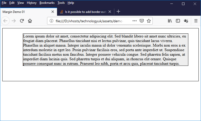
This example demonstrates the effect of adding margins to a <div> element
Because the <div> element is a block-level element, it takes up all of the available width of its parent container, which in this case is the outer <div> element. The outer <div> element in turn takes up all of the available width of its parent container, which is the <body> element. The height of the inner <div> element is determined by the height of its contents, the thickness of its top and bottom borders, and the thickness of its top and bottom margins (we have not applied any padding to the element).
The height of the content will depend on how many lines of text there are. The addition of a border and margins to the left and right of the text will reduce the width of the content box, which means that fewer words will fit on each line. The content box will increase in height each time an additional line of text is required.
In addition to the "longhand" margin properties, there is also a "shorthand" margin property (margin) that allows us to set values for the margins on all four sides with a single line of code. In the margin-demo-01.html example, we could achieve exactly the same result by replacing this:
div.margin {
margin-top: 20px;
margin-right: 40px;
margin-bottom: 60px;
margin-left: 80px;
background: #eeeeee;
}
with this:
div.margin {
margin: 20px 40px 60px 80px;
background: #eeeeee;
}
Note that we don`t need to explicitly state which values apply to which side. The values are applied clockwise, starting with the value for margin-top, followed by margin-right, then margin-bottom, and finally margin-left. The margin property can take from one to four values, which will be interpreted as follows:
Note that margin values can be negative, although there may be implementation-specific limitations on the use of negative margins. If percentage values are used, they refer to the width of the element's parent container regardless of whether they are applied to the top, bottom, left-hand or right-hand margins (if the width of the container is dependent on its contents, the effect of setting a percentage value is undefined).
Note also that if an element's margins are set to zero on all four sides (this is the default setting), then the margin edge will coincide with the border edge.
The margin properties can be applied to all (displayable) HTML elements except <table-row-group>, <table-header-group>, <table-footer-group>, <table-row>, <table-cell>, <table-column-group> and <table-column>.
One of the quirks (for want of a better word) of the CSS box model is that adjacent vertical margins of block-level elements will automatically merge - a feature known as margin auto collapse. Instead of being added together, the bottom margin of the higher element and the top margin of the lower element will be merged into a single margin that is assigned the width of the widest of the two individual margins (assuming they are different).
The following HTML code creates a web page that demonstrates this phenomenon:
<!doctype html>
<html lang="en">
<head>
<meta charset="utf-8">
<title>Margin Demo 02</title>
<style>
div {
border: solid 1px;
}
div.margin {
margin: 20px 40px 60px 80px;
background: #eeeeee;
}
span.margin {
margin: 80px;
background: #ffeeee;
border: solid 1px;
}
</style>
</head>
<body>
<div>
<div class="margin">
<span class="margin">Lorem</span><span class="margin">ipsum</span> dolor sit amet, consectetur adipiscing elit. Sed blandit libero sit amet nunc ultricies, eu feugiat diam placerat. Phasellus tincidunt nisi et lectus pulvinar, quis tincidunt lacus viverra. Phasellus in aliquet massa. Integer iaculis massa id dolor venenatis scelerisque. Morbi non eros a ex interdum molestie in eget leo. Proin pulvinar facilisis eros, sed porta ante imperdiet ut. Suspendisse tincidunt facilisis metus non faucibus. Integer posuere vehicula congue. Sed pharetra felis sapien, at imperdiet diam lacinia quis. Sed pharetra turpis et dui aliquam, in rhoncus elit ornare. Quisque posuere consequat nunc in rutrum. Praesent leo nibh, porta et arcu quis, placerat tincidunt turpis.
</div>
<div class="margin">
Lorem ipsum dolor sit amet, consectetur adipiscing elit. Sed blandit libero sit amet nunc ultricies, eu feugiat diam placerat. Phasellus tincidunt nisi et lectus pulvinar, quis tincidunt lacus viverra. Phasellus in aliquet massa. Integer iaculis massa id dolor venenatis scelerisque. Morbi non eros a ex interdum molestie in eget leo. Proin pulvinar facilisis eros, sed porta ante imperdiet ut. Suspendisse tincidunt facilisis metus non faucibus. Integer posuere vehicula congue. Sed pharetra felis sapien, at imperdiet diam lacinia quis. Sed pharetra turpis et dui aliquam, in rhoncus elit ornare. Quisque posuere consequat nunc in rutrum. Praesent leo nibh, porta et arcu quis, placerat tincidunt turpis.
</div>
</div>
</body>
</html>
Copy and paste this code into a new file in your HTML editor, save the file as margin-demo-02.html, and open the file in a web browser. You should see something like the illustration below.
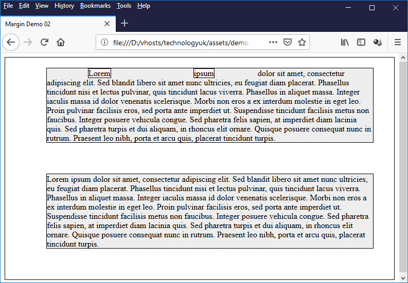
This example demonstrates phenomenon of margin auto collapse
As you can see from the illustration, the vertical spacing between the two inner <div> elements has exactly the same width as that of the bottom margin that applies to both inner <div> elements (i.e. 60 pixels). The second <div> element's top margin, which would otherwise have added 20 pixels to the vertical distance separating the two inner <div> elements, has been ignored.
Note also that we have applied an 80-pixel wide margin to all four sides of the <span> elements enclosing the first and second words within the first block of text, and have removed the space character from between the words. We also gave the <span> elements a background colour and a border to enable you to clearly see what the effect of adding these margins will be.
There are two interesting things to note here. The first is that the automatic margin collapse obviously does not apply to adjacent horizontal margins, since the distance between them is 160 pixels and not 80 pixels. The second thing to note is that the top and bottom margins we set for the <span> elements have been ignored altogether. This serves to highlight the fact that assigning a top or bottom margin to any non-replaced inline element using CSS is pointless, because it will always be ignored.
One final thing we should perhaps mention here is that there are a number of specific circumstances in which margin auto collapse does not occur (for example, where one or both of the adjoining elements is floated or absolutely positioned), but a detailed examination of all of the circumstances in which this is the case is beyond the scope of this article.
In the page "HTML Building Blocks" in this section, we stated that most HTML elements can be described as either block-level elements or inline elements. We can, however, change the default behaviour of an HTML element in this respect by changing the value assigned to its display property. Before we go any further, let's briefly review what we know about block-level and inline elements and the basic differences between them.
A block-level element like <p> or <div> has its display property is set to "block" and is rendered by the browser as if there are line breaks both before and after it. By default, it takes up the full width of its parent container and its height will be determined by its contents (which can be other block-level elements, inline elements, text, or data), but we can set its width or height explicitly using CSS.
An inline element like <span> behaves very differently. It has its display property set to "inline", and it will appear on the same line as any text or other HTML elements immediately surrounding it. Like the block-level element, its size is determined by its content. Unlike the block-level element, its content will break at the end of a line. Its width and height cannot be set using CSS.
We are going to concentrate here on the <div> and <span> elements. The <div> element is a generic block-level container, and the <span> element is its inline counterpart. In fact, the only difference between these two elements is that the <div> element's display property defaults to "block" and the <span> element's display property defaults to "inline".
Although a number of different values can be assigned to an element's display property, only three are of immediate interest to us. We have already seen the effect of two of these - block and inline. The third is inline-block, which as you may have guessed causes an element to display some of the characteristics of both block-level and inline elements.
An element whose display property is set to inline-block will flow with the surrounding text and other HTML elements rather than requiring a line break to occur before and after it, but its contents will not break at the end of a line and it will always be displayed as a block. This means that if there is not enough room for it to be displayed on the current line, it will be moved to the next line. It can also have its width and height set using CSS.
The HTML code below creates a web page that demonstrates the effect of using the block, inline and inline-block values to change the default behaviour of the <div> and <span> elements.
<!doctype html>
<html lang="en">
<head>
<meta charset="utf-8">
<title>Display Property Demo</title>
<style>
.inline-display {
width: 200px;
height: 50px;
margin: 10px;
padding: 10px;
border: solid 1px #ff0000;
background: rgba(255,192,192,0.5);
display: inline;
}
.block-display {
width: 200px;
height: 50px;
margin: 10px;
padding: 10px;
border: solid 1px #00ff00;
background: #eeffee;
display: block;
}
.inline-block-display {
width: 200px;
height: 50px;
margin: 10px;
padding: 10px;
border: solid 1px #0000ff;
background: #eeeeff;
display: inline-block;
}
div.parent { background: #eeeeee; }
</style>
</head>
<body>
<h1>Inline Elements</h1>
<div class="parent">
<span class="inline-display">Inline span.</span>
<div class="inline-display">Inline div.</div>
<span class="inline-display">Inline span. We have added text to this box to demonstrate what happens at the end of a line . . .</span>
</div>
<hr>
<h1>Block-level Elements</h1>
<div class="parent">
<div class="block-display">Block-level div.</div>
<span class="block-display">Block-level span.</span>
<div class="block-display">Block-level div.</div>
</div>
<hr>
<h1>Inline-block Elements</h1>
<div class="parent">
<span class="inline-block-display">Inline-block span.</span>
<div class="inline-block-display">Inline-block div.</div>
<span class="inline-block-display">Inline-block span.</span>
<div class="inline-block-display">Inline-block div.</div>
</div>
</body>
</html>
Copy and paste this code into a new file in your HTML editor, save the file as display-property-demo.html, and open the file in a web browser. You should see something like the illustration below.
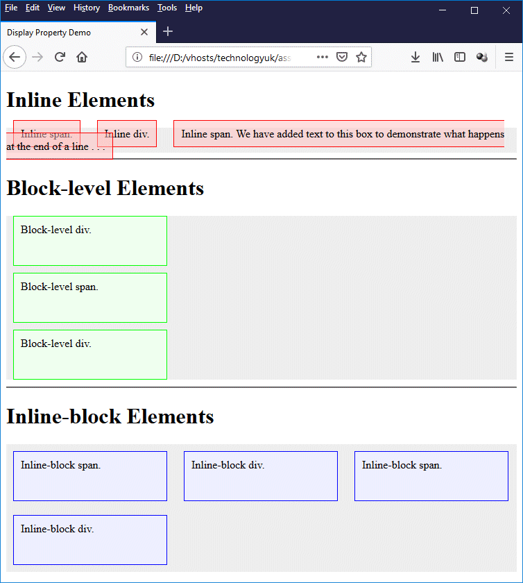
This example demonstrates the effect of changing an element's display property
Quite a number of interesting things emerge here. First of all, immediately underneath the heading "Inline Elements" we have a <div> element that contains another <div> element flanked on either side by <span> elements. All three of these elements contain some text, and all behave exactly the same way (i.e. as inline <span> elements) because we have set the display property of each to "inline" using the "inline-display" class.
We added a bit more text to the last <span> element to make it break at the end of the line (you may have to resize your browser window to make this happen), and as you can see, the <span> element's border-box breaks along with it. Note also that the padding (which is semi-transparent), extends above and below the <span> element, but only affects the horizontal placement of the text and other elements. It does not affect their vertical placement.
Under the next heading, "Block-level Elements", we have a <div> element containing a <span> element between two <div> elements. The elements are vertically stacked within their parent container (another <div> element) because all three have had their display property set to "block" using the "block-display" class.
You should by now be fairly comfortable with the idea that changing the <span> element's display property to "block" will effectively turn it into a <div> element. What might be puzzling you is the behaviour of the vertical margins within the parent container. We set the margins to 10 pixels all round (we did this, in fact, for all of our classes except the parent class).
You have probably realised why the vertical margin between the inner <div> and <span> elements are only 10 pixels wide and not 20 pixels, which would be the sum of the adjacent top and bottom margins. This is due to the margin auto collapse phenomenon which we described above. But why is there no margin between the first <div> element and the top of its parent container, or between the last <div> and the bottom of its parent container?
The answer is relatively simple. The top <div> element's margin is "touching" the margin of the <h1> element immediately above its parent container by virtue of the fact that the parent <div> has no padding or borders set.
If we set the padding-top property of the parent <div> to "1px", there would no longer be any contact between the top-most <div> element within the container and the <h1> element above it, and the top margin of the top-most inner <div> element would be restored. The same result could be achieved for the bottom-most <div> element by setting the padding-bottom property of the parent <div> element to "1px" (i.e. its bottom margin would be restored).
The next question you may have probably concerns the elements in the last parent <div> container, which we find under the heading "Inline-block Elements". As you can see, these elements behave like block-level elements in some respects and like inline element in others, because we have set the display property for all of them to "inline-block".
Setting the width and height properties for these elements will have an effect, but at the same time, they will also be displayed on the same line across the page, and will only "break" to the next line when there is no more space on the current line. What you may find puzzling is that, in this case, the top margins of the <div> and <span> elements adjacent to the top of the parent <div> have not collapsed.
If you think back to what we said earlier about margin auto collapse, you may recall that this does not occur if one or both of the adjoining elements is floated or absolutely positioned. Without going into lengthy and detailed explanations, the same applies if we set an element's display property to "inline-block", because by so doing we are putting the element outside the normal flow of the document, and the usual rules no longer apply.