| Author: | |
| Website: | |
| Page title: | |
| URL: | |
| Published: | |
| Last revised: | |
| Accessed: |
The CSS Flexible Box Layout Module Level 1 was first published in 2009 as a working draft. Flexbox achieved W3C candidate recommendation early in 2016, and is now supported by current versions of all mainstream browsers. It is described in various sources as a "one-dimensional" layout technology, because it allows web developers to control the layout of HTML elements within a row or a column (as opposed to a grid).
That's not to say that we can't use Flexbox to create grid-like layouts; it simply means that it was not specifically intended to fulfil that role (we'll be looking at the slightly more recent CSS Grid Layout Module Level 1 in the page "CSS Grid Layout"). What Flexbox allows us to do with relative ease, by comparison with "legacy" layout methods, can be summarised as follows:
The general idea is that the content should "flex" in order to occupy the space available, either by shrinking to fit into a smaller space, or by expanding to fill a larger space.
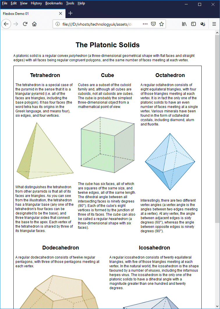
Perhaps the best way to demonstrate the kind of thing Flexbox is good at is to go straight to an example. The HTML code below reproduces the five-column page we created in the page "CSS Layout - Legacy Methods" using floats. This time, however, we'll use Flexbox.
<!doctype html>
<html lang="en">
<head>
<meta charset="utf-8">
<title>Flexbox Demo 01</title>
<style>
body {
padding: 1em 5%;
font-family: sans-serif;
font-size: 75%;
}
h1, h2 { text-align: center; }
main {
border: 1px solid;
display: flex;
}
section { padding: 0.5em; }
img {
width: 100%;
margin: 1em 0;
}
</style>
</head>
<body>
<h1>The Platonic Solids</h1>
<p>
A platonic solid is a regular convex <em>polyhedron</em> (a three-dimensional geometrical shape with flat faces and straight edges) with all faces being regular congruent polygons, and the same number of faces meeting at each vertex.
</p>
<main>
<section>
<h2>Tetrahedron</h2>
<p>
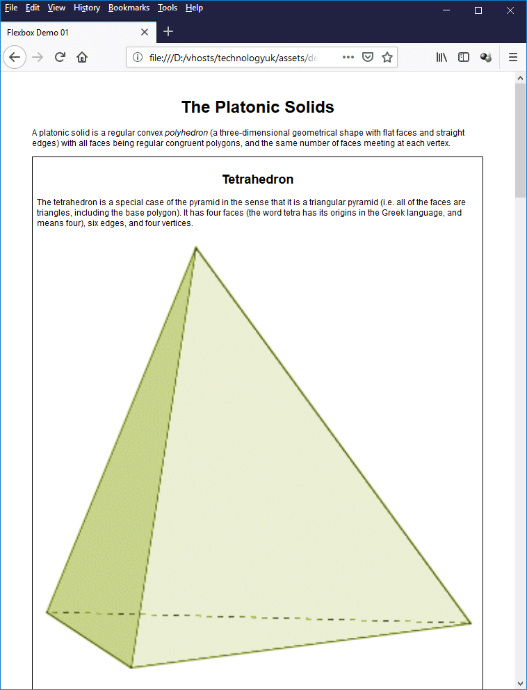
The tetrahedron is a special case of the pyramid in the sense that it is a triangular pyramid (i.e. all of the faces are triangles, including the base polygon). It has four faces (the word tetra has its origins in the Greek language, and means four), six edges, and four vertices.
<img class="left" src="https://www.technologyuk.net/assets/demo-images/platonic01.gif" alt="Tetrahedron">
What distinguishes the tetrahedron from other pyramids is that all of its faces are triangles. As you can see from the illustration, the tetrahedron has a triangular base (any one of the tetrahedron's four faces can be designated to be the base), and three triangular sides that connect the base to the apex. Each vertex of the tetrahedron is shared by three of its triangular faces.
</p>
</section>
<section>
<h2>Cube</h2>
<p>
Cubes are a subset of the cuboid family and, although all cubes are cuboids, not all cuboids are cubes. The cube is probably the simplest three-dimensional object from a mathematical point of view.
<img class="left" src="https://www.technologyuk.net/assets/demo-images/platonic02.gif" alt="Cube">
The cube has six faces, all of which are squares of the same size, and twelve edges, all of the same length. The dihedral angle between all intersecting faces is ninety degrees (90°). Each of the cube's eight vertices is formed by the junction of three of its faces. The cube can also be called a regular <em>hexahedron</em> (a three-dimensional shape with six faces).
</p>
</section>
<section>
<h2>Octahedron</h2>
<p>
A regular octahedron consists of eight equilateral triangles, with four of those triangles meeting at each vertex. It is in fact the only one of the platonic solids to have an even number of faces meeting at a single vertex. Various minerals have been found in the form of octahedral crystals, including diamond, alum and fluorite.
<img class="left" src="https://www.technologyuk.net/assets/demo-images/platonic03.gif" alt="Octahedron">
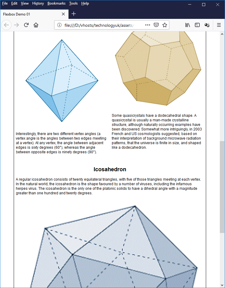
Interestingly, there are two different vertex angles (a vertex angle is the angles between two edges meeting at a vertex). At any vertex, the angle between adjacent edges is sixty degrees (60°), whereas the angle between opposite edges is ninety degrees (90°).
</p>
</section>
<section>
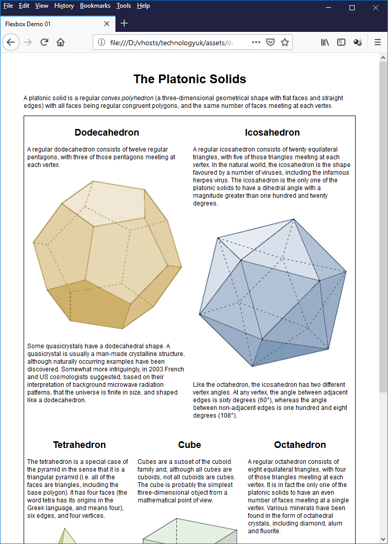
<h2>Dodecahedron</h2>
<p>
A regular dodecahedron consists of twelve regular pentagons, with three of those pentagons meeting at each vertex.
<img class="left" src="https://www.technologyuk.net/assets/demo-images/platonic04.gif" alt="Dodecahedron">
Some quasicrystals have a dodecahedral shape. A quasicrystal is usually a man-made crystalline structure, although naturally occurring examples have been discovered. Somewhat more intriguingly, in 2003 French and US cosmologists suggested, based on their interpretation of background microwave radiation patterns, that the universe is finite in size, and shaped like a dodecahedron.
</p>
</section>
<section>
<h2>Icosahedron</h2>
<p>
A regular icosahedron consists of twenty equilateral triangles, with five of those triangles meeting at each vertex. In the natural world, the icosahedron is the shape favoured by a number of viruses, including the infamous herpes virus. The icosahedron is the only one of the platonic solids to have a dihedral angle with a magnitude greater than one hundred and twenty degrees.
<img class="left" src="https://www.technologyuk.net/assets/demo-images/platonic05.gif" alt="Icosahedron">
Like the octahedron, the icosahedron has two different vertex angles. At any vertex, the angle between adjacent edges is sixty degrees (60°), whereas the angle between non-adjacent edges is one hundred and eight degrees (108°).
</p>
</section>
</main>
</body>
</html>
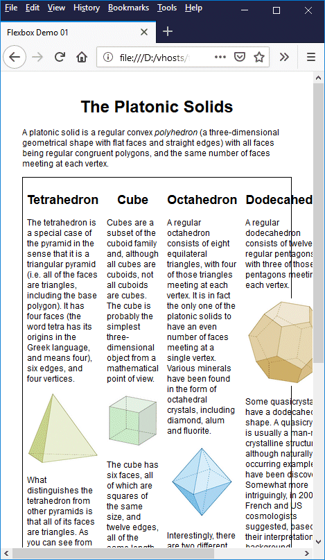
Copy and paste this code into a new file in your HTML editor, save the file as css-flexbox-demo-01.html, and open the file in a web browser. You should see something like the illustration below.
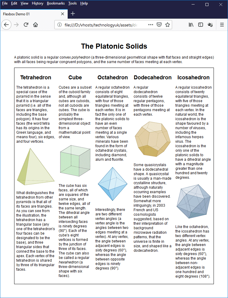
A five-column page layout using Flexbox
The most interesting feature here is the CSS code:
<style>
body {
padding: 1em 5%;
font-family: sans-serif;
font-size: 75%;
}
h1, h2 { text-align: center; }
main {
border: 1px solid;
display: flex;
}
section { padding: 0.5em; }
img {
width: 100%;
margin: 1em 0;
}
</style>
The first thing that should grab your attention is this CSS rule:
display: flex;
This code does a lot of work. It tells the browser that the <main> element is a flex container. That means that the immediate children of that container should be treated as flex items. The result is a multiple column layout, with equal-width columns. Furthermore, the columns are all the same height.
By default, a flex container treats its immediate children (the flex items) as flexible boxes and arranges them in a row, automatically giving each flexible box the same width and height. We no longer have to worry about "floating" the boxes so that they sit next to one another, or about calculating the percentage of the total available width we need to allocate to each box, or even about issues related to boxes with different heights.
So far so good, but before we proceed any further it might be useful to examine what W3C has to say about the Flexbox layout model, and its associated terminology. The following illustration is taken from the CSS Flexible Box Layout Module Level 1 W3C Candidate Recommendation, 19 November 2018 (Flex Layout Box Model and Terminology):
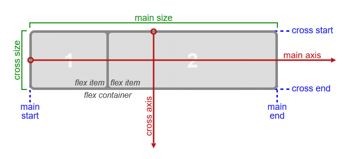
The directions and sizing terms applied to a row flex container
The terms shown on the diagram can be briefly described as follows:
In a nutshell, if the flex items within the flex container are being laid out as a row, then the main axis is in the horizontal direction, the main start and main end will be the left- and right-hand edges of the flex container (or vice versa, depending on text-direction), and the main size of each box will be equal to its width property.
If the flex items within the flex container are being laid out as a column, then the main axis is in the vertical direction, the main start and main end will be the top and bottom edges of the flex container (again, depending on text-direction), and the main size of each box will be equal to its height property.
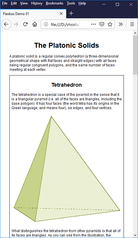
By default, the flex items in a flex container are laid out in a row, and the main axis runs in the horizontal direction. We can turn the flex container into a column by setting the value of the flex-direction property to "column" (by default, it is set to "row"). Temporarily change the CSS code that styles the <main> element in the file css-flexbox-demo-01.html to the following:
main {
border: 1px solid;
display: flex;
flex-direction: column;
}
If you save the file and reopen it in a web browser, you should now see something like the following illustration:
We have set the flex-direction property to "column"
As you can see, the result is that the page now looks very much like it would have if we had not used a flex container at all. While we're on the subject of the flex-direction property, there are two other values that may be used, namely "row-reverse" and "column-reverse". As you might expect, these values work exactly the same as the "row" and "column" values, except that the ordering of the flex items within the row or column is reversed.
Change the CSS code that styles the <main> element in the file css-flexbox-demo-01.html once more, this time to the following:
main {
border: 1px solid;
display: flex;
flex-direction: row-reverse;
}
If you save the file and reopen it in a web browser, you should now see something like the following:
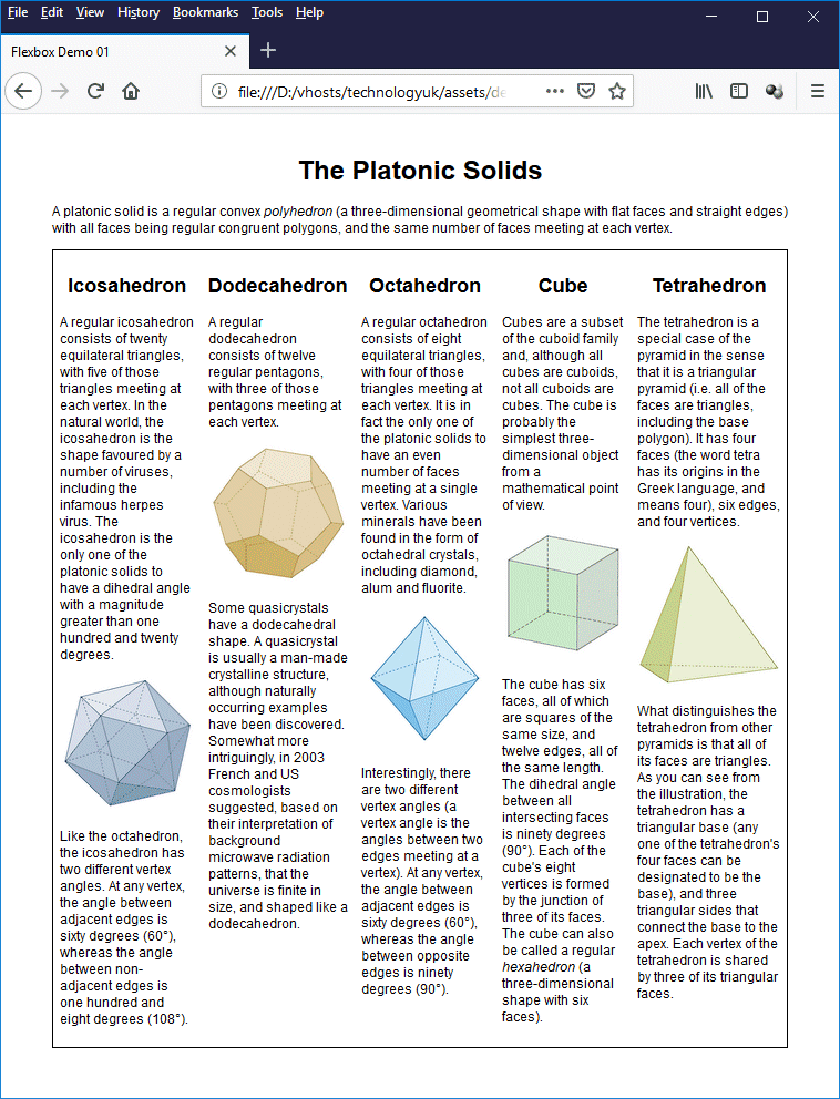
We have set the flex-direction property to "row-reverse"
As you can see, the page now looks exactly as it did previously except that the order of the columns has been reversed. The first column describes the icosahedron, while details of the tetrahedron now appear in the last column.
This ability to reverse (or otherwise manipulate) the ordering of flex items could be very useful under the right circumstances, but should be used with care, especially in situations where a user is navigating using the keyboard rather than a mouse or touchscreen, since by default the document's tab order will correspond to the ordering of elements within the HTML document.
Flexbox gets its name from the fact that the contents of a flex container are flexible. They will grow or shrink as required to fill the available space in the horizontal or vertical direction, depending on the orientation of the main axis. As with most things in life, however, Flexbox has its limitations when it comes to shrinking things; there is a point beyond which flex items cannot be further compressed. Look what happens when we reduce the width of the browser window for our "Platonic Solids" page beyond a certain point:
The flex items overflow the flex container
The flex items now extend beyond the right-hand boundary of the flex container. Note that, if we were to set the flex-direction property to "row-reverse", the flex items would not only appear in the reverse order, they would start at the right hand boundary of the flex container, and any overflow would extend in the opposite direction, i.e. beyond the left-hand boundary of the flex container.
The columns in our page still exist, but the user will have to scroll horizontally in order to see the right-most columns - not a particularly desirable state of affairs. Fortunately, there is an easy way to resolve this problem. Change the CSS code for the <main> element to the following:
main {
border: 1px solid;
display: flex;
flex-wrap: wrap;
}
If you save the file and reopen it in a web browser, you should now see something like the following:
We have set the flex-wrap property to "wrap"
This is actually fine if we maintain the browser window at (or close to) the width shown. Unfortunately, if we make the browser window wider once more, we will still only have a single column, which rather defeats the object of using a flexible container. Change the CSS code for the <section> element to the following:
section {
padding: 0.5em;
flex: 200px;
}
Save the file once more and reopen it in a web browser. You should now see something like the following (try changing the width of your browser window to see what happens as the horizontal space available changes):
We have set the flex property for the <section> element to "200px"
The flex-wrap property can take one of three values: "nowrap" (this is the default), "wrap" and "wrap-reverse". The effect of "wrap-reverse" is the same as that of "wrap", except that, if the contents of the flex container are forced to wrap, the line order is reversed:
We have set the flex-wrap property for the <main> element to "wrap-reverse"
The CSS rule flex: 200px; tells the browser that each <section> element should have an initial width of 200 pixels. The browser will fit as many 200 pixel-wide flex items into the width of the flex container as it can. Any horizontal space left over will, by default, be distributed evenly between those flex items. Any flex items that do not fit on the first line will be wrapped to the second line; items that don't fit on the second line will be wrapped to the third line, and so on.
Before we leave the subject of wrapping flex items within a flex container it is probably worth mentioning that we can set both the flex-direction property and the flex-wrap property using the shorthand property flex-flow. For example, instead of writing this:
flex-direction: row; flex-wrap: wrap;
we could simply write this instead, which does exactly the same thing:
flex-flow: row wrap;
The flex property applies to flex items, and is actually a shorthand property that can represents up to three distinct Flexbox properties simultaneously:
The official recommendation is to stick to the shorthand flex property. W3C has this to say:
"Authors are encouraged to control flexibility using the flex shorthand rather than with flex-basis directly, as the shorthand correctly resets any unspecified components to accommodate common uses."
If you have been experimenting with resizing the current version of the "Platonic Solids" page, you will probably realise that we still have a problem. Our flex container contains an odd number of flex items (five, to be precise). If we resize the browser window so that only two items fit into a line, the last item sits in a line all by itself. By default, it will take up the full width of the flex container. The illustration below shows what this looks like.
The final flex item occupies the full width of the flex container
The icosahedron image has been enlarged to more than twice its original size in order to fill the space available to it. Unfortunately, it was never intended to be viewed at this size and just doesn't look very good. In fact, if we reduce the browser width so that there is not quite enough space for more than one flex item in a line, all of the images will be displayed at almost twice their actual size.
We should be able to limit the degree to which a flex item of this nature grows - and of course we can. In fact, there are a number of ways in which we can approach this problem. For the moment, we'll settle for limiting the maximum width of a flex item to 280 pixels, which is the actual size of the GIF images used to illustrate the various platonic solids. Change the CSS code for the <section> element once more, this time to the following:
section {
padding: 0.5em;
flex: 200px;
max-width: 280px;
}
Save the file again and reopen it in a web browser. You should now see something like the illustration below.
We have set the max-width property for the <section> element to "280px"
Setting the <section> element's flex property to a value of "200px" sets its flex-basis property to a value of "200px", ensuring that no flex item will have a width of less than 200 pixels, but by setting its max-width property to "280px", we also ensure that no flex item will exceed 280 pixels in width, regardless of how much additional horizontal space is available. Thus, as you can see from the illustration, even when the icosahedron is the only item in the last line of the flex container, it will only occupy a column width of 280 pixels.
One of the problems facing developers before Flexbox came along was how to create responsive multi-column layouts without jumping through too many hoops. We have already seen how it is possible to create multi-column layouts using floats, percentages, and various workarounds (like the "clearfix" hack for dealing with the problem of columns with different heights).
Flexbox makes multi-column layouts easy. We have already created a multi-column layout using Flexbox in which each column in a flex container is allocated an equal amount of space. We have looked at one way in which we can constrain the column widths to minimum and maximum values using a combination of the flex-basis and max-width properties.
We can also utilise the flex-grow and flex-shrink properties to control column widths. The following HTML code creates a web page that displays randomly generated paragraphs of text in three columns, each of which is allocated a different proportion of the available width using the flex-grow property:
<!doctype html>
<html lang="en">
<head>
<meta charset="utf-8">
<title>Flexbox Demo 02</title>
<style>
body {
padding: 1em 5%;
font-family: sans-serif;
}
h1 { text-align: center; }
main {
padding: 1em;
border: 1px solid;
display: flex;
}
div.col_1, div.col_2, div.col_3 {
box-sizing: border-box;
padding: 0 1em;
}
.col_1 {
flex: 3;
background: powderblue;
font-size: 65%;
}
.col_2 {
flex: 4;
background: beige;
font-size: 90%;
}
.col_3 {
flex: 5;
background: darkseagreen;
font-size: 100%;
}
</style>
</head>
<body>
<h1>Proportional Column Widths</h1>
<main>
<div class="col_1">
<p>
Lorem ipsum dolor sit amet, consectetur adipiscing elit, sed do eiusmod tempor incididunt ut labore et dolore magna aliqua. Dictum sit amet justo donec enim diam vulputate ut. Egestas dui id ornare arcu. Id eu nisl nunc mi ipsum faucibus vitae aliquet. Non blandit massa enim nec dui nunc mattis. Ut morbi tincidunt augue interdum velit. Sed odio morbi quis commodo odio aenean sed adipiscing. Feugiat in fermentum posuere urna nec tincidunt praesent semper. Nisl tincidunt eget nullam non nisi. Erat imperdiet sed euismod nisi porta. Sodales neque sodales ut etiam sit amet nisl purus. Fermentum et sollicitudin ac orci phasellus egestas tellus rutrum tellus. Pellentesque habitant morbi tristique senectus et netus. Nunc lobortis mattis aliquam faucibus purus in. Senectus et netus et malesuada fames ac turpis egestas maecenas. Id leo in vitae turpis massa sed. Purus faucibus ornare suspendisse sed nisi lacus sed viverra tellus. Nec feugiat in fermentum posuere urna nec. Pulvinar neque laoreet suspendisse interdum consectetur libero id. Morbi enim nunc faucibus a pellentesque sit amet porttitor.
</p>
</div>
<div class="col_2">
<p>
Libero nunc consequat interdum varius sit amet. Aliquam ut porttitor leo a diam sollicitudin tempor. Gravida in fermentum et sollicitudin ac orci phasellus egestas. Nec tincidunt praesent semper feugiat nibh sed pulvinar. Interdum velit laoreet id donec ultrices tincidunt arcu. Pharetra convallis posuere morbi leo urna molestie at elementum eu. Fringilla phasellus faucibus scelerisque eleifend donec pretium vulputate. Nunc lobortis mattis aliquam faucibus purus. Ornare suspendisse sed nisi lacus sed viverra tellus in. Odio morbi quis commodo odio aenean. Dictum sit amet justo donec enim diam.
</p>
</div>
<div class="col_3">
<p>
Elementum pulvinar etiam non quam lacus suspendisse. Donec massa sapien faucibus et molestie. Diam maecenas ultricies mi eget mauris. Vitae auctor eu augue ut lectus arcu bibendum at. Aliquet eget sit amet tellus. Tristique senectus et netus et malesuada. Aenean vel elit scelerisque mauris pellentesque. Faucibus ornare suspendisse sed nisi lacus sed. Ultricies leo integer malesuada nunc vel risus. Sed nisi lacus sed viverra tellus in hac habitasse. Rhoncus aenean vel elit scelerisque mauris pellentesque. Sollicitudin ac orci phasellus egestas tellus rutrum tellus pellentesque eu. Rhoncus urna neque viverra justo nec ultrices. Tincidunt tortor aliquam nulla facilisi cras fermentum odio eu. Pharetra et ultrices neque ornare aenean euismod elementum. Nisi est sit amet facilisis magna etiam tempor orci. At imperdiet dui accumsan sit. Faucibus nisl tincidunt eget nullam non nisi est. Vel pharetra vel turpis nunc eget lorem.
</p>
</div>
</main>
</body>
</html>
Copy and paste this code into a new file in your HTML editor, save the file as css-flexbox-demo-02.html, and open the file in a web browser. You should see something like the illustration below.
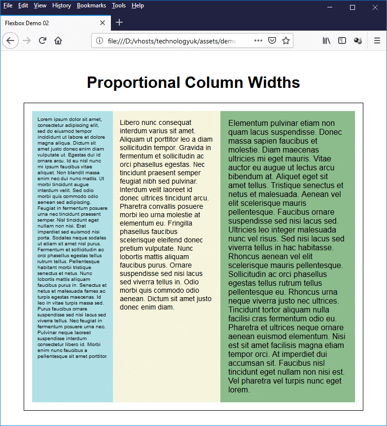
A multi-column page with different column widths
Note that in this example, we are not concerned with wrapping content to the next line. As with the previous example, we have used the <main> element to create the flex container. This time, however, we have used <div> elements for the flex items. Here is the CSS code that sets up the three columns:
.col_1 {
flex: 3;
background: powderblue;
font-size: 65%;
}
.col_2 {
flex: 4;
background: beige;
font-size: 90%;
}
.col_3 {
flex: 5;
background: darkseagreen;
font-size: 100%;
}
The important thing to notice here is the use of the shorthand flex property to set different values for the flex-grow property of each of the classes .col_1, .col_2, and .col_3, namely "3", "4" and "5" respectively. These values define the proportion of the total available width that each column should be allocated. The available width is thus represented by an integer value of 12 (3 + 4 + 5).
The first column's <div> has the class .col_1, and thus gets 3/12 (or 1/4) of the total width; the second column's <div> has the class .col_2 and gets 4/12 (1/3) of the total width; and the last column's <div> has the class .col_3 and gets 5/12 of the total width. This means that if the width of the flex container (excluding any padding) is 720 pixels, the first, second and third columns would be allocated 180 pixels, 240 pixels, and 300 pixels respectively.
Note, for the record, that the values used can be any positive integer or real number. We could, for example, have used the numbers 1.5, 2, and 2.5. Or we could have used 9, 12 and 15. The result would have been the same in each case, but it probably makes sense to use the simplest possible combination of integer values that gives us the desired proportions, if only for the sake of maintaining clarity.
The value allocated to the flex-shrink property defines the flex shrink factor, which determines how much the flex item will shrink relative to any other flex items in the flex container when "negative free space" is distributed. If you don't set a value for the flex-shrink property, it will be set to "1". If all flex items have this value, they will all shrink in the same proportion.
The flex-shrink property can be useful if you want one of the columns in your page to have a minimum width beyond which it will not shrink. You may decide, for example, that you want to create a vertical primary navigation scheme on the left-hand side of the page, in which case you will also want to ensure that the left-hand column is always wide enough to display all of your main navigational links.
This can be achieved by setting the value for the first column's flex-basis property to the desired minimum width, and setting its flex-shrink property to "0". Setting the flex-shrink property for the remaining columns to "1" will ensure that these columns will shrink in equal proportion when the width of the browser window is reduced, but the width of the first column will never be less than the value assigned to its flex-basis property.
To see how this works, amend the CSS code for the "Proportional Column Widths" page to read as follows:
.col_1 {
flex: 3 0 120px;
background: powderblue;
font-size: 65%;
}
.col_2 {
flex: 4 1 160px;
background: beige;
font-size: 90%;
}
.col_3 {
flex: 5 1 200px;
background: darkseagreen;
font-size: 100%;
}
As you can see, we have set values for the flex-basis property in each column's class definition that are in the same proportion as the values allocated to their flex-grow properties. The .col_1 class, however, has its flex-shrink property set to "0", whereas the .col_2 and .col_3 classes both have their flex-shrink property set to "1".
Save the file css-flexbox-demo-02.html once more, and open it in a web browser. Now try shrinking the browser window to see what happens. You will find that, although the second and third columns will shrink as they did previously, the first column will never have a width of less than 120 pixels.
You could also fix the width of the first column to a specific value by assigning that value to its flex-basis property, and assigning a value of "0" to both its flex-grow and flex-shrink properties. The proportion of the remaining space allocated to the other two columns would depend on the values assigned to their respective flex-grow and flex-shrink properties.
So far, we have looked at organising flex items within flex containers so that they occupy all of the available space. There may be occasions, however, when we want our flex items to have a fixed width, regardless of the width of the flex container. Let's see what happens by default. The following HTML code creates a web page that displays the sixteen named colours defined by the W3C HTML 4.01 Recommendation, published in 1999:
<!doctype html>
<html lang="en">
<head>
<meta charset="utf-8">
<title>Flexbox Demo 02</title>
<style>
body {
padding: 1em 5%;
font-family: sans-serif;
}
h1 { text-align: center; }
main {
padding: 1em;
border: 1px solid;
display: flex;
flex-wrap: wrap;
}
.color {
box-sizing: border-box;
padding: 20px 0;
margin: 10px;
border: 1px solid #888888;
font-family: monospace;
font-size: 120%;
color: white;
text-align: center;
line-height: 30px;
flex: 0 0 140px;
height: 100px;
}
</style>
</head>
<body>
<h1>HTML Basic Colours</h1>
<main>
<div class="color" style="background: black;">Black<br>Hex: #000000</div>
<div class="color" style="background: silver;">Silver<br>Hex: #c0c0c0</div>
<div class="color" style="background: grey;">Gray<br>Hex: #808080</div>
<div class="color" style="background: white; color: black;">White<br>Hex: #ffffff</div>
<div class="color" style="background: maroon;">Maroon<br>Hex: #800000</div>
<div class="color" style="background: red;">Red<br>Hex: #ff0000</div>
<div class="color" style="background: purple;">Purple<br>Hex: #800080</div>
<div class="color" style="background: fuchsia;">Fuchsia<br>Hex: #ff00ff</div>
<div class="color" style="background: green;">Green<br>Hex: #008000</div>
<div class="color" style="background: lime; color: black;">Lime<br>Hex: #00ff00</div>
<div class="color" style="background: olive;">Olive<br>Hex: #808000</div>
<div class="color" style="background: yellow; color: black;">Yellow<br>Hex: #ffff00</div>
<div class="color" style="background: navy;">Navy<br>Hex: #000080</div>
<div class="color" style="background: blue;">Blue<br>Hex: #0000ff</div>
<div class="color" style="background: teal;">Teal<br>Hex: #008080</div>
<div class="color" style="background: aqua; color: black;">Aqua<br>Hex: #00ffff</div>
</main>
</body>
</html>
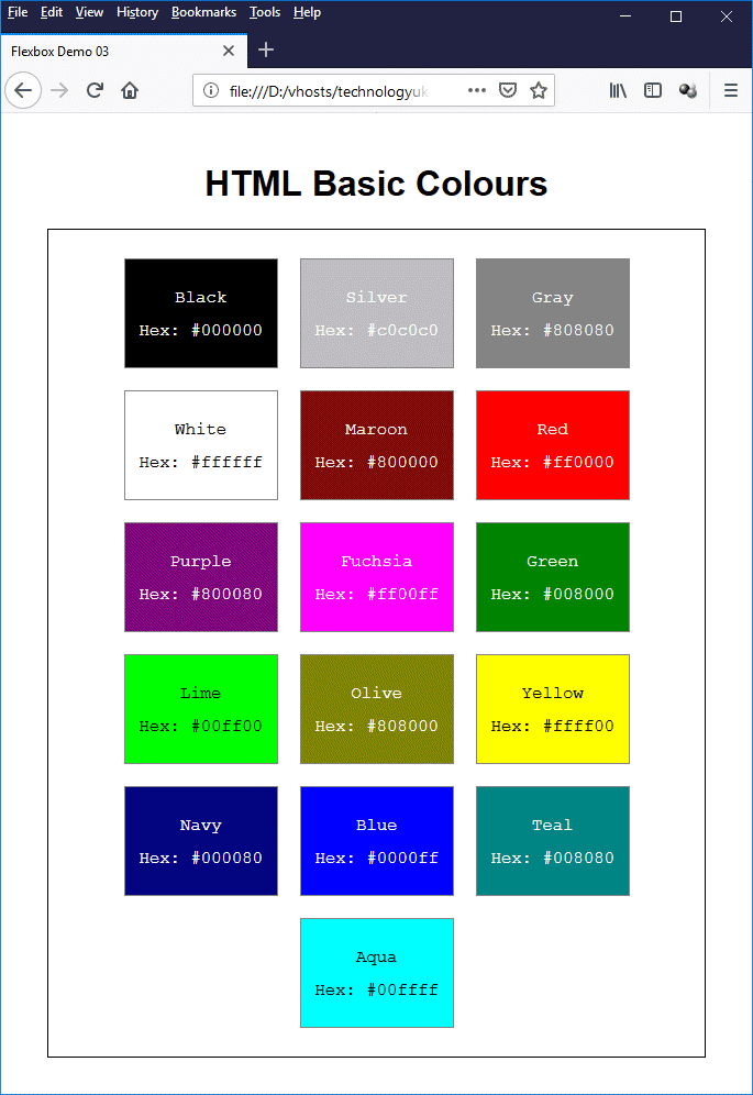
Copy and paste this code into a new file in your HTML editor, save the file as css-flexbox-demo-03.html, and open the file in a web browser. You should see something like the illustration below.
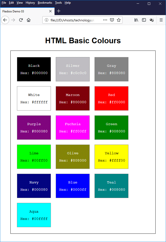
A colour chart showing the colours defined in the 1999 HTML 4.01 Recommendation
We have set the flex-wrap property for the flex container to "wrap" so that flex items that don't fit on a line will wrap to the next line, but apart from that we have done nothing to change the way in which the flex items arrange themselves within the flex container. As you can see from the illustration, the flex items in each line are left-aligned.
With Flexbox, it is possible to control both the horizontal and vertical alignment of the flex items in a flex container. In either case, the property (or properties) used to achieve this control will depend on the value assigned to the flex-direction property ("row"/"row-reverse" or "column"/"column-reverse"), which determines whether the flex container is configured as a row or a column.
Aligning flex items horizontally in a row or vertically in a column is referred to by W3C as axis alignment, because it determines how the flex items are distributed along the flex container's main axis. Conversely, the vertical alignment of items in a row or the horizontal alignment of flex items in a column is referred to as cross-axis alignment, because it determines how the flex items are distributed along the flex container's cross axis.
W3C describes the justify-content property as an "axis alignment" property, because it determines where the flex items sit on the main axis (which in this case is the horizontal axis). It has a default value of "flex-start", which causes the first flex item in each line to be positioned at the start of the main axis (whether this is the left-hand or right-hand end of the main axis will depend on the text direction).
The values that can be assigned to the justify-content property are as described below.
Open the file css-flexbox-demo-03.html once more, and add the following CSS rule to the CSS code that styles the <main> element:
justify-content: center;
Now save the file and reopen it in a web browser. You should now see something like the illustration below.
The flex items are now centred within the flex container
As you can see, the flex items have been centred within the flex container and the page now has a symmetry to it that (we think) gives it a somewhat more pleasing look.
The HTML code below creates a web page that demonstrates the application of different values to the justify-content property.
<!doctype html>
<html lang="en">
<head>
<meta charset="utf-8">
<title>Flexbox Demo 04</title>
v<style>
body {
padding: 1em 5%;
font-size: 1.2em;
line-height: 50px;
}
h1, h2 { text-align: center; }
.cssrule { font-family: monospace;}
section {
margin: 0 0 1em;
padding: 0.25em;
border: 1px solid;
display: flex;
}
#start { justify-content: flex-start; }
#end { justify-content: flex-end; }
#center { justify-content: center; }
#spaceb { justify-content: space-between; }
#spacea { justify-content: space-around; }
div {
text-align: center;
height: 50px;
}
.long {
flex: 0 0 200px;
background: powderblue;
}
.short {
flex: 0 0 100px;
background: beige;
}
.medium {
flex: 0 0 150px;
background: darkseagreen;
}
</style>
</head>
<body>
<h1>Alignment Demo (justify-content)</h1>
<span class="cssrule">justify-content: flex-start;</span>
<section id="start">
<div class="long">Long</div>
<div class="short">Short</div>
<div class="medium">Medium</div>
</section>
<span class="cssrule">justify-content: flex-end;</span>
<section id="end">
<div class="long">Long</div>
<div class="short">Short</div>
<div class="medium">Medium</div>
</section>
<span class="cssrule">justify-content: center;</span>
<section id="center">
<div class="long">Long</div>
<div class="short">Short</div>
<div class="medium">Medium</div>
</section>
<span class="cssrule">justify-content: space-between;</span>
<section id="spaceb">
<div class="long">Long</div>
<div class="short">Short</div>
<div class="medium">Medium</div>
</section>
<span class="cssrule">justify-content: space-around;</span>
<section id="spacea">
<div class="long">Long</div>
<div class="short">Short</div>
<div class="medium">Medium</div>
</section>
</body>
</html>
Copy and paste this code into a new file in your HTML editor, save the file as css-flexbox-demo-04.html, and open the file in a web browser. You should see something like the illustration below.
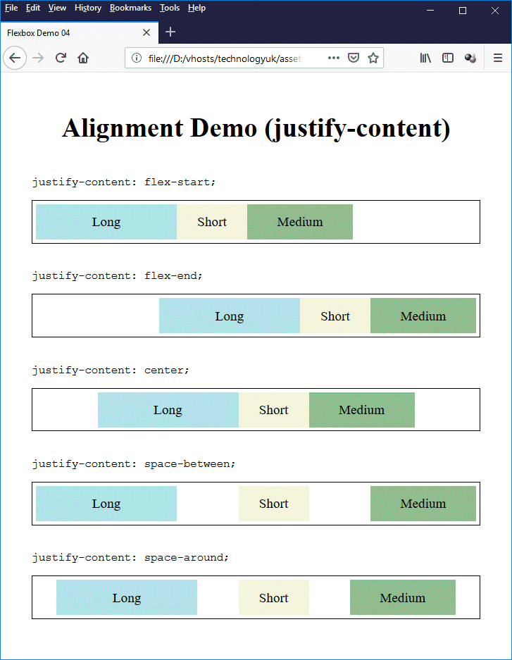
This page demonstrates the effect of applying different values to the justify-content property
Ignoring multi-line containers for the moment (we'll return to the subject of multi-line containers later), cross-axis alignment is concerned with how flex items sit on a flex container's cross axis. We'll be looking here at two closely-related cross-axis alignment properties - align-items and align-self. Let's start by looking at what happens by default to flex items inside a flex container when each flex item has a different height.
The HTML code below creates a web page that displays three paragraphs of randomly generated text, each in its own "column" (you will notice that this example is very similar to the example we used above to demonstrate setting different values for the flex property to in order to control column widths, except that this time the columns are all the same width).
<!doctype html>
<html lang="en">
<head>
<meta charset="utf-8">
<title>Flexbox Demo 05</title>
<style>
body {
padding: 1em 5%;
font-family: sans-serif;
}
h1 { text-align: center; }
main {
padding: 1em;
border: 1px solid;
display: flex;
}
col_1, col_2, col_3 {
box-sizing: border-box;
flex: 1;
padding: 0 1em;
font-size: 75%;
}
.col_1 { background: powderblue; }
.col_2 { background: beige; }
.col_3 { background: darkseagreen; }
</style>
</head>
<body>
<h1>Cross Axis Alignment of Columns</h1>
<main>
<div class="col_1">
<p>
Lorem ipsum dolor sit amet, consectetur adipiscing elit, sed do eiusmod tempor incididunt ut labore et dolore magna aliqua. Dictum sit amet justo donec enim diam vulputate ut. Egestas dui id ornare arcu. Id eu nisl nunc mi ipsum faucibus vitae aliquet. Non blandit massa enim nec dui nunc mattis. Ut morbi tincidunt augue interdum velit. Sed odio morbi quis commodo odio aenean sed adipiscing. Feugiat in fermentum posuere urna nec tincidunt praesent semper. Nisl tincidunt eget nullam non nisi. Erat imperdiet sed euismod nisi porta. Sodales neque sodales ut etiam sit amet nisl purus. Fermentum et sollicitudin ac orci phasellus egestas tellus rutrum tellus. Pellentesque habitant morbi tristique senectus et netus. Nunc lobortis mattis aliquam faucibus purus in. Senectus et netus et malesuada fames ac turpis egestas maecenas. Id leo in vitae turpis massa sed. Purus faucibus ornare suspendisse sed nisi lacus sed viverra tellus. Nec feugiat in fermentum posuere urna nec. Pulvinar neque laoreet suspendisse interdum consectetur libero id. Morbi enim nunc faucibus a pellentesque sit amet porttitor.
</p>
</div>
<div class="col_2">
<p>
Libero nunc consequat interdum varius sit amet. Aliquam ut porttitor leo a diam sollicitudin tempor. Gravida in fermentum et sollicitudin ac orci phasellus egestas. Nec tincidunt praesent semper feugiat nibh sed pulvinar. Interdum velit laoreet id donec ultrices tincidunt arcu. Pharetra convallis posuere morbi leo urna molestie at elementum eu. Fringilla phasellus faucibus scelerisque eleifend donec pretium vulputate. Nunc lobortis mattis aliquam faucibus purus. Ornare suspendisse sed nisi lacus sed viverra tellus in. Odio morbi quis commodo odio aenean. Dictum sit amet justo donec enim diam.
</p>
</div>
<div class="col_3">
<p>
Elementum pulvinar etiam non quam lacus suspendisse. Donec massa sapien faucibus et molestie. Diam maecenas ultricies mi eget mauris. Vitae auctor eu augue ut lectus arcu bibendum at. Aliquet eget sit amet tellus. Tristique senectus et netus et malesuada. Aenean vel elit scelerisque mauris pellentesque. Faucibus ornare suspendisse sed nisi lacus sed. Ultricies leo integer malesuada nunc vel risus. Sed nisi lacus sed viverra tellus in hac habitasse. Rhoncus aenean vel elit scelerisque mauris pellentesque. Sollicitudin ac orci phasellus egestas tellus rutrum tellus pellentesque eu. Rhoncus urna neque viverra justo nec ultrices. Tincidunt tortor aliquam nulla facilisi cras fermentum odio eu. Pharetra et ultrices neque ornare aenean euismod elementum. Nisi est sit amet facilisis magna etiam tempor orci. At imperdiet dui accumsan sit. Faucibus nisl tincidunt eget nullam non nisi est. Vel pharetra vel turpis nunc eget lorem.
</p>
</div>
</main>
</body>
</html>
Copy and paste this code into a new file in your HTML editor, save the file as css-flexbox-demo-05.html, and open the file in a web browser. You should see something like the illustration below.
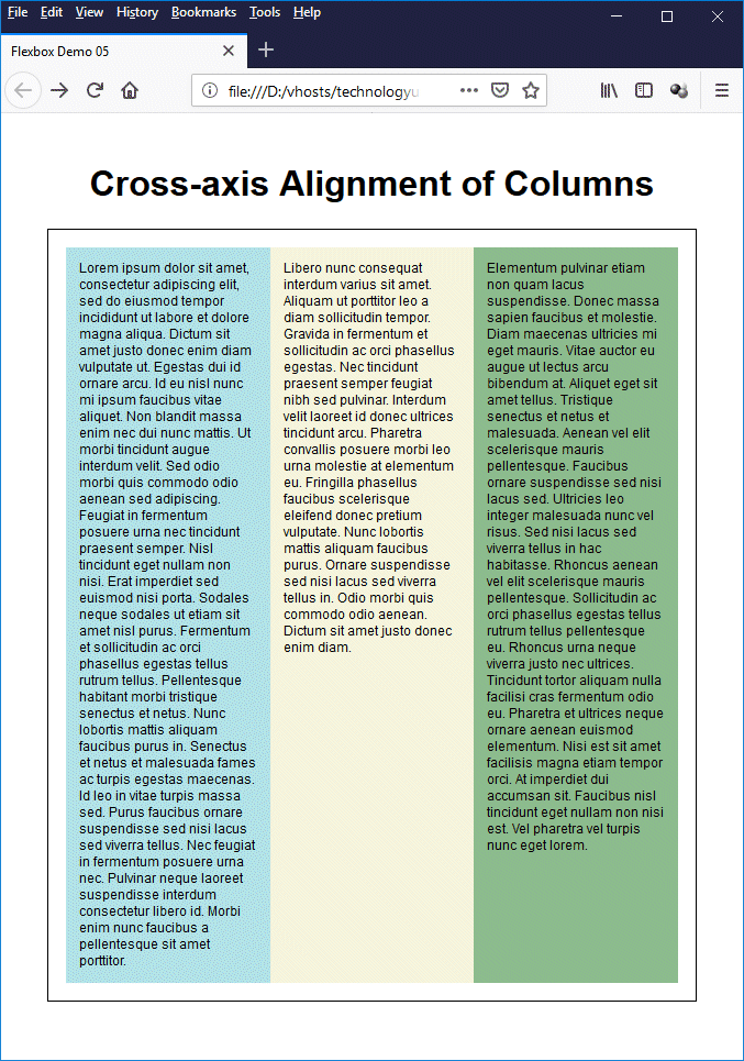
By default, flex items are stretched to fill the height of the flex container
In this example, each flex item consists of a <div> element. The align-items property that controls the cross-axis alignment of the flex items inside the flex container is, by default, set to a value of "stretch". This means that (assuming the flex container is configured as a row) each flex item occupies the full height of the flex container.
The values that can be assigned to the align-items property (and also the align-self property, which we'll get to in due course) are described below.
Open the file css-flexbox-demo-05.html once more, and add the following CSS rule to the CSS code that styles the <main> element:
align-items: center;
Now save the file and reopen it in a web browser. You should now see something like the illustration below.
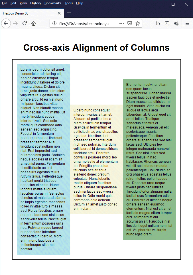
The flex items are now centred vertically within the flex container
As you can see, the flex items have now been centred vertically within the flex container. Centring text and other HTML elements in a container is something that is quite difficult to achieve without Flexbox, but with Flexbox it becomes a trivial exercise.
The HTML code below creates a web page that demonstrates the application of different values to the align-items property.
<!doctype html>
<html lang="en">
<head>
<meta charset="utf-8">
<title>Flexbox Demo 05</title>
<style>
body {
padding: 1em 5%;
font-family: sans-serif;
}
h1 { text-align: center; }
.cssrule { font-family: monospace; font-size: 1.2em; }
section {
margin: 0.25em 0;
padding: 0.25em;
border: 1px solid;
display: flex;
}
.col_1, .col_2, .col_3 {
box-sizing: border-box;
flex: 1;
}
.col_1 { background: powderblue; font-size: 60%; }
.col_2 { background: beige; font-size: 120%; }
.col_3 { background: darkseagreen; font-size: 75%; }
#s1 { align-items: start; }
#s2 { align-items: end; }
#s3 { align-items: center; }
#s4 { align-items: baseline; }
#s5 { align-items: stretch; }
</style>
</head>
<body>
<h1>Alignment Demo (align-items)</h1>
<span class="cssrule">align-items: flex-start;</span>
<section id="s1">
<div class="col_1">
<p>Lorem ipsum dolor sit amet, consectetur adipiscing elit, sed do eiusmod tempor incididunt ut labore et dolore magna aliqua.</p>
</div>
<div class="col_2">
<p>Libero nunc consequat interdum varius sit amet.</p></div>
<div class="col_3">
<p>Elementum pulvinar etiam non quam lacus suspendisse. Donec massa sapien faucibus et molestie.</p>
</div>
</section>
<span class="cssrule">align-items: flex-end;</span>
<section id="s2">
<div class="col_1">
<p>Lorem ipsum dolor sit amet, consectetur adipiscing elit, sed do eiusmod tempor incididunt ut labore et dolore magna aliqua.</p>
</div>
<div class="col_2">
<p>Libero nunc consequat interdum varius sit amet.</p></div>
<div class="col_3">
<p>Elementum pulvinar etiam non quam lacus suspendisse. Donec massa sapien faucibus et molestie.</p>
</div>
</section>
<span class="cssrule">align-items: center;</span>
<section id="s3">
<div class="col_1">
<p>Lorem ipsum dolor sit amet, consectetur adipiscing elit, sed do eiusmod tempor incididunt ut labore et dolore magna aliqua.</p>
</div>
<div class="col_2">
<p>Libero nunc consequat interdum varius sit amet.</p></div>
<div class="col_3">
<p>Elementum pulvinar etiam non quam lacus suspendisse. Donec massa sapien faucibus et molestie.</p>
</div>
</section>
<span class="cssrule">align-items: baseline;</span>
<section id="s4">
<div class="col_1">
<p>Lorem ipsum dolor sit amet, consectetur adipiscing elit, sed do eiusmod tempor incididunt ut labore et dolore magna aliqua.</p>
</div>
<div class="col_2">
<p>Libero nunc consequat interdum varius sit amet.</p></div>
<div class="col_3">
<p>Elementum pulvinar etiam non quam lacus suspendisse. Donec massa sapien faucibus et molestie.</p>
</div>
</section>
<span class="cssrule">align-items: stretch;</span>
<section id="s5">
<div class="col_1">
<p>Lorem ipsum dolor sit amet, consectetur adipiscing elit, sed do eiusmod tempor incididunt ut labore et dolore magna aliqua.</p>
</div>
<div class="col_2">
<p>Libero nunc consequat interdum varius sit amet.</p></div>
<div class="col_3">
<p>Elementum pulvinar etiam non quam lacus suspendisse. Donec massa sapien faucibus et molestie.</p>
</div>
</section>
</body>
</html>
Copy and paste this code into a new file in your HTML editor, save the file as css-flexbox-demo-06.html, and open the file in a web browser. You should see something like the illustration below (note that the red line in the baseline section was added by us to highlight the baseline alignment of the three paragraphs).
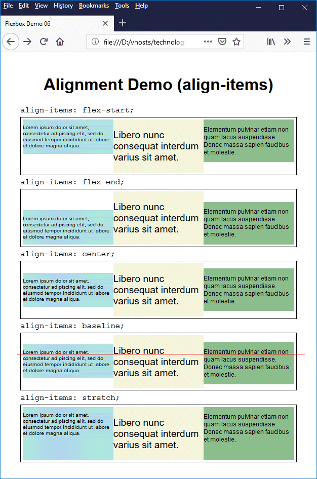
This page demonstrates the effect of applying different values to the align-items property
The align-self property essentially has the same effect as the align-items property, except that instead of being applied to the flex container, it is applied to an individual flex item. If a value is assigned to the flex-items property of a flex container, and a different value is assigned to the align-self property of one of the flex items within that container, then the value assigned to the align-self property overrides the value assigned to the align-items property for that flex item.
Multi-line flex containers are flex containers that have free space on the cross axis. In order for this to be true, they must have a fixed height, or the flex container will simply adjust its height to fit the contents and there won't be any free space on the cross axis. The flex container's flex-wrap property must also be set to "wrap" (or "wrap-reverse").
The property that controls the alignment of flex items on a flex container's cross axis is the align-content property. The HTML code below creates a web page that demonstrates how the align-content property might be used.
<!doctype html>
<html lang="en">
<head>
<meta charset="utf-8">
<title>Flexbox Demo 07</title>
<style>
body {
margin: 0 auto;
font-family: sans-serif;
}
header, nav {
width: 100%;
display: flex;
flex-wrap: wrap;
justify-content: flex-end;
}
header {
background-image: url("https://www.technologyuk.net/assets/demo-images/solar-system.png");
background-repeat: no-repeat;
background-color: black;
height: 150px;
align-content: space-between;
}
nav {
height: 50px;
align-content: flex-end;
}
p { padding: 0 1em; }
form { margin: 5px; }
h1 { text-align: center; }
li { list-style: none; }
img, li a { display: block; }
a {
text-decoration: none;
font-size: 75%;
font-weight: bold;
margin: 0 0.5em 0.5em;
color: #ffffff;
}
a.dead { color: #ffcc00; }
a:hover { text-decoration: underline; }
a.dead:hover { text-decoration: none; }
.citation { margin: 2em 4em; }
</style>
</head>
<body>
<header>
<form>
<input type="search" placeholder="Search the site...">
<button>Search</button>
</form>
<nav>
<a class="dead">Home</a>
<a href="#">Mercury</a>
<a href="#">Venus</a>
<a href="#">Earth</a>
<a href="#">Mars</a>
<a href="#">Jupiter</a>
<a href="#">Saturn</a>
<a href="#">Uranus</a>
<a href="#">Neptune</a>
</nav>
</header>
<h1>The Solar System</h1>
<p>According to Wikipedia:</p>
<p class="citation">
<cite>"The Solar System is the gravitationally bound planetary system of the Sun and the objects that orbit it, either directly or indirectly. Of the objects that orbit the Sun directly, the largest are the eight planets, with the remainder being smaller objects, such as the five dwarf planets and small Solar System bodies . . . . The four smaller inner planets, Mercury, Venus, Earth and Mars, are terrestrial planets, being primarily composed of rock and metal. The four outer planets are giant planets, being substantially more massive than the terrestrials. The two largest, Jupiter and Saturn, are gas giants, being composed mainly of hydrogen and helium; the two outermost planets, Uranus and Neptune, are ice giants, being composed mostly of substances with relatively high melting points compared with hydrogen and helium, called volatiles, such as water, ammonia and methane. All eight planets have almost circular orbits that lie within a nearly flat disc called the ecliptic."</cite>
</p>
</body>
</html>
Copy and paste this code into a new file in your HTML editor, save the file as css-flexbox-demo-07.html, and open the file in a web browser. You should see something like the illustration below.
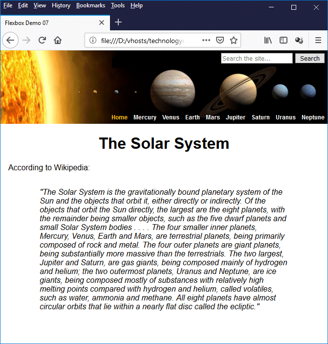
This page demonstrates the use of the align-content property
Some explanation of what exactly the CSS code is doing is probably necessary here, since it might not be so obvious at first glance. Let's look at the CSS code common to both the <header> element and the <nav> element first:
header, nav {
width: 100%;
display: flex;
flex-wrap: wrap;
justify-content: flex-end;
}
This code sets the width of both elements to 100%, makes them flex containers, and also makes it possible for them to become multi-line flex containers by setting the flex-wrap property of both to "wrap" (they will not actually become multi-line flex containers until we set a height for each and populate them with flex items). It also sets the justify-content property of both to "flex-end", so that flex-items will be aligned towards the main end edge of the main axis (in this case, the right-hand side of the flex container).
Next, we have the CSS code that completes the styling of the <header> element:
header {
background-image: url("https://www.technologyuk.net/assets/demo-images/solar-system.png");
background-repeat: no-repeat;
background-color: black;
height: 150px;
align-content: space-between;
}
This code sets up the background image for the <header> element and sets its height to 150 pixels. The last line sets the align-content property to "space-between", which means that any unused space on the cross axis will be evenly distributed between however many lines there are in the flex container; the first line will be flush with cross start, and the last line will be flush with cross end.
We have two flex items inside the <header> flex container - the <form> element that holds the search box, and the <nav> element that holds the primary navigational links. Remember that we set the width property of the <nav> element to "100%", which means it cannot sit on the same line as any other flex item. The <form> element will thus occupy the top-right-hand corner of the flex container, while the <nav> element will occupy the bottom-right-hand corner.
The CSS code for the <nav> element itself completes the styling of the page header:
nav {
height: 50px;
align-content: flex-end;
}
You will recall that the <nav> element is a flex container in its own right, with its flex-wrap property set to "wrap", as well as being a flex item within the <header> element. We have now also given it a fixed height which enables it to be a multi-line container. The <nav> element's align-content property is set to "flex-end", which means that all of the flex items within it (i.e. all of the navigational links) will be aligned towards the cross end edge of the flex container.
The values that can be assigned to the align-content property are described below.
The HTML code below creates a web page that demonstrates the application of different values to the align-content property.
<!doctype html>
<html lang="en">
<head>
<meta charset="utf-8">
<title>Flexbox Demo 08</title>
<style>
body {
width: 600px;
margin: auto;
padding: 1em 5%;
font-family: sans-serif;
}
h1 { text-align: center; }
.cssrule { font-family: monospace; font-size: 1.2em; }
section {
width: 100%;
height: 100px;
background: beige;
padding: 2px;
margin: 0.25em 0;
border: 1px solid;
display: flex;
flex-wrap: wrap;
}
div {
box-sizing: border-box;
border: 1px solid;
margin: 1px;
line-height: 30px;
text-align: center;
}
.col_1 {
background: orange;
flex: 0 0 98px;
}
.col_2 {
background: yellow;
flex: 0 0 198px;
}
.col_3 {
background: coral;
flex: 0 0 298px;
}
#s1 { align-content: start; }
#s2 { align-content: end; }
#s3 { align-content: center; }
#s4 { align-content: space-between; }
#s5 { align-content: space-around; }
#s6 { align-content: stretch; }
</style>
</head>
<body>
<h1>Alignment Demo (align-content)</h1>
<span class="cssrule">align-content: flex-start;</span>
<section id="s1">
<div class="col_1">1</div>
<div class="col_2">2</div>
<div class="col_3">3</div>
<div class="col_3">3</div>
<div class="col_2">2</div>
<div class="col_1">1</div>
</section>
<span class="cssrule">align-content: flex-end;</span>
<section id="s2">
<div class="col_3">3</div>
<div class="col_2">2</div>
<div class="col_1">1</div>
<div class="col_1">1</div>
<div class="col_3">3</div>
<div class="col_2">2</div>
</section>
<span class="cssrule">align-content: center;</span>
<section id="s3">
<div class="col_2">2</div>
<div class="col_3">3</div>
<div class="col_1">1</div>
<div class="col_3">3</div>
<div class="col_1">1</div>
<div class="col_2">2</div>
</section>
<span class="cssrule">align-content: space-between;</span>
<section id="s4">
<div class="col_1">1</div>
<div class="col_2">2</div>
<div class="col_3">3</div>
<div class="col_3">3</div>
<div class="col_2">2</div>
<div class="col_1">1</div>
</section>
<span class="cssrule">align-content: space-around;</span>
<section id="s5">
<div class="col_3">3</div>
<div class="col_2">2</div>
<div class="col_1">1</div>
<div class="col_1">1</div>
<div class="col_3">3</div>
<div class="col_2">2</div>
</section>
<span class="cssrule">align-content: stretch;</span>
<section id="s6">
<div class="col_2">2</div>
<div class="col_3">3</div>
<div class="col_1">1</div>
<div class="col_3">3</div>
<div class="col_1">1</div>
<div class="col_2">2</div>
</section>
</body>
</html>
Copy and paste this code into a new file in your HTML editor, save the file as css-flexbox-demo-08.html, and open the file in a web browser. You should see something like the illustration below.
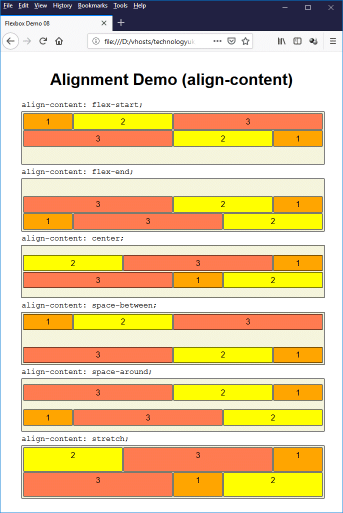
This page demonstrates the effect of applying different values to the align-content property
The order property can be used to specify the order in which flexbox items appear within a flex container. The value assigned to this property by default is "0", which means that, by default, all flex items appear within a flex container in the order in which they appear in the HTML document. The value assigned to a flex item's order property can be any integer value (including negative values).
Flex items with a higher value assigned to their order property will appear later in the flex container than flex items with a lower value assigned to their order property. If the value assigned to the order property of two or more flex items within a flex container is the same, those flex items will appear in the same order as they appear in the HTML document.
W3C has this to say about re-ordering flex items (and HTML elements in general):
"Authors must use order only for visual, not logical, reordering of content. Style sheets that use order to perform logical reordering are non-conforming."
Indeed, if an HTML document is logically structured, it will not normally be necessary or desirable to re-order content. However, there may be circumstances under which "visual reordering of content" can be undertaken to create the required layout while preserving the logical ordering of elements within the HTML document itself. W3C give the following example:
"Many web pages have a similar shape in the markup, with a header on top, a footer on bottom, and then a content area and one or two additional columns in the middle. Generally, it's desirable that the content come first in the page's source code, before the additional columns. However, this makes many common designs, such as simply having the additional columns on the left and the content area on the right, difficult to achieve. This has been addressed in many ways over the years, often going by the name 'Holy Grail Layout' when there are two additional columns. 'order' makes this trivial. For example, take the following sketch of a page's code and desired layout:"
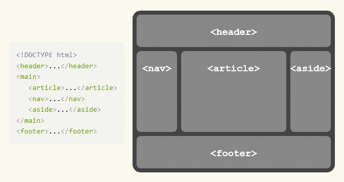
This common page layout can be achieved using flex layout without compromising accessibility
(see Section 5.4.1. of the CSS Flexible Box Layout Module Level 1)
As you can see, the visual ordering of the <nav>, <article>, and <aside> elements is different to the order in which they appear in the HTML code. This can easily be achieved by making the <main> element a flex container, and using the order property to switch the order in which the <nav> and <article> elements will appear when rendered by the browser.
The HTML code below uses Flexbox to create a web page with a responsive layout loosely based on the example layout illustrated above, and using the order property in the manner suggested in order to position the navigation panel at the left-hand side of the main content pane whilst preserving the <article> - <nav> - <aside> ordering within the HTML document itself.
<!doctype html>
<html lang="en">
<head>
<meta charset="utf-8">
<title>Flexbox Demo 09</title>
<meta name="viewport" content="width=device-width, initial-scale=1.0">
<meta name="mobile-web-app-capable" content="yes">
<meta http-equiv="X-UA-Compatible" content="IE=edge">
<style>
html { overflow-y: auto; background: #408040; }
body {
margin: 0;
font-family: sans-serif;
line-height: 1.5;
}
header{
display: flex;
justify-content: space-between;
background: #80a080;
}
div.search { padding: 2em 1em; }
div.mobile_bar {
display: flex;
justify-content: space-between;
background: #80a080;
padding: 5px 5px 10px;
}
main { display: flex; }
nav {
order: 1;
width: 200px;
background: #efffef;
}
article {
order: 2;
flex:1;
overflow: auto;
min-height: 480px;
background: #ffffff;
}
aside {
order: 3;
width: 200px;
background: #efffef;
}
aside p { font-size: 75%; }
footer {
text-align: center;
padding: 20px 0;
background: #408040;
}
h1, h2 { color: #008000; margin: 1em 0; text-align: center; }
p { margin: 2em 15%; }
img { display: block; }
ul.menu { padding: 0 1em; margin: 0; }
ul.menu li {
padding: 5px 10px;
border-bottom: solid 1px #ccddcc;
font-size: small;
list-style: none;
}
a { text-decoration: none; margin: 0 1em; color: #ffffff; }
a:hover { text-decoration: underline; }
a.dead:hover { text-decoration: none; }
ul.menu li:hover{ background-color: #ccffcc; }
ul.menu li.dead:hover{ background-color: #efffef; }
ul.menu li a { display: block; }
ul.menu li a { color: #404040; }
ul.menu li a:hover { text-decoration: underline; }
ul.menu li.dead a { color: #808080; }
ul.menu li.dead a:hover { text-decoration: none; }
/* MOBILE DEVICE SPECIFIC */
@media only screen and (max-width: 599px) {
header, main { flex-flow: column; }
article { min-height: initial; }
aside { width: 100%; }
nav { display: none; visibility: none; width: 100%; }
div.logo, div.search { width: 100%; }
div.search { padding: 0.5em 0; text-align: center; }
p { text-align: left; margin: 1em 10%; }
div.content { width: 100%; }
}
/* SXGA/WXGA Screens and wider */
@media only screen and (min-width: 600px) {
div.mobile_bar { display: none; }
}
</style>
<script>
function toggle_visibility(id) {
var e = document.getElementById(id);
if(e.style.display == 'block')
e.style.display = 'none';
else
e.style.display = 'block';
}
window.onresize = function(event) {
var e = document.getElementById("menu");
var w = window.innerWidth;
if(w > 599)
e.style.display = 'block';
else
e.style.display = 'none';
};
</script>
</head>
<body>
<header>
<div class="logo">
<img src="http://www.technologyuk.net/assets/demo-images/responsive-demo-02-logo.gif" alt="Site Logo">
</div>
<div class="search">
<form>
<input type="search" placeholder="Search the site...">
<button>Search</button>
</form>
</div>
</header>
<div class="mobile_bar">
<a href="#"><img src="http://www.technologyuk.net/assets/demo-images/responsive-demo-home.gif" alt="Home"></a>
<a href="#" onClick='toggle_visibility("menu"); return false;'><img src="http://www.technologyuk.net/assets/demo-images/responsive-demo-menu.gif" alt="Menu"></a>
</div>
<main>
<article>
<h1>Article</h1>
<p>
Lorem ipsum dolor sit amet, consectetur adipiscing elit. Sed blandit libero sit amet nunc ultricies, eu feugiat diam placerat. Phasellus tincidunt nisi et lectus pulvinar, quis tincidunt lacus viverra. Phasellus in aliquet massa. Integer iaculis massa id dolor venenatis scelerisque. Morbi non eros a ex interdum molestie in eget leo. Proin pulvinar facilisis eros, sed porta ante imperdiet ut. Suspendisse tincidunt facilisis metus non faucibus. Integer posuere vehicula congue. Sed pharetra felis sapien, at imperdiet diam lacinia quis.
<br><br>
</p>
</article>
<nav id="menu">
<h2>Navigation</h2>
<ul class="menu">
<li class="dead"><a>Home</a></li>
<li><a href="#">Page 01</a></li>
<li><a href="#">Page 02</a></li>
<li><a href="#">Page 03</a></li>
<li><a href="#">Page 04</a></li>
<li><a href="#">Page 05</a></li>
<li><a href="#">Page 06</a></li>
<li><a href="#">Page 07</a></li>
</ul>
</nav>
<aside>
<h2>Aside</h2>
<p>
Lorem ipsum dolor sit amet, consectetur adipiscing elit. Sed blandit libero sit amet nunc ultricies, eu feugiat diam placerat. Phasellus tincidunt nisi et lectus pulvinar, quis tincidunt lacus viverra. Phasellus in aliquet massa. Integer iaculis massa id dolor venenatis scelerisque.
<br><br>
</p>
</aside>
</main>
<footer>
<a href="#">Sitemap</a>
<a href="#">Contact</a>
<a href="#">Privacy</a>
</footer>
</body>
</html>
Copy and paste this code into a new file in your HTML editor, save the file as css-flexbox-demo-09.html, and open the file in a web browser. You should see something like the illustration below.
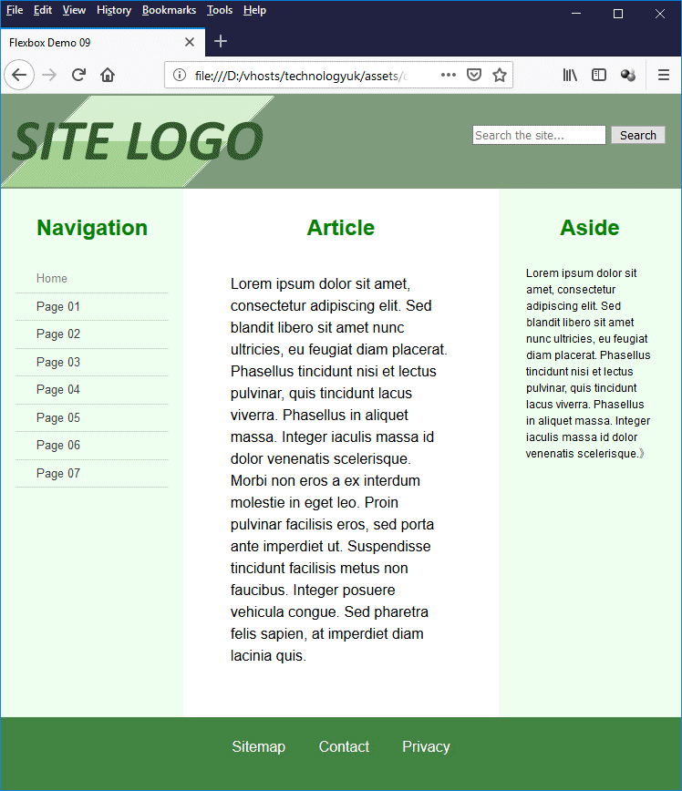
This page demonstrates the use of the order property
If you have been through the section "HTML Basics", or at least read the page "Website Design Basics" in that section, the screenshot above should look familiar to you. We have in fact adapted the code for one of the examples given in that page to create this example. The main difference (apart from the fact that we now have a three-column layout rather than a two-column layout) is that we have used Flexbox to position most of the page elements, including the visual ordering of the <nav>, <article> and <aside> elements.
It should have become apparent to you by now that there are many aspects of creating web page layouts that, although perfectly possible before Flexbox came along, are considerably easier to achieve with Flexbox. Indeed, Flexbox is a versatile and powerful addition to the web developer's toolkit.
There are some good arguments, however, for not abandoning the so-called "legacy" methods altogether. For one thing, there are still a number of older browsers out there that do not support Flexbox. Depending on your target audience, you may need to write fallback code that uses legacy methods in order to ensure that users who are still clinging to their ageing browsers can view your content.
Perhaps a better argument for not abandoning legacy methods altogether is that there is still a huge body of content on the web that uses those methods. If you are ever charged with maintaining any of that content, a familiarity with the techniques used to create it will stand you in good stead, whether the intention is to upgrade the existing content or simply to maintain it.
It has no doubt also occurred to you that, given the versatility of Flexbox, there is really nothing we can't do with it in terms of creating layout, so why bother learning about CSS Grid layout? After all, not only can we configure flex containers as either rows or columns, we can also create nested flex containers by turning a flex item into a flex container in its own right, as we have seen.
The short answer is that, as we pointed out at the beginning of this article, Flexbox was always intended to be a one-dimensional layout technology. It is certainly true that it can be used to construct grid layouts, but then so can the legacy layout methods - if you're prepared to jump through enough hoops. CSS Grid layout is specifically designed to provide two-dimensional layout solutions.
Our recommendation is to use the tools that will get the job done in the most efficient manner. Sometimes that might be Flexbox, another time it might be CSS Grid. There may even be occasions when legacy methods are the simplest option (and would guarantee that your content would be available to most users). We will leave you to ponder these points. The next page in this section will look at CSS Grid layout.