| Author: | |
| Website: | |
| Page title: | |
| URL: | |
| Published: | |
| Last revised: | |
| Accessed: |
We looked briefly at issues related to web page layout and responsive design in the page "Website Design Basics" in the "HTML Basics" section. There, we learned that, while there are no rules telling us how a web page should be laid out, most web pages will contain some or all of the following components:
We also learned of the need to impose some kind of structure on our web pages in order to organise and contain these elements. HTML provides a number of structural elements, like the <header>, <nav>, <section> and <footer> elements, that enable us to organise our content in a logical fashion. It also allows us to create structures such as tables, lists and forms, and insert media elements such as images and video clips into our pages.
By default, however, all of the block-level HTML elements occupy the full width of the screen, and all HTML elements are displayed one after another on the page in the order in which they appear in our HTML document. Controlling the physical dimensions of those elements and how they are laid out on the screen is something we can only do with CSS.
Perhaps the biggest challenge facing us today as web developers is the diversity of web-enabled devices, both in terms of their physical size and screen resolution, and in terms of the bandwidth available to deliver content. Above all, we need to ensure that our page layout can adapt to whatever device it is displayed on in a way that allows our content to be accessed in an optimum manner.
What that means, in essence, is giving our pages the ability both to resize elements and to reposition elements in relation to one another in response to the display hardware parameters they encounter - an approach known as "responsive web design". This will ensure that the web pages we create will be rendered in a satisfactory manner on any kind of end user device, regardless of display resolution, aspect ratio, or any other technical constraints.
The page layout examples we looked at in the page "Website Design Basics" were essentially all slightly different versions of a basic design that included a page header, a main content area, and a page footer together with either a horizontal navigation scheme located beneath the page header or a vertical navigation scheme positioned to the left of the main content area.
We also briefly introduced the CSS Flexbox Layout Module, first published in 2009 as a working draft. Flexbox has not yet achieved full Recommendation status, but is now supported by all mainstream browsers. The same is true of CSS Grid Layout, a more recent and an even more versatile framework for creating web page layouts which, ironically, is reminiscent of the once-fashionable but now frowned-upon practice of using tables to implement page layout.
We will be looking at both CSS Flexbox layout and CSS Grid layout in more detail in "CSS Flexbox Layout" and "CSS Grid Layout". Meanwhile, there are other CSS modules currently in the pipeline that will almost certainly have significance for web page layout using CSS in the future, even though they have not yet achieved Recommendation or Candidate Recommendation status:
This page deals with CSS layout techniques that are described by some developers - and the authors of several blogs, tutorials and guides dealing with the subject - as "legacy" methods. In short, there is a significant body of informed opinion that recommends the use of newer techniques like CSS Flexbox and CSS Grid.
Techniques such as the use of HTML tables for page layout are certainly no longer appropriate for mainstream web development. Other techniques described on this page, however, may still be regarded as a legitimate approach to creating page layout, even if they have been superseded by newer and arguably better techniques.
There will be occasions where a "legacy" approach does the job perfectly well, so it certainly doesn't hurt to know how these layout techniques work. Beyond that, we would point out that there are still a number of people using older versions of popular browsers that either don't support some of the newer CSS layout techniques, or provide only limited support for them. Using "legacy" methods pretty much guarantees that the majority of browsers currently in use will display your pages correctly.
In the final analysis, the choice of which CSS technology (or technologies) to use for creating page layouts will probably be determined by factors such as the target audience, and whether or not developers are constrained by institutional guidelines and policies in this respect. If the overriding priority is simply to reach as many people as possible irrespective of demographics, then you may want to stick to using one or more of the "legacy" methods described here.
You can of course have the best of both worlds, using the latest technology but providing fallback code for users with older browsers. This means that your content should look great on the latest versions of any popular browser, but will still be accessible to a visitor using an older version - perhaps even a very old version - of one of these browsers. Bear in mind, however, that providing a fallback for every situation is both time consuming and subject to the law of diminishing returns.
By default, as we saw above, block-level HTML elements occupy the full width of the screen and are stacked vertically, appearing in the order in which they occur in the HTML code. Inline elements may appear on the same line as other inline elements, but here too the document ordering is preserved. The normal flow of an HTML document can thus be said to be linear.
It is worth remembering at this point that CSS - cascading style sheets - is all about style rather than substance. It's a presentational language that we use to make our content look good. HTML, by contrast, is a markup language. We use it to impose structure on our content, and to convey meaningful information about our content, both to the reader and to search engines, screen readers, and intelligent information management and retrieval systems.
CSS can be used to present content in a way that moves it away from the normal flow of a document, sometimes quite drastically. It is possible with CSS, for example, to make an HTML element invisible, or even to remove it from the document flow altogether. Such a powerful tool will obviously enable us to create the page layouts we require, but it must also be used with care.
You should work on the principle that, if a user decides for whatever reason to turn off your carefully crafted page styling (an option that is available in most browsers), the content of your web page will still be readable and make sense, even if it's not particularly pretty. The illustration below shows what the technologyuk.net home page looks like with no styling.
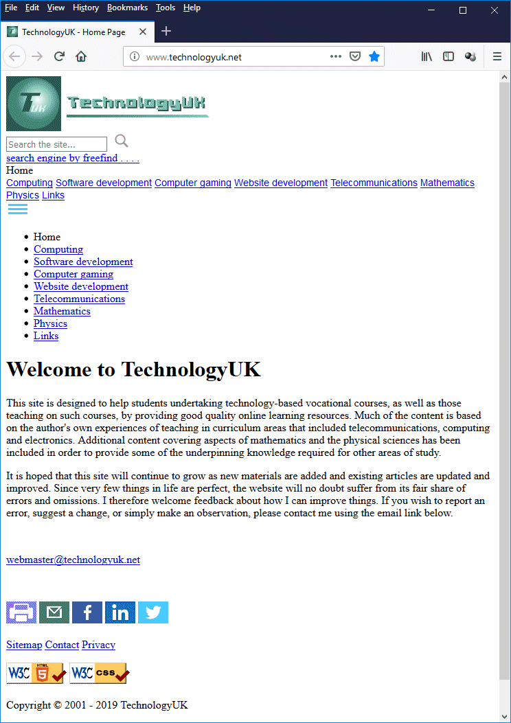
The technologyuk.net home page with no styling
As you can see, the page does not look particularly elegant, but the content can be read and the navigational controls are both accessible and functional. The key point here is that CSS is intended to enhance the appearance of a well-structured document; it is not intended to compensate for shortcomings in the way the document is structured. Here is the technologyuk.net home page again, this time with the CSS fully restored:

The technologyuk.net home page, this time with styling
Both of the screenshots above were captured with the browser window set to a size of 742 × 949 pixels in order to ensure a meaningful comparison. We'd like to think that the styled version is much more aesthetically pleasing than the un-styled version (bearing in mind, of course, that beauty is in the eye of the beholder!) but we are confident that, even without styling, our page is perfectly useable.
Your first design goal, before you consider how your pages should be styled, is to get the structure right using HTML alone. This will have two beneficial effects. It will reduce to a minimum the amount of work you need to do in order to create the page layout you desire, because you won't need to make huge changes to get everything into the correct position. It will also ensure that your web pages are readable even if, for whatever reason, your CSS code is not loaded.
Using tables for page layout was one of those things that seemed like a good idea at the time. In fact, it probably was a good idea before we had CSS, and for some time after CSS arrived on the scene, given that even basic CSS was at first not uniformly supported across browsers. It seemed logical that the table - as a structure that could be used to organise tabular data - could just as easily be used to organise an entire document.
A web developer would typically use a table for page layout by placing headers, footers, navigational links and blocks of content into various table rows and columns. Just to demonstrate the principle, we've reproduced to TechnologyUK.net home page below, using no structural markup whatsoever other than tables.
<!DOCTYPE html>
<html lang="en">
<head>
<title>TechnologyUK - Home Page</title>
<meta charset="utf-8">
<style>
html, body {
height: 100%;
margin: 0;
padding: 0;
}
html { overflow-y: scroll; }
td.logo img { margin: 10px; }
table {
width: 100%;
height: 100%;
margin: 0;
padding: 0;
border-spacing: 0;
}
td { padding: 0; }
body {
font-family: sans-serif;
background-image: url("https://www.technologyuk.net/assets/images/background-home.jpg");
background-attachment: fixed;
background-repeat: no-repeat;
background-position: center top;
background-size: cover;
margin: 0;
padding: 0;
}
td.header {
height: 104px;
background-image: linear-gradient(to right, rgba(255,255,255,1), rgba(255,255,255,0));
}
td.logo {
height: 104px;
vertical-align: top;
padding: 0;
}
td.search {
height: 104px;
text-align: right;
vertical-align: middle;
padding: 0 1em 0 0;
}
td.navbar {
padding: 0 1em;
height: 80px;
background: #182F48;
vertical-align: top;
}
td.navbar a {
display: inline-block;
color: #ffffff;
font-size: 83.33%;
font-weight: bold;
padding: 0.25em 0.5em;
margin: 0.5em;
border: 1px solid #808080;
border-radius: 5px;
}
td.navbar a.dead {
color: #ffdd00;
border: 1px solid #e06000;
}
td.content {
padding: 0 15%;
background-image: linear-gradient(to right, rgba(255,255,255,1), rgba(255,255,255,0));
}
td.footer {
background: #182F48;
color: #cccccc;
font-size: 83.33%;
text-align: center;
}
h1 {
color: #8fa4de;
font-size: 150%;
text-align: center;
margin: 2em;
}
p {
font-family: sans-serif;
margin: 1.5em 0;
text-align: left;
line-height: 1.5em;
}
p.center {
text-align: center;
line-height: normal;
}
a { text-decoration: none; }
a:hover { text-decoration: underline; }
a.dead:hover, span.search a:hover { text-decoration: none; }
a.inline { font-size: 100%; }
span.botnav a {
color: #cccccc;
padding: 1em;
}
span.search {
display: inline-block;
font-size: 70%;
color: #606060;
padding: 1em;
}
</style>
</head>
<body>
<table>
<tr>
<td class="header">
<table>
<tr>
<td class="logo">
<img src="https://www.technologyuk.net/assets/images/logo.png" alt="The TechnologyUK Logo">
</td>
<td class="search">
<form>
<input type="search" id="site-search" placeholder="Search the site...">
<img src="https://www.technologyuk.net/assets/icons/search_icon.gif" alt="Submit Query"><br>
<a href="#" ><span class="search">search engine by freefind . . . .</span></a>
</form>
</td>
</tr>
</table>
</td>
</tr>
<!-- NAV BAR -->
<tr>
<td class="navbar">
<a class="dead">Home</a><br>
<a href="#">Computing</a>
<a href="#">Software development</a>
<a href="#">Computer gaming</a>
<a href="#">Website development</a>
<a href="#">Telecommunications</a>
<a href="#">Mathematics</a>
<a href="#">Physics</a>
<a href="#">Links</a>
</td>
</tr>
<tr>
<td class="content">
<h1>Welcome to TechnologyUK</h1>
<p>
This site is designed to help students undertaking technology-based vocational courses, as well as those teaching on such courses, by providing good quality online learning resources. Much of the content is based on the author's own experiences of teaching in curriculum areas that included telecommunications, computing and electronics. Additional content covering aspects of mathematics and the physical sciences has been included in order to provide some of the underpinning knowledge required for other areas of study.
</p>
<p>
It is hoped that this site will continue to grow as new materials are added and existing articles are updated and improved. Since very few things in life are perfect, the website will no doubt suffer from its fair share of errors and omissions. I therefore welcome feedback about how I can improve things. If you wish to report an error, suggest a change, or simply make an observation, please contact me using the email link below.
</p>
<p class="center">
<a class="inline" href="mailto:webmaster@technologyuk.net">webmaster@technologyuk.net</a>
</p>
</td>
</tr>
<!-- FOOTER -->
<tr>
<td class="footer">
<br>
<img src="https://www.technologyuk.net/assets/icons/print_icon.png" alt="Print">
<img src="https://www.technologyuk.net/assets/icons/share_icon_email.png" alt="Email">
<img src="https://www.technologyuk.net/assets/icons/share_icon_facebook.png" alt="Share on Facebook">
<img src="https://www.technologyuk.net/assets/icons/share_icon_linkedin.png" alt="Share on LinkedIn">
<img src="https://www.technologyuk.net/assets/icons/share_icon_twitter.png" alt="Share on Twitter">
<br><br>
<span class="botnav"><a href="#">Sitemap</a></span>
<span class="botnav"><a href="#">Contact</a></span>
<span class="botnav"><a href="#">Privacy</a></span>
<br><br>
<img src="https://www.technologyuk.net/assets/icons/html5-logo.gif" alt="Valid HTML5">
<img src="https://jigsaw.w3.org/css-validator/images/vcss" alt="Valid CSS!">
<br><br>
<span class="copyright">Copyright © 2001 - 2019 TechnologyUK</span>
<br><br>
<span class="botnav"><a href="#">Cite this page</a></span>
<br><br>
</td>
</tr>
</table>
</body>
</html>
This actually works very well on a desktop computer as you can see from the illustration below, and even adapts to changes in the size of the browser window, although it doesn't work so well on a smartphone. One reason why it works so well for the technologyuk.net home page, of course, is that most of our pages, including the home page, have a very simple single column format with a horizontal navigation scheme.

The technologyuk.net home page, recreated using tables
If you compare this version with the original very carefully you can spot some minor differences, such as variations in horizontal and particularly vertical spacing, depending on the size of the browser window. Otherwise, the overall result is the same (note that for the sake of keeping things simple, interactive features such as hypertext links and the search facility don't actually work – this is all about the layout).
There are of course many good reasons not to use tables for creating page layout. From a semantic point of view alone, it's a complete disaster, since all of the structural elements are table cells, regardless of their purpose. It also requires a significant amount of CSS code to get things looking the way we want them to, even for a simple single column layout.
When we start to create more complex multi-column layouts, for example the amount of styling required in order to create the right layout is going to increases considerably. The real problems emerge, however, when it comes to producing responsive layouts that will adapt to a range of display devices. A table is, after all, a fairly rigid structure. We can resize columns, rows and cells, but we can't dynamically re-arrange their topology.
The bottom line is, use tables for arranging tabular data (that's what they're designed for after all), but don't use tables for layout, even if they seem to offer an easier alternative to other, more legitimate, layout techniques. In the long term, using tables for page layout is going to make your life more difficult, and will have a detrimental effect on both your search engine ranking and the accessibility of your pages. For the final word on this issue, we suggest the following link:
Should I use tables for layout?
As we explained in the page "The CSS Box Model" elsewhere in this section, every displayable HTML element occupies its own rectangular area, or box, on the screen. The dimensions of the box and its position on the screen in relation to other HTML elements will depend on the type of HTML element, the nature of its content, and the value assigned to its display property.
Every displayable HTML element has a display property that is set to some default value that determines how it is displayed on screen. We can change the way in which an HTML element is displayed by changing the value assigned to its display property. This can be very useful when we are creating page layouts because it gives us a great deal of flexibility over how individual elements behave.
Before we start to experiment, however, let's first consider why certain elements are set up to behave in the manner they do. Take the paragraph element (<p>) as an example. In printed media, paragraphs are groups of sentences that occupy the full width of a page or column, and are separated from the content above or below them in the page or column by a blank line.
Paragraphs in HTML behave by default just like paragraphs on the printed page. They are presented as a separate block of text that takes up the full width of a page or column. They do so because the default value of the paragraph element's display property is "block".
The paragraph element is an important structural element of a web page, just as a paragraph is an important structural feature of printed media. Other important structural elements in HTML include the heading elements <h1> through <h6>, the <header> and <footer> elements, the <section> and <article> elements, the <nav> element, and of course the ubiquitous <div> element. Like the paragraph element, all of these elements have their display property set to "block".
Non-structural HTML elements include text-level semantic elements such as <a>, <b>, <em>, <i>, <span> and <strong>. All of these elements have their display property set to "inline", which means that they will be displayed on the same line as any surrounding text or other inline elements. The <span> element, by the way, is the inline equivalent to the <div> element - both are generic HTML containers that should only be used in situations where a more suitable HTML element is unavailable.
Changing the value assigned to the display property of an HTML element can radically alter its behaviour, as we demonstrated in the page "The CSS Box Model", where we assigned the values "block", "inline" and "inline-block" to the display property of the <span> and <div> elements in order to demonstrate that they are both simply generic containers whose behaviour depends on the value assigned to their display property.
In fact, we can change the default behaviour of any displayable HTML element by changing the value assigned to its display property. Furthermore, we are not limited to the values "block", "inline" and "inline-block". The table below lists some of the values that the display property can take, and briefly describes the effect they have on an element's behaviour.
| Value | Description |
|---|---|
| block | Causes an element to generate a block box. |
| inline-block | Causes an element to generate an inline-level block container. The inside of an inline-block is formatted as a block box, and the element itself is formatted as an atomic inline-level box. |
| inline | Causes an element to generate one or more inline boxes. |
| list-item | Causes an element to generate a principal block box and a marker box. |
| none | Causes an element to not to be displayed. The element and its content are effectively ignored by the user agent when it renders the document. |
| inline-table table table-caption table-cell table-column table-column-group table-footer-group table-header-group table-row table-row-group |
These values cause an element to behave like a table element. |
Note that the values listed in the table are taken from the Cascading Style Sheets Level 2 Revision 1 (CSS 2.1) Specification which became a W3C Recommendation in June, 2011. A significant number of new values, some of which are at the time of writing classed as "experimental", have been added by the CSS Display Module Level 3 W3C Candidate Recommendation, the latest version of which was published in August 2018. We will be looking at some of the more widely adopted of these new values in due course.
You may be wondering why you would want to change the default behaviour of an HTML element by altering the value of its display property. The ability to do so does of course allow us to use the <div> element in place of the <span> element, and vice versa, as we have demonstrated, but what would be the point?
The short answer is that in that in the case of generic containers like <div> and <span>, there is no point. It does mean, however, that we can choose an HTML element on the basis of its semantic value without having to worry about how it will be displayed because, if necessary, we can change the way it is displayed.
It is also quite interesting that, although the use of tables to create page layouts has been largely abandoned and is generally discouraged, there is an entire range of values that can be assigned to an element's display property to make it behave like a table element. This would appear to be a tacit acknowledgment by W3C that real world structures other than tables can often have table-like properties.
We have seen, for example, that tables have often been used to good effect to structure HTML forms, which do not have an inherent structure of their own. It could well be that using tables in this manner may still be considered by some not to be good practice. Assigning table-like qualities to form elements using the display property, on the other hand, may be more palatable. Let's look at an example that does just that. The following HTML code creates a web page that displays a simple contact details form:
<!doctype html>
<html lang="en">
<head>
<meta charset="utf-8">
<title>CSS Display Property Demo</title>
<style>
html { font-family: sans-serif; }
body { text-align: center; }
form {
display: table;
margin: 1em auto;
padding: 1em;
border: 1px solid;
}
form div { display: table-row; }
form label, form input {
display: table-cell;
margin-bottom: 10px;
}
form label {
width: 150px;
padding-right: 5%;
text-align: right;
}
form input { width: 300px; }
form p { display: table-caption; }
</style>
</head>
<body>
<h1>A Basic Contact Details Form</h1>
<p>
The form below is structured using table-related values with the display property.
</p>
<form>
<p><strong>Please enter your contact details:</strong></p>
<div>
<label for="fname">First name:</label>
<input type="text" id="fname">
</div>
<div>
<label for="lname">Last name:</label>
<input type="text" id="lname">
</div>
<div>
<label for="email">Email address:</label>
<input type="email" id="email">
</div>
<div>
<label></label>
<button type="submit">Submit</button>
</div>
</form>
</body>
</html>
Copy and paste this code into a new file in your HTML editor, save the file as css-display-property-demo.html, and open the file in a web browser. You should see something like the illustration below.
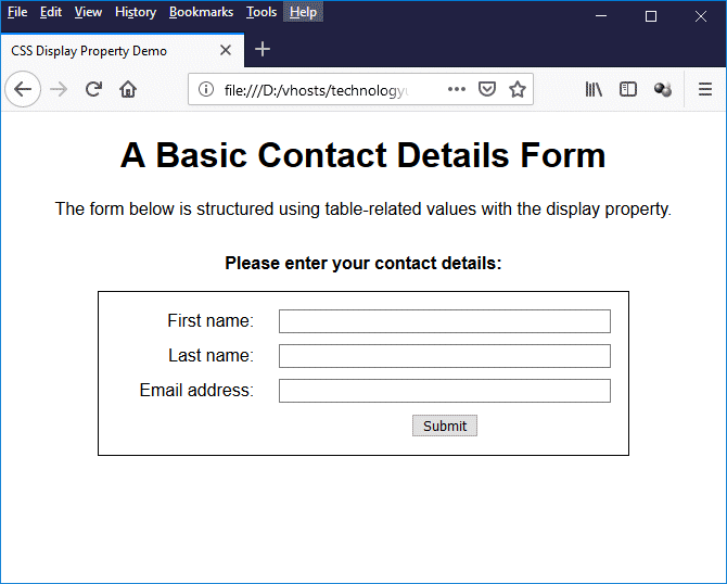
A basic contact details form, structured using the display property with table-related values
The display property is used in the above example to make the <form> element behave like a table. Any <div> elements that appear inside the form are set to display as table rows, and the <label>, <input> and <button> elements are all set to display as table cells. To finish things off, a paragraph element (<p>) is used inside the form to create a table caption.
The display property is undoubtedly the most important CSS property for controlling layout because it allows us to change the way HTML elements are displayed. Every displayable HTML element has a default value set for its display property that can be overridden. Even the more recent CSS layout systems, like CSS Flexbox and CSS Grid Layout, require the display property to be set to the appropriate value (i.e. display: flex; or display: grid;).
The value assigned to an HTML element's float property determines whether the element's box will "float" to the left, to the right, or not at all. The float property may be set for any displayable HTML element, but will have no effect if applied to elements that are absolutely positioned.
If a box is floated to the left, the content that follows it in the document tree will usually flow on the right side of the box, starting at the top of the box. This is however subject to whether or not the element immediately following the floated box has its clear property set (see below). If a box is floated to the right, content flows on the left side of the box, again starting at the top of the box, and again subject to whether or not the element immediately following the floated box has its clear property set.
The float property was originally intended to allow blocks of text to wrap around any images that might be placed on a page. The idea is that the image is set to float the left or right of the page, while adjacent paragraphs of text will occupy any space available to the right or left of the image rather than starting on a new line (if the image is to the left) or forcing a line break (if the image is to the right).
This behaviour occurs because "floating" an element takes it out of the document's normal flow. Any block-level element that follows the floated element in the document tree starts on the same line it would have started on had the floated element not been there, and its container will overlap that of the floated element. Its contents, however, will wrap around the floated element.
The HTML code below creates a web page that demonstrates how the float property was originally intended to be used, which is to make blocks of text wrap around images.
<!doctype html>
<html lang="en">
<head>
<meta charset="utf-8">
<title>Float Property Demo 01</title>
<style>
body {
padding: 1em 10%;
font-family: serif;
font-size: 120%;
}
h1 { text-align: center; }
img.left {
float: left;
margin: 0 1em 1em 0;
}
img.right {
float: right;
margin: 0 0 1em 1em;
}
</style>
</head>
<body>
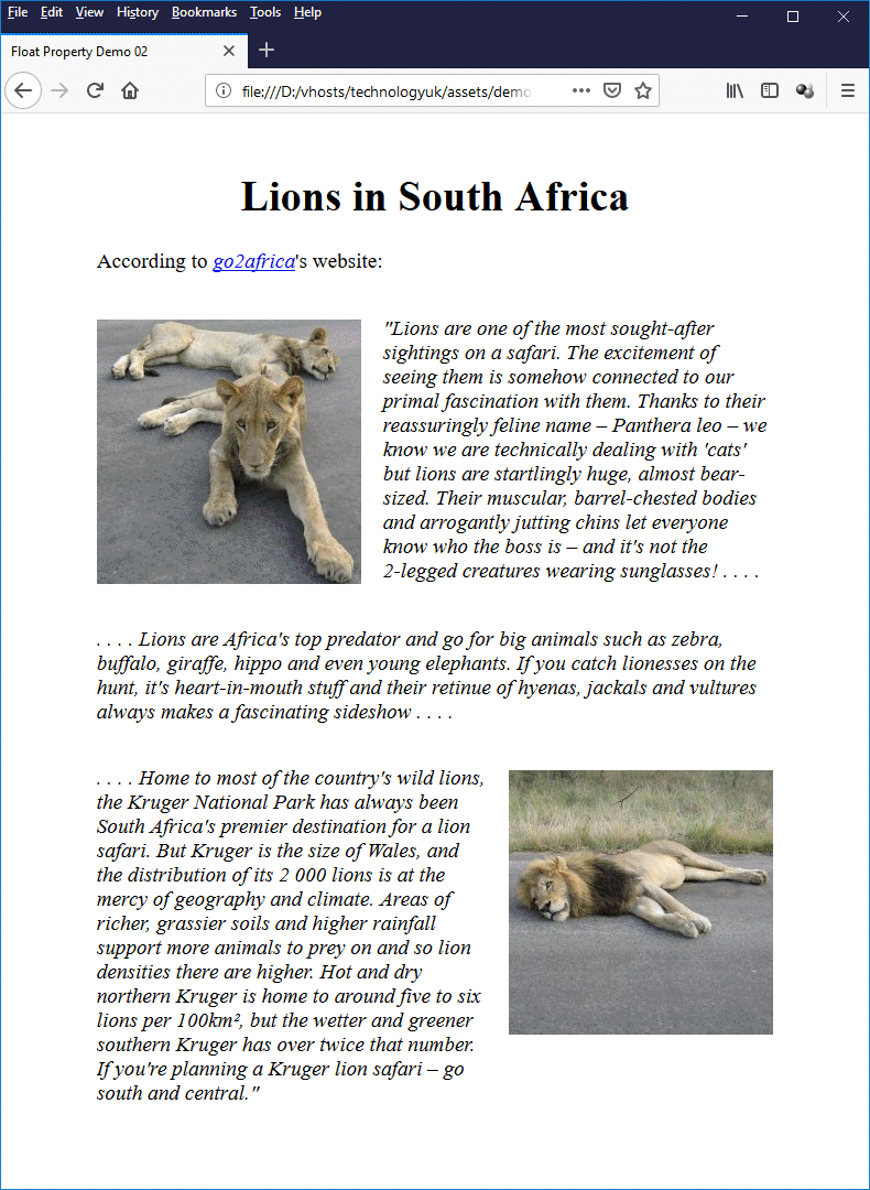
<h1>Lions in South Africa</h1>
<p>
According to <a href="https://www.go2africa.com/"><em>go2africa</em></a>'s website:
</p>
<img class="left" src="https://www.technologyuk.net/assets/demo-images/lionesses.jpg" alt="Lionesses in SA" width="240" height="240">
<p>
<cite>"Lions are one of the most sought-after sightings on a safari. The excitement of seeing them is somehow connected to our primal fascination with them. Thanks to their reassuringly feline name – Panthera leo – we know we are technically dealing with 'cats' but lions are startlingly huge, almost bear-sized. Their muscular, barrel-chested bodies and arrogantly jutting chins let everyone know who the boss is – and it's not the 2-legged creatures wearing sunglasses! . . . .</cite>
</p>
<p>
<cite> . . . . Lions are Africa's top predator and go for big animals such as zebra, buffalo, giraffe, hippo and even young elephants. If you catch lionesses on the hunt, it's heart-in-mouth stuff and their retinue of hyenas, jackals and vultures always makes a fascinating sideshow. . . . .</cite>
</p>
<img class="right" src="https://www.technologyuk.net/assets/demo-images/lion.jpg" alt="A lion in SA" width="240" height="240">
<p>
<cite> . . . . Home to most of the country's wild lions, the Kruger National Park has always been South Africa's premier destination for a lion safari. But Kruger is the size of Wales, and the distribution of its 2 000 lions is at the mercy of geography and climate. Areas of richer, grassier soils and higher rainfall support more animals to prey on and so lion densities there are higher. Hot and dry northern Kruger is home to around five to six lions per 100km², but the wetter and greener southern Kruger has over twice that number. If you're planning a Kruger lion safari – go south and central."</cite>
</p>
</body>
</html>
Copy and paste this code into a new file in your HTML editor, save the file as css-float-property-demo-01.html, and open the file in a web browser. You should see something like the illustration below.
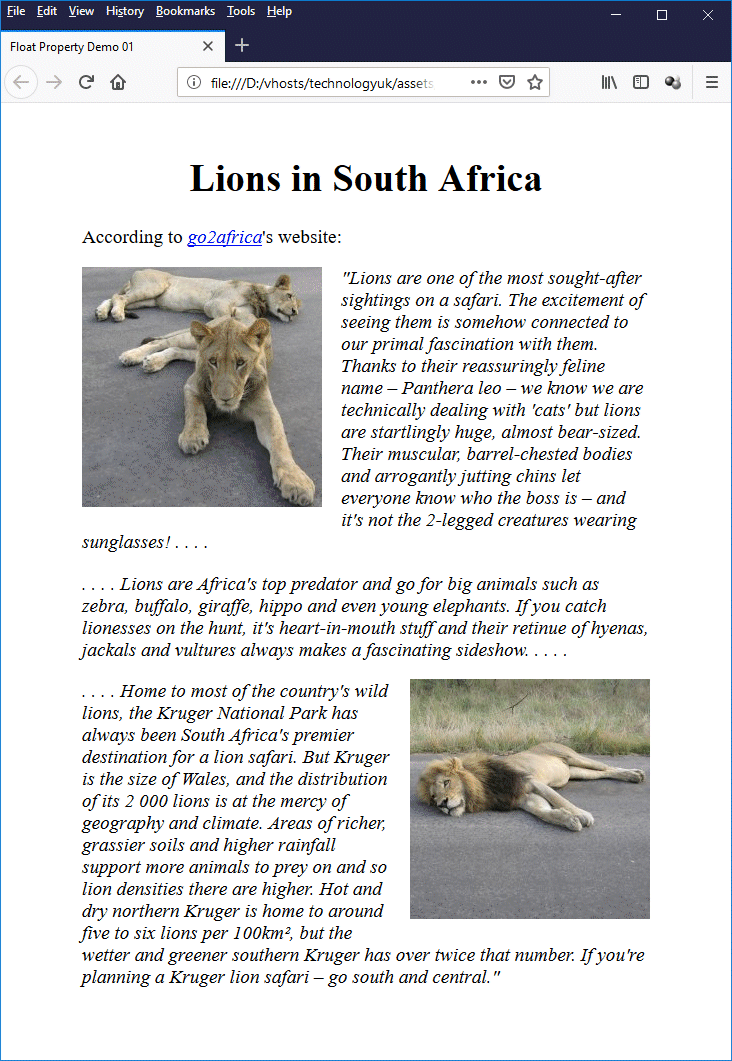
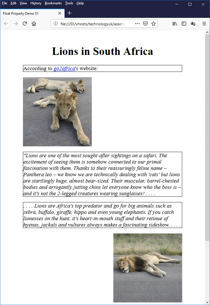
The float property is conventionally used to make text wrap around images
To see more clearly how a floated element interacts with its block-level neighbours, try adding the following line of code to the embedded stylesheet in the file css-float-property-demo-01.html:
p { border: 1px solid; }
This line of code simply puts a border round the paragraph elements, enabling you to clearly see how the paragraph elements interact with the floated images. Save the file and reopen it in a browser. You should now see something like this:
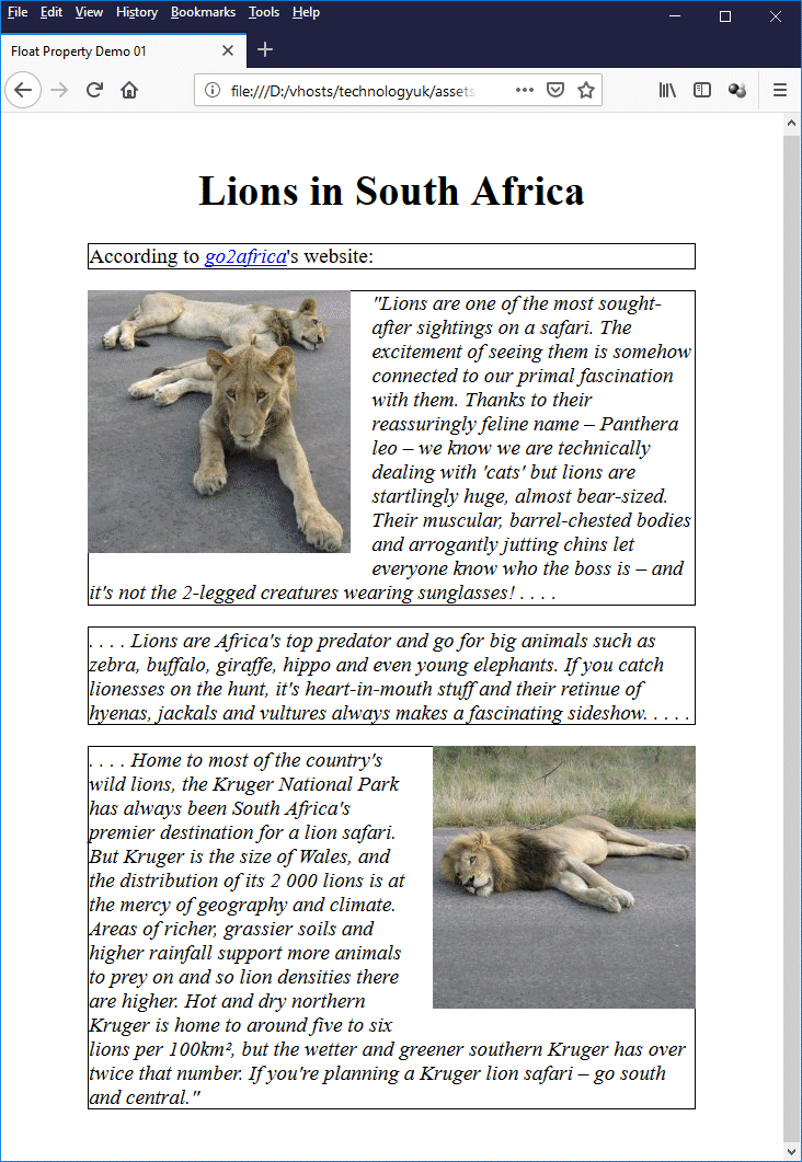
The floated images' containers are overlapped by those of their block-level neighbours
Suppose we have a paragraph that follows a floated element, but we don't want the paragraph's text to wrap around the floated element. Can we prevent it from happening? Actually, yes. We just need to use the clear property with the paragraph. To see how this works, open the file css-float-property-demo-01.html in your HTML editor once more and edit this code:
p { border: 1px solid; }
to read as follows:
p {
border: 1px solid;
clear: both;
}
Save the file and reopen it in a browser. You should now see something like this:
We have "cleared" both sides of each paragraph
Setting an element's clear property to "left" tells the browser that the left-hand side of the element may not be adjacent to a floating element that appears before it in the document tree. Similarly, setting the element's clear property to "right" tells the browser that the right-hand side of the element may not be adjacent to a floating element that precedes it in the tree. Setting the element's clear property to "both", as we did above, indicates that neither side of the element may be adjacent to a floating element that precedes it.
In the examples we have looked at so far, the text in a paragraph that follows an image either flows around the image to the left or right on the page or (if we have set the paragraph's clear property to an appropriate value) appears below the image, leaving an area of white space to one side or the other of the image. It may well be, however, that neither of these arrangements is what we actually want.
Let's suppose that we want our text to appear next to the image, but not wrap around the image. In other words, no text from an adjacent paragraph wraps underneath the image; it effectively stays in its own "column". We might, for example, want to re-write our "Lions in South Africa" page so that each image is paired with a single paragraph, with the penultimate paragraph taking up the full width of the page, like this:
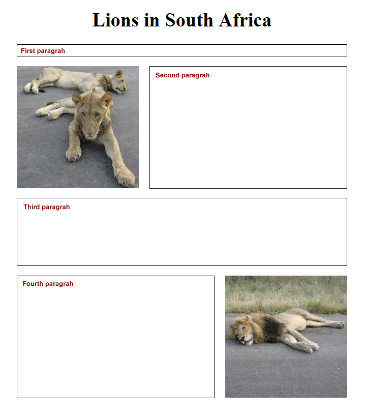
This is the page layout we want to achieve
Let's think about potential problems first. The first paragraph appears in the document tree before anything else, so we can leave it as it is. The text in the second paragraph will begin level with the top of the first image and to the right of the image. There are now three possible scenarios.
If the height of the second paragraph is less than the height of the first image, it will stay in its own "column", but the text of the third paragraph will wrap around the image, which is not what we want. If the height of the second paragraph is greater than the height of the first image, it will wrap around the image and continue underneath it, which is also not what we want.
Only if the text in the second paragraph is the same height as the first image will we get the layout we are actually seeking, but we can't guarantee that this will be the case. We could attempt to pad out or reduce the amount of text in the second paragraph so that its height matched that of the image exactly, but this will only work if we can fix the width of the paragraph. Even then, the results are not guaranteed.
There are essentially two things we need to do in order to solve the problem. The first thing we must do is to put each image, and the paragraph with which it is to be paired, in a separate container – we can think of it as a "wrapper". The idea is that we want (eventually) to exclude any text that does not belong together with an image. Here is the revised version of our "Lions in South Africa" page:
<!doctype html>
<html lang="en">
<head>
<meta charset="utf-8">
<title>Float Property Demo 02</title>
<style>
body {
padding: 1em 10%;
font-family: serif;
font-size: 120%;
}
h1 { text-align: center; }
img.left {
float: left;
margin: 0 1em 1em 0;
}
img.right {
float: right;
margin: 0 0 1em 1em;
}
div { border: 1px solid; }
</style>
</head>
<body>
<h1>Lions in South Africa</h1>
<p>
According to <a href="https://www.go2africa.com/"><em>go2africa</em></a>'s website:
</p>
<div>
<img class="left" src="https://www.technologyuk.net/assets/demo-images/lionesses.jpg" alt="Lionesses in SA" width="240" height="240">
<p>
<cite>"Lions are one of the most sought-after sightings on a safari. The excitement of seeing them is somehow connected to our primal fascination with them<!-- . Thanks to their reassuringly feline name – Panthera leo – we know we are technically dealing with 'cats' but lions are startlingly huge, almost bear-sized. Their muscular, barrel-chested bodies and arrogantly jutting chins let everyone know who the boss is – and it's not the 2-legged creatures wearing sunglasses! --> . . . .</cite>
</p>
</div>
<p>
<cite> . . . . Lions are Africa's top predator and go for big animals such as zebra, buffalo, giraffe, hippo and even young elephants. If you catch lionesses on the hunt, it's heart-in-mouth stuff and their retinue of hyenas, jackals and vultures always makes a fascinating sideshow . . . .</cite>
</p>
<div>
<img class="right" src="https://www.technologyuk.net/assets/demo-images/lion.jpg" alt="A lion in SA" width="240" height="240">
<p>
<cite> . . . . Home to most of the country's wild lions, the Kruger National Park has always been South Africa's premier destination for a lion safari. But Kruger is the size of Wales, and the distribution of its 2 000 lions is at the mercy of geography and climate. Areas of richer, grassier soils and higher rainfall support more animals to prey on and so lion densities there are higher. Hot and dry northern Kruger is home to around five to six lions per 100km², but the wetter and greener southern Kruger has over twice that number. If you're planning a Kruger lion safari – go south and central."</cite>
</p>
</div>
</body>
</html>
Copy and paste this code into a new file in your HTML editor, save the file as css-float-property-demo-02.html, and open the file in a web browser. You should see something like the illustration below.
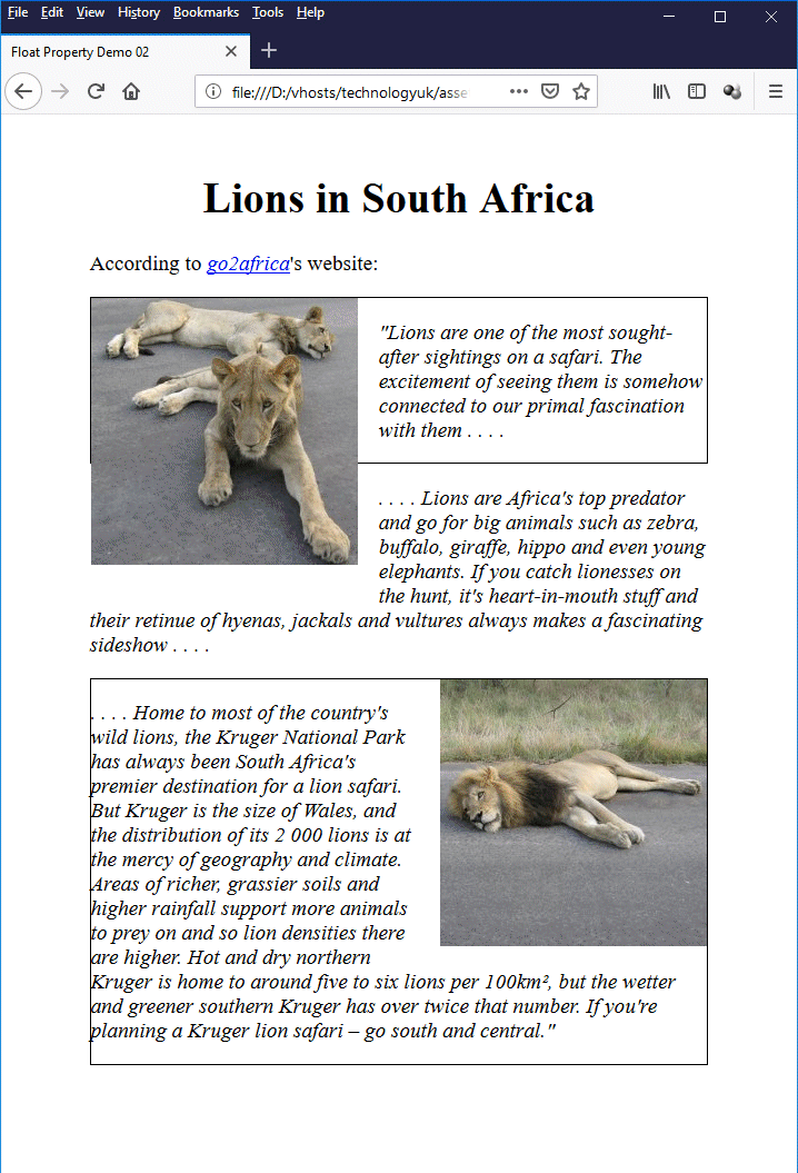
We have used a <div> element to encapsulate each image-paragraph pairing
Looking at the illustration, you can see that we have not, as yet, solved our problems. We have deliberately commented out some of the text in the second paragraph so that you can see that the text in the third paragraph will wrap around the first image. We have also set a one-pixel border on the <div> elements so that you can clearly see that, because the images have been floated and are thus outside the normal document flow, they are not encapsulated by the <div> elements.
We can force the <div> elements to include the images using something called a "clearfix hack", of which there seem to be a number of different versions. The version we present here simply involves setting the overflow property of the <div> element to a value of "auto". Open the file css-float-property-demo-02.html in your HTML editor, un-comment the text in the second paragraph, and amend the embedded stylesheet to read as follows:
div {
border: 1px solid;
overflow: auto;
}
Save the file, and open it in a web browser. You should now see something like this:
Thanks to the "clearfix hack", each image is now encapsulated by its parent <div>
As you can see, we are now closer to the required layout, but we still have text wrapping around both images rather than staying in its own column. We can fix this by applying a margin to the affected paragraphs to push the text to the left or right, as appropriate. Add the following rules to the embedded style sheet:
p.rcol { margin-left: 260px; }
p.lcol { margin-right: 260px; }
Now add the class ".rcol" to the second paragraph and the class ".lcol" to the last paragraph. Finally, remove the border from the <div> elements by changing this code in the embedded stylesheet:
div {
border: 1px solid;
overflow: auto;
}
to this:
div { overflow: auto; }
Finally, add a margin to the top of each image to line it up with the top of the adjacent text by amending the embedded stylesheet code as follows:
img.left {
float: left;
margin: 1.2em 1em 1em 0;
}
img.right {
float: right;
margin: 1.2em 0 1em 1em;
}
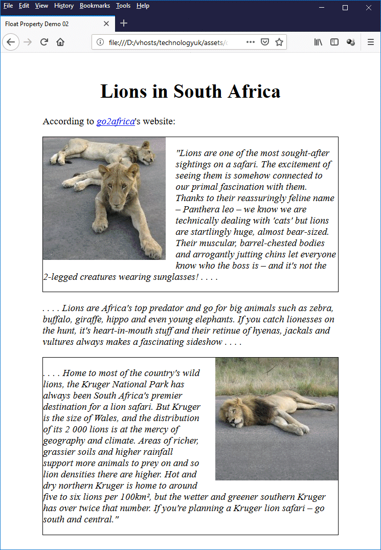
Save the file and open it in a browser once more. You should now see something like this:
We now have the layout we were seeking
We have now successfully created the layout we set out to achieve, using various hacks and tweaks. This is not a particularly elegant solution, and while it works reasonably well for a layout involving two columns, you can probably imagine how much more complicated life can become when we are dealing with more than two columns. We will now look at how we can use floats slightly more efficiently to create multiple-column layouts.
We have seen how an image can be floated to the left or right of a page, and how we can use various hacks and tweaks to make text flow around it, or even sit beside it in its own "column". Web developers were quick to realise, however, that if images could be floated, then so could other HTML elements, making it possible to create sophisticated multi-column page layouts of the kind seen in newspapers or magazines.
The basic technique is to use an HTML element such as <div> to create each "column". The width of each column is restricted to some percentage of the total width of the page (note that the sum of the column widths should add up to 100%). The column elements are then "floated" to the left. This removes them from the normal document flow so that instead of being stacked vertically, they sit next to each other on the page.
An example should clarify how this works. The following HTML code creates a five-column web page that describes the properties of various platonic solids:
<!doctype html>
<html lang="en">
<head>
<meta charset="utf-8">
<title>Float Property Demo 03</title>
<style>
body {
padding: 1em 5%;
font-family: sans-serif;
font-size: 75%;
}
h1 { text-align: center; }
.wrapper {
border: 1px solid;
overflow: auto;
}
.col {
box-sizing: border-box;
width: 20%;
padding: 0.5em;
float: left;
}
img {
width: 100%;
margin: 1em 0;
}
</style>
</head>
<body>
<h1>The Platonic Solids</h1>
<p>
A platonic solid is a regular convex <em>polyhedron</em> (a three-dimensional geometrical shape with flat faces and straight edges) with all faces being regular congruent polygons, and the same number of faces meeting at each vertex.
</p>
<div class="wrapper">
<div class="col">
<h2>Tetrahedron</h2>
<p>
The tetrahedron is a special case of the pyramid in the sense that it is a triangular pyramid (i.e. all of the faces are triangles, including the base polygon). It has four faces (the word tetra has its origins in the Greek language, and means four), six edges, and four vertices.
<img class="left" src="https://www.technologyuk.net/assets/demo-images/platonic01.gif" alt="Tetrahedron">
What distinguishes the tetrahedron from other pyramids is that all of its faces are triangles. As you can see from the illustration, the tetrahedron has a triangular base (any one of the tetrahedron's four faces can be designated to be the base), and three triangular sides that connect the base to the apex. Each vertex of the tetrahedron is shared by three of its triangular faces.
</p>
</div>
<div class="col">
<h2>Cube</h2>
<p>
Cubes are a subset of the cuboid family and, although all cubes are cuboids, not all cuboids are cubes. The cube is probably the simplest three-dimensional object from a mathematical point of view.
<img class="left" src="https://www.technologyuk.net/assets/demo-images/platonic02.gif" alt="Cube">
The cube has six faces, all of which are squares of the same size, and twelve edges, all of the same length. The dihedral angle between all intersecting faces is ninety degrees (90°). Each of the cube's eight vertices is formed by the junction of three of its faces. The cube can also be called a regular <em>hexahedron</em> (a three-dimensional shape with six faces).
</p>
</div>
<div class="col">
<h2>Octahedron</h2>
<p>
A regular octahedron consists of eight equilateral triangles, with four of those triangles meeting at each vertex. It is in fact the only one of the platonic solids to have an even number of faces meeting at a single vertex. Various minerals have been found in the form of octahedral crystals, including diamond, alum and fluorite.
<img class="left" src="https://www.technologyuk.net/assets/demo-images/platonic03.gif" alt="Octahedron">
Interestingly, there are two different vertex angles (a vertex angle is the angles between two edges meeting at a vertex). At any vertex, the angle between adjacent edges is sixty degrees (60°), whereas the angle between opposite edges is ninety degrees (90°).
</p>
</div>
<div class="col">
<h2>Dodecahedron</h2>
<p>
A regular dodecahedron consists of twelve regular pentagons, with three of those pentagons meeting at each vertex.
<img class="left" src="https://www.technologyuk.net/assets/demo-images/platonic04.gif" alt="Dodecahedron">
Some quasicrystals have a dodecahedral shape. A quasicrystal is usually a man-made crystalline structure, although naturally occurring examples have been discovered. Somewhat more intriguingly, in 2003 French and US cosmologists suggested, based on their interpretation of background microwave radiation patterns, that the universe is finite in size, and shaped like a dodecahedron.
</p>
</div>
<div class="col">
<h2>Icosahedron</h2>
<p>
A regular icosahedron consists of twenty equilateral triangles, with five of those triangles meeting at each vertex. In the natural world, the icosahedron is the shape favoured by a number of viruses, including the infamous herpes virus. The icosahedron is the only one of the platonic solids to have a dihedral angle with a magnitude greater than one hundred and twenty degrees.
<img class="left" src="https://www.technologyuk.net/assets/demo-images/platonic05.gif" alt="Icosahedron">
Like the octahedron, the icosahedron has two different vertex angles. At any vertex, the angle between adjacent edges is sixty degrees (60°), whereas the angle between non-adjacent edges is one hundred and eight degrees (108°).
</p>
</div>
</div>
</body>
</html>
Copy and paste this code into a new file in your HTML editor, save the file as css-float-property-demo-03.html, and open the file in a web browser. You should see something like the illustration below.
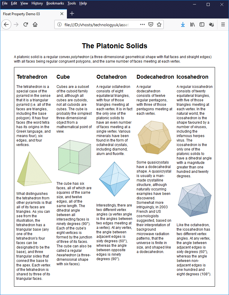
A five-column page layout using floats and percentages
There are a few things to note here. First of all, because we are splitting the page text over five columns, we have reduced the font size to 75% of the default font size. This is similar to what you see in newspaper columns, where the size of the text is reduced in order for the content to still be readable in a narrow column format.
The next thing to note is the CSS code used to style the columns:
.col {
box-sizing: border-box;
width: 20%;
padding: 0.5em;
float: left;
}
We have set the box-sizing property to "border-box". This means we can add padding (and even borders) to the column without having to re-calculate the width property, which is set to "20%" (i.e. one-fifth of the total available width, since there will be five columns).
Since we are interspersing our text with illustrative images, it would be nice if we could guarantee that the image will always occupy the width of the column exactly, even if the column width changes as we resize the browser window (which of course it will, since we are using percentages for the column widths). We achieve this goal by setting the width property for the <img> element to "100%".
img {
width: 100%;
margin: 1em 0;
}
We have also set top and bottom margins for the image element to create some white space between each image and the text above and below it.
The final step is to add a "wrapper" around our columns and use the "clearfix hack" to ensure that the content of our columns is completely encapsulated by the wrapper (which in this case a is another <div> element). The border is purely a cosmetic touch, but it does serve to illustrate that our wrapper does indeed completely contain our columns.
.wrapper {
border: 1px solid;
overflow: auto;
}
If you resize your browser, you will see that the columns and the images will all resize themselves width-wise in order to fit into the available space. There is a point, however, beyond which the contents of each column will become very difficult to read. We estimate that this occurs if the browser window falls significantly below a width of 800 pixels. One way in which we can solve this problem is by adding the following CSS code to our embedded style sheet:
@media only screen and (max-width: 799px) {
body {
font-size: 100%;
padding: 1em;
}
.col {
box-sizing: border-box;
width: 100%;
padding: 1em;
float: none;
}
img {
width: 240px;
display: block;
margin: 1em auto;
}
}
We will be discussing the use of media queries to implement responsive design in due course.
The position property can be used to move an element from where it would appear on the page under normal circumstances to a different position. Thus, like the float property, the position property can be used to remove an HTML element from the normal flow of a document. Unlike the float property, the position property is not really used to create entire page layouts. We can think of it more as a tool for fine-tuning existing layouts.
The values most commonly used with the position property are as follows:
All HTML elements are statically positioned by default. There may be times, however when we want to change the default positioning of an element. Let's have a look at some basic examples of how the position property works, starting with relative positioning. The following HTML code creates a web page that displays three paragraphs of randomly generated text:
<!doctype html>
<html lang="en">
<head>
<meta charset="utf-8">
<title>Position Property Demo 01</title>
<style>
body {
padding: 0 10%;
font-size: 1.2em;
}
h1 { text-align: center; }
</style>
</head>
<body>
<h1>Relative Positioning Demo</h1>
<p>
Lorem ipsum dolor sit amet, consectetur adipiscing elit, sed do eiusmod tempor incididunt ut labore et dolore magna aliqua. Nascetur ridiculus mus mauris vitae ultricies. Purus non enim praesent elementum facilisis leo. Quis eleifend quam adipiscing vitae. A diam sollicitudin tempor id eu nisl nunc mi. Mi in nulla posuere sollicitudin aliquam ultrices sagittis orci. Egestas sed sed risus pretium quam. Eu ultrices vitae auctor eu. Mauris pellentesque pulvinar pellentesque habitant. Sagittis nisl rhoncus mattis rhoncus urna neque. Cursus euismod quis viverra nibh. Augue neque gravida in fermentum et sollicitudin. Id neque aliquam vestibulum morbi.
</p>
<p>
<cite>Tincidunt ornare massa eget egestas purus viverra accumsan in nisl. Et sollicitudin ac orci phasellus egestas tellus rutrum tellus. Aliquet porttitor lacus luctus accumsan tortor posuere ac ut. Ut tristique et egestas quis. Eu mi bibendum neque egestas congue quisque egestas. Maecenas ultricies mi eget mauris pharetra. Libero volutpat sed cras ornare arcu dui vivamus. Id aliquet risus feugiat in ante. In metus vulputate eu scelerisque felis. Praesent elementum facilisis leo vel fringilla est ullamcorper eget. Nullam non nisi est sit amet facilisis magna.</cite>
</p>
<p>
Parturient montes nascetur ridiculus mus mauris vitae ultricies leo integer. Sollicitudin nibh sit amet commodo nulla facilisi nullam. Dolor sit amet consectetur adipiscing elit pellentesque habitant. Consequat ac felis donec et. Amet nisl suscipit adipiscing bibendum. Malesuada bibendum arcu vitae elementum curabitur vitae. Commodo nulla facilisi nullam vehicula ipsum a arcu cursus vitae. A condimentum vitae sapien pellentesque habitant. Ornare aenean euismod elementum nisi quis eleifend quam adipiscing vitae. Lacinia at quis risus sed vulputate.
</p>
</body>
</html>
Copy and paste this code into a new file in your HTML editor, save the file as css-position-property-demo-01.html, and open the file in a web browser. You should see something like the illustration below (note that the code does not yet actually implement any relative positioning).
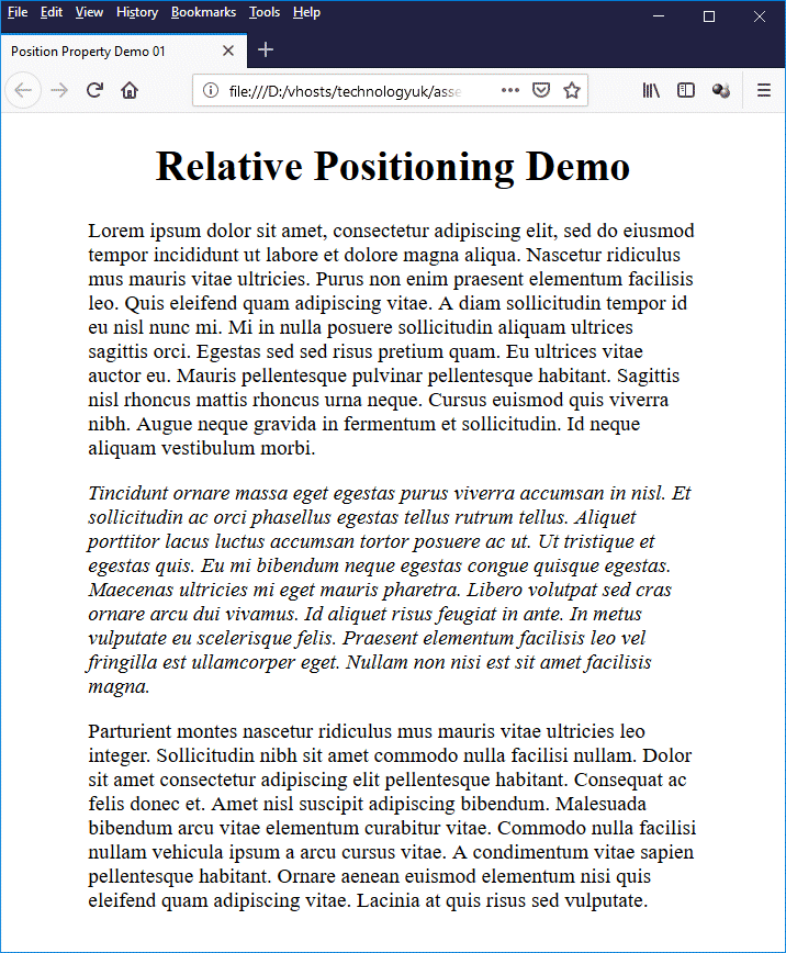
This page displays three paragraphs of randomly generated text
You may have noticed if you looked at the HTML code that we enclosed the second paragraph between the opening and closing tags of a <cite> element, which is why that paragraph appears in italics. From a semantic point of view this is fine, because screen readers, search engines and other intelligent text-parsing software will register the fact that this paragraph is a citation.
From a visual point of view, however, it may leave something to be desired in terms of signalling to the reader that this is a citation. The text is italicised, but apart from that it doesn't really stand out and could perhaps be overlooked. Let's make it a little bit more obvious that there is something special about this text. Add the following code to the embedded style sheet:
.citation {
box-sizing: border-box;
padding: 1em 2em;
border: 1px solid orange;
position: relative;
left: 10%;
width: 80%;
background: FloralWhite;
}
and change the opening tag of the second paragraph to this:
<p class="citation">
.
.
.
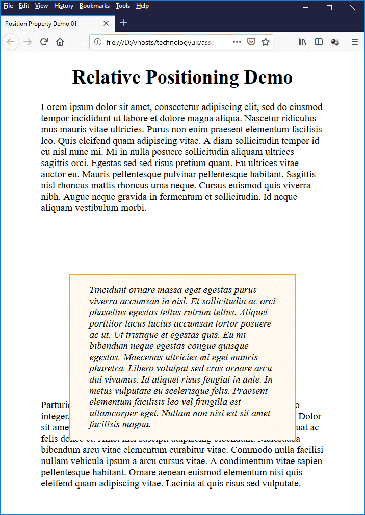
Save the file and reopen it in a browser. You now should see something like this:
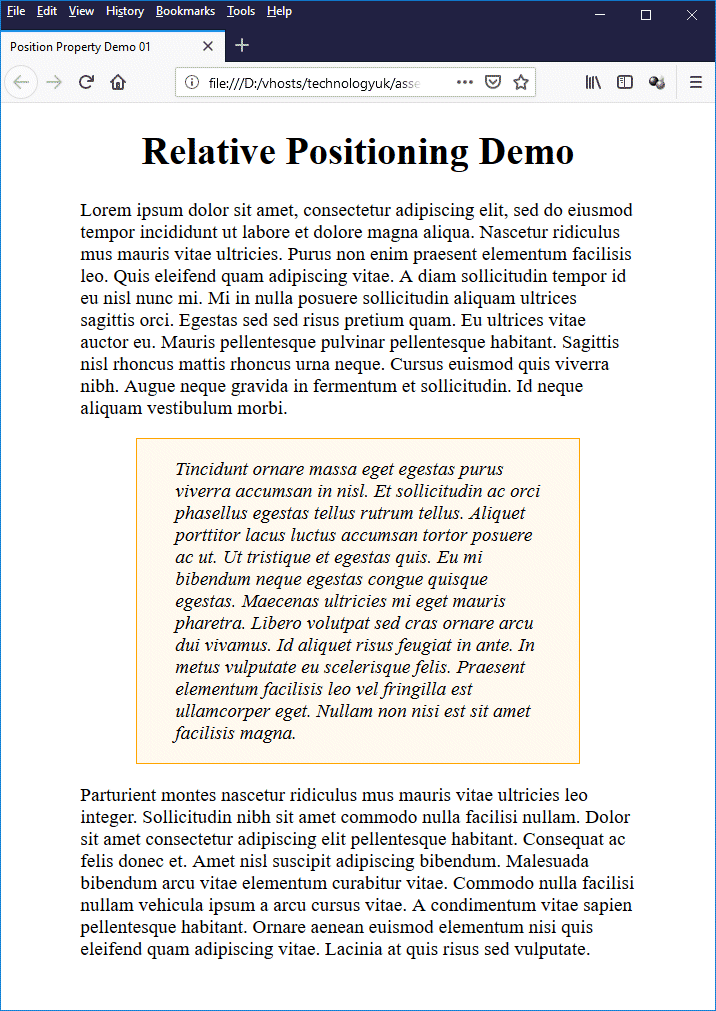
The "citation" now stands out clearly
We have done two things here in order to make our "citation" stand out. The most obvious change is that we have put a coloured background behind it and given it a border. We have also indented the paragraph left and right, which we achieved using the following CSS rules:
position: relative;
left: 10%;
width: 80%;
The first rule (position: relative;) tells the browser that any subsequent adjustment to the paragraph's position should be made with respect to the paragraph's default position. The next rule (left: 10%;) tells the browser to position the paragraph to the right of its normal position by a value equivalent to 10% of the parent container's width (the parent container in this case being the <body> element).
The final rule (width: 80%;) tells the browser to set the width of the paragraph to 80% of the parent container's width. This last rule is necessary because the paragraph element is a block-level element, and by default would occupy the full width of its container (the <body> element).
Offsetting the paragraph's horizontal position does not change its width, so the paragraph will extend past the right-hand boundary of the of the <body> element by the offset amount (the exact opposite of what we actually want to happen) unless we do something about it. Setting the paragraph's width property to "80%" compensates for the initial 10% offset and gives the paragraph a 10% offset from the right-hand boundary of its parent container.
Of course, we could just as easily have implemented the required indentation by setting appropriate values for the padding property of the paragraph element. We chose to use relative positioning merely to demonstrate how it works. One thing that is maybe not so obvious in this example is how a relatively positioned element interacts with its neighbouring elements. Try adding this CSS rule to the .citation class in the embedded stylesheet:
top: 100px;
Save the file once more and reopen it in a browser. You now should see something like this:
The "citation" paragraph now overlaps the following paragraph
As you can see, the "citation" paragraph has been vertically offset downwards by 100 pixels, but the paragraph following it has not moved. This is because other (non-positioned) elements on the page will behave as if the relatively positioned element was in its "normal" position (i.e. the position it would have occupied had it not been offset using relative positioning).
This feature can be quite useful if, for example, we actually want one element to overlay another, but we also need to be careful not to inadvertently obscure part of our content when using relative positioning.
When we position an element using absolute positioning to, we specify its location as an offset from the position of the closest positioned ancestor element (in the absence of any other positioned ancestor, this would be the document's root element, which is the <html> element).
Because an absolutely positioned element is removed completely from the normal document flow, any element that follows an absolutely positioned element in the HTML document is positioned as though the absolutely positioned element doesn't exist. The following HTML code creates a web page that displays two paragraphs of randomly generated text, and has a "Copy" stamp positioned centrally on the page:
<!DOCTYPE html>
<html>
<head>
<title>Position Property Demo 02</title>
<style>
body {
width: 600px;
margin: 0 auto;
font-size: 1.2em;
font-family: sans-serif;
}
main {
position: relative;
background: FloralWhite;
padding: 0.25em 1em;
}
h1 { text-align: center; }
.stamp {
position: absolute;
top: 190px;
left: 190px;
opacity: 0.4;
}
</style>
</head>
<body>
<h1>Absolute Positioning Demo</h1>
<main>
<img class="stamp" src="https://www.technologyuk.net/assets/demo-images/copy-stamp.gif" alt="Copy stamp">
<p>
Lorem ipsum dolor sit amet, consectetur adipiscing elit, sed do eiusmod tempor incididunt ut labore et dolore magna aliqua. Cum sociis natoque penatibus et magnis. Gravida quis blandit turpis cursus in. Sed euismod nisi porta lorem mollis aliquam ut porttitor. Purus sit amet volutpat consequat mauris nunc. Metus vulputate eu scelerisque felis imperdiet. Aliquam sem et tortor consequat. Egestas quis ipsum suspendisse ultrices gravida dictum. Lectus sit amet est placerat in egestas erat imperdiet. Eros donec ac odio tempor orci dapibus ultrices. Consequat semper viverra nam libero justo. Ornare massa eget egestas purus viverra accumsan in nisl. Tristique nulla aliquet enim tortor. Elementum sagittis vitae et leo duis ut. Integer enim neque volutpat ac tincidunt vitae semper quis lectus. Curabitur vitae nunc sed velit dignissim sodales ut eu. Iaculis eu non diam phasellus.
</p>
<p>
Vestibulum lorem sed risus ultricies tristique nulla aliquet enim. Ullamcorper morbi tincidunt ornare massa eget. Dignissim convallis aenean et tortor. Sodales ut etiam sit amet. Sed viverra ipsum nunc aliquet bibendum. Ultricies integer quis auctor elit. Leo integer malesuada nunc vel risus commodo viverra maecenas accumsan. Leo in vitae turpis massa sed elementum tempus egestas sed. Quisque egestas diam in arcu cursus euismod quis viverra nibh. Sit amet aliquam id diam maecenas. Sem nulla pharetra diam sit. Arcu cursus euismod quis viverra nibh cras pulvinar. Arcu vitae elementum curabitur vitae nunc sed velit dignissim sodales. Nibh praesent tristique magna sit amet. Ut venenatis tellus in metus vulputate eu. Eget felis eget nunc lobortis mattis aliquam faucibus purus.
</p>
</main>
</body>
</html>
Copy and paste this code into a new file in your HTML editor, save the file as css-position-property-demo-02.html, and open the file in a web browser. You should see something like the illustration below.
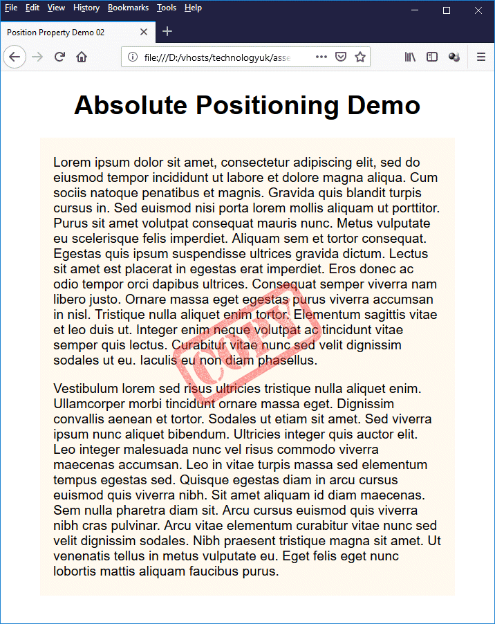
This page displays two paragraphs of text and a "Copy" stamp
The "copy" stamp is a GIF image with a transparent background. We have absolutely positioned the <img> element that references the image by giving it the class .stamp, which is defined as follows:
.stamp {
position: absolute;
top: 190px;
left: 190px;
opacity: 0.4;
}
The image is 220 × 220 pixels, and since we have set the <body> element to a width of 600 pixels, a horizontal offset of 190 pixels centres the image on the page. Note that the image is positioned relative to the <main> element as the <img> element's closest positioned ancestor. Because <main> is a block-level element, it occupies the full width of its parent (<body>), and its height is determined by its content (the two paragraphs of text).
With the file open in a browser, try resizing the browser window to see what happens. You should find that the "Copy" stamp remains in the same position relative to the text at all times. Absolute positioning can be used when you want to position an element at a fixed location relative to some other element without otherwise affecting the page layout.
Fixed positioning is similar to absolute positioning in that when an HTML element is in a fixed position, non-positioned elements will arrange themselves on the page as if the fixed element were not present. The main difference is that, whereas the absolutely positioned element is positioned relevant to its first positioned ancestor (or the <html> element in the absence of any such ancestor), the fixed element's position is fixed in relation to the viewport, and it will therefore stay where it is on the screen when the page is scrolled.
This can be a useful feature if, for example, you wish to display a navigation menu or some other feature of your web page at all times, regardless of where the user has scrolled to on the page. The HTML code below creates a simple web page that demonstrates one possible application of fixed positioning. The top section of the page, comprising a logo, search box and horizontal navigation bar, are fixed in position so that they will always be visible, even if the user scrolls to the bottom of the page.
<!doctype html>
<html lang="en">
<head>
<meta charset="utf-8">
<title>Position Property Demo 03</title>
<style>
body {
margin: 0;
font-family: sans-serif;
font-size: 1.25em;
}
.fixed {
position: fixed;
background: #ffffff;
top: 0px;
width: 100%;
z-index: 1;
}
header {
display: inline-block;
width: 100%;
}
.logo { float: left; }
.search { float: right; padding: 2em 1em; }
.bar {
height: 24px;
background: #88aadd;
padding: 20px 0;
text-align: center;
}
div.content { margin-top: 200px; }
footer {
text-align: center;
padding: 20px 0;
background: #88aadd;
}
h1 {
color: #000040;
margin: 1em;
text-align: center;
}
p { margin: 2em 20%; }
li { list-style: none; }
img, li a { display: block; }
a {
text-decoration: none;
margin: 0 1em;
color: #ffffff;
}
a.dead { color: #ffcc00; }
a:hover { text-decoration: underline; }
a.dead:hover { text-decoration: none; }
</style>
</head>
<body>
<div class="fixed">
<header>
<div class="logo">
<img src="http://www.technologyuk.net/assets/demo-images/logo-blue.gif" alt="Site Logo">
</div>
<div class="search">
<form>
<input type="search" placeholder="Search the site...">
<button>Search</button>
</form>
</div>
</header>
<nav class="bar">
<a class="dead">Home</a>
<a href="#">Page 01</a>
<a href="#">Page 02</a>
<a href="#">Page 03</a>
<a href="#">Page 04</a>
<a href="#">Page 05</a>
</nav>
</div>
<div class="content">
<h1>Fixed Positioning Demo</h1>
<p>
Lorem ipsum dolor sit amet, consectetur adipiscing elit, sed do eiusmod tempor incididunt ut labore et dolore magna aliqua. Lobortis feugiat vivamus at augue eget arcu. Morbi non arcu risus quis. Vitae auctor eu augue ut lectus arcu bibendum at varius. Sed id semper risus in. Nulla facilisi etiam dignissim diam. Sed lectus vestibulum mattis ullamcorper velit sed ullamcorper morbi tincidunt. Nec ultrices dui sapien eget mi proin sed libero. Rhoncus est pellentesque elit ullamcorper dignissim cras. Aenean pharetra magna ac placerat vestibulum lectus mauris. Etiam sit amet nisl purus in mollis nunc sed. Nullam eget felis eget nunc. Eget aliquet nibh praesent tristique magna sit. Iaculis eu non diam phasellus vestibulum lorem sed risus.
</p>
<p>
Justo nec ultrices dui sapien eget mi proin sed libero. Diam vel quam elementum pulvinar etiam non. Nulla pellentesque dignissim enim sit amet venenatis urna cursus. Nibh sit amet commodo nulla facilisi nullam vehicula. Mauris in aliquam sem fringilla ut morbi tincidunt augue interdum. Vel elit scelerisque mauris pellentesque pulvinar pellentesque. Egestas congue quisque egestas diam in arcu. Tempus quam pellentesque nec nam. Enim ut sem viverra aliquet eget. Ultricies mi quis hendrerit dolor magna eget. Enim nunc faucibus a pellentesque sit. Suscipit tellus mauris a diam. Fermentum leo vel orci porta. Non consectetur a erat nam at lectus urna duis. Blandit volutpat maecenas volutpat blandit aliquam etiam erat velit.
</p>
<p>
Nulla pellentesque dignissim enim sit. Velit ut tortor pretium viverra. Ut aliquam purus sit amet luctus venenatis lectus magna fringilla. Amet luctus venenatis lectus magna fringilla urna porttitor rhoncus. Curabitur gravida arcu ac tortor. Adipiscing vitae proin sagittis nisl rhoncus. Viverra ipsum nunc aliquet bibendum enim facilisis gravida neque. Nibh ipsum consequat nisl vel pretium lectus quam id leo. Urna molestie at elementum eu facilisis. Feugiat in fermentum posuere urna nec. Aliquet eget sit amet tellus cras. Lorem ipsum dolor sit amet consectetur adipiscing. At elementum eu facilisis sed odio morbi. Facilisis sed odio morbi quis. Cursus eget nunc scelerisque viverra mauris in aliquam. Montes nascetur ridiculus mus mauris vitae ultricies leo integer. Tincidunt eget nullam non nisi est. Sapien faucibus et molestie ac feugiat sed lectus vestibulum. Non odio euismod lacinia at quis. Eget aliquet nibh praesent tristique magna sit amet.
</p>
<br>
</div>
<footer>
<a href="#">Sitemap</a>
<a href="#">Contact</a>
<a href="#">Privacy</a>
</footer>
</body>
</html>
Copy and paste this code into a new file in your HTML editor, save the file as css-position-property-demo-03.html, and open the file in a web browser. You should see something like the illustration below.
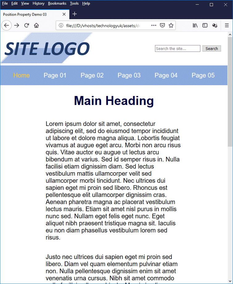
This page has a "fixed" header and navigation bar
Try scrolling up and down the page (if necessary, reduce the size of your browser window to make a vertical scroll bar appear). You should see that the page header and navigation bar remain at the top of the browser window at all times. Here is the crucial bit of CSS code responsible for this feature:
.fixed {
position: fixed;
background: #ffffff;
top: 0px;
width: 100%;
z-index: 1;
}
We have enclosed the <header> and <nav> elements in a <div> element of class .fixed. The CSS rules in this class set the position property of the <div> element to "fixed", give it an offset of zero pixels from the top of the viewport, and set its width property to "100%". Note, however, that we have added a couple of additional rules that might need some explanation.
First of all, the line background: #ffffff; gives the fixed <div> element a white background (by default, it would be transparent). This is because, when we scroll the page, the fixed <div> and the scrolled content will overlap. The white background prevents the user from seeing scrolled content through the page header, which would be rather disconcerting. Which brings us nicely to the next point.
The line z-index: 1; gives the fixed <div> element's z-index property a value of "1". What is the z-index property, and why have we given it this value? Essentially, the z-index property represents the order in which HTML elements are layered on the screen when a page is rendered. You can think of it as a kind of stacking order that determines which element is on top when two elements overlap.
In normal document flow, elements are displayed one after another on the screen, from top to bottom, and no element overlaps any other element. By default, all elements have their z-index property set to a value of "auto" (effectively, zero), which effectively means they are all in the same layer. When an element is positioned, its z-index property is assigned a positive integer value.
If there are several positioned elements in an HTML document, the value assigned to the z-index property of each positioned element depends entirely on the order in which it appears in the HTML document. The first positioned element is assigned a z-index value of "1"; the second positioned element is assigned a z-index value of "2"; and so on. Elements with a higher z-index value will appear in front of elements with a lower z-index value.
We can, of course, manipulate the stacking order by setting the value of an element's z-index property to a higher or lower value (including negative values), depending on whether we want to put that element in the foreground, or send it into the background somewhere.
If you've been paying attention, you'll realise that we don't actually need to set our fixed <div> element's z-index property, since it is the only positioned element in our document, and will therefore be rendered in front of the scrolled content automatically. But hopefully, you can see why this might become necessary if we were dealing with a number of overlapping positioned elements.
The last significant point to note is the CSS code for the <div> element that holds the main block of page content, which is assigned the class .content:
div.content { margin-top: 200px; }
Remember that an HTML element that is subject to fixed positioning is just like an HTML element that is subject to absolute positioning in that it is removed completely from the normal document flow. Other (non-positioned) HTML elements will be positioned as if the fixed element were not present.
If we allow our main page content to start at the top of the page (which it will do by default), part of it will be obscured by the fixed portion of our page, which is higher in the stacking order. In order to prevent this from happening, we need to set a sufficiently large top margin for the main page content so that it is pushed down the page and appears beneath the fixed elements at the top of the page.