| Author: | |
| Website: | |
| Page title: | |
| URL: | |
| Published: | |
| Last revised: | |
| Accessed: |
We have probably all heard the ancient Chinese proverb which asserts that a picture is worth a thousand words. I personally, however, agree with the U.S. computer and cognitive scientist John McCarthy (1927-2011). McCarthy (the man who developed the Lisp programming language and coined the term artificial intelligence) is quoted as having said:
"As the Chinese say, 1001 words is worth more than a picture."
Even though McCarthy's comment was probably somewhat tongue-in-cheek, we should never underestimate the power of words. There is another saying you are no doubt familiar with, which states that "the pen is mightier than the sword".
The textual content of a web page is very important. We can do more with text than produce a simple narrative. We use text to express mathematical concepts and scientific theories in a concise format using written formulas and equations. We use text to write program code and scripts. We use text to label charts and diagrams, and to create technical specifications. In short, text is very important indeed.
Almost as important as the text itself, however, is how we display it. Our deathless prose is not going to win us many accolades if no-one can read it because we've used a font size that's way too small, or a font colour that can barely be seen against the background colour. In fact, there are a number of things we have to consider, just about the text itself, before we get around to thinking about layout issues. These include:
We have already touched upon the issue of text and background colours; in fact, we have already looked at the whole subject of using colour in HTML documents in some depth, so we won't be saying much more about it here. We will however be looking at the other text attributes quite closely.
When it comes to text layout, we will need to consider how we are going to organise the text on the page. Keep in mind that a web page is (at least in most cases) more like a newspaper or a magazine than a book. We will be dealing with the physical layout of web pages elsewhere in this section. There are nevertheless things we can do to organise our text, regardless of where it is positioned on the page. These include:
When a browser renders an HTML document as a web page, the size of the text displayed for a particular HTML element will be the browser's default text size for that element unless you specify a different font size using the element's style attribute. In many cases the default font size is perfectly OK. Sometimes, however, it is necessary to 'tweak' the font size in order to achieve the desired result.
There are a couple of things you need to take into consideration before you start specifying font sizes. First of all, the range of devices on which your web site can be displayed is enormous, from low-end smartphones (or even "wearables") up to room-sized, Internet-enabled smart TVs. Your decisions concerning font-size need to take this into account.
The second thing you need to consider is that most if not all popular web browsers allow the user to change the browser's default font size. This is largely due to the fact that a significant number of people have difficulty reading text at default font sizes. You should therefore avoid the use of font size units that will override the browser defaults and cause your text to be rendered at a fixed size regardless of any other consideration.
Currently, the only HTML elements that directly affect font size are the heading elements <h1>, <h2>, <h3>, <h4>, <h5> and <h6>, and the <small> element. Since the heading elements have a very specific purpose and are not used to control the font size of normal text, we will be looking at them later, in a different context.
The <small> element reduces the font size of the text it encloses to the next size down from whatever the parent element's font size happens to be (e.g. large to medium, medium to small, or small to extra-small). The following HTML code demonstrates the use of the <small> element:
<!doctype html>
<html lang="en">
<head>
<meta charset="utf-8">
<title>Small Demo</title>
</head>
<body>
<p>
Lorem ipsum dolor sit amet, consectetur adipiscing elit, sed do eiusmod tempor incididunt ut labore et dolore magna aliqua. Ut enim ad minim veniam, quis nostrud exercitation ullamco laboris nisi ut aliquip ex ea commodo consequat. Duis aute irure dolor in reprehenderit in voluptate velit esse cillum dolore eu fugiat nulla pariatur. Excepteur sint occaecat cupidatat non proident, sunt in culpa qui officia deserunt mollit anim id est laborum.
</p>
<p>
<small>
Lorem ipsum dolor sit amet, consectetur adipiscing elit, sed do eiusmod tempor incididunt ut labore et dolore magna aliqua. Ut enim ad minim veniam, quis nostrud exercitation ullamco laboris nisi ut aliquip ex ea commodo consequat. Duis aute irure dolor in reprehenderit in voluptate velit esse cillum dolore eu fugiat nulla pariatur. Excepteur sint occaecat cupidatat non proident, sunt in culpa qui officia deserunt mollit anim id est laborum.
</small>
</p>
<p>
<small>
<small>
Lorem ipsum dolor sit amet, consectetur adipiscing elit, sed do eiusmod tempor incididunt ut labore et dolore magna aliqua. Ut enim ad minim veniam, quis nostrud exercitation ullamco laboris nisi ut aliquip ex ea commodo consequat. Duis aute irure dolor in reprehenderit in voluptate velit esse cillum dolore eu fugiat nulla pariatur. Excepteur sint occaecat cupidatat non proident, sunt in culpa qui officia deserunt mollit anim id est laborum.
</small>
</small>
</p>
</body>
</html>
Copy and paste this code into a new file in your HTML editor, save the file as small-demo.html, and open the file in a web browser. You should see something like the following:
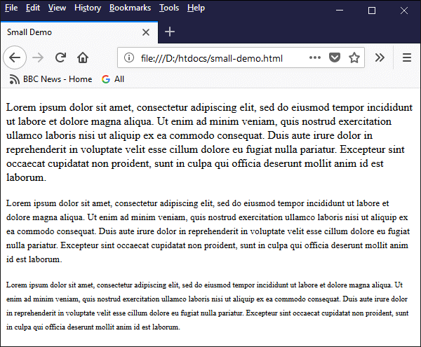
This example shows how the <small> element affects font size
Note that by using nested <small> elements, we can reduce the size of the enclosed text incrementally; each level of nesting will reduce the font size from the previous level. We strongly recommend that you don't do this. You can achieve far more control over font sizes (and do it much more efficiently) by using the style attribute.
Before we start looking at how to manipulate font sizes using styles, let's look at the options available to us in terms of font size units. What kind of values can we specify for the font-size property of an HTML element's style attribute? The range of options is large and potentially quite confusing. There are essentially two main types of font size unit: fixed and relative.
Let's look first at the fixed-size units (these are commonly known as absolute length units). The table below summarises the different fixed-size units available for use with the font-size property and gives some examples of their use.
| Unit | Description | Example of usage |
|---|---|---|
| cm | centimetres | style="font-size: 1.5cm;" |
| mm | millimetres | style="font-size: 15mm;" |
| in | inches | style="font-size: 0.5in;" |
| px | pixels | style="font-size: 24px;" |
| pt | points | style="font-size: 12pt;" |
| pc | picas | style="font-size: 1.5pc;" |
Centimetres, millimetres and inches are physical size units with which you are no doubt familiar. Points and picas are also physical size units; a point is equal to 1/72 of an inch, and a pica is equal to 1/6 of an inch (i.e. 12 points). All of the units listed above are absolute units of size with the exception of pixels; the physical size of a pixel will vary, depending on the viewing device on which it is displayed, and the screen or viewport resolution in use.
In terms of sizing fonts in your HTML documents, it is probably a good idea to avoid the use of absolute length units - including pixels - altogether. The size of the text in your pages should be able to adapt itself to suit the device on which it is displayed, which could be anything from a hand-held device to a state-of-the-art widescreen smart TV.
That of course leaves us with relative size units (commonly known as relative length units). The table below summarises the different relative size units available for use with the font-size property.
| Unit | Description |
|---|---|
| em | The size of the current font. |
| ex | The x-height of the current font (i.e., approximately the height of lower-case letters such as a, c, m or o). Rarely used. |
| ch | The width of the zero character ('0') in the current font. Rarely used. |
| rem | The size of the font used for the document's root element. |
| vw | Equivalent to 1/100 of the viewport width. |
| vh | Equivalent to 1/100 of the viewport height. |
| vmin | Equivalent to 1/100 of the viewport's smallest dimension (width or height). |
| vmax | Equivalent to 1/100 of the viewport's largest dimension (width or height). |
| % | A percentage of the parent element's font size. |
A font size of 1em specifies the current font size (i.e. whatever the font size of the parent element happens to be). A font size of 2em would be twice the current font size; and a font size of 1.5em would be one-and-a-half times the current font size.
A font size of 1rem specifies the root font size, i.e. the font size specified for the document's <html> element (if none is explicitly specified, this will be the default browser font). In every other respect, the rem unit behaves in exactly the same way as the em unit; a font size of 2rem would be twice the root font size, and so on.
A font size of 100% is equivalent to the parent element's font size, or 1em. A font size of 200% would be twice the current font size (2em); and a font size of 150% would be one-and-a-half times the current font size (1.5em). This website uses percentages almost exclusively to specify font sizes.
It is worth noting at this point that an HTML element will, by default, inherit the font size of its parent element - this applies from the root element (<html>) down. If you set the font size for a <section> element, for example, you do not need to set it for every element you place inside the section - unless, of course, you wish to specify a different font size for a particular element.
The following HTML code demonstrates the use of em, rem and %:
<!doctype html>
<html lang="en">
<head>
<meta charset="utf-8">
<title>Relative Font Sizes</title>
</head>
<body style="font-size: 1em">
<h1>Relative Font Sizes</h1>
<p style="font-size: 1em">This text is set to 1em</p>
<section style="font-size: 2em">
<p style="font-size: 1.5em">This text is set to 1.5em</p>
<p style="font-size: 150%">This text is set to 150%</p>
<p style="font-size: 1em">This text is set to 1em</p>
<p style="font-size: 100%">This text is set to 100%</p>
<p style="font-size: 1rem">This text is set to 1rem</p>
</section>
</body>
</html>
Copy and paste this code into a new file in your HTML editor, save the file as relative-font-size-demo.html, and open the file in a web browser. You should see something like the following:
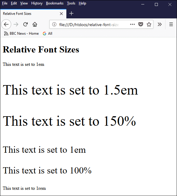
This example shows the effect of the relative font-size units em, rem and %
It is also possible to set the font size of individual words or phrases (or even a single character) within the text of an HTML element using the style attribute of the <span> element. The following code fragment shows how this works:
<p>
We can make a single word <span style="font-size: 2em">bigger</span> or <span style="font-size: 0.5em">smaller</span>.
</p>
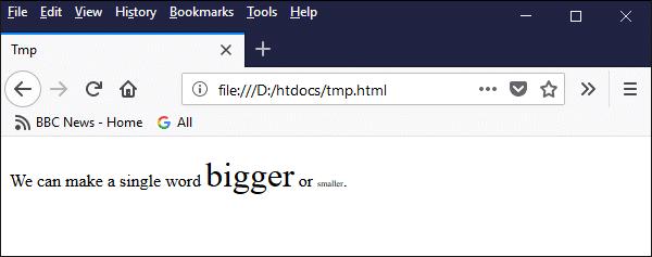
We can change the font size for individual words or phrases
The final group of relative length units we want to look at are the vw, vh, vmin and vmax units. These are relatively new "viewport-relative" units that appeared in the Cascading Style Sheets (CSS) specification between 2011 and 2015. These units work similarly to existing relative length units like em or rem but represent a percentage of the current browser viewport (i.e. the visible area of a web page).
This means we can scale text according to the size of the display device on which it is rendered. The vw unit represents one percent of the viewport's width, while the vh unit represents one percent of the viewport's height. Similarly, the vmin unit represents one percent of the viewport's smallest dimension, while the vmax unit represents one percent of the viewport's largest dimension.
The viewport-relative units can be useful for defining font sizes that adapt to the user's current viewport size. This can help to facilitate responsive web design - an approach centred on creating web pages that display well on a range of display devices. It should be used with care, however. Allowing the text to scale upwards or downwards without applying some constraints could result in text that has become either way too large or way too small to read.
The following HTML code demonstrates the use of the viewport-relative vw unit:
<!doctype html>
<html lang="en">
<head>
<meta charset="utf-8">
<title>Viewport Demo</title>
</head>
<body style="font-size: 2vw;">
<h1>Viewport Demo</h1>
<p>
Lorem ipsum dolor sit amet, consectetur adipiscing elit, sed do eiusmod tempor incididunt ut labore et dolore magna aliqua. Ut enim ad minim veniam, quis nostrud exercitation ullamco laboris nisi ut aliquip ex ea commodo consequat. Duis aute irure dolor in reprehenderit in voluptate velit esse cillum dolore eu fugiat nulla pariatur. Excepteur sint occaecat cupidatat non proident, sunt in culpa qui officia deserunt mollit anim id est laborum.
</p>
</body>
</html>
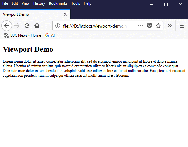
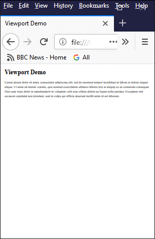
Copy and paste this code into a new file in your HTML editor, save the file as viewport-demo.html, open the file in a web browser, and try changing the size of the browser window to see how the size of the text responds. The following series of screenshots shows how the text size changes in response to the changes in the viewport width:
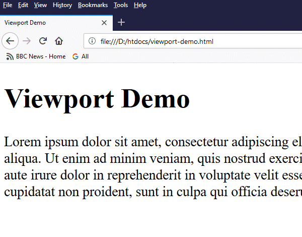
A (partial) screen shot of viewport-demo.html with the browser window maximised
A screen shot of viewport-demo.html with a viewport width of 600 pixels
A screen shot of viewport-demo.html with a viewport width of (circa) 300 pixels
As you can see, at a viewport width of just over 300 pixels, although it is still relatively easy to make out the text of the level 1 heading, the paragraph below it has become almost unreadable. The solution would be to set a minimum font size; once the minimum font size is reached, the text should wrap around in order to fit into the available viewport width. This is certainly possible, but the question of how we would implement it is beyond the scope of this page.
There are a number of pre-defined keywords that can be assigned to the font-size property of an element's style attribute, which are summarised in the table below. These keywords will all affect the size of the element's text in some way, although the effect they have is to some extent dependent on the browser implementation.
| Value | Description |
|---|---|
| medium | Sets font size to medium (basically, the browser default font size) |
| xx-small | Sets font-size to xx-small |
| x-small | Sets font-size to extra small |
| small | Sets font-size to small |
| large | Sets font-size to large |
| x-large | Sets font-size to extra large |
| xx-large | Sets font-size to xx-large |
| smaller | Sets font-size to smaller than the parent element |
| larger | Sets font-size to larger than the parent element |
| initial | Sets font-size to its default value |
| inherit | Inherits font-size from the parent element |
The keywords described above do not provide the same degree of control over font size as the absolute-length, relative-length, or viewport-relative units. They may nevertheless be useful in certain situations; we leave it to the reader to experiment with their use.
The font weight of text refers to its degree of boldness. So far as most of us are concerned, text is either bold or normal (i.e. not bold). There are, however (depending on the specific font in use), a number of differing degrees of boldness. Let's deal with the simplest case first however. If we simply wish to make a piece of text bold, without worrying too much about exactly how bold it is, there are two HTML elements that will do this quite nicely, without the need to invoke an element's style attribute.
The first of these elements is the bold (<b>) element which, as its name suggests, makes the enclosed text bold. The second element is strong (<strong>) which basically does exactly the same thing as the bold element. There is a bit of history here; the bold element was allegedly deprecated in HTML 4 and replaced with the strong element (which usually has exactly the same on-screen effect).
Both elements are currently still valid in HTML 5; the strong element is supposedly more meaningful in the sense that its use indicates (for example to a screen reader or some other form of intelligent text-parsing software) that the enclosed text is more important than the surrounding text. This website does not use the bold element for the simple reason that we suspect that W3C will eventually deprecate it.
The HTML code below demonstrates the use of both the bold (<b>) tag and the strong (<strong>) tag. As you will see from the screenshot, both tags are rendered by the browser in exactly the same way.
<!doctype html>
<html lang="en">
<head>
<meta charset="utf-8">
<title>Bold and Strong Tags</title>
</head>
<body>
<p>
This text contains a <b>bold</b> word and a <strong>strong</strong> word.
</p>
<p>
<b>
Lorem ipsum dolor sit amet, consectetur adipiscing elit, sed do eiusmod tempor incididunt ut labore et dolore magna aliqua. Ut enim ad minim veniam, quis nostrud exercitation ullamco laboris nisi ut aliquip ex ea commodo consequat. Duis aute irure dolor in reprehenderit in voluptate velit esse cillum dolore eu fugiat nulla pariatur. Excepteur sint occaecat cupidatat non proident, sunt in culpa qui officia deserunt mollit anim id est laborum.
</b>
</p>
<p>
<strong>
Lorem ipsum dolor sit amet, consectetur adipiscing elit, sed do eiusmod tempor incididunt ut labore et dolore magna aliqua. Ut enim ad minim veniam, quis nostrud exercitation ullamco laboris nisi ut aliquip ex ea commodo consequat. Duis aute irure dolor in reprehenderit in voluptate velit esse cillum dolore eu fugiat nulla pariatur. Excepteur sint occaecat cupidatat non proident, sunt in culpa qui officia deserunt mollit anim id est laborum.
</strong>
</p>
</body>
</html>
Copy and paste this code into a new file in your HTML editor, save the file as fontweight-tags-demo.html, and open the file in a web browser. You should see something like the following:
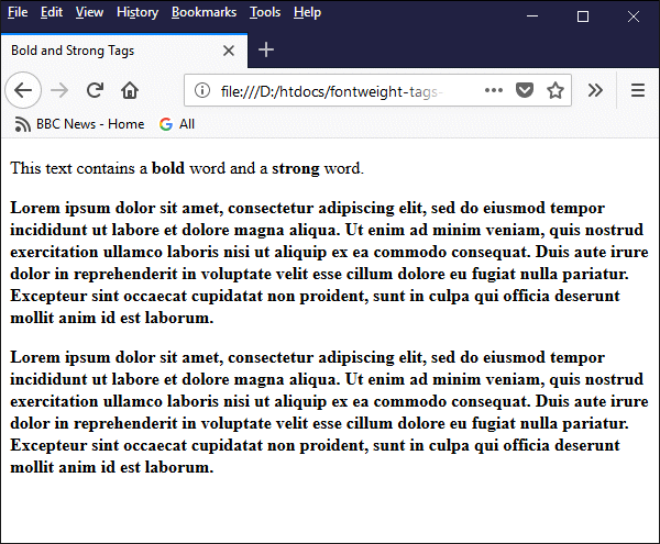
The bold (<b>) tag and the strong (<strong>) tag have the same effect
If you want to exercise a bit more control over the degree of boldness, you need to use an element's style attribute. The property we are concerned with here is the font-weight property. The table below lists the values that may be assigned to the font-weight property.
| Value | Description |
|---|---|
| normal | Normal (i.e. default) font weight (equivalent to 400). |
| bold | Bold font weight (equivalent to 700). |
| bolder | Heavier than the parent element |
| lighter | Lighter than the parent element |
| 100 | Thin (hairline) |
| 200 | Extra Light (Ultra Light) |
| 300 | Light |
| 400 | Normal |
| 500 | Medium |
| 600 | Semi Bold (Demi Bold) |
| 700 | Bold |
| 800 | Extra Bold (Ultra Bold) |
| 900 | Black (Heavy) |
| initial | Sets font-weight to its default value |
| inherit | Inherits the value of font-weight from the parent element |
As you can see, the only keywords that actually specify a font weight are normal (equivalent to 400) and bold (equivalent to 700). The result of assigning any one of the other keywords - bolder, lighter, initial or inherit - will depend either on the font-weight of the parent or on the default font-weight.
In fact, the result of using any of the above values other than normal or bold will very much depend on the font being used. Many popular fonts can only be displayed as either normal text or bold text. Even fonts with extended weights typically only provide three of four different font weights.
If the browser cannot find an exact match for the specified font-weight among the available options, it will choose the option closest to the weight specified. The following HTML code demonstrates how this works for different fonts:
<!doctype html>
<html lang="en">
<head>
<meta charset="utf-8">
nbsp; <title>Font Weight Values</title>
</head>
<body>
<p>
<u>Default browser font:</u><br>
<span style="font-weight: 100">This text has a font-weight of 100.</span><br>
<span style="font-weight: 200">This text has a font-weight of 200.</span><br>
<span style="font-weight: 300">This text has a font-weight of 300.</span><br>
<span style="font-weight: 400">This text has a font-weight of 400.</span><br>
<span style="font-weight: 500">This text has a font-weight of 500.</span><br>
<span style="font-weight: 600">This text has a font-weight of 600.</span><br>
<span style="font-weight: 700">This text has a font-weight of 700.</span><br>
<span style="font-weight: 800">This text has a font-weight of 800.</span><br>
<span style="font-weight: 900">This text has a font-weight of 900.</span><br>
</p>
<p style="font-family: 'Open Sans';">
<u>Open Sans:</u><br>
<span style="font-weight: 100">This text has a font-weight of 100.</span><br>
<span style="font-weight: 200">This text has a font-weight of 200.</span><br>
<span style="font-weight: 300">This text has a font-weight of 300.</span><br>
<span style="font-weight: 400">This text has a font-weight of 400.</span><br>
<span style="font-weight: 500">This text has a font-weight of 500.</span><br>
<span style="font-weight: 600">This text has a font-weight of 600.</span><br>
<span style="font-weight: 700">This text has a font-weight of 700.</span><br>
<span style="font-weight: 800">This text has a font-weight of 800.</span><br>
<span style="font-weight: 900">This text has a font-weight of 900.</span><br>
</p>
</body>
</html>
Copy and paste this code into a new file in your HTML editor, save the file as fontweight-values-demo.html, and open the file in a web browser. Depending on your browser and the fonts available on your computer, you should see something like the following:
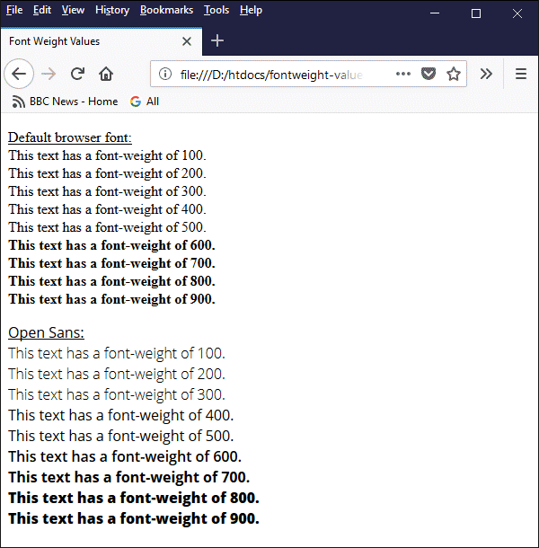
The browser selects a font weight from the available options based on the specified font-weight value
As you can see from the above example, the default browser font (in this case Times New Roman) could only be displayed as either normal or bold text. The Open Sans font manages to provide five distinctly different font weights in response to the nine values requested. If you don't have the Open Sans font (you can download it from Font Squirrel free of charge), your results will look somewhat different.
Most of the fonts currently available on your computer are probably limited to a relatively small number of style and font weight combinations, partly due to the fact that each font variant must be stored in its own file. This could change in the near future due to the development of variable fonts.
The idea behind variable fonts is that multiple variants are stored in a single font file, enabling a significant overall reduction in file size. This has a number of implications, including the simplification of font file distribution and management, and faster loading of font data.
From the web developer's point of view, variable fonts have the potential to allow far more control over the appearance of text in a browser. At the time of writing, browser support for variable fonts can best be described as "getting there".
We can specify the font to be used for an HTML element by setting the font-family property of the element's style attribute. This will be the name of the font (e.g. Times New Roman or Arial or Courier New). So what options are available to us, and what pitfalls do we need to be aware of?
Most of the fonts on your computer will be TrueType fonts. These fonts were originally developed by Apple Computers and are now used extensively by both Apple and Microsoft in their operating systems. A number of TrueType fonts are provided with your computer's operating system. Additional fonts can be obtained from various online sources.
You can, if you so wish, specify a different font for each and every element in an HTML document. Be aware, however, that a web browser can only display fonts that are installed on the host computer. If you specify a font that is unavailable, the browser will use the system font that provides the closest match (if it doesn't recognise the font at all, it will simply use the default browser font).
We all have our favourite fonts, of course, but you should always work on the assumption that the user's computer may not have that particular font. Fortunately, a Plan B (and even a Plan C) is relatively easy to implement. Before we talk about the options available to us, however, let's consider a few fundamental questions.
Should we go for a serif or a sans-serif font? Just in case you are not familiar with these terms, a serif font is one in which a small line (i.e. the serif) is attached to the end of a stroke in a letter or symbol. A font without these lines is called sans-serif, from the French word sans, which means "without".
The general consensus of opinion seems to be that sans-serif fonts are more readable than serif fonts. Having carried out an (admittedly rather informal) investigation into the fonts used on a large number of popular websites, we would have to conclude that most web developers appear to share this view. Wikipedia, as a case in point, employs a sans-serif font for its main text (as does this website).
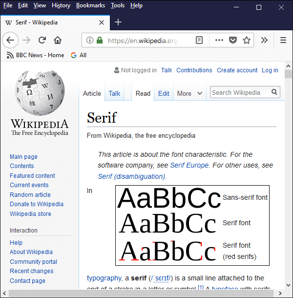
Wikipedia uses a sans-serif font for the majority of its textual content
The second question to consider is, should we use proportional fonts or fixed width fonts? This question is somewhat easier to answer in the sense that we can identify situations in which one or the other is preferable. A proportional font is one in which different characters have different widths. An upper or lower case "i", for example, will take up less horizontal space than an upper or lower case "m".
Certainly, for general text (like the text of this web page), a proportional font looks much nicer and is easier to read. Where fixed-width fonts come into their own is for reproducing program code, or scripts, or indeed HTML code! They are also useful if you are creating tables containing columns of figures and want to get the columns to align vertically.
We should mention two other generic font types that are defined by the CSS standard, and that you may have occasion to use; the first is cursive, which is intended to emulate handwriting. The second is fantasy, which is more difficult to describe. Essentially, fantasy fonts are usually highly ornate, and are probably best described as "decorative".
The type of font you choose should be appropriate for the job in hand. We said earlier, for example, that sans-serif fonts are preferable for general text because they are easier to read. When it comes to mathematical and scientific notation, however, it is our experience that a serif font works better. Consequently, this site uses a serif font for the majority of its mathematical and scientific formulae.
We said earlier that it was relatively easy to implement a Plan B. This plan says that we can nominate a different font to be used in the event that the font we actually wanted to use is not available. This plan relies on the availability of what are known as "web safe fonts". These are fonts that are (supposedly) found on the majority of computers.
Unfortunately, opinions vary considerably over what constitutes a "web-safe" font. The bottom line is that Microsoft and Apple both have their own proprietary fonts, and we have yet to see a "web-safe" font that is guaranteed to be on both Windows and Mac OS systems. Then there's Linux (let's not forget Linux users!), which also has its own fonts - and these can vary from one Linux distribution to another.
Which is why we also have a Plan C. This plan assumes that, despite having specified the font we would like to be used, plus at least one "web-safe" font, the computer on which our web page actually lands has never even heard of any of our carefully chosen alternatives. What then? We simply add the name of one of the generic font types (serif, sans serif, monospace, cursive or fantasy) to our list, and let the browser determine the best font to use from the selection available to it.
The following HTML code demonstrates the use of each of the generic font keywords:
<!doctype html>
<html lang="en">
<head>
<meta charset="utf-8">
<title>Generic Fonts</title>
</head>
<body>
<p>This text uses the browser default font.</p>
<p style="font-family: serif;">This text uses a generic serif font.</p>
<p style="font-family: sans-serif;">This text uses a generic sans serif font.</p>
<p style="font-family: monospace;">This text uses a generic monospace font.</p>
<p style="font-family: cursive;">This text uses a generic cursive font.</p>
<p style="font-family: fantasy;">This text uses a generic fantasy font.</p>
</body>
</html>
Copy and paste this code into a new file in your HTML editor, save the file as generic-fonts-demo.html, and open the file in a web browser. Depending on your browser and the fonts available on your computer, you should see something like the following:
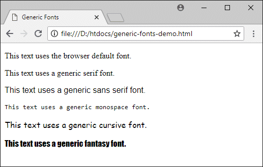
The browser attempts to find a match for each generic font type specified
We used chrome for the above screenshot, since our version of Firefox did not seem to interpret the fantasy keyword correctly (or at all, really). The first paragraph tag in the document does not specify a font, so the default browser font (in this case, the serif font Times New Roman) is used. The second paragraph calls for a generic serif font to be used, so Times New Roman is used here also.
If you want to see what exactly which fonts are used for a particular HTML element - plus a lot of other useful information - right click on the item of interest in your browser window and select "inspect" (or "inspect element") to see a page of information about the selected element, including the font used to render it, as illustrated below. This feature is available for Firefox, Chrome and Opera, but seems to be absent in Microsoft Edge and Safari for Windows.
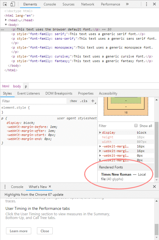
Right-click on an element and select the "inspect" or "inspect element" option
The fonts used by Chrome for sans serif, monospace, cursive, and fantasy are (respectively) Arial, Consolas, Comic Sans MS, and Impact. Note that, in this instance, Chrome is running on a Windows system. The results would obviously be different for another operating system. They may also be different for different browsers running on the same system.
When we specify a set of alternative fonts to be used for the font-family property of an element's style attribute, we supply the font names in a comma-separated list, in order of preference. We start with the font we would like to see used, followed by the names of any alternative fonts (in order of preference, if any), followed by the generic font type specifier. This list of fonts is sometimes referred to as a font stack.
The browser works its way through the list until it finds a match with one of the fonts available on the system. If no match is found it will use whichever font provides the best match with the generic font type. The table below lists popular fonts of each generic type that are present on Microsoft Windows, Mac OS, and Linux systems.
| Font type | Windows | Mac OS | Linux |
|---|---|---|---|
| Serif | Times New Roman | Times | Nimbus Roman No 9 L |
| Sans serif | Arial | Helvetica | Nimbus Sans L |
| Monospace | Courier New | Courier | Nimbus Mono L |
| Cursive | Comic Sans | MS Brush Script MT | URW Chancery L |
We have not included any fantasy fonts in the table simply because these fonts are so diverse that it is a rather pointless exercise to try and find even vaguely equivalent fantasy fonts for three different operating systems (even the cursive fonts are not particularly similar to one another in appearance).
Note that we have listed the operating systems from left to right in order of how widely used they are. One survey we looked at recently claimed that for desktop and laptop computers, Microsoft Windows has a market share of almost 89%, with Mac OS on just under 9%, and Linux just over 2%.
The following HTML code demonstrates the use of font stacks for each of the font types (serif, sans serif, monospace and cursive) based on the above table:
<!doctype html>
<html lang="en">
<head>
<meta charset="utf-8">
<title>Font Stacks</title>
</head>
<body>
<p style="font-family: 'Times New Roman', Times, 'Nimbus Roman No 9 L', serif;">This text uses a serif font.</p>
<p style="font-family: Arial, Helvetica 'Nimbus Sans L', sans-serif;">This text uses a sans serif font.</p>
<p style="font-family: 'Courier New', Courier, 'Nimbus Mono L', monospace;">This text uses a monospace font.</p>
<p style="font-family: 'Comic Sans MS', 'Brush Script MT', 'URW Chancery L', cursive;">This text uses a cursive font.</p>
</body>
</html>
Copy and paste this code into a new file in your HTML editor, save the file as font-stacks-demo.html, and open the file in a web browser. Depending on your browser and the fonts available on your computer, you should see something like the following:
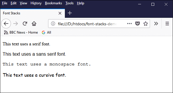
The browser will render each item in the first font it finds in the font stack
Note that we made some fairly arbitrary choices for our font stacks, simply to demonstrate the principle. If the appearance of text is going to be a critical factor in your web pages, you might need to do a certain amount of research into the fonts available for different operating systems before you make a decision on what fonts to include in your own font stacks.
There may be occasions when you want to ensure that a specific font is available for your web pages (for example, for a special logo or heading). You can't guarantee that the font will be installed on the user's computer, especially if it is a font that is not widely used, but there is a way around this. There is a CSS rule that allows you to use a font for a web page even if is not installed on the client computer.
In order for this to be possible, the font file for the required font must be stored on your web server. NOTE: There are many fonts available online that are free for non-commercial use. There are also many paid-for fonts for which a specific web-font licence can be obtained. Before you use any font in the manner described below, always check the relevant documentation to ensure that you are legally entitled to do so.
The CSS @font-face rule allows us to include the necessary font file(s) along with the HTML file downloaded to the client computer. In order to use the @font-face rule we need to define it inside a <style> element. The HTML code below uses the @font-face rule to get the browser to render some text in a font called Good Times, which can be downloaded from 1001 Fonts.
<!doctype html>
<html lang="en">
<head>
<meta charset="utf-8">
<title>Font Stacks</title>
<style>
@font-face {
font-family: 'good times rg';
src: url('good times rg.ttf');
}
</style>
</head>
<body>
<p style="font-family: 'good times rg';">
Lorem ipsum dolor sit amet, consectetur adipiscing elit, sed do eiusmod tempor incididunt ut labore et dolore magna aliqua. Ut enim ad minim veniam, quis nostrud exercitation ullamco laboris nisi ut aliquip ex ea commodo consequat. Duis aute irure dolor in reprehenderit in voluptate velit esse cillum dolore eu fugiat nulla pariatur. Excepteur sint occaecat cupidatat non proident, sunt in culpa qui officia deserunt mollit anim id est laborum.
</p>
</body>
</html>
Download the file good-times.zip using the download link available here, and unzip the contents (a file called good times rg.ttf) into the your htdocs folder. Once you have done this, copy and paste the above code into a new file in your HTML editor, save the file as @font-face-demo.html and open it in a web browser. you should see something like the following:
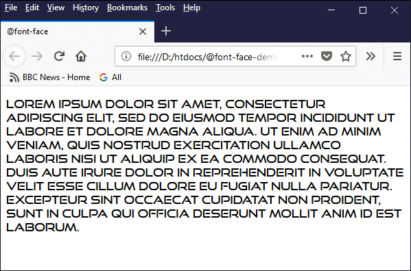
The browser renders the text using the Good Time font
The rule essentially tells the browser that if it sees a particular font specified as a value for the font-family property in an element's style attribute, it should download the font file (if it is not already in your browser cache) from the URL specified. This does of course increase the overall download time for your page, but the effect should be hardly noticeable unless the client computer has a very slow Internet connection.
One final but very important thing to consider is the question of accessibility. The subject of accessibility will be dealt with in some detail elsewhere, but you should seriously consider whether or not you should specify the use of fonts that will override the browser's default fonts, effectively removing the user's ability to choose the typeface used by the browser to display your pages.
This website's style sheet, for example, merely calls for a sans-serif font to be used for normal text and a serif font for mathematical and scientific notation. Within those basic constraints - and coupled with the fact that we use relative values to specify font sizes - the user can exercise a great deal of control over both the size of the text in these pages and the typeface used to render them.
The font-style property affects the appearance of text inside an HTML element. As with other text properties, it can be set using the element's style attribute. The following values can be assigned to the font style property:
In case you were wondering, there is a difference between italic and oblique. Italic text is usually rendered using special italic characters that are included with a font by the font's designers, whereas oblique text is achieved by skewing the font's normal characters slightly clockwise through a predefined angle to simulate italicised text. In most cases, however, you will notice little or no difference in the appearance of the text.
The following HTML code demonstrates the effects of the different font style attribute values:
<!doctype html>
<html lang="en">
<head>
<meta charset="utf-8">
<title>Font Styles Demo</title>
</head>
<body>
<p>This text is not styled.</p>
<p style="font-style: normal;">This text is displayed using the normal (i.e. default) style.</p>
<p style="font-style: italic;">This text is displayed in italics.</p>
<p style="font-style: oblique;">This text is displayed as oblique text.</p>
</body>
</html>
Copy and paste this code into a new file in your HTML editor, save the file as font-styles-demo.html, and open the file in a web browser. You should see something like the following:
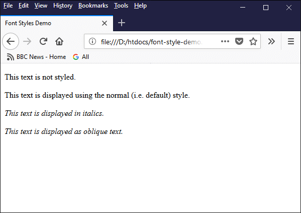
The browser displays text as normal text (the default), italic text, or oblique text
Text decoration, as the term implies, adds something extra to the text it is applied to. Specifically, it overlines the text, underlines the text, or puts a line through the text (i.e. a strikethrough effect). It can apply a combination of any two of these effects - or even all three - to the same text! In addition, as we shall see, it is possible to specify both the colour and the style of the text decoration. In fact, the text-decoration property is effectively three properties rolled into one:
text-decoration-line
text-decoration-color
text-decoration-style
The text-decoration-line property can take any or all of the following values:
underline - the text will be underlined
overline - the text will be overlined
line-through - the text will have a line through it
initial - the default value
inherit - the value will be inherited from the parent element
The text-decoration-style property can any of the following values:
solid - displays as a single line (the default value)
double - displays as a double line
dotted - displays as a dotted line
dashed - displays as a dashed line
wavy - displays as a wavy line
initial - the default value
inherit - the value will be inherited from the parent element
The text-decoration-color property can be assigned any valid colour reference, or it can be set to initial or inherit.
The text-decoration property can be set using an element's style attribute. It is typically assigned one (or more) of the three line-type values listed above, optionally followed by values for text-decoration-color and/or text-decoration-style. Alternatively, it can be assigned the value none (which removes any existing text decoration), initial (the default value will be used), or inherit (the value assigned to the parent element will be used).
The following HTML code demonstrates how text decoration might be used:
<!doctype html>
<html lang="en">
<head>
<meta charset="utf-8">
<title>Text Decoration Demo</title>
</head>
<body>
<p style="text-decoration: underline;">
This text is underlined.
</p>
<p style="text-decoration: overline;">
This text is overlined.
</p>
<p style="text-decoration: line-through;">
This text is struck-through.
</p>
<p style="text-decoration: underline red;">
This text is underlined in red.
</p>
<p style="text-decoration: underline blue wavy;">
This text is underlined with a blue wavy line.
</p>
<p style="text-decoration: wavy blue underline;">
This text is underlined with a blue wavy line as well.
</p>
<p style="text-decoration: underline overline line-through green double;">
This text is underlined, overlined <em>and</em> struck-through, with a green double line!
</p>
</body>
</html>
Copy and paste this code into a new file in your HTML editor, save the file as text-decoration-demo.html, and open the file in a web browser. You should see something like the following:
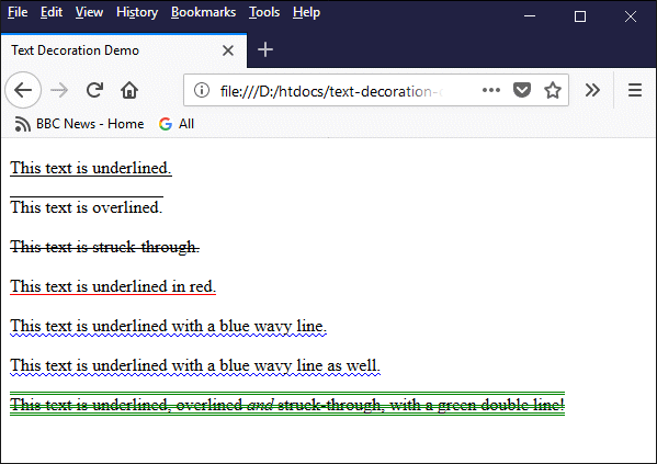
Various examples of using text decoration
Note that the values chosen for the text-decoration-line, text-decoration-color and text-decoration-style properties are placed after the text-decoration keyword, separated by spaces; the order in which they appear is not important.
Note also that when the text-decoration keyword is used, it is not necessary to use the text-decoration-line, text-decoration-color or text-decoration-style keywords. Both of the examples below produce the same result:
<p style="text-decoration: underline red double;">
This text is double underlined in red!
</p>
<p style="text-decoration-line: underline; text-decoration-color: red; text-decoration-style: double;">
This text is double underlined in red!
</p>
Text transformation allows us to control the capitalisation of text, i.e. whether characters are displayed as uppercase or lowercase text, regardless of how they appear in the HTML code. The text-transform property can be set using an element's style attribute, and can be assigned any of the following values:
none - the text is displayed exactly as it appears in the HTML code
capitalize - capitalises the first letter of each word
uppercase - converts all letters to uppercase
lowercase - converts all letters to lowercase
full-width - displays all characters in a fixed-width square
The last property in the list (full-width) is somewhat of an anomaly since, unlike the other options, it does not have any effect at all on the capitalisation of text. It has a similar effect to specifying a fixed-width font in the sense that the characters are all allocated the same width. However, the character spacing is much wider than that used for most fixed-width fonts, and a monospace font is used instead of the default font.
The following HTML code provides a number of examples of how the text-transform property can be used to transform the way in which text is displayed:
<!doctype html>
<html lang="en">
<head>
<meta charset="utf-8">
<title>Text Transform Demo</title>
</head>
<body>
<p style="text-transform: capitalize;">
the boy stood on the burning deck
</p>
<p style="text-transform: uppercase;">
the boy stood on the burning deck
</p>
<p style="text-transform: lowercase;">
THE BOY STOOD ON THE BURNING DECK
</p>
<p style="text-transform: full-width;">
the boy stood on the burning deck
</p>
<p style="font-family: monospace;">
the boy stood on the burning deck
</p>
<p style="text-transform: uppercase;">
the boy stood on the <span style="text-transform: full-width;">burning</span> deck
</p>
</body>
</html>
Copy and paste this code into a new file in your HTML editor, save the file as text-transformation-demo.html, and open the file in a web browser. You should see something like the following:
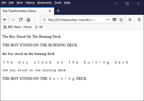
Various examples of using text transformation
The penultimate example uses the paragraph element's style attribute to specify a generic fixed-width font for the text. Compare the output to that of the previous example, which uses the paragraph element's style attribute to set the text-transform property to full-width.
The final example uses a <span> … </span> tag nested within a paragraph element to set the text-transform property of the word "burning" to full-width. Note that this negates the capitalisation applied to the parent element.
The text, for those interested, is the opening line of the poem Casabianca, written by Mrs. Felicia Dorothea Hemans, which chronicles a now legendary act of heroism that took place on the deck of the doomed French flagship L'Orient during the Battle of the Nile in 1798. The poem is based on the eye-witness accounts given by British sailors who saw the incident.
The text-shadow property adds a drop shadow to an HTML element's text content. A drop shadow, as the name suggests, is a shadow image of the text that is typically displayed in a darker colour than the text itself, and appears behind the text (i.e., in the background). The property can be set using the element's style attribute, and can be assigned values in a comma-separated list of up to four values selected from the following list:
h-shadow - the position of horizontal shadow
v-shadow - the position of vertical shadow
blur-radius - the size of the blur radius
color - any valid colour reference
none - no shadow (default value)
initial - the default value
inherit - the value is inherited from the parent element
The h-shadow value is required and can be either positive or negative. It determines the horizontal position of the shadow relative to the text. A negative value will offset the shadow so that its left edge is to the left of the text, while a positive value will offset the shadow so that its right edge is to the right of the text.
The v-shadow value is also required, and it too can be either positive or negative. It determines the vertical position of the shadow relative to the text. A negative value will offset the shadow above the text, while a positive value will offset the shadow below the text.
The blur-radius value effectively determines the distance over which the shadow is dispersed and fades into the background.
The following HTML code provides a number of examples of how the text-shadow property might be used:
<!doctype html>
<html lang="en">
<head>
<meta charset="utf-8">
<title>Text Shadow Demo</title>
</head>
<body>
<h1>
This header does not have a text shadow.
</h1>
<h1 style="text-shadow: 2px 2px">
This header has a text shadow!
</h1>
<h1 style="text-shadow: 2px 2px 2px;">
This header has a text shadow!
</h1>
<h1 style="text-shadow: 10px 10px blue;">
This header has a text shadow!
</h1>
<h1 style="text-shadow: 3px 3px 3px green;">
This header has a text shadow!
</h1>
<h1 style="text-shadow: 5px 5px 5px orange;">
This header has a text shadow!
</h1>
</body>
</html>
Copy and paste this code into a new file in your HTML editor, save the file as text-shadow-demo.html, and open the file in a web browser. You should see something like the following:
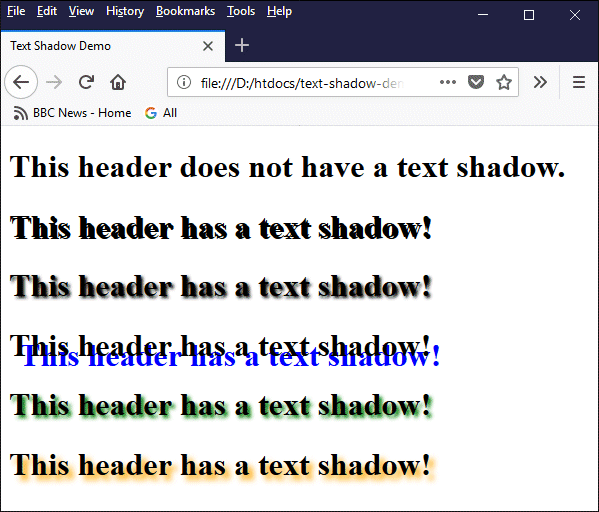
Various examples of using drop shadows
The ability to set a drop shadow for an item of text has no functional value other than to create some interesting visual effects, but it can be quite fun to play around with it. The size units used to specify the values for h-shadow, v-shadow and blur-radius can be based on points (pt), em units (em) or pixels (px), although in practice you will rarely see anything other than pixels used.
It is also possible to apply several text shadows to the same text simultaneously. This is achieved by using multiple sets of shadow values separated by commas. Why you should want to do this eludes us for the moment, but if you would like to experiment, you could try something like the following:
<h1 style="text-shadow: 5px 5px 5px orange, 10px 10px 10px green, 20px 20px 20px blue;">
This heading has three text shadows!
</h1>
This code produces something like this:
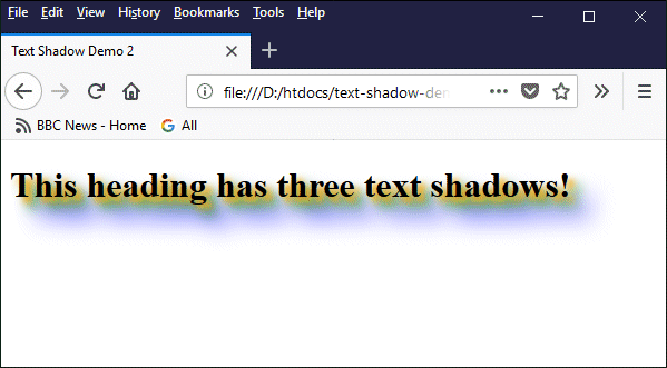
An example of multiple drop shadows applied to the same text
These include the heading elements <h1>, <h2>, <h3>, <h4>, <h5> and <h6>, which are used to provide section and sub-section headings for an HTML document and are rendered in a bold typeface by default. The font sizes used vary, depending on the browser implementation. As far as we can ascertain, most browsers currently render each of the six heading elements at a weighted percentage of the default font size, as shown below.
<h1> - 200%
<h2> - 150%
<h3> - 112 - 117%
<h4> - 100%
<h5> - 81 - 83%
<h6> - 63 - 69 %
The following HTML code demonstrates the use of the six heading elements:
<!doctype html>
<html lang="en">
<head>
<meta charset="utf-8">
<title>Headings Demo</title>
</head>
<body>
<h1>This is a level 1 heading</h1>
<h2>This is a level 2 heading</h2>
<h3>This is a level 3 heading</h3>
<h4>This is a level 4 heading</h4>
<p><b>This is NOT a level 4 heading</b></p>
<h5>This is a level 5 heading</h5>
<h6>This is a level 6 heading</h6>
</body>
</html>
Copy and paste this code into a new file in your HTML editor, save the file as headings-demo.html, and open the file in a web browser. You should see something like the following:
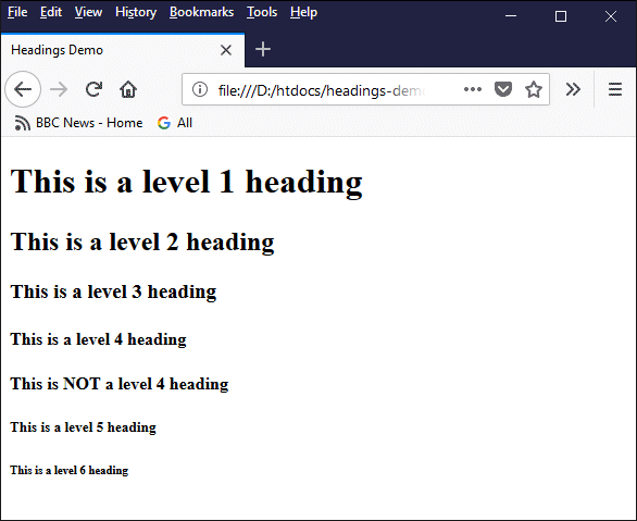
This example shows the relative font sizes of HTML headings at levels 1 to 6
We have inserted a paragraph (<p>) element between the level 4 and level 5 headings to illustrate the point that a level 4 heading is rendered at the default font size in most browsers, the difference being that the level 4 heading is rendered in bold type. We have intentionally emboldened the paragraph text using the bold (<b>) element to make it easier for the reader to compare the two font sizes.
Note that you should NOT use the heading elements to control font size. Headings are primarily intended for use as section and subsection headings. The difference in font size is intended to indicate the level of importance of a particular section or sub-section within an HTML document.
There should be only one level 1 heading, which should appear at the top of your document. Each of the main sections of your document should have a level 2 heading. The main sub-sections within each section should have a level 3 heading, and so on. Note that, in practice, the use of headings beyond level 3 is rare.
It is also considered to be poor practice to skip heading levels in an HTML document simply to reduce the size of a particular section heading; if you feel you really need to make the font size of a heading smaller than the default font size, either try using the <small> element or use the heading's style attribute to specify a different font size.
We have come across HTML elements that affect the layout of text, like the ubiquitous paragraph element. There are also many text-level elements in HTML5 that directly affect either the appearance of the text to which they are applied or that impart machine-readable semantic information about the text (or both). The following table lists the text-level elements in alphabetical order, and briefly describes what they do.
| Element | Description |
|---|---|
| <abbr> … </abbr> | Abbreviation - represents an abbreviation or acronym (does not affect the appearance of the text in a browser window). |
| <b> … </b> | Bold - renders the enclosed text in a bold font. |
| <bdi> … </bdi> | BiDirectional Isolation - used to isolate text that might need to be rendered in a direction opposite that of the surrounding text. |
| <bdo> … </bdo> | BiDirectional Override - used to override the direction of the enclosed text so that it is rendered in a different direction - requires the dir attribute to be set to ltr (left-to-right) or rtl (right-to-left). |
| <cite> … </cite> | Cite - defines the enclosed text (usually displayed in italics) as a reference to a creative work - for example, the title of a book, film, or painting, or the URL of a web page. |
| <code> … </code> | Code - renders the enclosed text using a style intended to indicate that it is a computer code fragment (typically using a fixed-width font). |
| <dfn> … </dfn> | Definition - identifies the text it encloses (usually displayed in italics) as the term being defined or explained by the text that follows it. |
| <em> … </em> | Emphasis - renders the enclosed text as emphasized text (i.e. in italics). |
| <i> … </i> | Italic - displays the enclosed text in italics in order to emphasize or draw attention to the text; the W3C recommends the use of the appropriate semantic element in preference to the <i> tag wherever possible (for example, the <em> tag or the <cite> tag). |
| <kbd> … </kbd> | Keyboard Input - represents text input generated by a user (for example keyboard input or text created by voice recognition software) - typically displayed using a fixed-width font. |
| <mark> … </mark> | Mark text - the enclosed text is rendered as highlighted text. |
| <q> … </q> | Quotation - indicates that the enclosed text is an inline quotation, usually by enclosing the text in quotation marks. |
| <samp> … </samp> | Sample - used to enclose text that represents sample output from a computer program (usually rendered in a fixed-width font). |
| <small> … </small> | Small - reduces the font size of the enclosed text to the next size down from the parent element's font size (e.g. large to medium, or small to x-small) - its intended use (in HTML5) is for representing comments or small print items. |
| <strong> … </strong> | Strong - indicates that the enclosed text is important, typically by rendering it in a bold typeface. |
| <sub> … </sub> | Subscript - an inline element that renders the enclosed text as subscripted text. |
| <sup> … </sup> | Superscript - an inline element that renders the enclosed text as superscripted text. |
| <time> … </time> | Time - defines a human-readable date and/or time that can also be used to encode machine-readable date and/or time information - for example, to enable browsers to display reminders or schedule events, or to enable search engines to refine searches (does not affect the appearance of the text in a browser window). |
| <var> … </var> | Variable - the enclosed text represents the name of a variable in a mathematical expression or computer program; typically rendered in italics. |
We have already seen how the <small> element is used to make text smaller. The HTML code below demonstrates the use of some of the other text-level HTML elements listed above.
<!doctype html>
<html lang="en">
<head>
<meta charset="utf-8">
<title>HTML Text-Level Elements</title>
</head>
<body>
<h1>HTML Text-Level Elements</h1>
<p>The following elements embolden text:</p>
<p>
<code><b></code> - <b>this is bold text</b><br>
<code><strong></code> - <strong>this is strong text</strong><br>
</p>
<p>These elements italicise text:</p>
<p>
<code><cite></code> - <cite>this is a citation</cite><br>
<code><dfn></code> - <dfn>this is a definition</dfn><br>
<code><em></code> - <em>this text is emphasised</em><br>
<code><i></code> - <i>this text is in italics</i><br>
<code><var></code> - <var>this text is a variable</var><br>
</p>
<p>These elements render text in a fixed-width font:</p>
<p>
<code><code></code> - <code>this is a line of code</code><br>
<code><kbd></code> - <kbd>this is a keyboard input</kbd><br>
<code><samp></code> - <samp>this text is sample output</samp><br>
</p>
<p>Examples of supercripted and subscripted text:</p>
<p>
<code><sup></code> - 2<sup>10</sup> is equivalent to 1,024<br>
<code><sub></code> - 64<sub>10</sub> is equivalent to the binary number 1000000<br>
</p>
<p>We can mark text, and make it read backwards:</p>
<p>
<code><mark></code> - <mark>this text is marked (highlighted)</mark><br>
<code><bdo></code> - <bdo dir="rtl">this text is all backwards!</bdo><br>
</p>
<p>We can even quote great works of literature:</p>
<p>
<code><q></code> - <q>The boy stood on the burning deck . . .</q><br>
</p>
</body>
</html>
Copy and paste this code into a new file in your HTML editor, save the file as text-level-elements-demo.html, and open the file in a web browser. You should see something like the following:
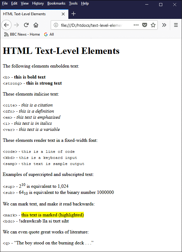
This example shows the effect of applying various text-level HTML elements
As you can see, in terms of how text is actually displayed (which is largely dependent on the browser implementation) many of these elements would appear to be duplications of one another, although each element might be interpreted as having its own special meaning when read by a screen reader or some other form of intelligent text parsing software. Whether or not that is of concern to web authors will depend on a number of factors that we will not discuss here.
The TechnologyUK website uses the <em> and <strong> tags to represent italicised and emboldened text respectively, mainly because the W3C formerly recommended their use in preference to the <i> and <b> tags, which at one point in time, if memory serves, were due to be deprecated. At the time of writing these tags are still included in HTML5 but have newly acquired semantic meaning.
Text alignment describes how text is laid out on a page, or within a self-contained block of text, in terms of where each line of text begins and ends. There are four main options when it comes to aligning text, which are as follows:
The text of an HTML element is aligned using the text-align property of the element's style attribute. The table below lists the values that may be assigned to the text-align property.
| Value | Description |
|---|---|
| left | Aligns text to the left (this is the default behaviour) |
| right | Aligns text to the right |
| centre | Centres the text |
| justify | Aligns text to left and right by inserting white space between words |
| initial | Sets the text-align property to its default value |
| inherit | Inherits the value of the text-align property from the parent element |
The following HTML code demonstrates the use of the text-align property:
<!doctype html>
<html lang="en">
<head>
<meta charset="utf-8">
<title>Text Alignment</title>
</head>
<body>
<p style="text-align: left;">
Generally speaking, blocks of text of a significant size should be left-aligned to ensure readability. Centred or right-aligned text makes finding the beginning of a new line of text more difficult, since each line tends to be of a different length.
</p>
<p style="text-align: right;">
Generally speaking, blocks of text of a significant size should be left-aligned to ensure readability. Centred or right-aligned text makes finding the beginning of a new line of text more difficult, since each line tends to be of a different length.
</p>
<p style="text-align: center;">
Generally speaking, blocks of text of a significant size should be left-aligned to ensure readability. Centred or right-aligned text makes finding the beginning of a new line of text more difficult, since each line tends to be of a different length.
</p>
<p style="text-align: justify;">
Generally speaking, blocks of text of a significant size should be left-aligned to ensure readability. Centred or right-aligned text makes finding the beginning of a new line of text more difficult, since each line tends to be of a different length.
</p>
</body>
</html>
Copy and paste this code into a new file in your HTML editor, save the file as text-alignment-demo.html, and open the file in a web browser. You should see something like the following:
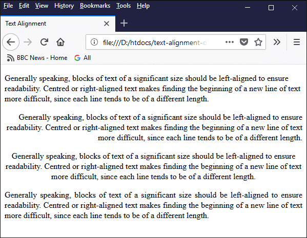
Text can be left- or right-justified, centred, or fully justified
When it comes to the text alignment of large blocks of text, there is a broad consensus of opinion that says that text should always (or almost always) be left justified for the sake of readability. Web developers are sometimes urged by their clients to use fully justified text because "it looks neater". And there are certainly situations in which the use of fully justified text is … well, fully justified! As a general rule, however, its use should be avoided.
Justified text is often used for printed media like newspapers and magazines - is often quite necessary in fact - because these kinds of publications frequently have multiple columns on a page side by side and in fairly close proximity. The resulting uniform-width white space between columns tends to act as a column separator.
Reading a web page, however, is very different from reading a newspaper or a magazine. To start with, a computer screen is not a static display. A modern LCD monitor typically has a frame rate of 60 frames per second, and a backlight frequency of 200 Hz. This means that the eyes have to work harder when reading text on a computer screen than when reading a newspaper or magazine article.
Then there's the question of how the white space used to justify the text is distributed. This can sometimes have unforeseen side effects that affect readability, and will depend on things like font size, word and letter spacing, and the width of the print area. The typesetter for a newspaper or magazine article knows the exact size and shape of the space they have to work with; a web developer is essentially working blind.
Whereas the typesetter can immediately see how the white space in their article is distributed and can make any necessary adjustments before publication, the web designer is faced with an almost infinite number of permutations when it comes to the display device, screen resolution, operating system and web browser that will be used to display the results of their labours - not to mention user preferences!
There is also a significant body of evidence to suggest that justified text is more difficult for dyslexic users because the different amount of white space between words can have the effect of causing dyslexic users to lose track of where they are more easily. According to Dyslexia International, at least one in ten people worldwide have some form of dyslexia. That's a lot of potential visitors.
Justified text also has the potential to cause problems for visually impaired users who use a screen magnifier, because the larger areas of white space are magnified along with the text, which sometimes makes it difficult for users to move from one word to the next because of the uneven spacing between words.
Indentation is the use of empty space at the beginning of a line of text. Sometimes used to denote the start of a new paragraph (especially in newspaper and magazine columns, for example, where paragraphs tend to follow one another without an intervening blank line). Whitespace is frequently used in printed media to provide a degree of separation between words, phrases or blocks of text, or to align columns of text or numerical data.
Various levels of indentation are used by programmers when writing program code, and by web authors when writing HTML code or scripts. Its purpose in this context is simply to provide visual clues about the level at which a given line or block of code is nested within the surrounding code, and to make the source code easier to read for the people responsible for maintaining the code.
Indentation in source code is for the most part ignored by source-code compilers, interpreters and web browsers. The indentation you use to make your HTML code more readable, for example, will not be displayed by the web browser when it renders your HTML document as a web page. So how do we get the browser to actually display indentation?
In terms of the overall structure of a web page, we use HTML elements like <section> and <div>, together with whatever styling is required, to organise our content. For tabular data, we have HTML tables. But suppose we just want make it easier to read a block of text by indenting the first line of a paragraph (or even an entire paragraph), or by increasing the line spacing, or by increasing the space between words or individual characters?
Pretty much all of the text-level indentation and whitespace features we may wish to implement can be achieved using the style attribute of the HTML element within which the text appears. The properties we can use for this purpose include the following:
The line-height property can be assigned a value using virtually any size unit, including pixels, points, em units, centimetres and percentages. The use of a dimensionless value is considered to be the best practice, however, whereby the font-size value is simply multiplied by a number to get the line height.
A block of text is generally considered to be easier to read if the lines are spaced sufficiently far apart, and recommended values range from around 1.5 to 2.0. The following HTML code demonstrates the effect of applying different values to the line-height property:
<!doctype html>
<html lang="en">
<head>
<meta charset="utf-8">
<title>Line Height Demo</title>
</head>
<body>
<h1>Line Height Demo</h1>
<p style="line-height: 1.0">
The boy stood on the burning deck<br>
Whence all but he had fled;<br>
The flame that lit the battle's wreck<br>
Shone round him o'er the dead.<br>
</p>
<p style="line-height: 1.25">
The boy stood on the burning deck<br>
Whence all but he had fled;<br>
The flame that lit the battle's wreck<br>
Shone round him o'er the dead.<br>
</p>
<p style="line-height: 1.5">
The boy stood on the burning deck<br>
Whence all but he had fled;<br>
The flame that lit the battle's wreck<br>
Shone round him o'er the dead.<br>
</p>
<p style="line-height: 1.75">
The boy stood on the burning deck<br>
Whence all but he had fled;<br>
The flame that lit the battle's wreck<br>
Shone round him o'er the dead.<br>
</p>
<p style="line-height: 2.0">
The boy stood on the burning deck<br>
Whence all but he had fled;<br>
The flame that lit the battle's wreck<br>
Shone round him o'er the dead.<br>
</p>
</body>
</html>
Copy and paste this code into a new file in your HTML editor, save the file as line-height-demo.html, and open the file in a web browser. You should see something like the following:
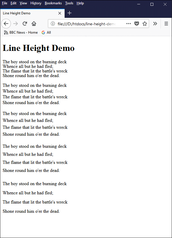
An example of using different line spacings
The letter-spacing and word-spacing property can be assigned a value using pixels, points, em units, and centimetres. Using em units is recommended because they are relative length units. This means that the space between the letters will remain in proportion with the size of the font, even if the font size changes.
The following HTML code demonstrates the effect of applying different values to the word-spacing and letter-spacing properties:
<!doctype html>
<html lang="en">
<head>
<meta charset="utf-8">
<title>Word and Letter Spacing Demo</title>
</head>
<body>
<h1>Word and Letter Spacing Demo</h1>
<p>
God and the soldier<br>
All men adore<br>
In time of trouble,<br>
And no more;<br>
For when war is over<br>
And all things righted,<br>
God is neglected -<br>
The old soldier slighted.<br>
</p>
<p style="word-spacing: 1.5em">
God and the soldier<br>
All men adore<br>
In time of trouble,<br>
And no more;<br>
For when war is over<br>
And all things righted,<br>
God is neglected -<br>
The old soldier slighted.<br>
</p>
<p style="letter-spacing: 1.0em">
God and the soldier<br>
All men adore<br>
In time of trouble,<br>
And no more;<br>
For when war is over<br>
And all things righted,<br>
God is neglected -<br>
The old soldier slighted.<br><br>
</p>
<p style="text-align: center">God And The Soldier - Anonymous</p>
</body>
</html>
Copy and paste this code into a new file in your HTML editor, save the file as word-and-letter-spacing-demo.html, and open the file in a web browser. You should see something like the following:
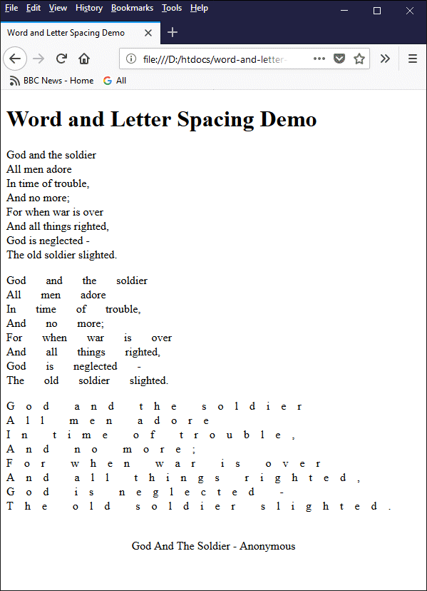
Example of changing the size of the spaces between words and letters
We will now look indentation. The standard form of indentation for a paragraph of text indents the first line and leaves the remaining lines where they are. For this, we use the paragraph's style attribute together with the indent property. If we want to indent a whole paragraph of text, we need to use the padding property.
The trickiest thing to implement is a hanging indent. That's where the first line of the paragraph remains flush with the left-hand text margin and the rest of the lines are indented. In order to achieve this, we have to use both the padding property and the text-indent property with a negative value.
The following HTML code demonstrates how we go about applying these different types of indentation to a paragraph of text:
<!doctype html>
<html lang="en">
<head>
<meta charset="utf-8">
<title>Indentation Demo</title>
</head>
<body>
<h1>Indentation Demo</h1>
<p>
We set sail on this new sea because there is new knowledge to be gained, and new rights to be won, and they must be won and used for the progress of all people. For space science, like nuclear science and all technology, has no conscience of its own. Whether it will become a force for good or ill depends on man, and only if the United States occupies a position of pre-eminence can we help decide whether this new ocean will be a sea of peace or a new terrifying theater of war. I do not say that we should or will go unprotected against the hostile misuse of space any more than we go unprotected against the hostile use of land or sea, but I do say that space can be explored and mastered without feeding the fires of war, without repeating the mistakes that man has made in extending his writ around this globe of ours.
</p>
<p style="text-indent: 2.0em">
There is no strife, no prejudice, no national conflict in outer space as yet. Its hazards are hostile to us all. Its conquest deserves the best of all mankind, and its opportunity for peaceful cooperation many never come again. But why, some say, the moon? Why choose this as our goal? And they may well ask why climb the highest mountain? Why, 35 years ago, fly the Atlantic? Why does Rice play Texas?
</p>
<p style="padding: 2.0em; text-indent: -2.0em">
We choose to go to the moon. We choose to go to the moon in this decade and do the other things, not because they are easy, but because they are hard, because that goal will serve to organize and measure the best of our energies and skills, because that challenge is one that we are willing to accept, one we are unwilling to postpone, and one which we intend to win, and the others, too.
</p>
<p style="text-align: center">
"The Decision to Go to the Moon" by John F. Kennedy
</p>
</body>
</html>
Copy and paste this code into a new file in your HTML editor, save the file as indentation-demo.html, and open the file in a web browser. You should see something like the following:

Example of using different levels and types of indentation
The last property we will look at in the context of indentation and whitespace is the white-space property, which determines how whitespace characters used inside an HTML element are displayed or otherwise handled by the browser (the default behaviour is to treat sequences of whitespace characters as a single whitespace character, effectively ignoring all but the first occurrence). The white-space property can take the following values:
The only values of immediately interest here are pre and pre-wrap, which preserve white space as it appears in our HTML source code. The following HTML code demonstrates how we go about applying these types of indentation to a paragraph of text:
<!doctype html>
<html lang="en">
<head>
<meta charset="utf-8">
<title>White Space Demo</title>
</head>
<body>
<h1>White Space Demo</h1>
<p style="white-space:pre;">
Lorem ipsum dolor sit amet, consectetur adipiscing elit, sed do eiusmod tempor incididunt ut labore et dolore magna aliqua. Ut enim ad minim veniam, quis nostrud exercitation ullamco laboris nisi ut aliquip ex ea commodo consequat.<br>Duis aute irure dolor in reprehenderit in voluptate velit esse cillum dolore eu fugiat nulla pariatur. Excepteur sint occaecat cupidatat non proident, sunt in culpa qui officia deserunt mollit anim id est laborum.
</p>
<p style="white-space:pre-wrap;">
Lorem ipsum dolor sit amet, consectetur adipiscing elit, sed do eiusmod tempor incididunt ut labore et dolore magna aliqua. Ut enim ad minim veniam, quis nostrud exercitation ullamco laboris nisi ut aliquip ex ea commodo consequat.<br>Duis aute irure dolor in reprehenderit in voluptate velit esse cillum dolore eu fugiat nulla pariatur. Excepteur sint occaecat cupidatat non proident, sunt in culpa qui officia deserunt mollit anim id est laborum.
</p>
</body>
</html>
Copy and paste this code into a new file in your HTML editor, save the file as white-space-demo.html, and open the file in a web browser. You should see something like the following:
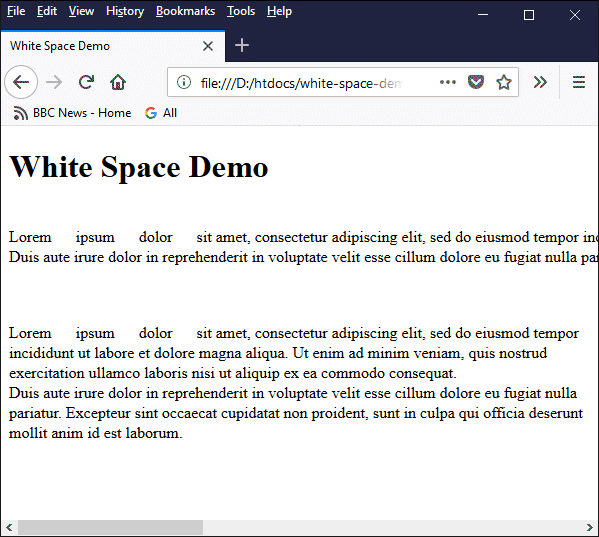
The white-space property can be used to preserve white space within text
In fact, unless you have a specific reason for not wanting your text to wrap at the end of a line, it's probably best to stick to using the pre value with large blocks of text. Note also that any white space at the beginning of a paragraph in your HTML code will be preserved along with any other white space, even if that was not the intention. You might need to make sure that your HTML editor has not inserted any unwanted spaces here - some editors do this to preserve indentation levels in the source code, since the browser will ignore leading spaces by default.
Once you have completed the task of adding markup to your content to turn it into a web page, you should open the page in a browser and proof read it. Even if you have written the content yourself and turned it into an HTML document using your favourite HTML editor, you can't be one hundred percent certain about how the finished article will look until you see it rendered by a web browser.
Bear in mind that users will have different screen resolutions and use different browser implementations. If possible, try viewing the page on different devices, and with different web browsers, to make sure everything "looks right". Read the web page carefully at least once in order to pick up on any typos or spelling mistakes. Better yet, get someone else - preferably someone not directly involved in creating the page - to read it. A second pair of eyes with a fresh perspective can often spot things that you might overlook.
The need to proof read pages is even more critical if you are not the content author. This can occur, for example, if you are given a word-processed document and asked to turn it into a web page. The natural tendency is to copy the text from the source document, paste it into an HTML template, and add the necessary additional markup. Because you have not produced the content yourself, however, it is even more important to check the output for errors and omissions.
Problems can also be created by the text-editing or word-processing software used to produce the source document. Microsoft Word, for example, uses "smart quotes" (curly quotation marks) instead of straight quotation marks. In addition, the source file may contain accented characters, mathematical symbols, and non-standard punctuation marks. Your HTML editor may, of course, take all these things in its stride and encode the input correctly. The only way you can be sure, however, is by proof reading the output.