| Author: | |
| Website: | |
| Page title: | |
| URL: | |
| Published: | |
| Last revised: | |
| Accessed: |
Unlike media such as video and audio, images - providing they are in one of the permitted file formats - can be displayed in web pages without requiring the user to download and install various plugins, add-ons, or browser extensions. Using images in your web pages is therefore a good place to start when it comes to enhancing the user experience, since it requires only a knowledge of how to use the appropriate HTML element and (of course) some reasonably good quality images.
In the early days of the World Wide Web, web browsers could not display images in a web page. Images were of course accessible on the web, but only via hypertext links. A linked-to image would typically be downloaded to the user's computer and viewed using a separate image viewer application.
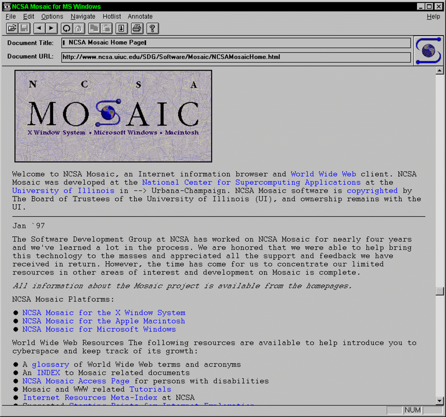
Then, in 1992, University of Illinois undergraduate Marc Andreessen, together with NCSA (National Center for Supercomputing Applications) employee Eric Bina, began development of the Mosaic web browser, which was released by NCSA the following year. Mosaic was one of the first cross-platform web browsers. It was easy to install, featured an easy-to-use graphical user interface (GUI), and was to become by far the most popular browser of its time.
The most innovative feature of the new bowser was the <img> tag, which allowed images to be displayed inline with the text content of a web document. The user didn't have to click on a link in order to see the image, and no additional software was required to display it. This feature, more than any other, helped to make the web popular with hundreds of thousands of users who had previously seen the web purely as an esoteric tool for scientists and academics.
At first, the new tag caused some consternation among the more conservative members of the web establishment. As is often the case, however, standards eventually caught up with innovation, and the <img> tag was included in W3C's HTML 2.0 specification, released in 1995.
Today, most people would consider a website without any images to be boring. In fact, it's almost impossible to find a live website that is totally devoid of images. We managed to find just one - the website of Interrupt Technology Corporation - which has absolutely no images whatsoever, not even a logo. In truth, it doesn't have much in the way of content at all, but it is a live website at the time of writing.
The appropriate use of images can enhance your web pages considerably. We have probably all heard the saying (allegedly an ancient Chinese proverb) that "a picture is worth a thousand words". In fact, the expression is thought to have been based on the sentence "Use a picture: it's worth a thousand words" that appeared in an article published in the Syracuse Advertising Men's Club in 1911. The Chinese expression "Hearing something a hundred times isn't better than seeing it once" could be interpreted as being roughly equivalent.
Whatever the origin of the sentiment, it is certainly one that has merit. Images can often convey far more information, and far more quickly, than several pages of text. Certainly, including an image in a web page requires far less effort than writing several pages of text. That said, you should exercise discretion when using images.
Too many images crowded onto a page makes the page look cluttered and represents a kind of visual information overload. Your website's logo, for example, should stand out and be noticed, not have to compete for attention with half a dozen other images crammed into the same space. The logo has an important part to play in giving a website its unique identity and should appear in a prominent position on all your pages.
Whenever you use an image, make sure you have a good reason for doing so other than simply filling space. It's perfectly OK to insert an image in a web page to break up a long section of text, but you must ensure that the image (or images) you use for this purpose are relevant to, and illustrative of, the text within which they appear. If possible, they should provide information that the text alone cannot convey.
In this page we will look at the various image file formats available for adding images to web pages, and the circumstances under which each might be used. We will also be showing you how to add an image to an HTML document, and some of the things you can do control the size at which the image is displayed and where it is positioned. We will also be looking at ways in which you can optimise images in order to make best use of available bandwidth.
The Graphic Interchange Format (GIF) was developed during the 1980s by the CompuServe Information Service (CIS), the first major commercial online service in the US. It was later adopted for use in web documents because of its efficient compression algorithm, and because it was already a widely used format.
The Lempel Ziv Welch (LZW) compression scheme used (named after the individuals responsible for developing it) is described as "lossless", because although file size is reduced, image quality is preserved. The main limitation is that, because GIF images have a fixed colour depth of 8 bits, the number of different colours in any one image is limited to 256.
The relatively simple nature of the compression algorithm means that GIF files are best suited for storing images that have large areas of a single colour, such as block diagrams, company logos and so on. They are not suitable for storing complex photographic images that contain a large number of colours.
The images below were created from the same bitmapped image of coloured blocks. The image on the left has been saved as a GIF file, while that on the right has been saved as a JPEG file. If you look closely, you can see that the edges in the JPEG image are slightly blurred. The JPEG file is also approximately fifty percent bigger than the GIF file.


The same bitmapped image saved as a GIF (left), and as a JPEG (right)
Photographic images can be saved as GIF files, although the results are often unsatisfactory due to the limited number of colours. The reduction in colour depth often requires a process called dithering to create the impression that there are more colours present in the image than there actually are.
When a photographic image is dithered, pixels of two different colours are positioned next to each other to create the illusion that a third colour is present. The result is often a good approximation of the original 16-bit or 32-bit photographic image, but some image quality is inevitably lost. Most computers now have graphics adaptors that allow millions of colours to be displayed, so there is really no reason to store photographic images as GIF files.
The images below illustrate the difference in quality between GIF and JPEG file formats for photographic images. The image on the left is a GIF file, while the image on the right is a JPEG file. Only very close inspection will reveal any difference between the two images.
The same photographic image stored as a GIF (left), and as a JPEG file (right)
The really interesting thing here is the relative file size – despite the fact that both images are exactly the same size (260 × 280 pixels) the GIF file is over three times the size of the JPEG file! The difference in file size arises because the compression algorithm used by the GIF file format is not particularly efficient when applied to photographic images.
GIF files come into their own when the number of colours in the image is relatively small, or where there are large contiguous areas of the same colour. When saving graphic images as GIF files therefore, use the least number of colours that provides an acceptable result.
The GIF file format allows you to select one colour to be transparent (usually the background colour). This is useful for graphic images that are used as logos over a coloured background, or for diagrams with clean lines that are superimposed over a coloured background or other graphic images (note however that this doesn't work so well if the image has dithered or anti-aliased edges or employs the background colour for areas that should remain visible).
Consider the two GIF images shown below. The image on the left is the same bitmapped image of coloured bocks, saved as a Gif file, that we saw above. The image on the right is essentially the same image except that we have made the background colour (which in this case is white) transparent. We are showing the images against a coloured background to demonstrate how a transparent background colour can be used to integrated an image into a web page.

The images are identical, except that the image on the right has a transparent background
The JPEG standard for image encoding and decoding has been around since 1992 and was developed by the Joint Photographic Experts Group. There are actually a number of different file formats in use for images encoded with JPEG, each with its own file extension. The file extensions you are most likely to encounter, however, are .jpg or .jpeg.
JPEG is essentially a method of compressing digital images that is best suited for images produced by digital photography. The degree of compression can be adjusted, with the trade-off being between file size and image quality. A compression ratio of 10:1 would result in minimal loss of image quality.
JPEG images usually have a colour depth of 24 bits per pixel, allowing an image to have up to 16.8 million colours. In reality, a single image is unlikely to use anywhere near that many different colours, even if it has 16.8 million pixels or above. The availability of such a large palette, however, makes JPEG image files highly suitable for digital photography, graphic design, and multimedia.
The nature of the algorithms used for JPEG file compression (essentially a sophisticated mathematical conversion process called discrete cosine transformation) allows users of graphics packages such as Adobe Photoshop to select the degree of compression required for each image. As we mentioned above, however, there is a trade-off between the degree of compression achieved and the quality of the resulting image.
A JPEG file can be up to one hundred times smaller than the equivalent uncompressed bitmap image. The compression algorithm discards as much of the file's data as possible during the compression process, retaining only enough data to be able to render an acceptable approximation of the original image.
JPEG compression is referred to as a "lossy" compression technique due to the inevitable loss of image quality that results. Compression is also very much a one-way process. Once you have compressed an image file and saved it as a JPEG file, you cannot restore it to its original state. For this reason, it is probably a good idea to retain a copy of the original image file as a backup, in case you wish to start processing the image again from scratch.
Consider the two images below. The image on the left has been saved in JPEG format with a standard compression factor of 15% and has a file size of 22,270 bytes, while the image on the right has been saved with a compression factor of 90% to give a file size of 3,172 bytes. Note that, for any given compression factor, the file size will reduce further and image quality degrade more each time the file is re-saved as a JPEG file (if a large number of successive file save operations are carried out, the degree of change will eventually become negligible).
Different compression values produce differences in picture quality
The degree of compression that can be achieved, together with the flexible nature of the compression algorithm itself, makes JPEG an obvious choice for photographic images to be displayed in web pages. It is not recommended for use with images like diagrams, line drawings, or images that may need to be edited on a regular basis; such images should be saved in a lossless format such as GIF or PNG.
You might also be interested to know that, for large images that may require a significant amount of time to download, there is an interlaced progressive JPEG format that compresses the image data in a series of passes, each of which adds more image detail. This allows a user with a slow Internet connection to see a reasonable version of the image before all of the image data has been downloaded (provided their browser supports progressive JPEG).
The Portable Network Graphics (PNG) image format was developed by a consortium of graphic software developers as a non-proprietary alternative to GIF (the LZW compression scheme was developed for GIF by CompuServe and patented by Unisys Corporation, and software developers whose applications saved files in GIF format were therefore at one time obliged to pay royalties to both companies).
The PNG format was designed specifically for web page images and offers a number of advanced features that include lossless compression, support for a range of colour depths, and the ability to accommodate a short, embedded text description of the image. This latter feature enables PNG image files to be indexed by search engines.
PNG can be used for both the kind of web graphics traditionally represented by GIF files (thanks to its lossless compression) and for photographic images that require 24-bit colour depth (although the lossless compression used by PNG results in files that are much larger than their JPEG counterparts).
The PNG format is at its best when used for line art, logos and diagrams of the type traditionally stored in GIF format. The result in terms of image quality is usually as good as the equivalent GIF image, and results in a file size that is on a par with, or smaller than, GIF. Unfortunately, inconsistent browser support for PNG graphics (Internet Explorer, in particular, does not fully support all the features of PNG graphics) has meant that widespread adoption of the PNG format has not yet occurred.
An image is embedded within a web page using the self-closing image tag (<img>). The image itself is not part of the HTML document. It resides in a separate image file that is referenced by the image tag's src attribute. The value assigned to the src attribute is the URL of the file containing the image information.
If the image file resides on the same server as the HTML file that references it (this is usually, though not always the case), a relative URL may be used. Note that, because the image tag itself does not directly enclose any content, it is said to be an empty (or void) tag.
According to the HTML 5 specification, empty tags may be closed, although they don't have to be. The policy of this website is to adopt the XHTML rule that all empty tags must be closed. This is achieved by including a solidus (forward slash), preceded by a space, immediately before the closing angle bracket. The HTML code below demonstrates how the image tag is used.
<!doctype html>
<html lang="en">
<head>
<meta charset="utf-8">
<title>Image Demo 01</title>
</head>
<body>
<h1>Image Demo 01</h1>
<p>
This year (2018), we went to Denmark for a week in June and visited some old haunts.
</p>
<img src="https://www.technologyuk.net/assets/demo-images/viking-beer-in-ribe.jpg" alt="A Viking beer in Ribe!">
<p>
This is me in Ribe, the oldest town in Denmark, sampling the local Viking beer (Vikingebryg). The weather wasn't all that nice, but the beer was!
</p>
</body>
</html>
The image file referenced by the above example resides in a subdirectory of the TechnologyUK website, and is referenced using an absolute URL, i.e. the image file's absolute Internet address. The use of an absolute URL is only necessary if the image you want to include on your web page is located on a different server from the HTML document itself. Otherwise, you can use a relative pathname (more about that shortly).
Copy and paste this code into a new file in your HTML editor, save the file as image-demo-01.html, and open the file in a web browser. You should see something like the following:
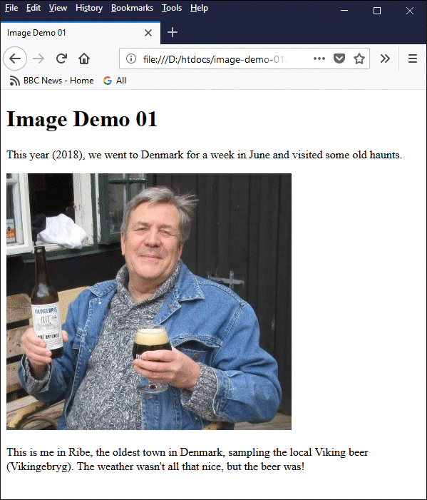
A basic example of photographic image embedded in a web page
The position at which the image appears on the page depends on where in the HTML code the tag is used. In the above example, the tag is used between two paragraphs, so the browser displays the first paragraph, then the image, then the second paragraph. This will not always be the case. As you will see, we can use the HTML global style attribute to exercise more control over where the image appears.
The image tag has several attributes. These are used to tell the browser how to display the image, or to convey semantic information about the image. Only two attributes are used in the above example. The first of these is the src attribute, which specifies the source of the image, i.e. the name of the image file, and where it can be found. This is a required attribute and must always be included.
If the image file resides in the same directory as the HTML document containing the image tag, the src attribute's value can be just the name of the image file. If the image file is in a different directory within your website's directory structure, you will need to use the pathname to the image. This can be an absolute pathname or a relative pathname.
An absolute pathname gives the location of a file within your website's directory structure that does not depend on the location of the HTML file referencing it. It specifies the complete path to the target file from the root directory of the website and includes each subdirectory that lies directly between the root directory and the target. A relative pathname gives the location of a file relative to the location of the HTML file referencing it. Consider the illustration below.
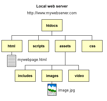
A web page will often include an image located in a local subdirectory
Suppose we have a web page called mywebpage.html which is located in the subdirectory html on the local webserver, which has the domain name mywebserver.com as shown above. Now let's suppose we want to include the image image.jpg in our web page. As you can see, the image is situated in a local directory called images.
The images directory is a subdirectory of the assets directory which, like the html directory, is a subdirectory of the root directory htdocs. To address the image, we can use either a relative pathname or an absolute pathname in our image tag. Each of the image tags below contains a valid URL. The first tag uses a relative pathname. The second tag uses an absolute pathname, and the third tag uses an absolute URL.
<img href="../assets/images/image.jpg" alt="My image">
<img href="/assets/images/image.jpg" alt="My image">
<img href="http://www.mywebserver.com/assets/images/image.jpg" alt="My image">
Note the use of the two dots in the first example. This essentially tells us we need to go up one directory level before we look for the next file or directory in the path (in this case, the assets directory). The second example starts with a solidus (forward slash), which is interpreted as representing the root directory of the current domain, effectively making this an absolute pathname.
The last example uses an absolute URL, and includes the protocol (http) and hostname (www.mywebserver.com), as well as the directory path and filename. This version of the URL gives the unique Internet address of the file and could be used from any web address to point to the file's location - which is precisely how we deal with a situation like the one depicted in the illustration below.
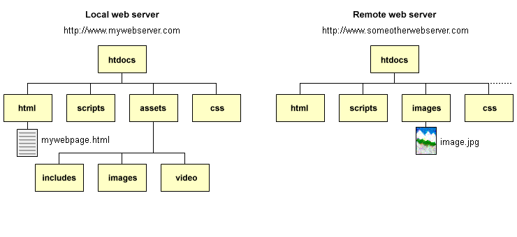
A web page may reference an image located on a remote server
There may be occasions when you wish to include an image in your web page that is not located on the server hosting your website. If this is the case, the image tag will need to include an absolute URL that includes the protocol, the hostname, the directory path and the filename.
In the example illustrated above, the image we are interested in is in a file called image.jpg which is located in the images subdirectory of a remote server with the hostname www.someotherserver.com. The image tag would therefore be formulated as shown here:
<img href="http://www.someotherserver.com/images/image.jpg" alt="Some other image">
The final question you should consider is when to use a relative pathname, when to use an absolute pathname, and when to use an absolute URL. The first point to make here is that, unless you are referencing images located on a remote server, there is normally no need to use an absolute URL. An absolute or relative pathname is perfectly adequate.
Use absolute pathnames for images like site logos, icons, and any other graphics that appear on all or most of your pages. This allows you (for example) to use the same URL for your site logo in all of your web pages, regardless of where they live within your directory structure. It also facilitates the creation of web page templates and include files.
Your website may be organised into a number of different subject areas internally, each having its own localised set of subdirectories to hold related HTML code, images, and other resources. It probably makes more sense to use relative pathnames at the local level because it allows you, if necessary, to make changes to your top-level directory structure without having to change all of your internal links.
* * *
The second attribute we used in our example web page is alt, which specifies the alternative text that will be displayed by the browser if, for whatever reason, the image cannot be displayed. Although alt is an optional attribute, the general consensus is that you should always use it because you cannot guarantee that the image will always be available. Even if it is available, you can't always guarantee that that it will be downloaded, or that the browser will be able to render it.
There is another good reason for using alt, which is that some users may be sight-impaired and thus unable to see images. These users typically use a screen reader to access your pages. Using the alt attribute enables the screen reader to provide information about the image to the user, even if they cannot see it. It may also be used by search engines and other text-parsing software to index and categorise the image.
You can also use the global HTML title attribute with images, which provides additional on-screen information about the image displayed when the user hovers over it with the mouse. The text defined for the title attribute is displayed at the location of the mouse pointer in the form of a "tooltip". An image can have both the alt attribute and the title attribute defined with the same (or different) text. The HTML code below demonstrates how the title attribute is used.
<!doctype html>
<html lang="en">
<head>
<meta charset="utf-8">
<title>Image Demo 02</title>
</head>
<body>
<h1>Image Demo 02</h1>
<p>This little tabby cat is very curious.</p>
<img src="https://www.technologyuk.net/assets/demo-images/curious-tabby.jpg" alt="A curious tabby cat!" title="A curious tabby cat!">
<p>Or maybe she just wants to have her picture taken!</p>
</body>
</html>
Copy and paste this code into a new file in your HTML editor, save the file as image-demo-02.html, and open the file in a web browser. You should see something like the illustration below. Move the mouse over the image to see the effect of the title attribute.
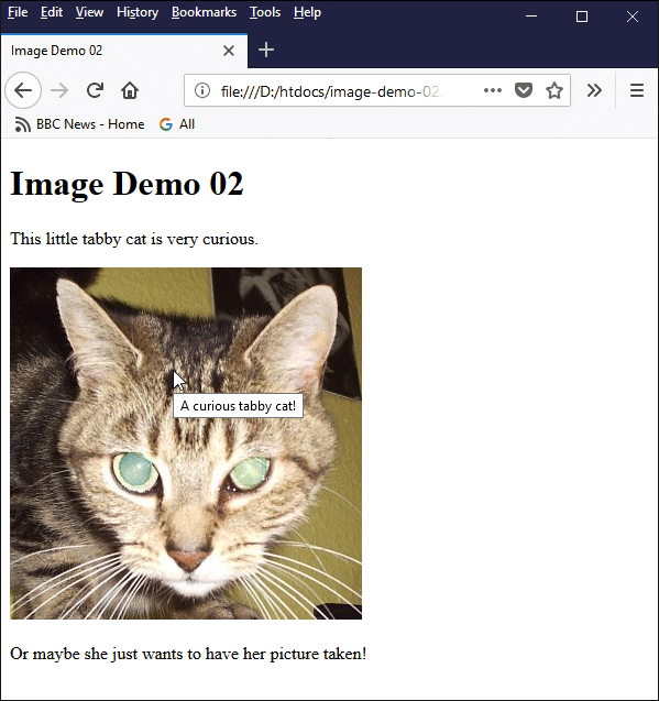
The title attribute can be used to create a "tooltip"
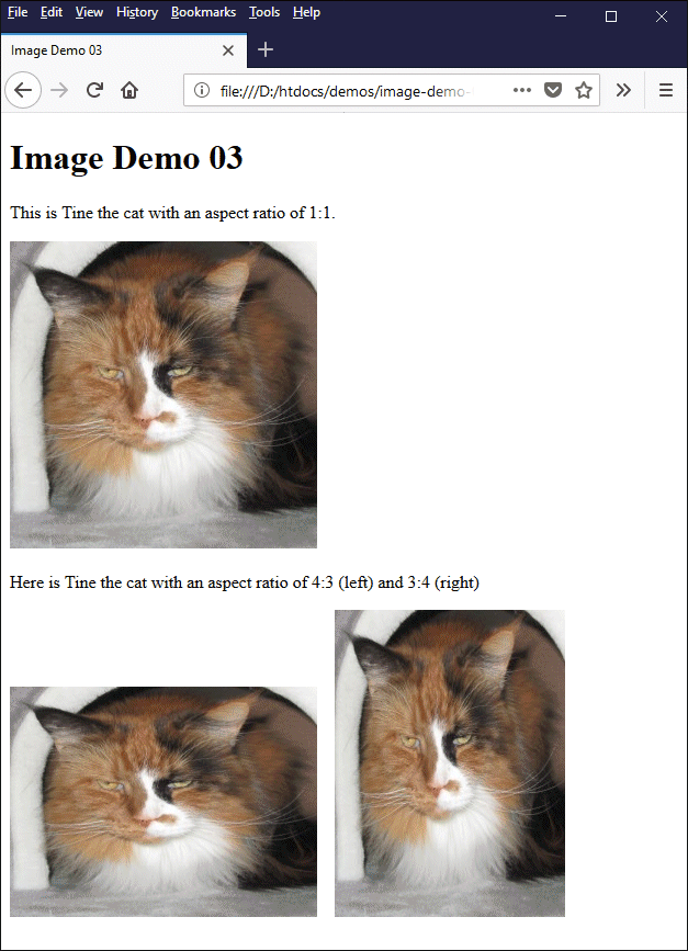
Two important aspects of an image that we have not yet dealt with are its width and height attributes. We can use these attribute to specify the size of the image on screen using pixel values. Use these properties with care, as they can alter the aspect ratio (i.e. the relationship between width and height) of an image, leading to the image being stretched in the horizontal or vertical direction.
The HTML code below creates a page that displays the same image three times, but with different dimensions.
<html lang="en">
<head>
<meta charset="utf-8">
<title>Image Demo 03</title>
</head>
<body>
<h1>Image Demo 03</h1>
<p>
This is Tine the cat with an aspect ratio of 1:1.
</p>
<img src="https://www.technologyuk.net/assets/demo-images/tine.jpg" alt="Tine the cat with an aspect ratio of 1:1">
<p>
Here is Tine the cat with an aspect ratio of 4:3 (left) and 3:4 (right)
</p>
<img src="https://www.technologyuk.net/assets/demo-images/tine.jpg" width="280" height="210" alt="Tine the cat with an aspect ratio of 4:3">
<img src="https://www.technologyuk.net/assets/demo-images/tine.jpg" width="210" height="280" alt="Tine the cat with an aspect ratio of 3:4">
</body>
</html>
Copy and paste this code into a new file in your HTML editor, save the file as image-demo-03.html, and open the file in a web browser. You should see something like the following:
This page displays the same photographic image with different aspect ratios
The original image has dimensions of 280 × 280 pixels (an aspect ratio of 1:1). The first image displayed on the page (top) does not have its width or height attribute set, and will be displayed using its original dimensions, with an aspect ratio of 1:1. The remaining two images both have their width and height attribute set. For the second image (bottom left) we keep the original width but reduce the height by twenty-five percent to give an aspect ratio of 4:3. For the final image (bottom right), we kept the original height but reduce the width by twenty-five percent to give an aspect ratio of 3:4.
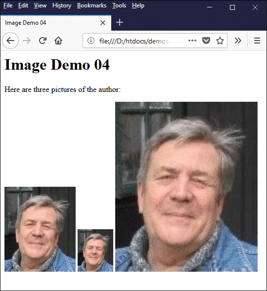
Other side-effects can also result from the resizing of an image. If the image is greatly reduced in size, for example, there will almost certainly be a significant loss of detail. If on the other hand the image is displayed at two or three times its original size, it may appear "blocky". The HTML code below creates a page that displays the same image three times, but with different width and height parameters.
<html lang="en">
<head>
<meta charset="utf-8">
<title>Image Demo 04</title>
</head>
<body>
<h1>Image Demo 04</h1>
<p>
Here are three pictures of the author:
</p>
<img src="https://www.technologyuk.net/assets/demo-images/cw.jpg" alt="A picture of the author">
<img src="https://www.technologyuk.net/assets/demo-images/cw.jpg" width="72" height="86" alt="A picture of the author (width and height reduced by 50%)">
<img src="https://www.technologyuk.net/assets/demo-images/cw.jpg" width="288" height="344" alt="A picture of the author (twice original width and height)">
</body>
</html>
Copy and paste this code into a new file in your HTML editor, save the file as image-demo-04.html, and open the file in a web browser. You should see something like the following:
The same photographic image is displayed three times at different screen dimensions
The left-hand image is displayed at its original size, the middle image is scaled down to half its original size, and the right-hand image is scaled up to twice its original size. As you can see, when we reduce the size of the image by fifty percent, it is difficult to make out any detail. Doubling the size of the image, on the other hand, makes it look pixelated.
It is usually better to resize your images using a suitable graphics program before you use them rather than change the dimensions using the width and height attributes. If for some reason you feel you must resize the image in this way, scale a larger, good-quality image down to the required size rather than scaling a smaller image up. As we have seen, this is easy enough to do. Suppose we have an image with a width of 720 pixels and a height of 480 pixels - an aspect ratio of 3:2. Let's further suppose that we want to display the image with a fixed width of 640 pixels. We could use the image tag as follows:
<img src="myImage.jpg" style="width: 640px;" alt="My image">
You don't need to specify the height of the image. The browser will automatically resize the height of the image to match it to the aspect ratio of the original image (in this case, because the aspect ratio is 3:2, the height would become 427 pixels).
The same thing applies if you specify a fixed value for the height. If we wanted to set the height of the image to 400 pixels, we could do the following:
<img src="myImage.jpg" style="height: 400px;" alt="My image">
Once again, you don't have to specify the width of the displayed image; the browser will automatically resize the width to maintain the 3:2 aspect ratio, so in this particular instance the width of the image on screen becomes 600 pixels.
By default, a browser will display an image on screen at its actual dimensions. Assuming you want your image to be displayed with its original width and height, therefore, you don't have to specify these dimensions at all. On the other hand, there are benefits to specifying both the height and width of an image in your HTML code.
If the browser has to wait for the image to download from the web server before it can determine the on-screen dimensions of an image, it will leave an arbitrary amount of space on the page as a kind of placeholder, and then adjust the size of the space to accommodate the image once it knows the actual dimensions. This can cause text and other content on the page to suddenly "jump", which is quite disconcerting for the user. Specifying both the width and height of an image will allow the browser to leave the right amount of space for the image when the page loads, even if the image cannot be displayed immediately.
There is a potential problem with specifying a fixed width or height for an image. We don't know in advance what kind of device our web page will be displayed on, or what the screen resolution of the display adapter is. Displaying an image with a fixed width of 640 pixels on a low-end smartphone that has a viewport width of only 320 pixels means that the user needs to scroll left and right, or use the appropriate gestures, in order to see all of the image. At the other end of the scale, the same image will look tiny on a high-end monitor with a screen resolution of 3840 × 2160 pixels.
The question of making your pages look good regardless of the hardware on which they are displayed is a complex one; it is part of the wider issue of responsive web design, which we will deal with more thoroughly elsewhere. There are some things we can do immediately, however, to gain a bit more control over how images are displayed.
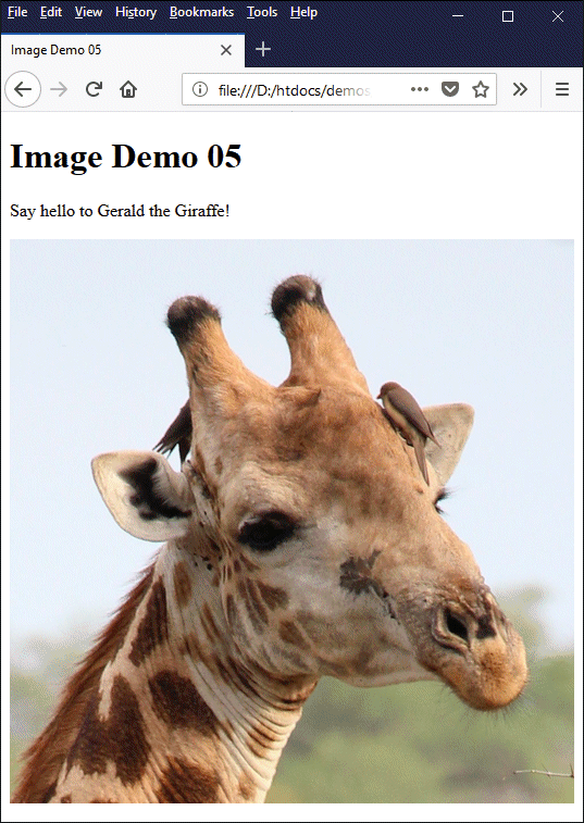
One thing we can do is to ensure that the image is never wider than the space available for it. We can achieve this by setting the max-width property of the image tag's style attribute. The HTML code below demonstrates how the max-width property is used.
<!doctype html>
<html lang="en">
<head>
<meta charset="utf-8">
<title>Image Demo 05</title>
</head>
<body>
<h1>Image Demo 05</h1>
<p>Say hello to Gerald the Giraffe!</p>
<img style="max-width: 100%;" src="https://www.technologyuk.net/assets/demo-images/giraffe.jpg" alt="Gerald the Giraffe">
</body>
</html>
Copy and paste this code into a new file in your HTML editor, save the file as image-demo-05.html, and open the file in a web browser. You should see something like the illustration below. Change the size of your browser window a few times to see how the size of the image is reduced if necessary to ensure that it is never wider than the browser window.
The image will never be wider than the browser window
You can also use the max-height property of the image's style attribute to restrict the height of the image to that of the element containing the image. Note, however, that this is only meaningful if the container element has a fixed height. In any case, setting the max-width property will cause the image's height to be rescaled in proportion to its width whenever the width changes.
If we simply set the style attribute's width property to 100%, the image will always occupy the full width of whatever HTML element it resides within. If the image is a child element of the <body> element, this effectively means it will occupy the entire width of the browser window, even if the original image is very small, so you should only do this if you are absolutely sure that is what you want to happen.
You may have noticed that in the examples provided so far, all of the images have been displayed on the left-hand side of the screen so that their left-hand border is flush with the browser's left-hand margin. The page would probably look a little more balanced if we could centre the images in the middle of the browser window. Suppose we were to edit our image-demo-01.html file as follows:
<!doctype html>
<html lang="en">
<head>
<meta charset="utf-8">
<title>Image Demo 06</title>
</head>
<body>
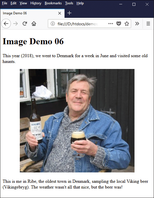
<h1>Image Demo 06</h1>
<p>
This year (2018), we went to Denmark for a week in June and visited some old haunts.
</p>
<p style="text-align: center;">
<img src="https://www.technologyuk.net/assets/demo-images/viking-beer-in-ribe.jpg" alt="A Viking beer in Ribe!">
</p>
<p>
This is me in Ribe, the oldest town in Denmark, sampling the local Viking beer (Vikingebryg). The weather wasn't all that nice, but the beer was!
</p>
</body>
</html>
Either save your changes using the filename image-demo-06.html or copy and paste the above code into a new file in your HTML editor and save it as image-demo-06.html. Once you have done this, open the file in a web browser. You should see something like the illustration below.
The image is now centered in the browser window
The only thing that has changed here is the we have enclosed the image tag within a paragraph tag (<p> … </p>), and set the text-align property of the paragraph tag's style attribute to center. This is not necessarily the best way to centre an image on the screen, but it's not breaking any rules and it will do for the moment. We will look at other methods of controlling our page layout in due course.
Optimising images for the web will present us with a number of challenges. First and foremost (at least from a visual design point of view) we want our images to look good on screen. A good quality image usually has a colour depth of twenty-four or thirty-two bits per pixel and a suitably high resolution.
The next thing we need to consider is how long the it will take for the image to download. This will of course depend on the user's connection speed and the size of the file. The larger the file, the longer it will take to download. Generally speaking - and depending on the kind of image we are dealing with - the size of an image file will depend on the dimensions of the image in terms of its width and height in pixels.
We are thus faced with a minor dilemma. Large, high-resolution images tend to have correspondingly large files. In order to ensure reasonably fast download times, however, we need to reduce file size as much as possible. As with many things in life, we must try to find a compromise between seemingly incompatible requirements.
The first step is to obtain your images. Graphics such as icons, logos, charts, graphs, and diagrams may be scanned from a book or magazine, or produced using an appropriate software package, or downloaded from an online source. Photographic images may also be scanned or obtained from an online source, or you may prefer to use your own photographs. Make sure that any images you download are not subject to copyright, or that you have the permission of the copyright holder to use them.
Regardless of the source of your images, make sure they are good quality images that are fit for their intended purpose. As a matter of policy, the quality of the images you obtain should be as high as possible. The idea, essentially, is that we will use a high-quality version of an image to produce a modified version that is optimised for the web; it is this optimised version that we will upload to our website.
It is sometimes necessary to experiment with images in order to obtain a satisfactory trade-off between image quality and file size. It is therefore a good policy to store the original (high-quality) version of any images you use as a backup. That way, if you decide you are not happy with the results of a particular optimisation, you can call up a copy of the original image and start the optimisation process again from the beginning.
It is also important to choose the correct file format for your images. If you are downloading images from an online source, you may well find that the source files are already in the most appropriate format. Similarly, if you are using a digital camera or a scanner to create digital images, the files created by the camera or scanner to store the images are usually already in a suitable format. A simple rule of thumb is to use JPEG images for photographs, and either GIF or PNG images for everything else (see above).
We come now to the question of what steps you can actually take to optimise your images. We are assuming here that you have access to, and are reasonably familiar with, suitable image editing software. Perhaps you own a copy of Photoshop or PaintShop Pro. If not, there are a number of good open source graphics packages available online; to get an idea of some of the possibilities, start by taking a look at GIMP and Inkscape.
In a nutshell, optimising images for the web essentially means reducing file size whilst maintaining an acceptable image quality. There are a number of steps you can take in order to achieve this.
The images created by digital cameras and scanners are typically quite large. Both of my Canon digital cameras (an Ixus 155 and an EOS 600D) can produce very large JPEG images with dimensions of 5152 × 3864 pixels and 5184 x 3456 pixels (in landscape mode) respectively. These images are many times larger than I actually need for my web pages.
Reducing such an image to a quarter of its original size would typically reduce the file size from between two and three megabytes to somewhere between two and three hundred kilobytes. File size is reduced by approximately ninety percent, and the image is still large enough to fill the average browser window. The images you use on your web pages will often be considerably smaller.
The image below originally had dimensions of 5184 × 3456 and a file size of 8,594,442 bytes (8.19 megabytes). We reduced the size of the image to give it dimensions of 720 x 480 pixels - less than 14% of its original width and height. The new, smaller version of the image has a file size of just 91,268 bytes (89.13 kilobytes).
Large images can be drastically reduced in size for the web and still look good
Depending on what kind of image you are using and what it is intended to depict, you may find that only part of the original image is actually needed. Diagrams and charts, for example, may be surrounded by large areas of white space, making it possible to reduce the overall dimensions of the image by cropping whilst retaining the essential information.
Photographs can also be cropped if the subject of the photograph is surrounded by spurious detail that is not of interest or has nothing to contribute to the context. If you are going to crop an image, however, we recommend you do so before any resizing takes place. Consider the image below. For the purposes of this page, we have reduced the image dimensions from its original size of 5184 × 3456 pixels to 780 x 520 pixels.
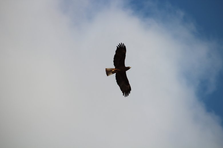
The interesting features of an image sometimes occupy a relatively small area of the image
The only thing that really interests us in this image is the eagle, which is surrounded by a whole lot of fairly featureless sky. The image below was obtained by cropping a square area of the image large enough to comfortably enclose the eagle's wingspan, which gave us an image with dimensions of 1485 x 1485 pixels.
We next resized the image to 640 x 640 pixels to give us the height we wanted, and then cropped the image once more to reduce the width, giving us the final dimensions of 360 x 640 pixels. The original file size of 4,013,469 bytes (3.82 megabytes) has been reduced to just 14,435 bytes (14.1 kilobytes).
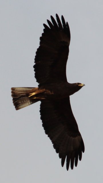
Cropping images helps us focus on what is important and reduces file size
Your image editing software may allow you to increase the degree to which photographic images are compressed, which will reduce the file size. As we saw above when looking at the JPEG file format, however, increasing the compression ratio will result in reduced image quality. You may need to experiment a little in order to determine the degree to which you can compress an image whilst still achieving acceptable image quality.
Although it is possible to reduce the number of colours in JPEG images, they will still be saved with a colour depth of 24 bits per pixel, and there is rarely anything to be gained from reducing the colour-depth in terms of file size. You can of course save a photographic image as a GIF file, in which case the colour depth will be reduced to 8 bits per pixel. However, the loss of image quality, even if acceptable, is almost never accompanied by a reduction in file size - in fact, the resulting GIF file is often significantly larger than the original JPEG file!
Reducing the colour depth of GIF or PNG files can reduce file size significantly, although we would recommend doing this on a case by case basis only. The GIF images below both show the same network diagram. The first image has a colour depth of 8 bits per pixel, contains 246 unique colours, and has a file size of 37,034 bytes (36.17 kilobytes). The second has a bit-depth of 4 bits per pixel, contains 16 unique colours (the maximum available), and has a file size of 18,857 bytes (18.42 kilobytes).
This GIF image has a colour depth of 8 bits per pixel and uses 246 colours
This GIF image has a colour depth of 4 bits per pixel and uses 16 colours
Generally speaking, it is not possible to predict the outcome of reducing the colour depth of a particular graphic image, either in terms of the reduction in file size (if any), or whether or not the quality of the resulting image is acceptable. You'll just have to try it out and decide for yourself whether the result justifies the trade-off between file size and image quality.
It may well help you to organise your page layout if you stick to a relatively small number of standard image sizes and aspect ratios. If you only have a single image on your web page, or even if you have several images that are relatively isolated from one another, this is not particularly necessary. However, if you are placing images side by side or one above the other in a web page, the page will simply look more organised if everything lines up nicely.
The HTML code below demonstrates how we can use standard images in a flexible page layout. This is probably the longest code example we have given you so far, but it should serve to give you an idea of the kind of thing that is possible when we combine standard-size images with a little bit of responsive web design.
<!doctype html>
<html lang="en">
<head>
<meta charset="utf-8">
<title>Image Demo 07</title>
</head>
<body>
<h1>Image Demo 07</h1>
<h2>Famous Sea Battles</h2>
<div style="float: left; text-align: center; padding: 1em;">
<img src="https://www.technologyuk.net/assets/demo_images/sea-battle-00.jpg" alt="The battle of Jutland (31st May 1916)."><br>
<p style="text-align: center;">Jutland</p>
</div>
<div style="float: left; text-align: center; padding: 1em;">
<img src="https://www.technologyuk.net/assets/demo_images/sea-battle-01.jpg" alt="The battle for Guadalcanal (7th August 1942 - 7th February 1943)."><br>
<p style="text-align: center;">Guadalcanal</p>
</div>
<div style="float: left; text-align: center; padding: 1em;">
<img src="https://www.technologyuk.net/assets/demo_images/sea-battle-02.jpg" alt="The battle of Midway (June 1942)."><br>
<p style="text-align: center;">Midway</p>
</div>
<div style="float: left; text-align: center; padding: 1em;">
<img src="https://www.technologyuk.net/assets/demo_images/sea-battle-03.jpg" alt="The sinking of the Bismark (27th May 1941)."><br>
<p style="text-align: center;">Bismark</p>
</div>
<div style="float: left; text-align: center; padding: 1em;">
<img src="https://www.technologyuk.net/assets/demo_images/sea-battle-04.jpg" alt="The battle of Trafalgar (21st October 1805)."><br>
<p style="text-align: center;">Trafalgar</p>
</div>
<div style="float: left; text-align: center; padding: 1em;">
<img src="https://www.technologyuk.net/assets/demo_images/sea-battle-05.jpg" alt="The battle of the River Plate (December 13th 1939)."><br>
<p style="text-align: center;">River Plate</p>
</div>
<div style="float: left; text-align: center; padding: 1em;">
<img src="https://www.technologyuk.net/assets/demo_images/sea-battle-06.jpg" alt="The attack on Pearl Harbour (7th December 1941)."><br>
<p style="text-align: center;">Pearl Harbour</p>
</div>
<div style="float: left; text-align: center; padding: 1em;">
<img src="https://www.technologyuk.net/assets/demo_images/sea-battle-07.jpg" alt="The battle of Lake Erie (September 13th 1813)."><br>
<p style="text-align: center;">Lake Erie</p>
</div>
<div style="float: left; text-align: center; padding: 1em;">
<img src="https://www.technologyuk.net/assets/demo_images/sea-battle-08.jpg" alt="The battle of the Nile (1st - 2nd August 1798)."><br>
<p style="text-align: center;">Nile</p>
</div>
<div style="float: left; text-align: center; padding: 1em;">
<img src="https://www.technologyuk.net/assets/demo_images/sea-battle-09.jpg" alt="The battle of Hampton Roads (8th - 9th March 1862)."><br>
<p style="text-align: center;">Hampton Roads</p>
</div>
</body>
</html>
Copy and paste the above code into a new file in your HTML editor and save it as image-demo-07.html. Once you have done this, open the file in a web browser. You should see something like the illustration below.
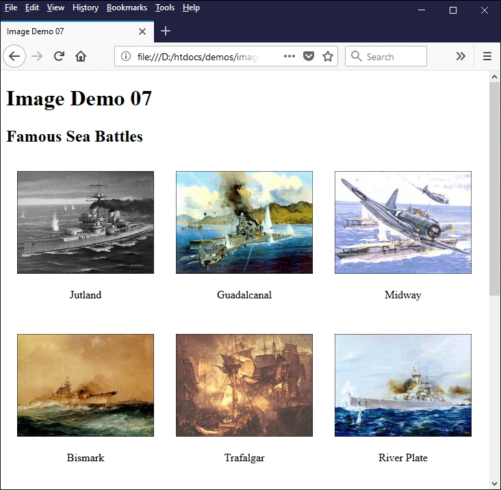
This page demonstrates the use of standard size images and responsive web design
Try changing the size of your browser window to see the way in which the layout changes in response. You could adapt this code quite easily to create your own gallery of images. Or you could create a similar page to hold a series of thumbnail images which, if clicked upon, would open a full-scale version of the image (we will be looking at an example that does exactly that in the page "Hypertext Links".
Using a set of standard sizes for your images can make life much easier when you start to work with more complex page layouts that use rows and columns to organise content. In terms of responsive design, you may (at some point) want to store the same image at several different resolutions so that your pages will look good regardless of whether they are displayed on a low-end smartphone or a state-of-the-art wide-screen smart TV - but that's something we'll look at elsewhere.
We should probably state up front that search engine optimisation (SEO) is a complex topic which we shall tackle in more detail elsewhere. There are a few things you can do, however, that can help to make your content easier to index from a search engine's point of view. One of the things you can do is to give your image files meaningful names.
The images you download from an image hosting service like Flickr will often have very long and obscure filenames that do not even remotely relate to the graphic content of the image itself (for example, a photograph of a rhino that I uploaded to Flickr has the filename 27620788101_affca4677d_o.jpg). This is not due to any lack of imagination on the part of the image provider; it merely reflects the provider's need to generate filenames through automated means because of the number of images they need to store and keep track of.
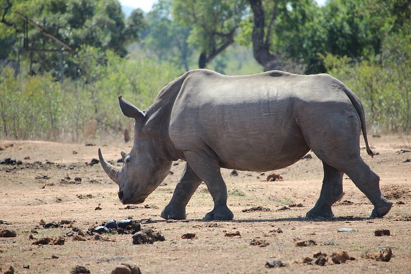
My photograph of a rhino is stored on Flickr with the fiename 27620788101_affca4677d_o.jpg
Similarly, the images you create using a scanner or a digital camera will typically have default filenames consisting of an automatically generated serial number, possibly combined with a date and timestamp. If I wanted to use my picture of a rhino in a web page, I would give it a much more meaningful file name like rhino-sa-2015-20-11.jpg, since I took this photograph on November 20 th 2015 in South Africa's Kruger National Park.
The thing about search engines is that, as clever as they are at finding information stored in text-based documents, they cannot discern anything about the nature of an image by scanning the contents of the image file. Giving your images meaningful file names therefore helps search engines to categorise and index them. This increases the chances that your page will be included in the search results generated in response to the appropriate user-defined search terms.
We mentioned earlier that it is considered good practice to always include the alt attribute in your image tags, because it provides alternative text that will be displayed if your image cannot be downloaded or cannot be displayed for some reason. It is also important for sight-impaired users who may be using a screen reader, because the screen reader can use the alternative text to convey meaningful information about the image to the user, even if they cannot see the image itself.
Alternative text can provide search engines with information that will help them to categorise and index your images in the same way that meaningful filenames do. Always remember, however, that the primary purpose of the alt attribute is to provide information about your image to the user. Don't be tempted to use the alt attribute as a means for sneaking in a few extra keywords; doing so is unlikely to contribute to your search engine ranking, and you may even find yourself being penalised as a result.
Images can be used in your web pages to provide a backdrop over which your page content will appear. You can use full-sized high-resolution images to provide a background image for your pages - like the wallpaper on your computer's desktop, for example - or they can be much smaller images that you can use to provide a tiled background for your pages. Or they can be somewhere in between. It depends what you want to do with them.
Whatever their intended use, your background images should be chosen with care so that they do not obscure the text on your website, or draw too much attention away from important features. It probably goes without saying that they should also be relevant to whatever your website is all about. Many websites, for example, will have a full-size background image on their home page that gives users an immediate visual impression of what the website is all about.
Probably the easiest kind of background image to use, in the sense that you don’t have to worry too much about sizing or stretching the image, is a simple tiled background using a repeating pattern. Consider the image below. This is a simple graphic designed to be tiled horizontally and vertically in order to create a tiled background.

A simple background tile
The file is stored on our website with the file name bg-tile.gif. The HTML code below demonstrates the use of this kind of image to create a tiled background. We have overlaid some text and a simple GIF image depicting the structure of an atom to demonstrate how they will look against the background we have created.
The background image to use is defined using the <body> element's style attribute. Note that the URL for the background image follows the url keyword, and is enclosed within parenthesis. The URL itself is enclosed within single quotes rather than double quotes, because we are already using double quotes to enclose the style attribute's definition.
The URL for the background image source file is specified in the same way as the URL for any other image you include in your web pages; it can be an absolute URL or a local URL (i.e. a relative or absolute pathname), depending on whether the image file resides on your own web server or on a remote server (although we would recommend using local image files wherever possible).
<!doctype html>
<html lang="en">
<head>
<meta charset="utf-8">
<title>Image Demo 08</title>
</head>
<body style="background-image: url('https://www.technologyuk.net/assets/demo-images/bg-tile.gif'); background-color: #f0f8f0;">
<h1>Image Demo 08</h1>
<p style="text-align: center;">
<img src="https://www.technologyuk.net/assets/demo-images/atom.gif" alt="Atom graphic">
</p>
<p style="text-align: center;">
A graphic depicting an atom
</p>
</body>
</html>
Copy and paste the above code into a new file in your HTML editor and save it as image-demo-08.html. Once you have done this, open the file in a web browser. You should see something like the illustration below. The effect is admittedly not particularly inspiring, but it should give you an idea of the kind of thing that is possible.
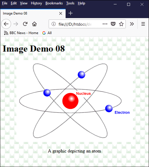
Some text and a simple graphic overlaid on a tiled background
The next illustration shows what the same page would look like if we us a similar graphic that has a transparent background colour. Note that we used a PNG file (atom.png) instead of a GIF file for the simple reason that PNG files are somewhat more dependable when it comes to displaying transparencies correctly. The result is a little more aesthetically pleasing, although care must be taken to ensure that the background does not obscure the clarity of your graphic, or draw attention away from important details.
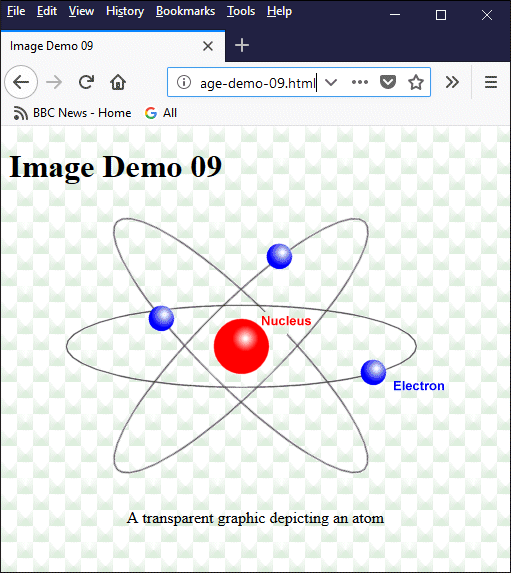
The overlaid image is now transparent
Another point to note here is that, in addition to the background image, we have specified a background colour in the <body> ... </body> element. It a good idea to always specify an appropriate background colour as well as a background image, just in case the background image itself is unavailable or can't be displayed for some reason. The illustration below shows what the same page would look like if the background image could not be displayed.
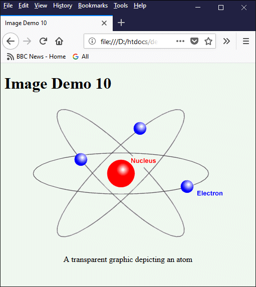
The same web page without the background image
We can specify a background image for a single HTML element on a web page. The background image will fill just the element's container, rather than the entire document. The HTML code below uses the same background image we used previously, but this time we are applying it only to the <p> ... </p> element within which our transparent atom graphic appears.
<!doctype html>
<html lang="en">
<head>
<meta charset="utf-8">
<title>Image Demo 11</title>
</head>
<body>
<h1>Image Demo 11</h1>
<p style="text-align: center; background-image: url('https://www.technologyuk.net/assets/demo-images/bg-tile.gif'); background-color: #f0f8f0;">
<img src="https://www.technologyuk.net/assets/demo-images/atom.png" alt="Atom graphic (transparent)">
</p>
<p style="text-align: center;">
A background image can be applied to a single HTML element
</p>
</body>
</html>
Copy and paste the above code into a new file in your HTML editor and save it as image-demo-11.html. Once you have done this, open the file in a web browser. You should see something like the illustration below. As you can see, the background image is tiled within the paragraph element's containing rectangle and does not affect other areas of the document.
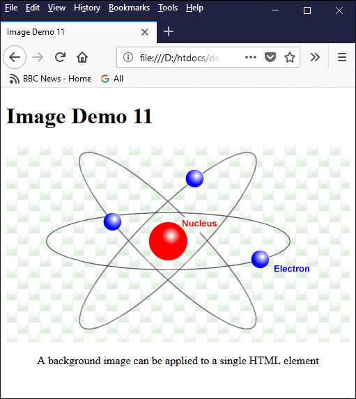
The background image provides a tiled background for the paragraph element
Note that we don't need to explicitly state that the background image should be repeated in the horizontal and vertical directions; this is the default behaviour for a background image. If we want to use an image to act as a background for our document (or for a single HTML element within our document) without it being tiled, we need to turn this behaviour off.
Let's suppose we want to use a single large, high-resolution image as a background for our web page, and that we want it to fill the entire browser window. The HTML code below demonstrates how we can provide a background for our document using a single background image.
<!doctype html>
<html lang="en">
<head>
<meta charset="utf-8">
<title>Image Demo 12</title>
</head>
<body style="background-image: url('https://www.technologyuk.net/assets/demo-images/safari-bg.jpg'); background-repeat: no-repeat; background-color: #efd8c8; background-position: center; background-size: cover;">
<h1>Image Demo 12</h1>
<h2>On safari in South Africa</h2>
<div style="float: left; text-align: center; padding: 1em;">
<img src="https://www.technologyuk.net/assets/demo-images/safari-01.jpg" alt="Buffalo at the water hole"><br>
<p style="text-align: center;">Buffalo</p>
</div>
<div style="float: left; text-align: center; padding: 1em;">
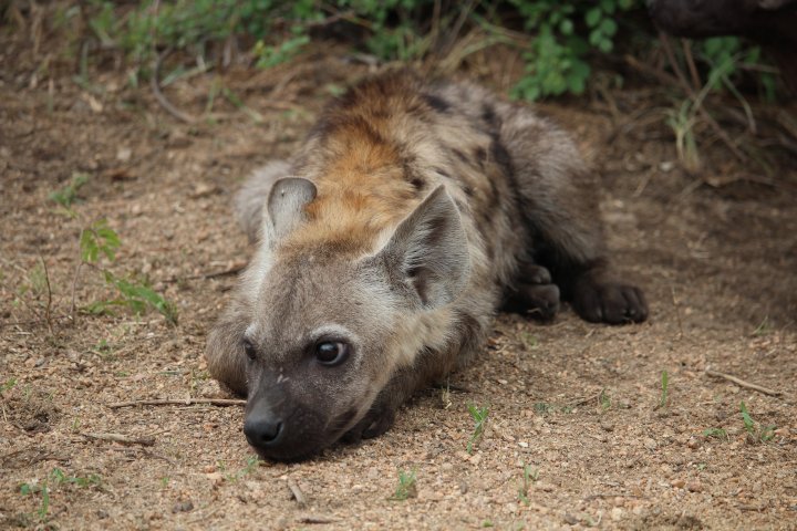
<img src="https://www.technologyuk.net/assets/demo-images/safari-02.jpg" alt="A hyena having a break"><br>
<p style="text-align: center;">Hyena</p>
</div>
<div style="float: left; text-align: center; padding: 1em;">
<img src="https://www.technologyuk.net/assets/demo-images/safari-03.jpg" alt="Some kind of exotic bird"><br>
<p style="text-align: center;">Exotic bird</p>
</div>
<div style="float: left; text-align: center; padding: 1em;">
<img src="https://www.technologyuk.net/assets/demo-images/safari-04.jpg" alt="One of the three wise monkeys"><br>
<p style="text-align: center;">Monkey</p>
</div>
<div style="float: left; text-align: center; padding: 1em;">
<img src="https://www.technologyuk.net/assets/demo-images/safari-05.jpg" alt="When I was a young warthog . . ."><br>
<p style="text-align: center;">Warthog</p>
</div>
<div style="float: left; text-align: center; padding: 1em;">
<img src="https://www.technologyuk.net/assets/demo-images/safari-06.jpg" alt="A grazing rhinoceros"><br>
<p style="text-align: center;">Rhino</p>
</div>
</body>
</html>
Copy and paste the above code into a new file in your HTML editor and save it as image-demo-12.html. Once you have done this, open the file in a web browser. You should see something like the illustration below.
Note that we have set the value of the background-size property to "cover". This resizes the background image so that it fills the entire HTML container element (which in this case is the entire document), which may mean stretching the image or trimming the image along one edge.
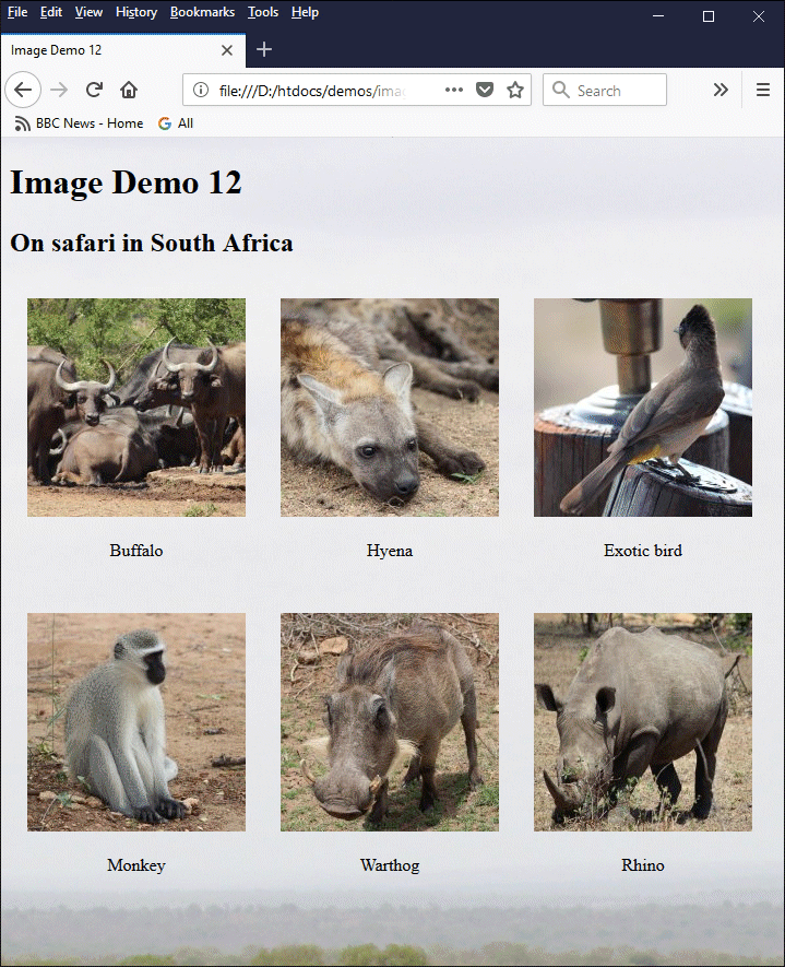
The background image fills the browser window
Try resizing the browser window to see the effect. The background image will always fill the entire browser window, but will be cropped by the browser in order to maintain the image's aspect ratio. We will not explore all of the possibilities for setting the properties of a background image here. You may of course do so if you wish; we will be providing a more comprehensive summary of the relevant properties, and providing examples of their usage, in the section "Introduction to Stylesheets".
We have only explored a few of the possibilities for using background images here. Hopefully it will give you an idea of what is possible, and enable you to formulate some ideas of your own. It is also a good idea to look at how other websites have used background images to enhance their page design. Keep in mind that background images are used primarily for decorative purposes or to emphasize the underlying theme of your pages; they do not form part of the informational content.